


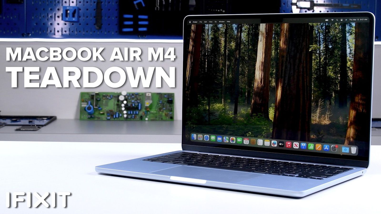
![iFixit Tears Down New M4 MacBook Air [Video]](https://www.iclarified.com/images/news/96717/96717/96717-640.jpg)

![Apple Officially Announces Return of 'Ted Lasso' for Fourth Season [Video]](https://www.iclarified.com/images/news/96710/96710/96710-640.jpg)


![9to5Rewards: Last chance to win a MacBook Pro from Chargeasap [Giveaway]](https://i0.wp.com/9to5mac.com/wp-content/uploads/sites/6/2024/10/M4-MacBook-Pro-doesnt-tempt-me-because-Apple-Silicon-Macs-are-almost-too-good.jpg?resize=1200%2C628&quality=82&strip=all&ssl=1)


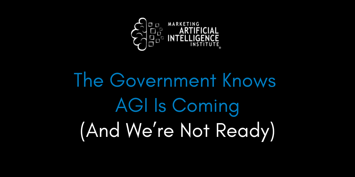
![[The AI Show Episode 139]: The Government Knows AGI Is Coming, Superintelligence Strategy, OpenAI’s $20,000 Per Month Agents & Top 100 Gen AI Apps](https://www.marketingaiinstitute.com/hubfs/ep%20139%20cover-2.png)

![[The AI Show Episode 138]: Introducing GPT-4.5, Claude 3.7 Sonnet, Alexa+, Deep Research Now in ChatGPT Plus & How AI Is Disrupting Writing](https://www.marketingaiinstitute.com/hubfs/ep%20138%20cover.png)


![If I use an API licensed with apache 2.0 in my project, what license do I use and what should I be aware of? [closed]](https://cdn.sstatic.net/Sites/softwareengineering/Img/apple-touch-icon@2.png?v=1ef7363febba)


.jpg?#)

.jpg?#)


Creating Essential Geometric Shapes Using CSS Only
When it comes to web design, CSS isn’t just for styling text or creating layouts—it can also be used to create visually engaging shapes! Whether you're building icons, UI elements, or just having fun experimenting, CSS offers a wide range of possibilities for creating shapes purely with code. In this post, we'll walk through how to create some common shapes—like circles, triangles, and squares—using only CSS. 1. Squares & Rectangles Squares and rectangles are the simplest shapes to create in CSS. All you need to do is define a width, height, and a background color. .square { width: 100px; height: 100px; background-color: #3498db; } If you want to create a rectangle, just adjust the width and height accordingly: .rectangle { width: 150px; height: 100px; background-color: #e74c3c; } 2. Circles To make a perfect circle, we start with a square and use the border-radius property to round the corners. When the width and height are equal, setting border-radius to 50% will create a circle. .circle { width: 100px; height: 100px; background-color: #2ecc71; border-radius: 50%; } 3. Triangles Creating triangles in CSS is a bit of a trick, but it's simple once you understand the basics. You can create a triangle using borders, where the actual shape is made by hiding three of the borders and manipulating the fourth one. .triangle { width: 0; height: 0; border-left: 50px solid transparent; border-right: 50px solid transparent; border-bottom: 100px solid #f39c12; } Here, we set width and height to 0 to collapse the element, and use border-left and border-right to create transparency. The color and size of the triangle come from the border-bottom. 4. Ellipses An ellipse is similar to a circle but stretched either horizontally or vertically. You can achieve this effect by adjusting the border-radius for both axes. .ellipse { width: 150px; height: 100px; background-color: #9b59b6; border-radius: 50%; } This creates a horizontally elongated ellipse. To create a vertically elongated one, swap the width and height values. 5. Pentagons and Other Polygons Using the clip-path property, you can create more complex shapes like pentagons or even polygons with as many sides as you like. Here’s an example of a pentagon: .pentagon { width: 100px; height: 100px; background-color: #f1c40f; clip-path: polygon(50% 0%, 100% 38%, 82% 100%, 18% 100%, 0% 38%); } The clip-path property allows you to specify a shape by defining the coordinates of its vertices. You can experiment with this property to create any polygonal shape. 6. Hearts You can also create a heart shape using CSS, combining multiple properties like border-radius and transform. .heart { width: 100px; height: 100px; background-color: #e74c3c; position: relative; transform: rotate(45deg); } .heart::before, .heart::after { content: ''; position: absolute; width: 100px; height: 100px; background-color: #e74c3c; border-radius: 50%; } .heart::before { top: -50px; left: 0; } .heart::after { top: 0; left: 50px; } Here, we use the ::before and ::after pseudo-elements to create the top curves of the heart, and then rotate the whole element to get the final shape. 7. Using transform for 3D Shapes CSS transforms can also be used to create 3D effects. For example, using rotateX, rotateY, or rotateZ, we can simulate a cube: .cube { width: 100px; height: 100px; background-color: #1abc9c; transform: rotateX(45deg) rotateY(45deg); } Conclusion As you can see, CSS can be a powerful tool for creating shapes without needing any images or SVGs. Whether you're designing simple UI elements or exploring more creative concepts, CSS gives you the flexibility to manipulate shapes with just a few lines of code. If you’re looking to create more advanced shapes, CSS also supports gradients, animations, and transitions to give your shapes dynamic, interactive effects. The key is experimentation! So, next time you're building a UI, try out these shapes to add some visual flair to your website—all with pure CSS. Happy Coding!

When it comes to web design, CSS isn’t just for styling text or creating layouts—it can also be used to create visually engaging shapes!
Whether you're building icons, UI elements, or just having fun experimenting, CSS offers a wide range of possibilities for creating shapes purely with code. In this post, we'll walk through how to create some common shapes—like circles, triangles, and squares—using only CSS.
1. Squares & Rectangles
Squares and rectangles are the simplest shapes to create in CSS. All you need to do is define a width, height, and a background color.
.square {
  width: 100px;
  height: 100px;
  background-color: #3498db;
}
If you want to create a rectangle, just adjust the width and height accordingly:
.rectangle {
  width: 150px;
  height: 100px;
  background-color: #e74c3c;
}
2. Circles
To make a perfect circle, we start with a square and use the border-radius property to round the corners. When the width and height are equal, setting border-radius to 50% will create a circle.
.circle {
  width: 100px;
  height: 100px;
  background-color: #2ecc71;
  border-radius: 50%;
}
3. Triangles
Creating triangles in CSS is a bit of a trick, but it's simple once you understand the basics. You can create a triangle using borders, where the actual shape is made by hiding three of the borders and manipulating the fourth one.
.triangle {
  width: 0;
  height: 0;
  border-left: 50px solid transparent;
  border-right: 50px solid transparent;
  border-bottom: 100px solid #f39c12;
}
Here, we set width and height to 0 to collapse the element, and use border-left and border-right to create transparency. The color and size of the triangle come from the border-bottom.
4. Ellipses
An ellipse is similar to a circle but stretched either horizontally or vertically. You can achieve this effect by adjusting the border-radius for both axes.
.ellipse {
  width: 150px;
  height: 100px;
  background-color: #9b59b6;
  border-radius: 50%;
}
This creates a horizontally elongated ellipse. To create a vertically elongated one, swap the width and height values.
5. Pentagons and Other Polygons
Using the clip-path property, you can create more complex shapes like pentagons or even polygons with as many sides as you like. Here’s an example of a pentagon:
.pentagon {
  width: 100px;
  height: 100px;
  background-color: #f1c40f;
  clip-path: polygon(50% 0%, 100% 38%, 82% 100%, 18% 100%, 0% 38%);
}
The clip-path property allows you to specify a shape by defining the coordinates of its vertices. You can experiment with this property to create any polygonal shape.
6. Hearts
You can also create a heart shape using CSS, combining multiple properties like border-radius and transform.
.heart {
  width: 100px;
  height: 100px;
  background-color: #e74c3c;
  position: relative;
  transform: rotate(45deg);
}

.heart::before,
.heart::after {
  content: '';
  position: absolute;
  width: 100px;
  height: 100px;
  background-color: #e74c3c;
  border-radius: 50%;
}

.heart::before {
  top: -50px;
  left: 0;
}

.heart::after {
  top: 0;
  left: 50px;
}
Here, we use the ::before and ::after pseudo-elements to create the top curves of the heart, and then rotate the whole element to get the final shape.
7. Using transform for 3D Shapes
CSS transforms can also be used to create 3D effects. For example, using rotateX, rotateY, or rotateZ, we can simulate a cube:
.cube {
  width: 100px;
  height: 100px;
  background-color: #1abc9c;
  transform: rotateX(45deg) rotateY(45deg);
}
Conclusion
As you can see, CSS can be a powerful tool for creating shapes without needing any images or SVGs. Whether you're designing simple UI elements or exploring more creative concepts, CSS gives you the flexibility to manipulate shapes with just a few lines of code.
If you’re looking to create more advanced shapes, CSS also supports gradients, animations, and transitions to give your shapes dynamic, interactive effects.
The key is experimentation! So, next time you're building a UI, try out these shapes to add some visual flair to your website—all with pure CSS.
Happy Coding!