


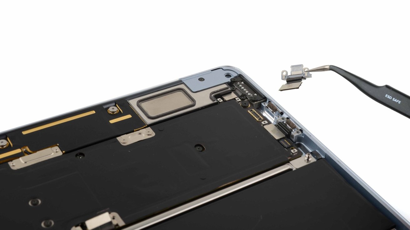
![iFixit Tears Down New M4 MacBook Air [Video]](https://www.iclarified.com/images/news/96717/96717/96717-640.jpg)

![Apple Officially Announces Return of 'Ted Lasso' for Fourth Season [Video]](https://www.iclarified.com/images/news/96710/96710/96710-640.jpg)


![[Update: Fix] Chromecast (2nd gen) and Audio can’t Cast in ‘Untrusted’ outage](https://i0.wp.com/9to5google.com/wp-content/uploads/sites/4/2019/08/chromecast_audio_1.jpg?resize=1200%2C628&quality=82&strip=all&ssl=1)


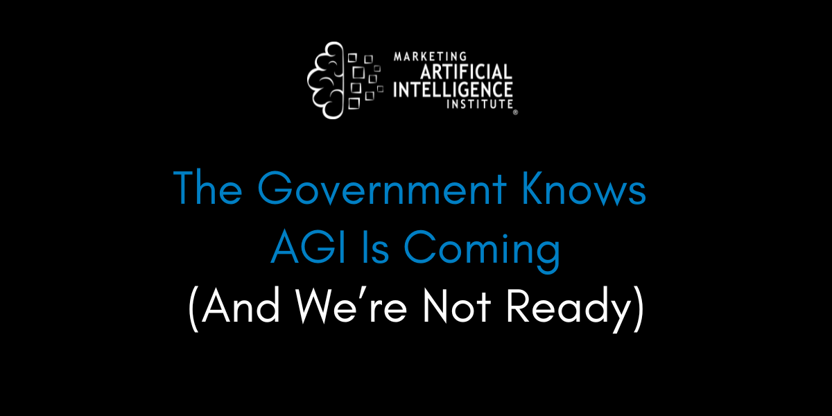
![[The AI Show Episode 139]: The Government Knows AGI Is Coming, Superintelligence Strategy, OpenAI’s $20,000 Per Month Agents & Top 100 Gen AI Apps](https://www.marketingaiinstitute.com/hubfs/ep%20139%20cover-2.png)

![[The AI Show Episode 138]: Introducing GPT-4.5, Claude 3.7 Sonnet, Alexa+, Deep Research Now in ChatGPT Plus & How AI Is Disrupting Writing](https://www.marketingaiinstitute.com/hubfs/ep%20138%20cover.png)


.jpg?#)


How to Create a Heartbeat Animation with CSS
Ever wanted to make your website feel alive? Let’s animate a heart that beats because...why not? No JavaScript. No libraries. Just pure CSS magic. Step 1: The Basic Heart First, we’ll use CSS to create a heart shape with ::before and ::after pseudo-elements: .heart { position: relative; width: 100px; height: 100px; background-color: red; transform: rotate(-45deg); margin: 50px auto; } .heart::before, .heart::after { content: ""; position: absolute; width: 100px; height: 100px; background-color: red; border-radius: 50%; } .heart::before { top: -50px; left: 0; } .heart::after { left: 50px; top: 0; } Boom! We have a heart. Now let’s make it beat! Step 2: Adding the Beat We’ll use the @keyframes rule to scale the heart in and out: @keyframes heartbeat { 0%, 100% { transform: scale(1) rotate(-45deg); } 50% { transform: scale(1.2) rotate(-45deg); } } .heart { animation: heartbeat 1s infinite; } Now the heart pulses. Play with the timing to make it feel more natural. Step 3: Fine-Tuning the Animation Real heartbeats aren’t perfectly smooth. Let’s tweak the easing: @keyframes heartbeat { 0%, 100% { transform: scale(1) rotate(-45deg); } 30% { transform: scale(1.2) rotate(-45deg); } 60% { transform: scale(1) rotate(-45deg); } 80% { transform: scale(1.1) rotate(-45deg); } } .heart { animation: heartbeat 1.2s infinite ease-in-out; } Now it’s got a bit more personality. Full Code Here's the full code: Heartbeat Animation .heart { position: relative; width: 100px; height: 100px; background-color: red; transform: rotate(-45deg); margin: 50px auto; animation: heartbeat 1.2s infinite ease-in-out; } .heart::before, .heart::after { content: ""; position: absolute; width: 100px; height: 100px; background-color: red; border-radius: 50%; } .heart::before { top: -50px; left: 0; } .heart::after { left: 50px; top: 0; } @keyframes heartbeat { 0%, 100% { transform: scale(1) rotate(-45deg); } 30% { transform: scale(1.2) rotate(-45deg); } 60% { transform: scale(1) rotate(-45deg); } 80% { transform: scale(1.1) rotate(-45deg); } } And the result: Final Thoughts CSS is powerful. No need for JavaScript when a simple animation does the job. You can use this effect for today (Valentine’s day), a loading screen, or just because hearts are cool. Try tweaking the colors, sizes, and timing to make it your own. Happy coding! ❤️ Thanks for reading! If you've enjoyed, feel free to like and follow me for more content! I also share more content on Digital Minds, so be sure to check it out!

Ever wanted to make your website feel alive?
Let’s animate a heart that beats because...why not?
No JavaScript. No libraries. Just pure CSS magic.
Step 1: The Basic Heart
First, we’ll use CSS to create a heart shape with ::before and ::after pseudo-elements:
.heart {
  position: relative;
  width: 100px;
  height: 100px;
  background-color: red;
  transform: rotate(-45deg);
  margin: 50px auto;
}

.heart::before,
.heart::after {
  content: "";
  position: absolute;
  width: 100px;
  height: 100px;
  background-color: red;
  border-radius: 50%;
}

.heart::before {
  top: -50px;
  left: 0;
}

.heart::after {
  left: 50px;
  top: 0;
}
Boom! We have a heart.
Now let’s make it beat!
Step 2: Adding the Beat
We’ll use the @keyframes rule to scale the heart in and out:
@keyframes heartbeat {
  0%, 100% { transform: scale(1) rotate(-45deg); }
  50% { transform: scale(1.2) rotate(-45deg); }
}

.heart {
  animation: heartbeat 1s infinite;
}
Now the heart pulses.
Play with the timing to make it feel more natural.
Step 3: Fine-Tuning the Animation
Real heartbeats aren’t perfectly smooth.
Let’s tweak the easing:
@keyframes heartbeat {
  0%, 100% { transform: scale(1) rotate(-45deg); }
  30% { transform: scale(1.2) rotate(-45deg); }
  60% { transform: scale(1) rotate(-45deg); }
  80% { transform: scale(1.1) rotate(-45deg); }
}

.heart {
  animation: heartbeat 1.2s infinite ease-in-out;
}
Now it’s got a bit more personality.
Full Code
Here's the full code:
Heartbeat Animation
And the result:
Final Thoughts
CSS is powerful.
No need for JavaScript when a simple animation does the job.
You can use this effect for today (Valentine’s day), a loading screen, or just because hearts are cool.
Try tweaking the colors, sizes, and timing to make it your own.
Happy coding! ❤️
Thanks for reading! If you've enjoyed, feel free to like and follow me for more content!
I also share more content on Digital Minds, so be sure to check it out!