


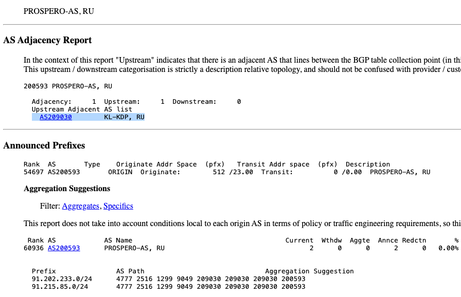


![Apple Officially Announces Return of 'Ted Lasso' for Fourth Season [Video]](https://www.iclarified.com/images/news/96710/96710/96710-640.jpg)
![Apple Plans Live Translation Feature for AirPods in iOS 19 [Report]](https://www.iclarified.com/images/news/96712/96712/96712-640.jpg)
![Apple Shares Official Trailer for 'F1' Starring Brad Pitt [Video]](https://www.iclarified.com/images/news/96714/96714/96714-640.jpg)


![[Update: Fix] Chromecast (2nd gen) and Audio can’t Cast in ‘Untrusted’ outage](https://i0.wp.com/9to5google.com/wp-content/uploads/sites/4/2019/08/chromecast_audio_1.jpg?resize=1200%2C628&quality=82&strip=all&ssl=1)


_Tanapong_Sungkaew_Alamy.jpg?#)

_JIRAROJ_PRADITCHAROENKUL_Alamy.jpg?#)


![[The AI Show Episode 139]: The Government Knows AGI Is Coming, Superintelligence Strategy, OpenAI’s $20,000 Per Month Agents & Top 100 Gen AI Apps](https://www.marketingaiinstitute.com/hubfs/ep%20139%20cover-2.png)


![[The AI Show Episode 138]: Introducing GPT-4.5, Claude 3.7 Sonnet, Alexa+, Deep Research Now in ChatGPT Plus & How AI Is Disrupting Writing](https://www.marketingaiinstitute.com/hubfs/ep%20138%20cover.png)


How to Build an Animated Sidebar Menu Using Tailwind CSS and JavaScript
In this blog post, we'll walk through the process of building an animated sidebar menu using Tailwind CSS and JavaScript. Sidebar menus are a common UI component in web applications, and adding animations can make them more engaging and user-friendly. By the end of this tutorial, you'll have a fully functional, animated sidebar menu that you can integrate into your projects. Table of Contents Introduction to Tailwind CSS Setting Up the Project Building the Sidebar Structure Adding Animations with Tailwind CSS Implementing Toggle Functionality with JavaScript Final Touches and Enhancements Conclusion 1. Introduction to Tailwind CSS Tailwind CSS is a utility-first CSS framework that allows you to build custom designs quickly by applying pre-defined classes directly in your HTML. It’s highly customizable and doesn’t require writing custom CSS for most use cases. For this tutorial, we’ll leverage Tailwind’s utility classes to style our sidebar and add animations. 2. Setting Up the Project Before we start, ensure you have Tailwind CSS installed in your project. If you haven’t set it up yet, follow these steps: Install Tailwind CSS npm install -D tailwindcss postcss autoprefixer npx tailwindcss init Configure tailwind.config.js module.exports = { content: ["./src/**/*.{html,js}"], theme: { extend: {}, }, plugins: [], }; Add Tailwind to Your CSS Create a src/input.css file and add the following: @tailwind base; @tailwind components; @tailwind utilities; Include Tailwind in Your HTML Link your CSS file in your HTML: Animated Sidebar Menu 3. Building the Sidebar Structure Let’s start by creating the basic structure of the sidebar and the main content area. Menu Home About Services Contact Toggle Sidebar Welcome to the Main Content This is the main content area. Click the button to toggle the sidebar. Explanation: The aside element represents the sidebar. It’s initially hidden by applying transform -translate-x-full, which moves it off-screen. The main element contains the main content and a button to toggle the sidebar. 4. Adding Animations with Tailwind CSS Tailwind makes it easy to add animations using utility classes. We’ll use the transition-all, duration-300, and ease-in-out classes to animate the sidebar when it toggles. Update the aside element to include these classes: 5. Implementing Toggle Functionality with JavaScript Now, let’s add JavaScript to toggle the sidebar’s visibility. Add the Script Include the following script at the end of your HTML file: const sidebar = document.getElementById('sidebar'); const toggleButton = document.getElementById('toggleSidebar'); toggleButton.addEventListener('click', () => { sidebar.classList.toggle('-translate-x-full'); }); Explanation: The script toggles the -translate-x-full class on the sidebar when the button is clicked, making it slide in and out. 6. Final Touches and Enhancements Add a Close Button Inside the Sidebar To improve usability, add a close button inside the sidebar: × Menu Home About Services Contact Update the script to handle the close button: const closeButton = document.getElementById('closeSidebar'); closeButton.addEventListener('click', () => { sidebar.classList.add('-translate-x-full'); }); Make the Sidebar Responsive You can make the sidebar responsive by hiding it on smaller screens and showing it only when toggled: 7. Conclusion Congratulations! You’ve built an animated sidebar menu using Tailwind CSS and JavaScript. This component is lightweight, customizable, and ready to be integrated into your projects. You can further enhance it by adding dropdown menus, icons, or dark mode support. Happy coding!
In this blog post, we'll walk through the process of building an animated sidebar menu using Tailwind CSS and JavaScript. Sidebar menus are a common UI component in web applications, and adding animations can make them more engaging and user-friendly. By the end of this tutorial, you'll have a fully functional, animated sidebar menu that you can integrate into your projects.
Table of Contents
- Introduction to Tailwind CSS
- Setting Up the Project
- Building the Sidebar Structure
- Adding Animations with Tailwind CSS
- Implementing Toggle Functionality with JavaScript
- Final Touches and Enhancements
- Conclusion
1. Introduction to Tailwind CSS
Tailwind CSS is a utility-first CSS framework that allows you to build custom designs quickly by applying pre-defined classes directly in your HTML. It’s highly customizable and doesn’t require writing custom CSS for most use cases. For this tutorial, we’ll leverage Tailwind’s utility classes to style our sidebar and add animations.
2. Setting Up the Project
Before we start, ensure you have Tailwind CSS installed in your project. If you haven’t set it up yet, follow these steps:
Install Tailwind CSS
npm install -D tailwindcss postcss autoprefixer
npx tailwindcss init
Configure tailwind.config.js
module.exports = {
  content: ["./src/**/*.{html,js}"],
  theme: {
    extend: {},
  },
  plugins: [],
};
Add Tailwind to Your CSS
Create a src/input.css file and add the following:
@tailwind base;
@tailwind components;
@tailwind utilities;
Include Tailwind in Your HTML
Link your CSS file in your HTML:
 lang="en">

   charset="UTF-8">
   name="viewport" content="width=device-width, initial-scale=1.0">
   href="/dist/output.css" rel="stylesheet">
  </span>Animated Sidebar Menu<span class="nt">