


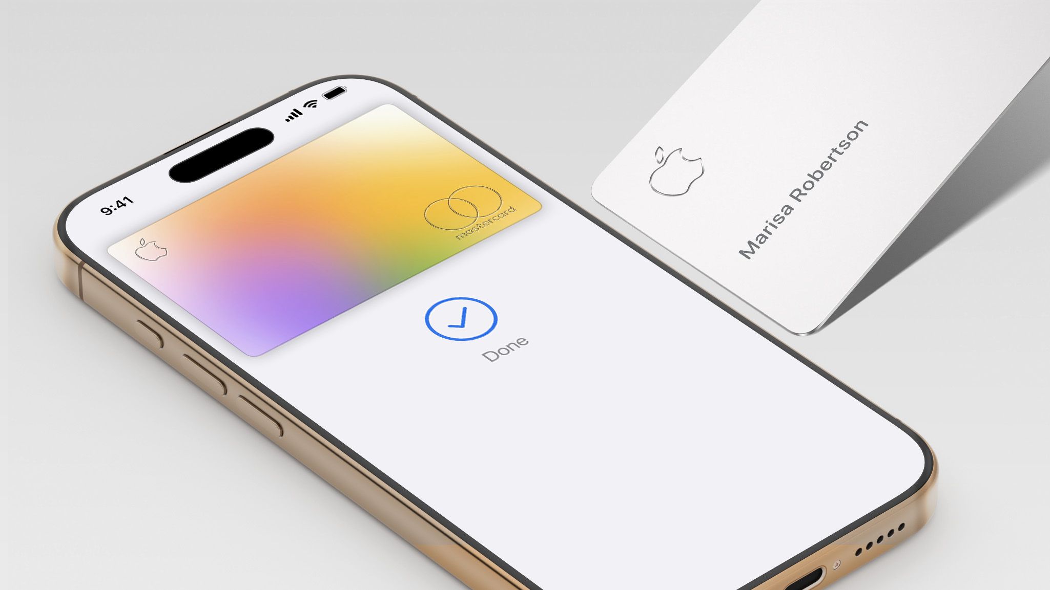
![Apple Foldable iPhone to Feature New Display Tech, 19% Thinner Panel [Rumor]](https://www.iclarified.com/images/news/97271/97271/97271-640.jpg)
![Apple Shares New Mother's Day Ad: 'A Gift for Mom' [Video]](https://www.iclarified.com/images/news/97267/97267/97267-640.jpg)
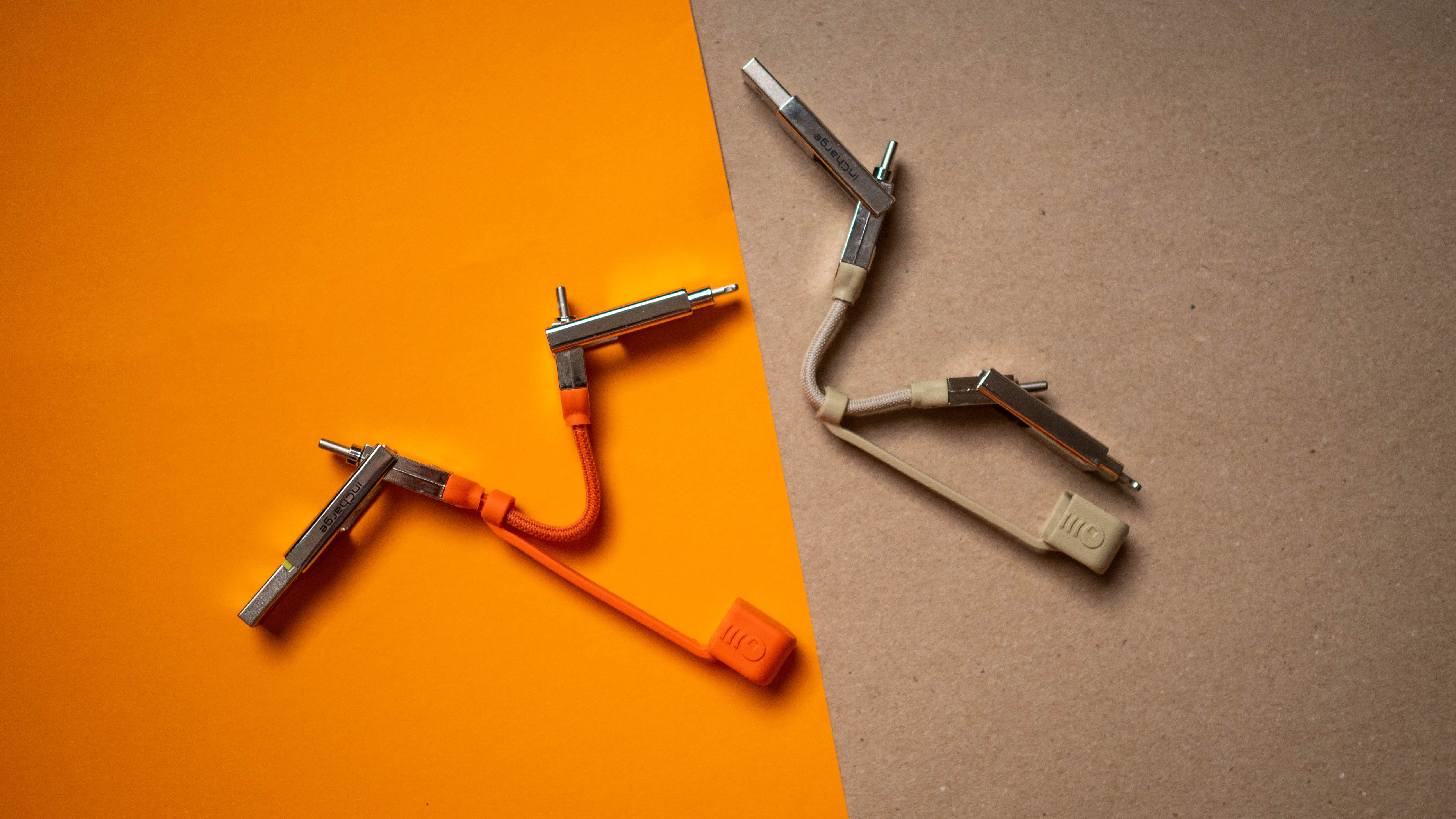
![Apple Developing New Chips for Smart Glasses, Macs, AI Servers [Report]](https://www.iclarified.com/images/news/97269/97269/97269-640.jpg)
![Apple Shares Official Trailer for 'Stick' Starring Owen Wilson [Video]](https://www.iclarified.com/images/news/97264/97264/97264-640.jpg)


![Some of the best accessories to pair with your Pixel 9 [Video]](https://i0.wp.com/9to5google.com/wp-content/uploads/sites/4/2024/10/Accessories-Header.jpg?resize=1200%2C628&quality=82&strip=all&ssl=1)


 Evolved as a Predominant Framework for Ransomware Attacks.webp?#)


_Aleksey_Funtap_Alamy.jpg?width=1280&auto=webp&quality=80&disable=upscale#)
_Sergey_Tarasov_Alamy.jpg?width=1280&auto=webp&quality=80&disable=upscale#)


![[The AI Show Episode 146]: Rise of “AI-First” Companies, AI Job Disruption, GPT-4o Update Gets Rolled Back, How Big Consulting Firms Use AI, and Meta AI App](https://www.marketingaiinstitute.com/hubfs/ep%20146%20cover.png)


![Life in Startup Pivot Hell with Ex-Microsoft Lonewolf Engineer Sam Crombie [Podcast #171]](https://cdn.hashnode.com/res/hashnode/image/upload/v1746753508177/0cd57f66-fdb0-4972-b285-1443a7db39fc.png?#)


.png?width=1920&height=1920&fit=bounds&quality=70&format=jpg&auto=webp#)

.png?width=1920&height=1920&fit=bounds&quality=70&format=jpg&auto=webp#)


Why Choose CSS Grid Over Flexbox for Layouts
When it comes to building modern, responsive web layouts, two CSS layout systems dominate the conversation: Flexbox and Grid. While both are powerful tools in your CSS arsenal, understanding when to use one over the other is key to writing clean, maintainable, and scalable CSS. This article will explore why CSS Grid often makes more sense for full-page layouts while acknowledging where Flexbox still shines. First Principles: Understanding the Core Differences Before diving into specifics, let's establish the fundamental difference between these two layout models: Flexbox is a one-dimensional layout model designed for laying out items in a single row or column. CSS Grid is a two-dimensional layout system designed for laying out items in rows and columns simultaneously. This fundamental difference determines when you should reach for one over the other. 5 Reasons to Choose CSS Grid for Layouts 1. True Two-Dimensional Control Flexbox excels when your content flows in a single direction (horizontal or vertical). But as soon as you need to manage both axes—placing items in specific positions across rows and columns—Grid becomes the clear winner. /* Using Grid for a 3x3 layout */ .container { display: grid; grid-template-columns: repeat(3, 1fr); grid-template-rows: auto auto auto; gap: 1rem; } With this simple code, you can place items in specific cells, span them across multiple columns or rows, and define the entire layout structure in one declaration. 2. Named Template Areas for Semantic Layouts One of Grid's most powerful features is the ability to define grid areas by name, making your layouts more readable and maintainable. .container { display: grid; grid-template-areas: "header header" "sidebar main" "footer footer"; grid-template-columns: 200px 1fr; } .header { grid-area: header; } .sidebar { grid-area: sidebar; } .main { grid-area: main; } .footer { grid-area: footer; } This semantic layout approach is remarkably intuitive. Anyone reading your code can immediately visualize the layout structure without having to calculate flex-based widths and orders. 3. Better for Page-Level Layouts For full-page layouts—dashboards, blogs, web apps—CSS Grid allows you to define an entire page structure at once. With Flexbox, you'd typically need to nest multiple flex containers to achieve the same result, leading to more complex HTML and potential performance issues. Example of nested Flexbox vs. clean Grid code Nested Flexbox approach: Header content Sidebar content Main content Footer content .page-container { display: flex; flex-direction: column; min-height: 100vh; } .content-container { display: flex; flex: 1; } .sidebar { width: 200px; } .main-content { flex: 1; } Cleaner Grid approach: Header content Sidebar content Main content Footer content .page-container { display: grid; grid-template-areas: "header header" "sidebar main" "footer footer"; grid-template-columns: 200px 1fr; grid-template-rows: auto 1fr auto; min-height: 100vh; } .header { grid-area: header; } .sidebar { grid-area: sidebar; } .main-content { grid-area: main; } .footer { grid-area: footer; } 4. More Predictable Alignment and Spacing CSS Grid provides more intuitive alignment and spacing tools when dealing with multiple rows and columns. The gap property works consistently across both dimensions, and alignment properties like justify-items and align-items are more predictable across complex layouts. .grid-container { display: grid; grid-template-columns: repeat(3, 1fr); gap: 20px; justify-items: center; align-items: center; } With Flexbox, you might need various combinations of margins, paddings, and justify-content properties to achieve the same spacing consistency. 5. Reduced HTML Nesting With Flexbox, complex layouts often require nested containers. Grid lets you build more complex designs without excessive HTML nesting, keeping your markup cleaner and more semantic. When to Stick with Flexbox Flexbox still has its place in your CSS toolkit! It shines for: Navigation menus and toolbars where items flow in a single direction Form controls that need to be aligned in a row Card layouts with dynamic content where items need to wrap naturally Centering a single element both horizontally and vertically /* Simple navigation with Flexbox */ .nav { display: flex; justify-content: space-between; align-items: center; } /* Centering with Flexbox - still unbeatable for this */ .centered-box { display: flex; justify-content: center; align-items: center; height: 100vh; } Decision Matrix: Flexbox vs. Grid Use Case Flexbox Grid One-dimensional layout ✅ Perfect fit ❌ Overkill Two-dimensional layout ❌ Complicated ✅ Perfect fit Component-level layout ✅ Great ✅ Go

When it comes to building modern, responsive web layouts, two CSS layout systems dominate the conversation: Flexbox and Grid. While both are powerful tools in your CSS arsenal, understanding when to use one over the other is key to writing clean, maintainable, and scalable CSS.
This article will explore why CSS Grid often makes more sense for full-page layouts while acknowledging where Flexbox still shines.
First Principles: Understanding the Core Differences
Before diving into specifics, let's establish the fundamental difference between these two layout models:
- Flexbox is a one-dimensional layout model designed for laying out items in a single row or column.
- CSS Grid is a two-dimensional layout system designed for laying out items in rows and columns simultaneously.
This fundamental difference determines when you should reach for one over the other.
5 Reasons to Choose CSS Grid for Layouts
1. True Two-Dimensional Control
Flexbox excels when your content flows in a single direction (horizontal or vertical). But as soon as you need to manage both axes—placing items in specific positions across rows and columns—Grid becomes the clear winner.
/* Using Grid for a 3x3 layout */
.container {
  display: grid;
  grid-template-columns: repeat(3, 1fr);
  grid-template-rows: auto auto auto;
  gap: 1rem;
}
With this simple code, you can place items in specific cells, span them across multiple columns or rows, and define the entire layout structure in one declaration.
2. Named Template Areas for Semantic Layouts
One of Grid's most powerful features is the ability to define grid areas by name, making your layouts more readable and maintainable.
.container {
  display: grid;
  grid-template-areas:
    "header header"
    "sidebar main"
    "footer footer";
  grid-template-columns: 200px 1fr;
}

.header  { grid-area: header; }
.sidebar { grid-area: sidebar; }
.main    { grid-area: main; }
.footer  { grid-area: footer; }
This semantic layout approach is remarkably intuitive. Anyone reading your code can immediately visualize the layout structure without having to calculate flex-based widths and orders.
3. Better for Page-Level Layouts
For full-page layouts—dashboards, blogs, web apps—CSS Grid allows you to define an entire page structure at once. With Flexbox, you'd typically need to nest multiple flex containers to achieve the same result, leading to more complex HTML and potential performance issues.
Example of nested Flexbox vs. clean Grid code
Nested Flexbox approach:
  Header content

    Sidebar content
    Main content

  Footer content
.page-container {
  display: flex;
  flex-direction: column;
  min-height: 100vh;
}

.content-container {
  display: flex;
  flex: 1;
}

.sidebar {
  width: 200px;
}

.main-content {
  flex: 1;
}
Cleaner Grid approach:
  Header content
  Sidebar content
  Main content
  Footer content
.page-container {
  display: grid;
  grid-template-areas:
    "header header"
    "sidebar main"
    "footer footer";
  grid-template-columns: 200px 1fr;
  grid-template-rows: auto 1fr auto;
  min-height: 100vh;
}

.header { grid-area: header; }
.sidebar { grid-area: sidebar; }
.main-content { grid-area: main; }
.footer { grid-area: footer; }
4. More Predictable Alignment and Spacing
CSS Grid provides more intuitive alignment and spacing tools when dealing with multiple rows and columns. The gap property works consistently across both dimensions, and alignment properties like justify-items and align-items are more predictable across complex layouts.
.grid-container {
  display: grid;
  grid-template-columns: repeat(3, 1fr);
  gap: 20px;
  justify-items: center;
  align-items: center;
}
With Flexbox, you might need various combinations of margins, paddings, and justify-content properties to achieve the same spacing consistency.
5. Reduced HTML Nesting
With Flexbox, complex layouts often require nested containers. Grid lets you build more complex designs without excessive HTML nesting, keeping your markup cleaner and more semantic.
When to Stick with Flexbox
Flexbox still has its place in your CSS toolkit! It shines for:
- Navigation menus and toolbars where items flow in a single direction
- Form controls that need to be aligned in a row
- Card layouts with dynamic content where items need to wrap naturally
- Centering a single element both horizontally and vertically
/* Simple navigation with Flexbox */
.nav {
  display: flex;
  justify-content: space-between;
  align-items: center;
}

/* Centering with Flexbox - still unbeatable for this */
.centered-box {
  display: flex;
  justify-content: center;
  align-items: center;
  height: 100vh;
}
Decision Matrix: Flexbox vs. Grid
| Use Case | Flexbox | Grid |
|---|---|---|
| One-dimensional layout | ✅ Perfect fit | ❌ Overkill |
| Two-dimensional layout | ❌ Complicated | ✅ Perfect fit |
| Component-level layout | ✅ Great | ✅ Good |
| Page-level layout | ❌ Clumsy | ✅ Ideal |
| Precise item placement | ❌ Hard | ✅ Easy with areas |
| Content-driven layouts | ✅ Flexible | ❌ More rigid |