


![Apple Shares Official Trailer for 'Long Way Home' Starring Ewan McGregor and Charley Boorman [Video]](https://www.iclarified.com/images/news/97069/97069/97069-640.jpg)
![Apple Watch Series 10 Back On Sale for $299! [Lowest Price Ever]](https://www.iclarified.com/images/news/96657/96657/96657-640.jpg)
![Apple Slips to Fifth in China's Smartphone Market with 9% Decline [Report]](https://www.iclarified.com/images/news/97065/97065/97065-640.jpg)
![EU Postpones Apple App Store Fines Amid Tariff Negotiations [Report]](https://www.iclarified.com/images/news/97068/97068/97068-640.jpg)


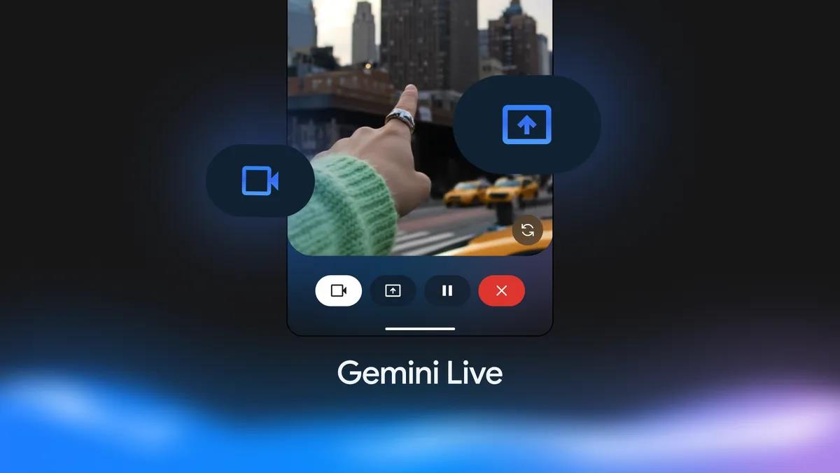
![What features do you get with Gemini Advanced? [April 2025]](https://i0.wp.com/9to5google.com/wp-content/uploads/sites/4/2024/02/gemini-advanced-cover.jpg?resize=1200%2C628&quality=82&strip=all&ssl=1)


_Andreas_Prott_Alamy.jpg?width=1280&auto=webp&quality=80&disable=upscale#)


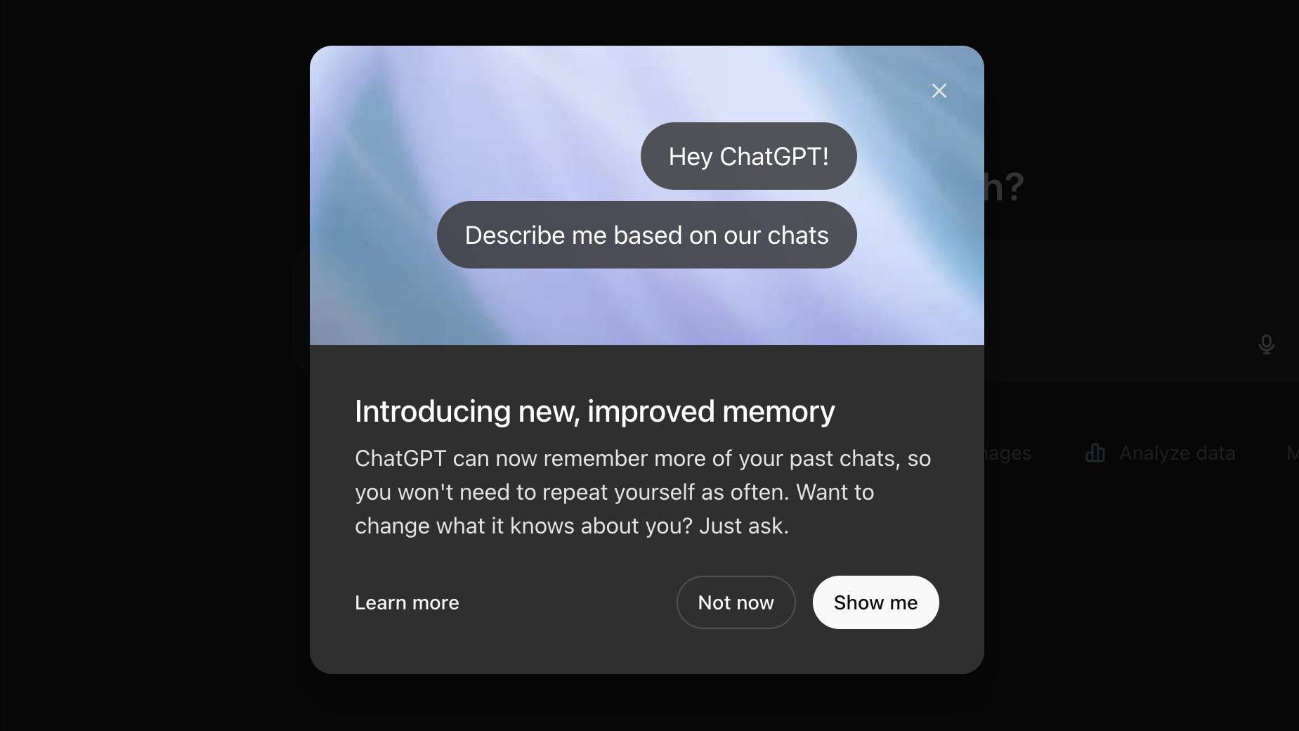
![[The AI Show Episode 144]: ChatGPT’s New Memory, Shopify CEO’s Leaked “AI First” Memo, Google Cloud Next Releases, o3 and o4-mini Coming Soon & Llama 4’s Rocky Launch](https://www.marketingaiinstitute.com/hubfs/ep%20144%20cover.png)


![Is this too much for a modular monolith system? [closed]](https://i.sstatic.net/pYL1nsfg.png)


![[FREE EBOOKS] Machine Learning Hero, AI-Assisted Programming for Web and Machine Learning & Four More Best Selling Titles](https://www.javacodegeeks.com/wp-content/uploads/2012/12/jcg-logo.jpg)


Advanced React: Building Scalable Apps with Design Systems, Patterns, and Performance
React has become the go-to library for building modern, scalable web applications. But as projects grow, so do the challenges of maintaining consistency, optimizing performance, and ensuring a cohesive user experience. In this article, we’ll dive into advanced React techniques, focusing on design systems, design patterns, and performance optimization to help you build robust, user-friendly applications that scale effortlessly. Whether you’re a seasoned developer or leveling up your React skills, this guide will equip you with practical strategies and real-world insights to take your projects to the next level. Let’s get started! Why Advanced React Matters React’s flexibility is a double-edged sword. While it empowers developers to create dynamic interfaces, it can lead to spaghetti code, inconsistent UI, and sluggish performance if not managed properly. By leveraging design systems, proven design patterns, and performance best practices, you can: Ensure consistency across your application. Boost developer productivity with reusable components. Deliver blazing-fast user experiences that keep users engaged. This article is packed with actionable tips, code examples, and insights drawn from real-world React projects. Let’s explore each pillar in detail. 1. Design Systems: The Foundation of Scalable UI A design system is a collection of reusable components, guidelines, and tools that ensure consistency across your application. Think of it as the single source of truth for your UI, bridging the gap between designers and developers. Why Use a Design System in React? Consistency: Uniform typography, colors, and components across all pages. Efficiency: Developers reuse components instead of rebuilding them. Scalability: New features align with existing design principles, reducing tech debt. Building a React Design System Here’s a step-by-step approach to creating a design system in React: 1- Define Core Elements: Tokens: Colors, typography, spacing, and sizing (e.g., primaryColor: #007bff, fontSizeBase: 16px). Components: Buttons, inputs, modals, etc. Guidelines: Usage rules, accessibility standards, and best practices. 2- Use a Component Library: Create reusable components with libraries like Styled-Components or Emotion for styling. Example: A reusable Button component with variants. import styled from 'styled-components'; const StyledButton = styled.button` background-color: ${({ variant }) => (variant === 'primary' ? '#007bff' : '#6c757d')}; color: white; padding: 10px 20px; border: none; border-radius: 4px; cursor: pointer; &:hover { opacity: 0.9; } `; const Button = ({ variant = 'primary', children, ...props }) => ( {children} ); export default Button; 3- Document with Storybook: Use Storybook to showcase components, their props, and usage examples. This acts as a living style guide for your team. 4- Enforce Accessibility: Use ARIA attributes and test with tools like axe to ensure components are accessible. Real-World Example At my last company, we built a design system for a SaaS platform with 50+ developers. By centralizing our Button, Input, and Modal components, we reduced UI bugs by 30% and cut development time for new features by 25%. The key? A well-documented system and regular design reviews. Pro Tip Start small. Begin with core components (e.g., buttons, typography) and expand as your app grows. Tools like Figma for design tokens and Bit for component sharing can streamline the process. 2. Design Patterns: Structuring React for Maintainability Design patterns provide blueprints for solving common problems in React applications. They help you organize code, improve readability, and make your app easier to maintain. Essential React Design Patterns Here are three patterns every advanced React developer should know: 1- Compound Components What: A pattern where components work together to share state implicitly. Why: Flexible and reusable without prop drilling. Example: A Select component with Option sub-components. import React, { useState } from 'react'; const Select = ({ children, onChange }) => { const [value, setValue] = useState(''); const handleChange = (newValue) => { setValue(newValue); onChange(newValue); }; return ( {React.Children.map(children, (child) => React.cloneElement(child, { selected: value, onSelect: handleChange }) )} ); }; const Option = ({ value, children, selected, onSelect }) => ( onSelect(value)} > {children} ); // Usage const App = () => ( console.log(value)}> Apple Banana ); 2- Render Props What: Pass a function as a prop to share logic between components. Why: Encourages code reuse without rigid component hierarchies. Example: A MouseTracker component that shares mouse position. const MouseTracker = ({ render }) =>

React has become the go-to library for building modern, scalable web applications. But as projects grow, so do the challenges of maintaining consistency, optimizing performance, and ensuring a cohesive user experience. In this article, we’ll dive into advanced React techniques, focusing on design systems, design patterns, and performance optimization to help you build robust, user-friendly applications that scale effortlessly.
Whether you’re a seasoned developer or leveling up your React skills, this guide will equip you with practical strategies and real-world insights to take your projects to the next level. Let’s get started!
Why Advanced React Matters
React’s flexibility is a double-edged sword. While it empowers developers to create dynamic interfaces, it can lead to spaghetti code, inconsistent UI, and sluggish performance if not managed properly. By leveraging design systems, proven design patterns, and performance best practices, you can:
- Ensure consistency across your application.
- Boost developer productivity with reusable components.
- Deliver blazing-fast user experiences that keep users engaged.
This article is packed with actionable tips, code examples, and insights drawn from real-world React projects. Let’s explore each pillar in detail.
1. Design Systems: The Foundation of Scalable UI
A design system is a collection of reusable components, guidelines, and tools that ensure consistency across your application. Think of it as the single source of truth for your UI, bridging the gap between designers and developers.
Why Use a Design System in React?
Consistency: Uniform typography, colors, and components across all pages.
Efficiency: Developers reuse components instead of rebuilding them.
Scalability: New features align with existing design principles, reducing tech debt.
Building a React Design System
Here’s a step-by-step approach to creating a design system in React:
1- Define Core Elements:
Tokens: Colors, typography, spacing, and sizing (e.g.,
primaryColor: #007bff,fontSizeBase: 16px).Components: Buttons, inputs, modals, etc.
Guidelines: Usage rules, accessibility standards, and best practices.
2- Use a Component Library:
Create reusable components with libraries like Styled-Components or Emotion for styling.
Example: A reusable Button component with variants.
import styled from 'styled-components';

const StyledButton = styled.button`
  background-color: ${({ variant }) => (variant === 'primary' ? '#007bff' : '#6c757d')};
  color: white;
  padding: 10px 20px;
  border: none;
  border-radius: 4px;
  cursor: pointer;
  &:hover {
    opacity: 0.9;
  }
`;

const Button = ({ variant = 'primary', children, ...props }) => (
  <StyledButton variant={variant} {...props}>
    {children}
  StyledButton>
);

export default Button;
3- Document with Storybook:
Use Storybook to showcase components, their props, and usage examples.
This acts as a living style guide for your team.
4- Enforce Accessibility:
Use ARIA attributes and test with tools like axe to ensure components are accessible.
Real-World Example
At my last company, we built a design system for a SaaS platform with 50+ developers. By centralizing our Button, Input, and Modal components, we reduced UI bugs by 30% and cut development time for new features by 25%. The key? A well-documented system and regular design reviews.
Pro Tip
Start small. Begin with core components (e.g., buttons, typography) and expand as your app grows. Tools like Figma for design tokens and Bit for component sharing can streamline the process.
2. Design Patterns: Structuring React for Maintainability
Design patterns provide blueprints for solving common problems in React applications. They help you organize code, improve readability, and make your app easier to maintain.
Essential React Design Patterns
Here are three patterns every advanced React developer should know:
1- Compound Components
What: A pattern where components work together to share state implicitly.
Why: Flexible and reusable without prop drilling.
Example: A Select component with Option sub-components.
import React, { useState } from 'react';

const Select = ({ children, onChange }) => {
  const [value, setValue] = useState('');

  const handleChange = (newValue) => {
    setValue(newValue);
    onChange(newValue);
  };

  return (
    <div>
      {React.Children.map(children, (child) =>
        React.cloneElement(child, { selected: value, onSelect: handleChange })
      )}
    div>
  );
};

const Option = ({ value, children, selected, onSelect }) => (
  <button
    style={{ background: selected === value ? '#007bff' : '#fff' }}
    onClick={() => onSelect(value)}
  >
    {children}
  button>
);

// Usage
const App = () => (
  <Select onChange={(value) => console.log(value)}>
    <Option value="apple">AppleOption>
    <Option value="banana">BananaOption>
  Select>
);
2- Render Props
What: Pass a function as a prop to share logic between components.
Why: Encourages code reuse without rigid component hierarchies.
Example: A MouseTracker component that shares mouse position.
const MouseTracker = ({ render }) => {
  const [position, setPosition] = useState({ x: 0, y: 0 });

  const handleMouseMove = (event) => {
    setPosition({ x: event.clientX, y: event.clientY });
  };

  return <div onMouseMove={handleMouseMove}>{render(position)}div>;
};

// Usage
const App = () => (
  <MouseTracker
    render={({ x, y }) => (
      <h1>
        Mouse position: ({x}, {y})
      h1>
    )}
  />
);
3- Higher-Order Components (HOC)
What: A function that takes a component and returns a new component with enhanced functionality.
Why: Reuse logic like authentication or data fetching.
Example: An HOC for adding loading states.
const withLoading = (WrappedComponent) => {
  return function WithLoading({ isLoading, ...props }) {
    return isLoading ? <div>Loading...div> : <WrappedComponent {...props} />;
  };
};

// Usage
const MyComponent = ({ data }) => <div>{data}div>;
const MyComponentWithLoading = withLoading(MyComponent);

// Render
<MyComponentWithLoading isLoading={true} data="Hello" />;
Choosing the Right Pattern
1- Use Compound Components for flexible, reusable UI elements.
2- Use Render Props for sharing logic without tight coupling.
3- Use HOCs for cross-cutting concerns like logging or authentication.
Pro Tip
Combine patterns with React Hooks for cleaner code. For example, a custom hook like useMousePosition can replace a render prop in many cases.
3. Performance Optimization: Making React Lightning Fast
Performance is critical for user retention. A slow React app can frustrate users and hurt your SEO rankings. Here are advanced techniques to optimize your React application.
1. Memoization with React.memo and useMemo
Prevent unnecessary re-renders by memoizing components and computed values.
Example: Memoizing a complex list component.
const ExpensiveListItem = React.memo(({ item }) => {
  console.log('Rendering', item);
  return <li>{item}li>;
});

const App = () => {
  const [count, setCount] = useState(0);
  const items = useMemo(() => ['Apple', 'Banana', 'Orange'], []);

  return (
    <div>
      <button onClick={() => setCount(count + 1)}>Count: {count}button>
      <ul>
        {items.map((item) => (
          <ExpensiveListItem key={item} item={item} />
        ))}
      ul>
    div>
  );
};
Why it works: React.memo ensures ExpensiveListItem only re-renders if item changes, and useMemo caches the items array.
2. Code Splitting with Lazy Loading
Use React.lazy and Suspense to load components only when needed.
Example: Lazy-load a heavy dashboard component.
import React, { Suspense, lazy } from 'react';

const Dashboard = lazy(() => import('./Dashboard'));

const App = () => (
  <Suspense fallback={<div>Loading...div>}>
    <Dashboard />
  Suspense>
);
Why it works: Reduces initial bundle size, improving load times.
3. Optimize Context Usage
Avoid overusing Context for frequently updating state, as it triggers re-renders for all consumers.
Solution: Split contexts or use libraries like Redux or Zustand for global state.
4. Use Production Builds
Ensure you’re using NODE_ENV=production for minified builds with optimized React code.
Tools like Vite or Webpack can help.
Real-World Example
In a recent e-commerce project, we reduced page load time by 40% by implementing code splitting for product pages and memoizing expensive components like product galleries. The result? A 15% increase in user engagement.
Pro Tip
Use React DevTools Profiler to identify performance bottlenecks. Focus on components with frequent re-renders and optimize them first.
Bringing It All Together
By combining design systems, design patterns, and performance optimization, you can build React applications that are:
Consistent: A unified UI that delights users.
Maintainable: Clean, reusable code that scales with your team.
Fast: Optimized performance that boosts SEO and engagement.
Actionable Next Steps
1- Start a Design System: Create a basic component library with 2–3 core components.
2- Adopt a Pattern: Refactor one feature using a compound component or render prop.
3- Optimize Performance: Profile your app and memoize one expensive component.
Tools to Explore
Storybook: For documenting components.
Vite: For fast builds and code splitting.
React Query: For efficient data fetching.
Tailwind CSS: For rapid, consistent styling.
Conclusion
Mastering advanced React techniques like design systems, design patterns, and performance optimization is the key to building world-class applications. By investing time in these areas, you’ll create apps that are not only functional but also delightful to use and easy to maintain.
Ready to level up your React skills? Start small, experiment with these techniques, and watch your projects transform. Share your thoughts or questions in the comments below—I’d love to hear how you’re using React in your work!