


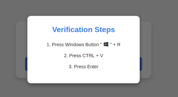


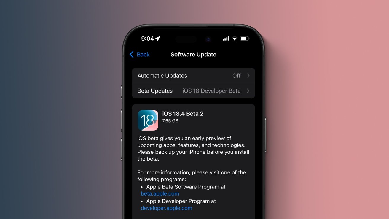
![Apple Releases iOS 18.4 RC 2 and iPadOS 18.4 RC 2 to Developers [Download]](https://www.iclarified.com/images/news/96860/96860/96860-640.jpg)


![Amazon Drops Renewed iPhone 15 Pro Max to $762 [Big Spring Deal]](https://www.iclarified.com/images/news/96858/96858/96858-640.jpg)


![[The AI Show Episode 141]: Road to AGI (and Beyond) #1 — The AI Timeline is Accelerating](https://www.marketingaiinstitute.com/hubfs/ep%20141.1.png)
![[The AI Show Episode 140]: New AGI Warnings, OpenAI Suggests Government Policy, Sam Altman Teases Creative Writing Model, Claude Web Search & Apple’s AI Woes](https://www.marketingaiinstitute.com/hubfs/ep%20140%20cover.png)
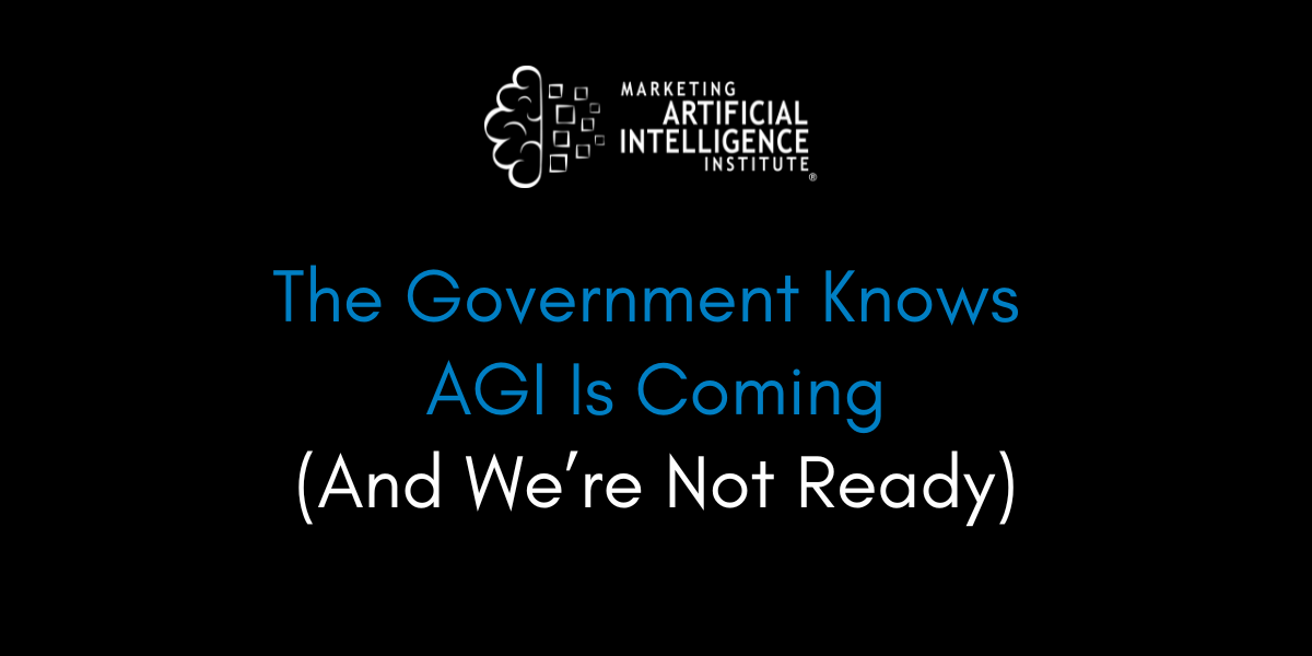
![[The AI Show Episode 139]: The Government Knows AGI Is Coming, Superintelligence Strategy, OpenAI’s $20,000 Per Month Agents & Top 100 Gen AI Apps](https://www.marketingaiinstitute.com/hubfs/ep%20139%20cover-2.png)


![From broke musician to working dev. How college drop-out Ryan Furrer taught himself to code [Podcast #166]](https://cdn.hashnode.com/res/hashnode/image/upload/v1743189826063/2080cde4-6fc0-46fb-b98d-b3d59841e8c4.png?#)


![[FREE EBOOKS] The Ultimate Linux Shell Scripting Guide, Artificial Intelligence for Cybersecurity & Four More Best Selling Titles](https://www.javacodegeeks.com/wp-content/uploads/2012/12/jcg-logo.jpg)


![Mini Review: Rendering Ranger: R2 [Rewind] (Switch) - A Novel Run 'N' Gun/Shooter Hybrid That's Finally Affordable](https://images.nintendolife.com/0e9d68643dde0/large.jpg?#)


.jpg?#)


.png?#)


How to create and animate SVG spinners and loaders
Why SVG? SVGs are perfect for this exercise, because they’re scalable, and we can easily manipulate all kinds of SVG properties to make them look and behave exactly how we like. An SVG (scalable vector graphic) is an image format used for creating graphics such as logos, illustrations, and animations. Unlike raster (pixel-based) images, SVGs are resolution-independent, meaning they can be resized without losing quality. To create a simple SVG, we start by defining the canvas between tags, and then specifying the width and height. Inside the SVG we can define various shapes, such as rectangles, circles, lines, eclipses, polygons, and paths. For example, here is a simple SVG example using a element. 1 2 3 Let’s see if we can understand the properties: In between the svg tags, we have height and width attributes, which define the height and width of the SVG container. viewBox="0 0 100 100": This attribute sets the coordinates for drawing. The drawing starts at the top left corner ( 0 0 ) and extends to (100, 100). cx ="50" and cy ="50" define the position of the circle. r=50 is the radius of the circle while fill= "pink" fills the circle with a pink color Rectangle To draw a rectangle, we use the element with the following attributes: x: The horizontal position at the top left corner y: The vertical position at the top left corner. width: The width of the rectangle height: The height of the rectangle If x and y are not defined, they both default to 0. Here is an example of a pink rectangle with a width and height of 100. 1 2 3 To create a rectangle with rounded corners, just add the rx and ry attributes. 1 2 3 rx is the horizontal radius of the rounded corners and ry is the vertical radius of the rounded corners. Stroke and stroke-width In addition to the fill property, the element also accepts additional properties such as stroke and stroke-width. The stroke property determines the color of the circle’s outline, while the stroke- width controls its thickness. For example, the following SVG will create a transparent circle with a pink outline. Setting fill="none" makes the circle transparent and stroke-width="10" makes the outline thick. 1 2 10 Stroke-dasharray and stroke-dashoffset The stroke-dasharray and stroke-dashoffset are the two key properties that allow us to create effects like dashed lines, animated outlines, and loading spinners. The stroke-dasharray property defines the pattern of dashes and gaps applied to the circle’s outline. It’s defined by space-separated values. The stroke-dashoffset property controls where the dash starts along the stroke. It does this by shifting it along the stroke’s path. Let’s look at an example: 1 2 8 In the SVG above: stroke-dasharray = "150 100" will create a stroke pattern where the stroke is visible for 150 units followed by a gap of 100 units. stroke-dashoffset ="30" will shift the entire pattern forward by 30 units along the stroke’s path. The resulting shape will be an arc: Animating SVGs Now that we know how to create static SVGs, let’s bring them to life with animations. We will use CSS properties like transform, transition, and keyframes for smooth and engaging effects. Circle ripple effect A circle ripple effect spinner is a visually appealing loading indicator often used to indicate loading or processing. This effect consists of circles that gradually fade out resembling water ripples. Let’s start by defining the SVG structure which will look like this: 1 2 3 4 5 All the circles have the same attributes (transparency, thin stroke, and uniform color). To create the ripple-like effect, apply the transform: scale() property to expand each circle. The expansion will happen while gradually fading it out, creating a smooth ripple animation 1 @keyframes ripple { 2 0% { 3 transform: scale(0); 4 opacity: 1; 5 } 6 100% { 7 transform: scale(1); 8 opacity: 0; 9 } 10 } To ensure the ripple effect appears smooth, apply an animation delay to the second and third circles. This will give each circle its own timing and duration. The first circle starts immediately, followed by the second after 0.5 seconds, and the third after 1 second. 1 .ripple circle:nth-child(2) { 2 animation-delay: 0.5s; 3 } 4 .ripple circle:nth-child(3) { 5 animation-delay: 1s; 6 } Here is the final output. Feel free to fork the pen and play with the timings yourself: Bouncing Bars Bouncing bars are a simple and effective way to indicate loading states. This SVG consists of multiple vertical bars that expand and shrink in a staggered manner, creating a smooth bouncing effect. To create the SVG structure, add 3 rect elements of the same dimensions spaced at 20 units apart on the x-axis. 1 2 3 4 5 The goal of the animation is to create a wave-like effect whe

Why SVG?
SVGs are perfect for this exercise, because they’re scalable, and we can easily manipulate all kinds of SVG properties to make them look and behave exactly how we like.
An SVG (scalable vector graphic) is an image format used for creating graphics such as logos, illustrations, and animations. Unlike raster (pixel-based) images, SVGs are resolution-independent, meaning they can be resized without losing quality.
To create a simple SVG, we start by defining the canvas between tags, and then specifying the width and height. Inside the SVG we can define various shapes, such as rectangles, circles, lines, eclipses, polygons, and paths.
For example, here is a simple SVG example using a
1 |
|
2 |
|
3 |
Let’s see if we can understand the properties:
- In between the svg tags, we have height and width attributes, which define the height and width of the SVG container.
-
viewBox="0 0 100 100": This attribute sets the coordinates for drawing. The drawing starts at the top left corner ( 0 0 ) and extends to (100, 100). -
cx ="50"andcy ="50"define the position of the circle. r=50is the radius of the circle whilefill= "pink"fills the circle with a pink color
Rectangle
To draw a rectangle, we use the
-
x: The horizontal position at the top left corner -
y: The vertical position at the top left corner. -
width: The width of the rectangle -
height: The height of the rectangle
If x and y are not defined, they both default to 0. Here is an example of a pink rectangle with a width and height of 100.
1 |
|
2 |
|
3 |
To create a rectangle with rounded corners, just add the rx and ry attributes.
1 |
|
2 |
|
3 |
rx is the horizontal radius of the rounded corners and ry is the vertical radius of the rounded corners.
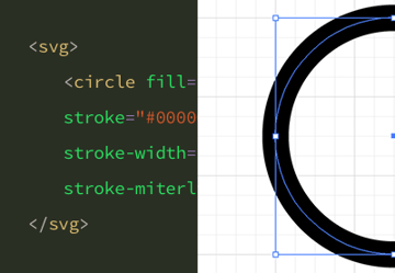
Stroke and stroke-width
In addition to the fill property, the stroke and stroke-width.
The stroke property determines the color of the circle’s outline, while the stroke- width controls its thickness.
For example, the following SVG will create a transparent circle with a pink outline. Setting fill="none" makes the circle transparent and stroke-width="10" makes the outline thick.
1 |
|
2 |
|
3 |
cx="50" |
4 |
cy="50" |
5 |
r="40" |
6 |
fill="none" |
7 |
stroke="pink" |
8 |
stroke-width="10" |
9 |
/>
|
10 |
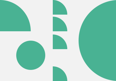
Stroke-dasharray and stroke-dashoffset
The stroke-dasharray and stroke-dashoffset are the two key properties that allow us to create effects like dashed lines, animated outlines, and loading spinners.
- The
stroke-dasharrayproperty defines the pattern of dashes and gaps applied to the circle’s outline. It’s defined by space-separated values. - The
stroke-dashoffsetproperty controls where the dash starts along the stroke. It does this by shifting it along the stroke’s path.
Let’s look at an example:
1 |
|
2 |
|
3 |
fill="none" |
4 |
stroke="#ff69b4" |
5 |
stroke-width="5" |
6 |
stroke-dasharray="150 100" |
7 |
stroke-dashoffset="0" /> |
8 |
In the SVG above:
stroke-dasharray = "150 100"will create a stroke pattern where the stroke is visible for 150 units followed by a gap of 100 units.stroke-dashoffset ="30"will shift the entire pattern forward by 30 units along the stroke’s path.
The resulting shape will be an arc:
Animating SVGs
Now that we know how to create static SVGs, let’s bring them to life with animations. We will use CSS properties like transform, transition, and keyframes for smooth and engaging effects.
Circle ripple effect
A circle ripple effect spinner is a visually appealing loading indicator often used to indicate loading or processing. This effect consists of circles that gradually fade out resembling water ripples.
Let’s start by defining the SVG structure which will look like this:
1 |
|
2 |
|
3 |
|
4 |
|
5 |
All the circles have the same attributes (transparency, thin stroke, and uniform color).
To create the ripple-like effect, apply the transform: scale() property to expand each circle. The expansion will happen while gradually fading it out, creating a smooth ripple animation
1 |
@keyframes ripple { |
2 |
0% { |
3 |
transform: scale(0); |
4 |
opacity: 1; |
5 |
}
|
6 |
100% { |
7 |
transform: scale(1); |
8 |
opacity: 0; |
9 |
}
|
10 |
}
|
To ensure the ripple effect appears smooth, apply an animation delay to the second and third circles. This will give each circle its own timing and duration. The first circle starts immediately, followed by the second after 0.5 seconds, and the third after 1 second.
1 |
.ripple circle:nth-child(2) { |
2 |
animation-delay: 0.5s; |
3 |
}
|
4 |
.ripple circle:nth-child(3) { |
5 |
animation-delay: 1s; |
6 |
}
|
Here is the final output. Feel free to fork the pen and play with the timings yourself:
Bouncing Bars
Bouncing bars are a simple and effective way to indicate loading states. This SVG consists of multiple vertical bars that expand and shrink in a staggered manner, creating a smooth bouncing effect.
To create the SVG structure, add 3 rect elements of the same dimensions spaced at 20 units apart on the x-axis.
1 |
|
2 |
|
3 |
|
4 |
|
5 |
The goal of the animation is to create a wave-like effect where the bar oscillates up and down smoothly. We will achieve this by animating the height and the y position of the bars using CSS keyframes.
1 |
@keyframes bars { |
2 |
0% { |
3 |
height: 40px; |
4 |
y: 10px; |
5 |
}
|
6 |
100% { |
7 |
height: 10px; |
8 |
y: 40px; |
9 |
}
|
10 |
}
|
To create a natural wave-like effect, add animation delays (0s, 0.3s, 0.45s) to ensure the bars move at different intervals, creating a smooth animation motion.
1 |
.bar1 {
|
2 |
animation: bars 0.3s 0s linear infinite alternate; |
3 |
} |
4 |
.bar2 {
|
5 |
animation: bars 0.3s 0.3s linear infinite alternate; |
6 |
} |
7 |
.bar3 {
|
8 |
animation: bars 0.3s 0.45s linear infinite alternate; |
9 |
} |
Here is the final output.
Spinning Dots
Our next exercise, the spinning dots animation, is an engaging way to indicate a loading process. It consists of multiple small dots evenly distributed in a circular pattern. The animation works by continuously rotating each dot while fading it in and out creating a smooth effect.
Let’s start by creating the SVG structure consisting of 8 circles arranged along a circular path.
1 |
|
2 |
|
3 |
|
4 |
|
5 |
|
6 |
|
7 |
|
8 |
|
9 |
|
10 |
The cx and cy attributes will define the position of each dot. As you can see, all the dots have the same color and radius.
The animation will have the following attributes:
- rotation: The whole SVG will rotate at 360 degrees, creating a continuous spinning effect.
- opacity: Each dot will fade in and out creating a pulsating effect.
Let’s define the animation with CSS keyframes.
1 |
@keyframes spinAround { |
2 |
100% { |
3 |
transform: rotate(360deg); |
4 |
}
|
5 |
}
|
6 |
|
7 |
@keyframes opacity { |
8 |
0%, 100% { |
9 |
opacity: 0.2; |
10 |
}
|
11 |
50% { |
12 |
opacity: 1; |
13 |
}
|
14 |
}
|
Apply the rotation animation to the entire SVG making it rotate every 3 seconds for a smooth looping effect. The second animation will make the circles fade in and out continuously.
1 |
.spinning-dots { |
2 |
animation: spinAround 3s linear infinite; |
3 |
}
|
4 |
|
5 |
.spinning-dots circle { |
6 |
animation: opacity 1.2s ease-in-out infinite; |
7 |
}
|
Finally, to achieve the staggered pulsing effect, we will apply the opacity animation to each dot and add animation delays, making each dot fade in and out at different times.
1 |
.spinning-dots circle:nth-child(2) { animation-delay: 0.1s; } |
2 |
.spinning-dots circle:nth-child(3) { animation-delay: 0.2s; } |
3 |
.spinning-dots circle:nth-child(4) { animation-delay: 0.3s; } |
4 |
.spinning-dots circle:nth-child(5) { animation-delay: 0.4s; } |
5 |
.spinning-dots circle:nth-child(6) { animation-delay: 0.5s; } |
6 |
.spinning-dots circle:nth-child(7) { animation-delay: 0.6s; } |
7 |
.spinning-dots circle:nth-child(8) { animation-delay: 0.7s; } |
The final effect will look like this:
Circular Spinner
On to the next one! This circular spinner is an effective way to indicate a loading status or waiting period in web applications. The SVG structure will consist of a transparent circle with a visible stroke. Animating the stroke will create a smooth spinning effect.
The SVG structure will look like this:
1 |
|
2 |
|
3 |
stroke-width="8" stroke-linecap="round" /> |
4 |
Here we have a circle with a radius of 40. The attribute fill:"none" makes the circle transparent, ensuring the stroke with smooth edges is visible.
We will only animate the stroke-dashoffset property to make the stroke look like it is being drawn continuously.
1 |
@keyframes circleRotate { |
2 |
0% { |
3 |
stroke-dashoffset: 251; |
4 |
}
|
5 |
100% { |
6 |
stroke-dashoffset: 0; |
7 |
}
|
8 |
}
|
Finally, let’s apply the animation to the circle making it animate infinitely over 2 seconds for a smooth looping effect.
1 |
.circle-spinner circle { |
2 |
stroke-dasharray: 250; |
3 |
transform-origin: center; |
4 |
animation: circleRotate 2s linear infinite; |
5 |
}
|
Here is the final output.
Loading Dots Animation
A loading dots animation is often used in typing indicators or loading states, where the dots fade in and out sequentially creating a smooth animation.
The SVG structure will consist of 3 circle elements positioned along the same x position and 20 units apart.
1 |
|
2 |
|
3 |
|
4 |
|
5 |
Let’s start by adding the opacity animation using CSS keyframes.
1 |
@keyframes reveal { |
2 |
0%, 100% {opacity:0.2;} |
3 |
50% {opacity:1;} |
4 |
|
5 |
}
|
At 0% and 100%, the circles are faded out. At 50%, the circles are fully visible, creating a smooth, pulsing effect that gives the dots a fade in and out effect.
To achieve the wave-like effect, we will add the animation delays to each circle to ensure they pulse at different times.
1 |
.dot{ |
2 |
animation: reveal 1.4s infinite; |
3 |
animation-fill-mode: both; |
4 |
}
|
5 |
.dot:nth-child(2){ |
6 |
animation-delay: 0.2s; |
7 |
}
|
8 |
.dot:nth-child(3){ |
9 |
animation-delay: 0.4s; |
10 |
}
|
Here is the final effect.
Conclusion
In this tutorial, we have leraned how to create different variation of SVG from scratch and animated them to build functional and engaging visuals. With this foundation, you can use the power of SVGs to create endless shapes, patterns and animations to enhance your web applications. Enjoy!
Learn more about SVGs


