


![Apple Watch Series 10 Back On Sale for $299! [Lowest Price Ever]](https://www.iclarified.com/images/news/96657/96657/96657-640.jpg)
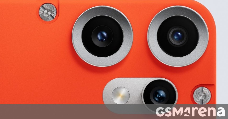
![Apple Slips to Fifth in China's Smartphone Market with 9% Decline [Report]](https://www.iclarified.com/images/news/97065/97065/97065-640.jpg)
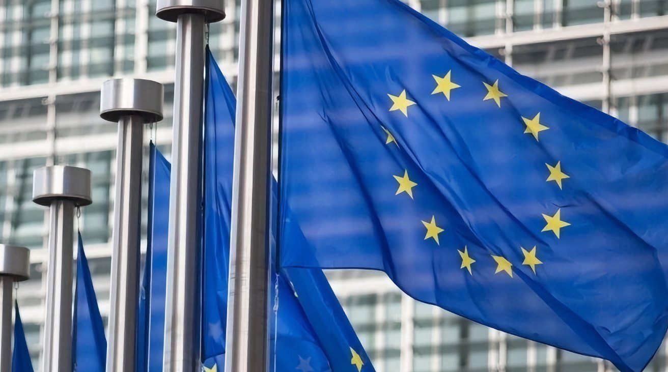
![EU Postpones Apple App Store Fines Amid Tariff Negotiations [Report]](https://www.iclarified.com/images/news/97068/97068/97068-640.jpg)


![What’s new in Android’s April 2025 Google System Updates [U: 4/18]](https://i0.wp.com/9to5google.com/wp-content/uploads/sites/4/2025/01/google-play-services-3.jpg?resize=1200%2C628&quality=82&strip=all&ssl=1)


_Andreas_Prott_Alamy.jpg?width=1280&auto=webp&quality=80&disable=upscale#)


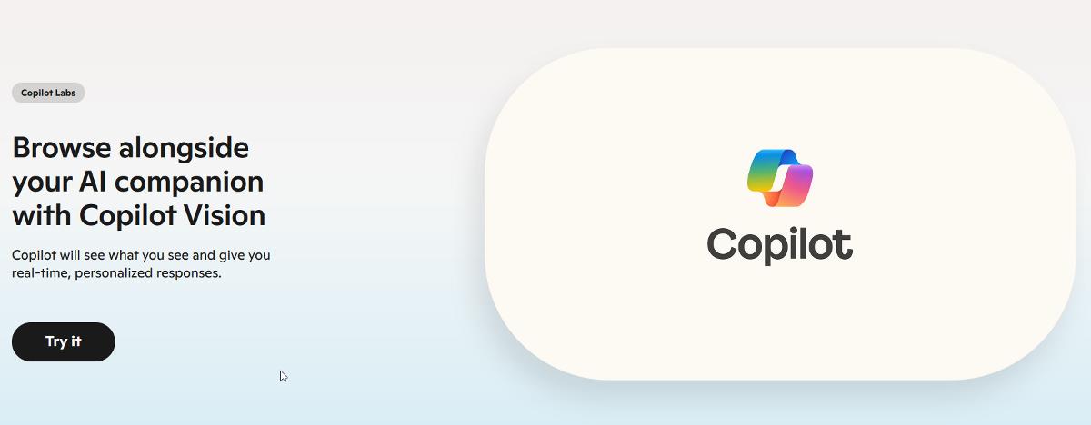
![[The AI Show Episode 144]: ChatGPT’s New Memory, Shopify CEO’s Leaked “AI First” Memo, Google Cloud Next Releases, o3 and o4-mini Coming Soon & Llama 4’s Rocky Launch](https://www.marketingaiinstitute.com/hubfs/ep%20144%20cover.png)


CSS Eggs : The New Batch
For the past few years I've made CSS Easter eggs. See my CSS Tips Series for links to earlier articles. A couple years ago, I joked that eggs were too expensive to be lost in the yard on a Easter Egg hunt. The prices have gotten even crazy lately. So it's back to digital eggs. Basic Egg The basic egg class is an oval shape. It will be modified, each egg will have it's own class with a different gradient. In this image the oval has a slightly larger border for better visibility. Subsequent borders are small and the color changed to blend into the background. .egg { height: 364px; width: 225px; aspect-ratio: 3 / 4; border-radius: 100% / 125% 125% 80% 80%; background: white; border: 4px var(--Pink) solid; } Make it look real Next a egg_white class with a linear-gradient is added to give the egg a more realistic look. The classes were named egg_color rather than color_egg to make the file easier to find. The gradient is made of several white and off white hues. The filter: drop-shadow places a shadow behind the oval. This helps separate it from the background. While the box-shadow: inset puts the shadow inside the oval. Together they give the egg depth. .egg_white { background: linear-gradient(to bottom, blanchedalmond, antiquewhite, beige, ghostwhite); border-color: #6b6b6b; filter: drop-shadow(0 0 0.75rem #6b6b6b); box-shadow: inset -25px -25px 40px rgba(0,0,0,.5); } Brown Egg A series of tan and brown colors paint the egg tan. The rest of the eggs just vary in color and size. I chose from the predefined colors names. There is a color sorted list of Color codes here. .egg_brown { background: linear-gradient(to bottom, blanchedalmond, wheat, burlywood, #c19a6b ); filter: drop-shadow(0 0 0.75rem black); box-shadow: inset -25px -25px 40px rgba(0,0,0,.5); } Blue Egg The blue egg is made of various blue hues. It's slightly larger than the brown egg. .egg_blue { height: 379px; width: 244px; background: linear-gradient(to bottom, lightcyan, var(--Bubbles), var(--ItalianSkyBlue), powderblue); filter: drop-shadow(0 0 0.75rem black); box-shadow: inset -25px -25px 40px rgba(0,0,0,.5); } Red Egg The last egg is the red egg. It was colored with shades of Salmon. Originally the eggs were all the same size. The brown egg is the template size. The white egg was made smaller and blue and red eggs made larger. .egg_salmon { height: 415px; width: 275px; aspect-ratio: 3 / 4; background: linear-gradient(to bottom, var(--LightSalmonPink), var(--LightSalmon), var(--DarkSalmon), var(--Salmon)); filter: drop-shadow(0 0 0.75rem black); box-shadow: inset -25px -25px 40px rgba(0,0,0,.5); } Git your Eggs in a row. Here's all the eggs together. Updating Old Eggs For comparison here's what my first batch of eggs looked like. The focus of that blog, CSS Egg Hunt was the various gradients that were demoed. Here are the same eggs with the addition of filter: drop-shadow and box-shadow: inset. /* 1st egg image in top image */ .egg_purple { background: linear-gradient( var(--Purple) 30%, var(--Blue) ); /* added to second image */ filter: drop-shadow(0 0 0.75rem black); box-shadow: inset -25px -25px 40px rgba(0,0,0,.5); } Wrap up It was fun to try to draw more realistic looking eggs. Hat Tip to Alvaro Montoro for his article on making eggs more egg shaped. It help get the width and height balanced. Drawing an Egg with CSS Alvaro Montoro ・ Apr 8 '23 #css #webdev #showdev -$JarvisScript git commit -m "Eggs Up"
For the past few years I've made CSS Easter eggs. See my CSS Tips Series for links to earlier articles. A couple years ago, I joked that eggs were too expensive to be lost in the yard on a Easter Egg hunt. The prices have gotten even crazy lately. So it's back to digital eggs.
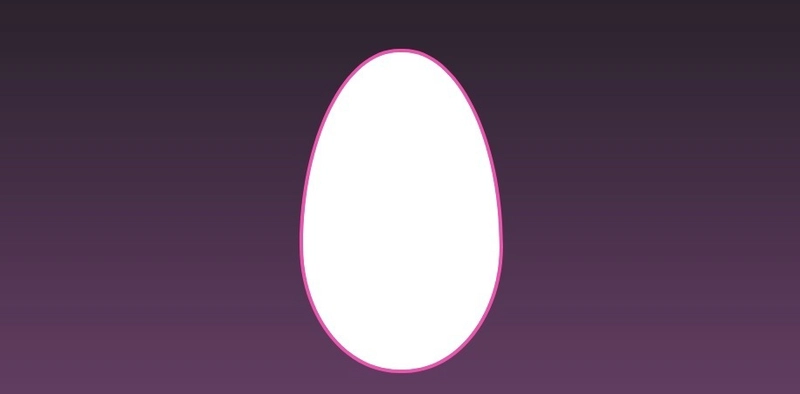
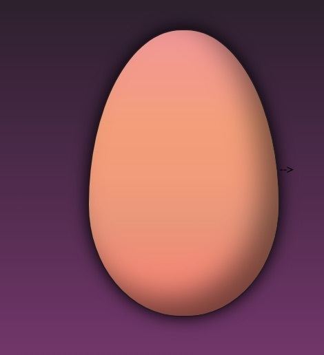
Basic Egg
The basic egg class is an oval shape. It will be modified, each egg will have it's own class with a different gradient. In this image the oval has a slightly larger border for better visibility. Subsequent borders are small and the color changed to blend into the background.
class="egg"> .egg {
height: 364px;
width: 225px;
aspect-ratio: 3 / 4;
border-radius: 100% / 125% 125% 80% 80%;
background: white;
border: 4px var(--Pink) solid;
}
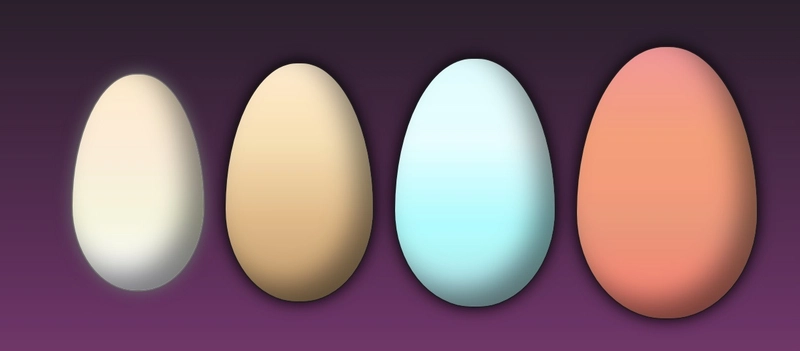
Make it look real
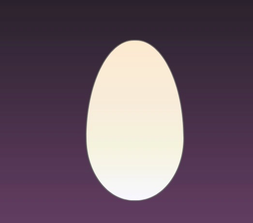
Next a egg_white class with a linear-gradient is added to give the egg a more realistic look. The classes were named egg_color rather than color_egg to make the file easier to find.
The gradient is made of several white and off white hues.
The filter: drop-shadow places a shadow behind the oval. This helps separate it from the background. While the box-shadow: inset puts the shadow inside the oval. Together they give the egg depth.
class="egg egg_white">
.egg_white {
    background:
    linear-gradient(to bottom,
        blanchedalmond, antiquewhite, beige, ghostwhite);
    border-color: #6b6b6b;
      filter: drop-shadow(0 0 0.75rem #6b6b6b);
        box-shadow: inset -25px -25px 40px rgba(0,0,0,.5);
}
Brown Egg
A series of tan and brown colors paint the egg tan. The rest of the eggs just vary in color and size. I chose from the predefined colors names. There is a color sorted list of Color codes here.
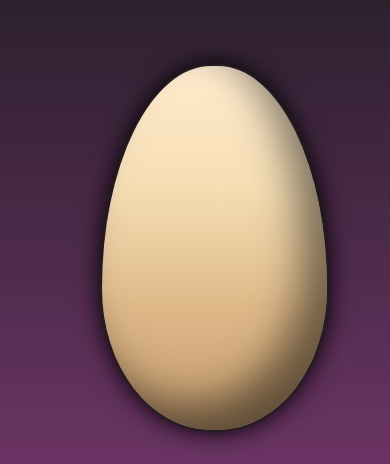
.egg_brown {
    background:
    linear-gradient(to bottom,
        blanchedalmond, wheat, burlywood, #c19a6b );
      filter: drop-shadow(0 0 0.75rem black);
    box-shadow: inset -25px -25px 40px rgba(0,0,0,.5);
}
Blue Egg
The blue egg is made of various blue hues. It's slightly larger than the brown egg.
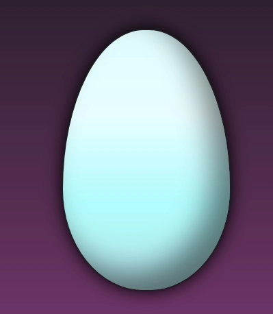
.egg_blue {
    height: 379px;
    width: 244px;
    background:
    linear-gradient(to bottom,
        lightcyan, var(--Bubbles), var(--ItalianSkyBlue), powderblue);
      filter: drop-shadow(0 0 0.75rem black);
    box-shadow: inset -25px -25px 40px rgba(0,0,0,.5);
}
Red Egg
The last egg is the red egg. It was colored with shades of Salmon.
Originally the eggs were all the same size. The brown egg is the template size. The white egg was made smaller and blue and red eggs made larger.
.egg_salmon {
    height: 415px;
    width: 275px;
    aspect-ratio: 3 / 4;
        background:
    linear-gradient(to bottom,
        var(--LightSalmonPink), var(--LightSalmon), var(--DarkSalmon), var(--Salmon));
    filter: drop-shadow(0 0 0.75rem black);
    box-shadow: inset -25px -25px 40px rgba(0,0,0,.5);
}
Git your Eggs in a row.
Here's all the eggs together.
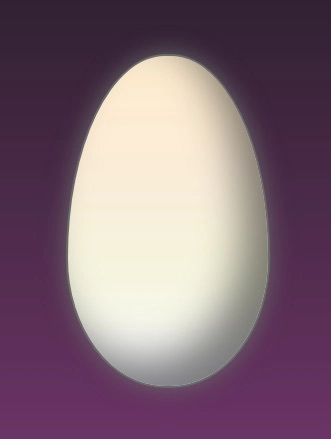
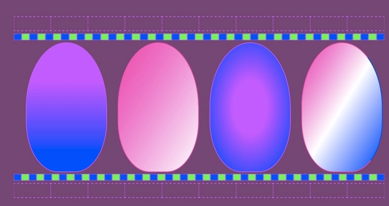
Updating Old Eggs
For comparison here's what my first batch of eggs looked like. The focus of that blog, CSS Egg Hunt was the various gradients that were demoed.
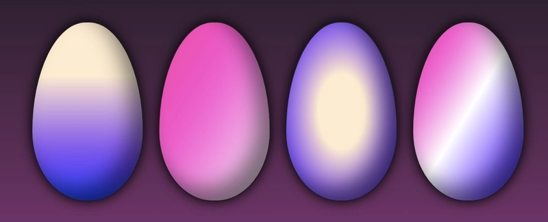
Here are the same eggs with the addition of filter: drop-shadow and box-shadow: inset.
/* 1st egg image in top image */
.egg_purple {
    background:
linear-gradient(
      var(--Purple) 30%,
      var(--Blue)
    );
/* added to second image */
  filter: drop-shadow(0 0 0.75rem black);
  box-shadow: inset -25px -25px 40px rgba(0,0,0,.5);

}
Wrap up
It was fun to try to draw more realistic looking eggs.
Hat Tip to Alvaro Montoro for his article on making eggs more egg shaped. It help get the width and height balanced.

-$JarvisScript git commit -m "Eggs Up"