


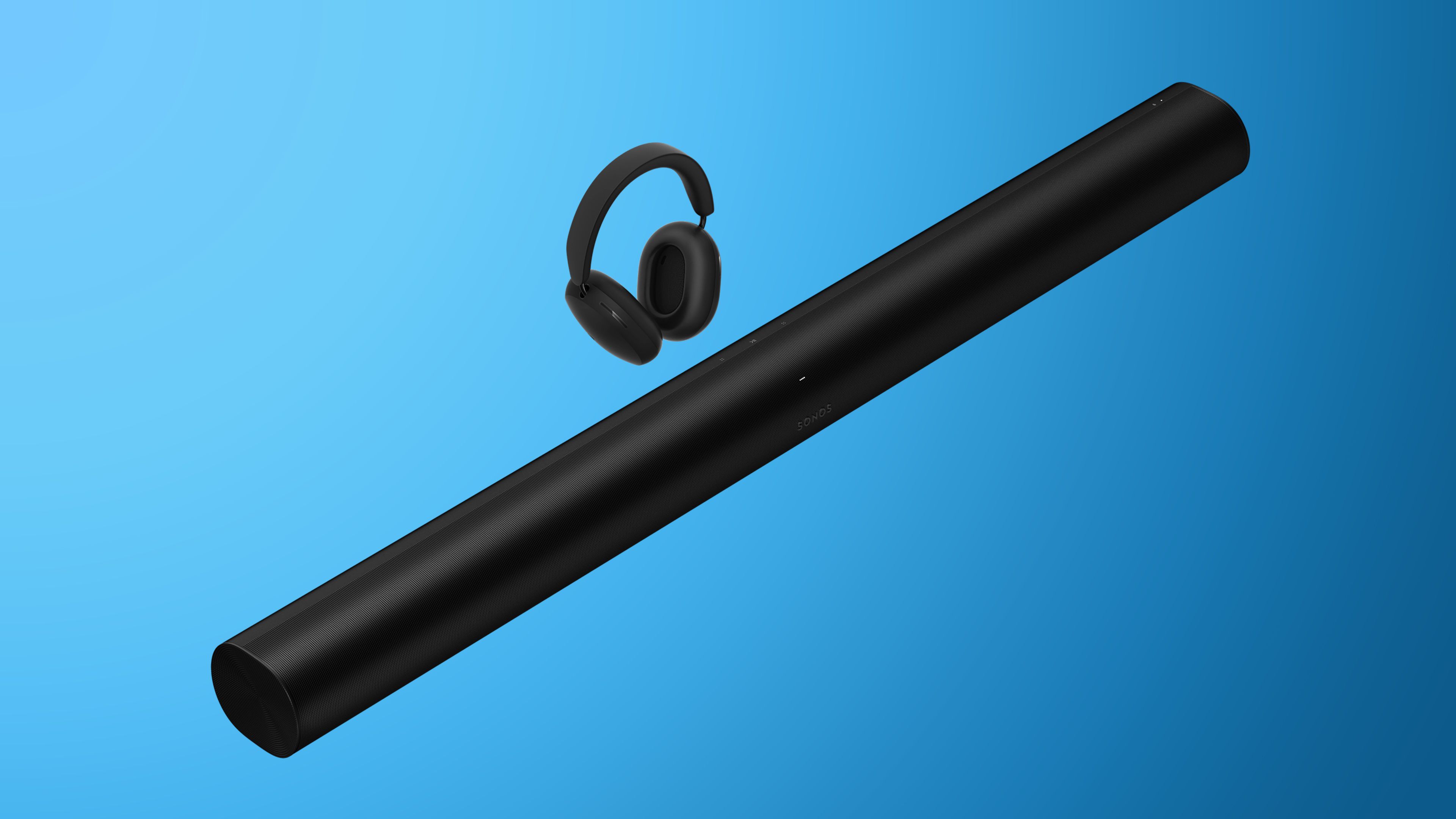
![Sonos Father's Day Sale: Save Up to 26% on Arc Ultra, Ace, Move 2, and More [Deal]](https://www.iclarified.com/images/news/97469/97469/97469-640.jpg)


.webp?#)


_Delphotos_Alamy.jpg?width=1280&auto=webp&quality=80&disable=upscale#)


![[The AI Show Episode 150]: AI Answers: AI Roadmaps, Which Tools to Use, Making the Case for AI, Training, and Building GPTs](https://www.marketingaiinstitute.com/hubfs/ep%20150%20cover.png)
![[The AI Show Episode 149]: Google I/O, Claude 4, White Collar Jobs Automated in 5 Years, Jony Ive Joins OpenAI, and AI’s Impact on the Environment](https://www.marketingaiinstitute.com/hubfs/ep%20149%20cover.png)


![[FREE EBOOKS] Solutions Architect’s Handbook, The Embedded Linux Security Handbook & Four More Best Selling Titles](https://www.javacodegeeks.com/wp-content/uploads/2012/12/jcg-logo.jpg)


![How to Survive in Tech When Everything's Changing w/ 21-year Veteran Dev Joe Attardi [Podcast #174]](https://cdn.hashnode.com/res/hashnode/image/upload/v1748483423794/0848ad8d-1381-474f-94ea-a196ad4723a4.png?#)


How to create a glassmorphism generator tool
Glassmorphism is a pretty resilient design style (it’s been around a long while now!) achieved by a combination of background blur transparency, a semi-transparent border, and sometimes subtle border shadows. Our glassmorphism generator Here’s what we’re going to build. How glassmorphism is created with CSS With CSS we can apply a background blur and a transparent background to an element and then place it over a background (typically an image, a gradient, or another layered element) to create the illusion of frosted glass. As you can see from the demo, we are using an image as our background, and the card element on top features a transparent background, a blur effect, a border, and a subtle box shadow. All these properties, when combined, create the frosted glass effect. Let's get started! Build a Glassmorphism generator HTML Structure The HTML structure will be minimal, with the following elements: A preview section to display the glass morphism effect in real-time. A settings section for customizing the color, blur, and opacity values. A element to display the CSS for the current glass effect. A button for copying the generated CSS. Here is all the HTML needed: 1 2 Glassmorphism Generator 3 4 5 6 7 Glassmorphism Effect 8 9 This is how your glassmorphism element will look with the current settings. 10 11 12 13 14 15 16 17 Color: 18 24 25 26 27 Opacity: 28 37 38 39 40 Blur: 41 50 51 52 53 54 55 56 57 Copy CSS 58 The values you use on the form elements here will be applied to the glassmorphism card when it first loads Styling with CSS Let's start by using flex to align everything at the center. Here are the styles for the body and the main container. 1 body { 2 display: flex; 3 flex-direction: column; 4 align-items: center; 5 min-height: 100vh; 6 padding: 20px; 7 font-family: "DM Mono", monospace; 8 } 9 main { 10 max-width: 600px; 11 display: flex; 12 gap: 20px; 13 flex-direction: column; 14 align-items: center; 15 } The preview section has a background image and a card on top showing the frosted glass effect. Add these styles to the preview container. 1 .preview-container { 2 color: #ffffff; 3 height: 320px; 4 border-radius: 0.5rem; 5 padding: 16px; 6 background-image: url("image url here"); 7 background-size: cover; 8 background-position: center; 9 } The Default Glassmorphism effect The first time you open the tool, we want a default frosted effect already applied to the glass card. As we mentioned, earlier, the frosted glass effect is achieved by a combination of 4 key CSS properties. Transparent background - makes the card partially see-through. Backdrop blur -This applies a blur to the background element. In our case, the background image will be blurred. Transparent Border - Adds a subtle semi-transparent outline defining the card's edges. Box shadow - Adds depth by using a soft shadow, making the card appear as though it's floating over the background image. In CSS, if you need to apply transparency to an element, you can use the rgba() or the hsla() color functions. These functions allow you to define a color with an alpha (transparency) value, where: 0 means fully transparent 1 means fully opaque. The lower the alpha value, the more transparent the effect, which is important for creating a glass effect. Add the following properties to the glass card. 1 .glass-card { 2 width: 75%; 3 height: 160px; 4 margin: 4rem auto 0; 5 padding: 24px; 6 background: rgba(254,245,238,0.2); 7 backdrop-filter: blur(5px); 8 -webkit-backdrop-filter: blur(5px); 9 border-radius: 10px; 10 border: 1px solid rgba(255, 255, 255, 0.2); 11 box-shadow: 0 4px 30px rgba(0, 0, 0, 0.1); 12 } 13 Here, we are applying a transparent background, a blur, a border, and a box shadow using the RGBA color function. The backdrop blur is the secret weapon behind the frosted effect. It blurs everything behind the card, creating the signature glass effect. Without this value, the background would be plain transparent. The thin semitransparent white border gives the card a shiny edge, while the box shadow will make it appear like it's floating above the background. The default effect will now look like this: Styling the other elements Let’s style the rest of the elements: 1 .settings-container { 2 width: 100%; 3 } 4 input[type="color"] { 5 width: 100%; 6 border: none; 7 padding: 4px; 8 border-radius: 4px; 9 cursor: pointer; 10 } 11 12 .slider { 13

Glassmorphism is a pretty resilient design style (it’s been around a long while now!) achieved by a combination of background blur transparency, a semi-transparent border, and sometimes subtle border shadows.
Our glassmorphism generator
Here’s what we’re going to build.
How glassmorphism is created with CSS
With CSS we can apply a background blur and a transparent background to an element and then place it over a background (typically an image, a gradient, or another layered element) to create the illusion of frosted glass.
As you can see from the demo, we are using an image as our background, and the card element on top features a transparent background, a blur effect, a border, and a subtle box shadow. All these properties, when combined, create the frosted glass effect.
Let's get started!
Build a Glassmorphism generator
HTML Structure
The HTML structure will be minimal, with the following elements:
- A preview section to display the glass morphism effect in real-time.
- A settings section for customizing the color, blur, and opacity values.
- A
- A button for copying the generated CSS.
Here is all the HTML needed:
1 |
|
2 |
Glassmorphism Generator
|
3 |
|
4 |
|
5 |
|
6 |
|
7 |
Glassmorphism Effect
|
8 |
|
9 |
This is how your glassmorphism element will look with the current settings. |
10 |
|
11 |
|
12 |
|
13 |
|
14 |
|
15 |
|
16 |
|
17 |
|
18 |
|
19 |
type="color" |
20 |
id="colorPicker" |
21 |
class="color-picker" |
22 |
value="#3abb16" |
23 |
/>
|
24 |
|
25 |
|
26 |
|
27 |
|
28 |
|
29 |
type="range" |
30 |
id="opacity" |
31 |
class="slider" |
32 |
min="0" |
33 |
max="1" |
34 |
step="0.01" |
35 |
value="0.25" |
36 |
/>
|
37 |
|
38 |
|
39 |
|
40 |
|
41 |
|
42 |
type="range" |
43 |
id="blur" |
44 |
class="slider" |
45 |
min="0" |
46 |
max="20" |
47 |
step="0.5" |
48 |
value="10" |
49 |
/>
|
50 |
|
51 |
|
52 |
|
53 |
|
54 |
|
55 |
|
56 |
|
57 |
|
58 |
Styling with CSS
Let's start by using flex to align everything at the center. Here are the styles for the body and the main container.
1 |
body { |
2 |
display: flex; |
3 |
flex-direction: column; |
4 |
align-items: center; |
5 |
min-height: 100vh; |
6 |
padding: 20px; |
7 |
font-family: "DM Mono", monospace; |
8 |
}
|
9 |
main { |
10 |
max-width: 600px; |
11 |
display: flex; |
12 |
gap: 20px; |
13 |
flex-direction: column; |
14 |
align-items: center; |
15 |
}
|
The preview section has a background image and a card on top showing the frosted glass effect. Add these styles to the preview container.
1 |
.preview-container { |
2 |
color: #ffffff; |
3 |
height: 320px; |
4 |
border-radius: 0.5rem; |
5 |
padding: 16px; |
6 |
background-image: url("image url here"); |
7 |
background-size: cover; |
8 |
background-position: center; |
9 |
}
|
The Default Glassmorphism effect
The first time you open the tool, we want a default frosted effect already applied to the glass card. As we mentioned, earlier, the frosted glass effect is achieved by a combination of 4 key CSS properties.
- Transparent background - makes the card partially see-through.
- Backdrop blur -This applies a blur to the background element. In our case, the background image will be blurred.
- Transparent Border - Adds a subtle semi-transparent outline defining the card's edges.
- Box shadow - Adds depth by using a soft shadow, making the card appear as though it's floating over the background image.
In CSS, if you need to apply transparency to an element, you can use the rgba() or the hsla() color functions. These functions allow you to define a color with an alpha (transparency) value, where:
- 0 means fully transparent
- 1 means fully opaque.
The lower the alpha value, the more transparent the effect, which is important for creating a glass effect.
Add the following properties to the glass card.
1 |
.glass-card { |
2 |
width: 75%; |
3 |
height: 160px; |
4 |
margin: 4rem auto 0; |
5 |
padding: 24px; |
6 |
background: rgba(254,245,238,0.2); |
7 |
backdrop-filter: blur(5px); |
8 |
-webkit-backdrop-filter: blur(5px); |
9 |
border-radius: 10px; |
10 |
border: 1px solid rgba(255, 255, 255, 0.2); |
11 |
box-shadow: 0 4px 30px rgba(0, 0, 0, 0.1); |
12 |
}
|
13 |
Here, we are applying a transparent background, a blur, a border, and a box shadow using the RGBA color function. The backdrop blur is the secret weapon behind the frosted effect. It blurs everything behind the card, creating the signature glass effect. Without this value, the background would be plain transparent.
The thin semitransparent white border gives the card a shiny edge, while the box shadow will make it appear like it's floating above the background. The default effect will now look like this:


Styling the other elements
Let’s style the rest of the elements:
1 |
.settings-container { |
2 |
width: 100%; |
3 |
}
|
4 |
input[type="color"] { |
5 |
width: 100%; |
6 |
border: none; |
7 |
padding: 4px; |
8 |
border-radius: 4px; |
9 |
cursor: pointer; |
10 |
}
|
11 |
|
12 |
.slider { |
13 |
width: 100%; |
14 |
height: 4px; |
15 |
background: #e0e0e0; |
16 |
border-radius: 2px; |
17 |
appearance: none; |
18 |
}
|
19 |
.settings { |
20 |
margin-bottom: 12px; |
21 |
}
|
22 |
.slider::-webkit-slider-thumb { |
23 |
appearance: none; |
24 |
width: 16px; |
25 |
height: 16px; |
26 |
background: #147ccb; |
27 |
border-radius: 50%; |
28 |
cursor: pointer; |
29 |
}
|
30 |
.slider::-moz-range-thumb { |
31 |
width: 16px; |
32 |
height: 16px; |
33 |
background: #147ccb; |
34 |
border-radius: 50%; |
35 |
cursor: pointer; |
36 |
border: none; |
37 |
}
|
38 |
.code-card { |
39 |
width: 95%; |
40 |
background-color: #e0e0e0; |
41 |
color: #021120; |
42 |
padding: 16px; |
43 |
border-radius: 8px; |
44 |
overflow-x: auto; |
45 |
}
|
46 |
|
47 |
pre { |
48 |
font-size: 0.875rem; |
49 |
white-space: pre-wrap; |
50 |
}
|
51 |
.copy-css { |
52 |
margin-top: 24px; |
53 |
cursor: pointer; |
54 |
text-transform: uppercase; |
55 |
|
56 |
color: #fff; |
57 |
font-size: 0.875rem; |
58 |
width: 100%; |
59 |
height: 45px; |
60 |
background-color: #167cbb; |
61 |
border-radius: 8px; |
62 |
font-weight: 600; |
63 |
border: none; |
64 |
}
|
Glassmorphism generation
In this part of the tutorial, we want to have a customization option where you can choose your own color, transparency, and blur values to create a unique glass effect.
Let's start by getting all the elements
1 |
const colorElement = document.getElementById("colorPicker"); |
2 |
const opacityElement = document.getElementById("opacity"); |
3 |
const blurElement = document.getElementById("blur"); |
4 |
const cssOutput = document.getElementById("output"); |
5 |
const copyCssButton = document.getElementById("copyCssButton"); |
6 |
const glassCard = document.querySelector(".glass-card"); |
When you select a color from the color picker element, its usually in the hex format, so we need to convert the selected color to the RGBA color format. To do that, let's create a function called hextoRGB, which will take in the hex color and opacity values chosen by the user and returns the corresponding RGBA format.
1 |
function hexToRGB(hex, opacity) { |
2 |
const r = parseInt(hex.slice(1, 3), 16); |
3 |
const g = parseInt(hex.slice(3, 5), 16); |
4 |
const b = parseInt(hex.slice(5, 7), 16); |
5 |
return `rgba(${r},${g},${b},${opacity})`; |
6 |
}
|
For example, if the selected color is #3498db, the corresponding color in RGBA format will be: rgba(52,152,219,0.6).
The next step is to update the glass card to reflect the selected color, blur, and opacity values. Create a function called updatePreview() that gets the selected values and applies them as styles to the glass card.
1 |
function updatePreview() { |
2 |
const color = colorElement.value; |
3 |
const transparency = opacityElement.value; |
4 |
const blur = blurElement.value; |
5 |
|
6 |
const backgroundColor = hexToRGB(color, transparency); |
7 |
glassCard.style.backgroundColor = backgroundColor; |
8 |
glassCard.style.backdropFilter = `blur(${blur}px)`; |
9 |
}
|
In the code, the preview section will dynamically update the appearance based on the values from the inputs.
-
glassCard.style.backgroundColor = backgroundColor:updates the background color using an RGBA value. glassCard.style.backdropFilter = `blur(${blur}px)`;: applies a blur effect to the background behind the card, creating the frosted glass look.
We also need to add event listeners to the inputs, to ensure any change in the values updates the preview.
1 |
colorElement.addEventListener("input", updatePreview); |
2 |
opacityElement.addEventListener("input", updatePreview); |
3 |
blurElement.addEventListener("input", updatePreview); |
Generate and copy CSS values
So far, we are able to create customized frosted glass effects, the next step is to generate the CSS used to achieve the glass effect and allow for easy copying as shown in the image below.


In the updatePreview () function, create a CSS string using the currently selected color, blur, and opacity values and add the string as the text content of the CSS output element. Every time you change a value, the CSS will also change and update the preview.
1 |
function updatePreview() { |
2 |
const color = colorElement.value; |
3 |
const transparency = opacityElement.value; |
4 |
const blur = blurElement.value; |
5 |
|
6 |
const backgroundColor = hexToRGB(color, transparency); |
7 |
glassCard.style.backgroundColor = backgroundColor; |
8 |
glassCard.style.backdropFilter = `blur(${blur}px)`; |
9 |
|
10 |
const css = `.card { |
11 |
background: ${backgroundColor}; |
12 |
backdrop-filter: blur(${blur}px); |
13 |
-webkit-backdrop-filter: blur(${blur}px); |
14 |
border-radius: 10px;
|
15 |
border: 1px solid rgba(255, 255, 255, ${transparency}); |
16 |
box-shadow: 0 4px 30px rgba(0, 0, 0, 0.1);
|
17 |
}`; |
18 |
|
19 |
output.textContent = css; |
20 |
}
|
The last feature is to copy the CSS values, making it easy to copy the generated CSS values with just one click. Add an event listener to the copy CSS button.
1 |
copyCssButton.addEventListener("click", function () { |
2 |
navigator.clipboard |
3 |
.writeText(cssOutput.textContent) |
4 |
.then(() => { |
5 |
alert("Css copied"); |
6 |
})
|
7 |
.catch((error) => { |
8 |
alert("error copying CSS"); |
9 |
});
|
10 |
});
|
Here we are using the navigator.clipboard API, a built-in browser tool that allows us to copy things to the clipboard. The writeText() method is used to copy the contents of the CSS output element directly to the clipboard.
Our final glassmorphism tool
Let’s remind ourselves of what we’ve built!


Conclusion
That's a wrap for this tutorial. Adding a frosted glass effect to your designs can enhance the overall aesthetic and give your UI a modern touch. To improve on this tool you can add support for different backgrounds such as shapes and gradients.


