_NicoElNino_Alamy.png?#)


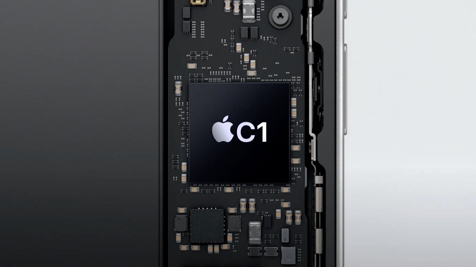
![Apple C1 vs Qualcomm Modem Performance [Speedtest]](https://www.iclarified.com/images/news/96767/96767/96767-640.jpg)
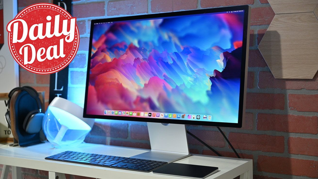
![Apple Studio Display On Sale for $1249 [Lowest Price Ever]](https://www.iclarified.com/images/news/96770/96770/96770-640.jpg)
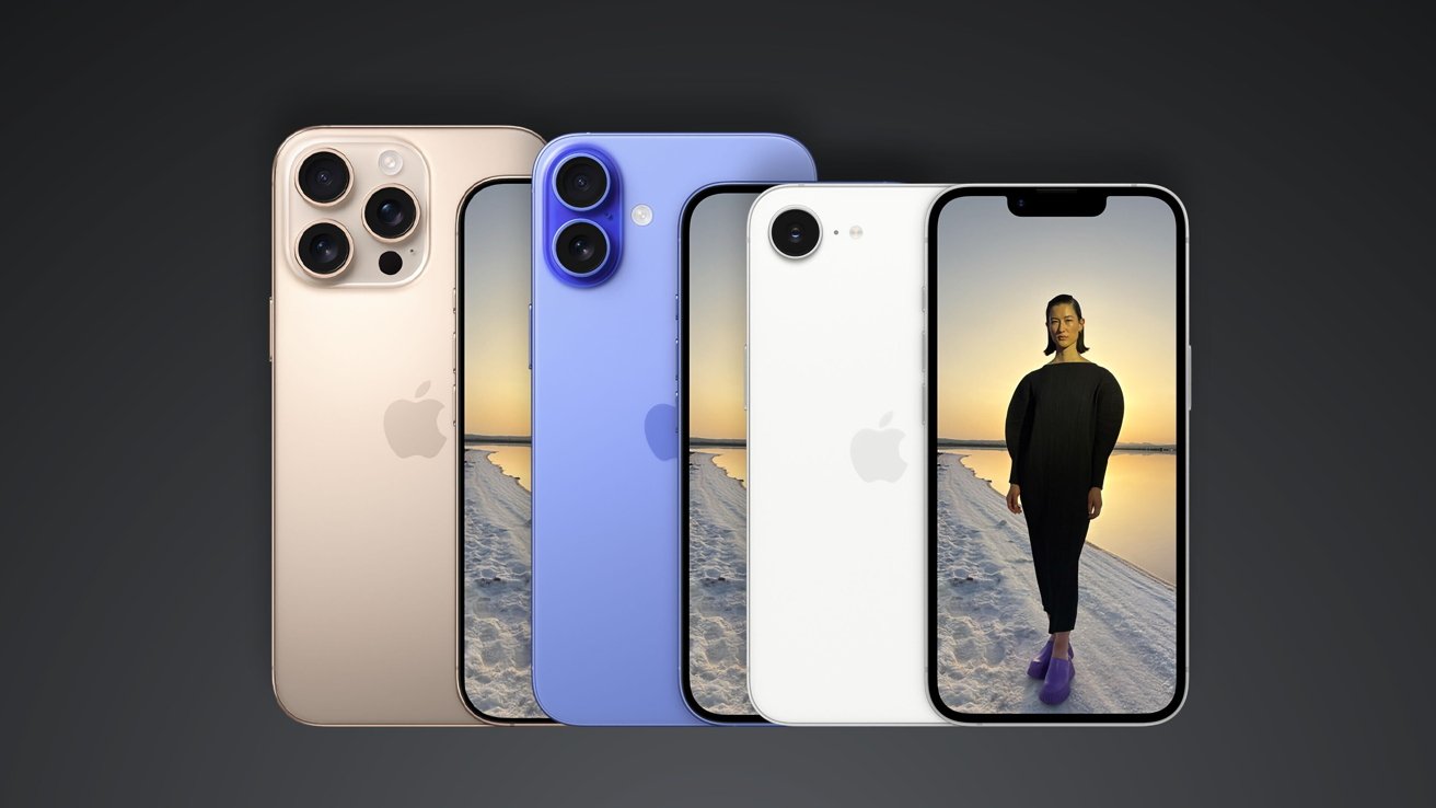
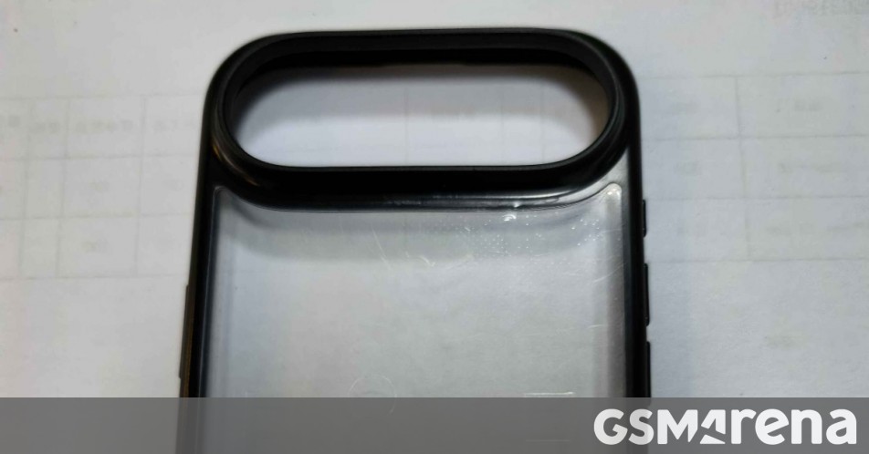
![Alleged Case for Rumored iPhone 17 Air Surfaces Online [Image]](https://www.iclarified.com/images/news/96763/96763/96763-640.jpg)


![Galaxy Tab S10 FE leak reveals Samsung’s 10.9-inch and 13.1-inch tablets in full [Gallery]](https://i0.wp.com/9to5google.com/wp-content/uploads/sites/4/2025/03/galaxy-tab-s10-fe-wf-10.jpg?resize=1200%2C628&quality=82&strip=all&ssl=1)


_Kjetil_Kolbjørnsrud_Alamy.jpg?#)


![[The AI Show Episode 139]: The Government Knows AGI Is Coming, Superintelligence Strategy, OpenAI’s $20,000 Per Month Agents & Top 100 Gen AI Apps](https://www.marketingaiinstitute.com/hubfs/ep%20139%20cover-2.png)


![[The AI Show Episode 138]: Introducing GPT-4.5, Claude 3.7 Sonnet, Alexa+, Deep Research Now in ChatGPT Plus & How AI Is Disrupting Writing](https://www.marketingaiinstitute.com/hubfs/ep%20138%20cover.png)


-I-Interviewed-Niantic-about-Selling-Pokémon-GO-to-Scopely-00-14-13.png?width=1920&height=1920&fit=bounds&quality=80&format=jpg&auto=webp#)


.jpg?#)


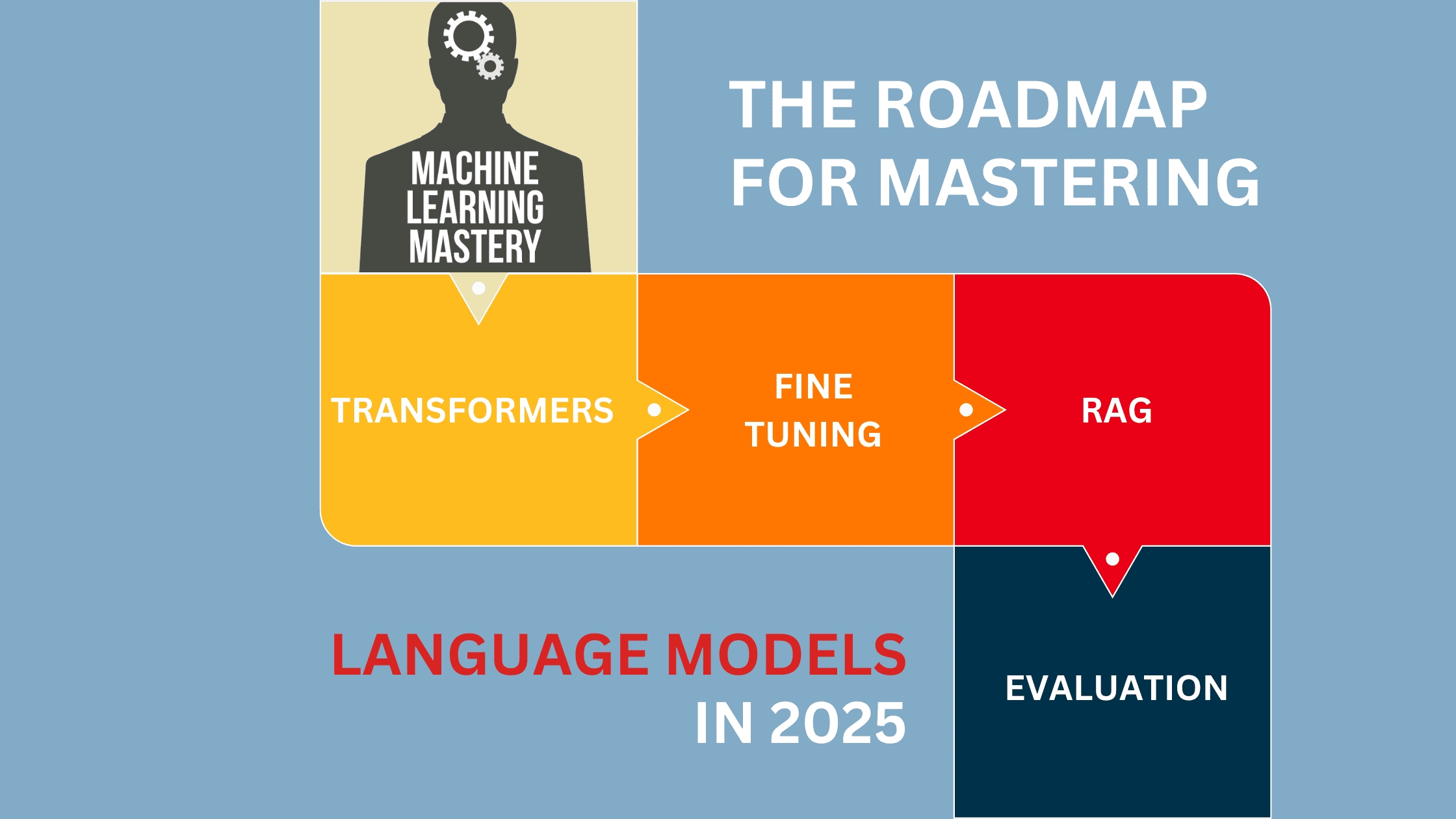
How to Dynamically Recognize Mobile Mode Using Pinia in Nuxt.js
In this blog, we’ll walk through how to manage the mobile mode state in a Nuxt 3 application using Pinia, Vue’s state management library. 1- Install Nuxt.js and Pinia First, if you haven't already, create a new Nuxt 3 project and install the necessary dependencies. npx nuxi init my-nuxt-app cd my-nuxt-app npm install npm install pinia 2- Create a Store to Manage the Mobile Mode State Next, define a store using Pinia to manage the state of the mobile mode. This store will track whether the app is in mobile mode (based on the window size). import { defineStore } from 'pinia'; export const useResponsiveStore = defineStore('responsive', { state: () => ({ mobileMode: false, }), actions: { setMobileMode(value) { this.mobileMode = value; }, }, }); 3- Set Up Pinia in Nuxt You need to create a plugin to integrate Pinia into your Nuxt 3 app. This plugin will ensure that the store is available globally. Create a new file under plugins/pinia.js: import { createPinia } from 'pinia'; export default defineNuxtPlugin((nuxtApp) => { const pinia = createPinia(); nuxtApp.vueApp.use(pinia); }); Then, make sure to register this plugin in your nuxt.config.js: export default { plugins: ['~/plugins/pinia.js'], }; 4- Update Mobile Mode Based on Window Size To handle window resizing, use a global layout or component that listens for window size changes and updates the mobile mode state accordingly. import { onMounted, onUnmounted } from 'vue'; import { useResponsiveStore } from '~/stores/useResponsiveStore'; const responsiveStore = useResponsiveStore(); const handleResize = () => { responsiveStore.setMobileMode(window.innerWidth < 768); }; onMounted(() => { handleResize(); window.addEventListener('resize', handleResize); }); onUnmounted(() => { window.removeEventListener('resize', handleResize); }); 5- Use the Mobile Mode State in a Component Now, let's create a simple component that conditionally renders content based on the mobile mode state. You are in mobile mode. You are in desktop mode. import { computed } from 'vue'; import { useResponsiveStore } from '~/stores/useResponsiveStore'; const responsiveStore = useResponsiveStore(); const mobileMode = computed(() => responsiveStore.mobileMode); With this setup, your Nuxt 3 app will dynamically adjust based on the user's screen size, and you can easily manage the mobile mode state using Pinia.

In this blog, we’ll walk through how to manage the mobile mode state in a Nuxt 3 application using Pinia, Vue’s state management library.
1- Install Nuxt.js and Pinia
First, if you haven't already, create a new Nuxt 3 project and install the necessary dependencies.
npx nuxi init my-nuxt-app
cd my-nuxt-app
npm install
npm install pinia
2- Create a Store to Manage the Mobile Mode State
Next, define a store using Pinia to manage the state of the mobile mode. This store will track whether the app is in mobile mode (based on the window size).
import { defineStore } from 'pinia';

export const useResponsiveStore = defineStore('responsive', {
  state: () => ({
    mobileMode: false,
  }),
  actions: {
    setMobileMode(value) {
      this.mobileMode = value;
    },
  },
});
3- Set Up Pinia in Nuxt
You need to create a plugin to integrate Pinia into your Nuxt 3 app. This plugin will ensure that the store is available globally.
Create a new file under plugins/pinia.js:
import { createPinia } from 'pinia';

export default defineNuxtPlugin((nuxtApp) => {
  const pinia = createPinia();
  nuxtApp.vueApp.use(pinia);
});
Then, make sure to register this plugin in your nuxt.config.js:
export default {
  plugins: ['~/plugins/pinia.js'],
};
4- Update Mobile Mode Based on Window Size
To handle window resizing, use a global layout or component that listens for window size changes and updates the mobile mode state accordingly.
5- Use the Mobile Mode State in a Component
Now, let's create a simple component that conditionally renders content based on the mobile mode state.
You are in mobile mode.
You are in desktop mode.
With this setup, your Nuxt 3 app will dynamically adjust based on the user's screen size, and you can easily manage the mobile mode state using Pinia.