


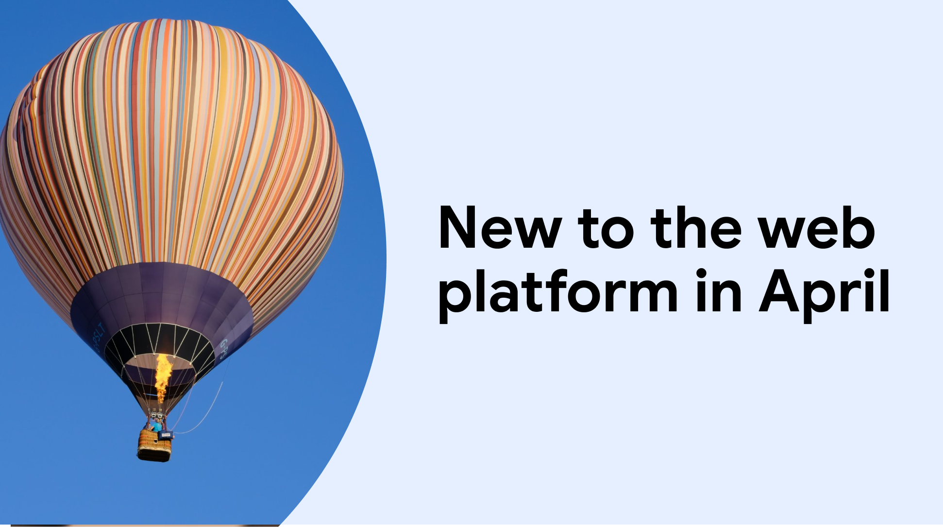


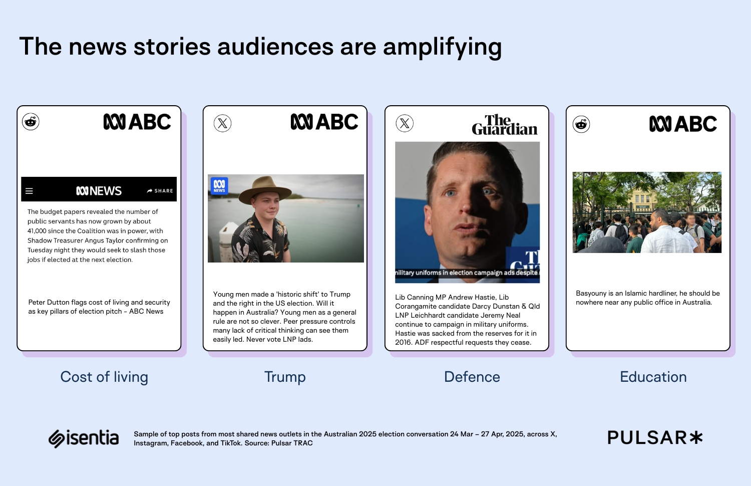
![Apple to Launch AI-Powered Battery Saver Mode in iOS 19 [Report]](https://www.iclarified.com/images/news/97309/97309/97309-640.jpg)
![Apple Officially Releases macOS Sequoia 15.5 [Download]](https://www.iclarified.com/images/news/97308/97308/97308-640.jpg)


-xl-xl-xl.jpg)


_Piotr_Adamowicz_Alamy.jpg?width=1280&auto=webp&quality=80&disable=upscale#)

_designer491_Alamy.jpg?width=1280&auto=webp&quality=80&disable=upscale#)


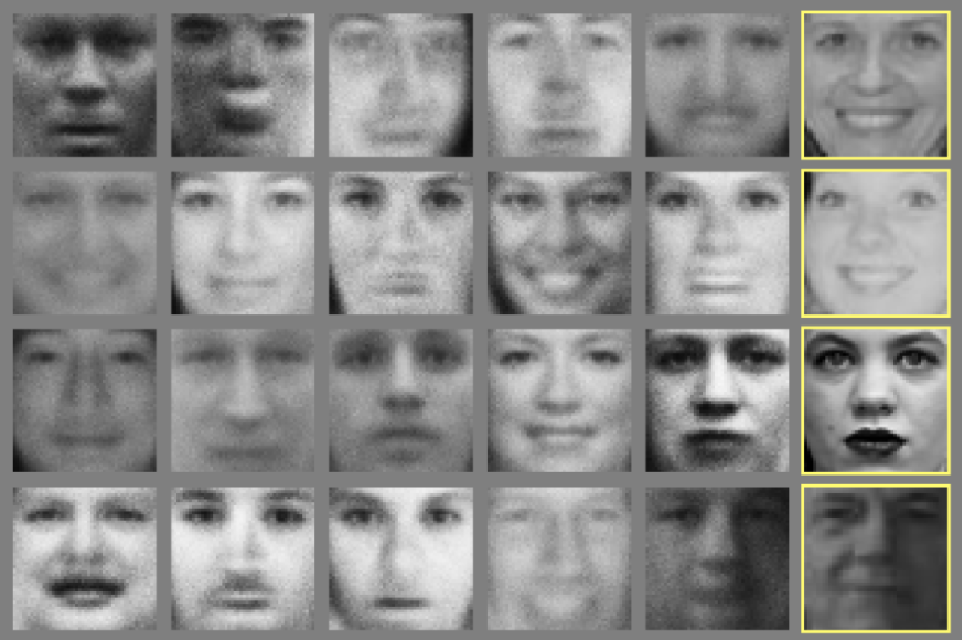
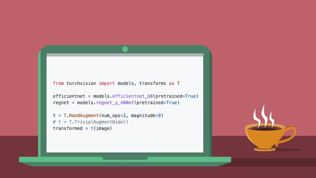


![Deepseek R1'i Yerel Olarak Çalıştırın: OpenWebUI + Ollama [Homelab]](https://media2.dev.to/dynamic/image/width=800%2Cheight=%2Cfit=scale-down%2Cgravity=auto%2Cformat=auto/https%3A%2F%2Fdev-to-uploads.s3.amazonaws.com%2Fuploads%2Farticles%2Fx3fl5u71vq5caqojk3bb.png)


![Ditching a Microsoft Job to Enter Startup Purgatory with Lonewolf Engineer Sam Crombie [Podcast #171]](https://cdn.hashnode.com/res/hashnode/image/upload/v1746753508177/0cd57f66-fdb0-4972-b285-1443a7db39fc.png?#)


Microsoft shows off the cool Windows Start concepts we never got
The Windows 11 Start menu is a functional menu, but not much more. Does that mean that Microsoft never had any better ideas? Of course not! In fact, they recently shared the Start menus that could have been. Four years ago, in 2021, my review of Windows 11 called it “unnecessary,” in part because of the unappealing Start menu that carried over from Windows 10X. Microsoft has since tweaked the Start menu, testing a “categories” view of Start and then bringing it to Windows alongside a new “phone companion” dashboard. A new blog post (via Windows Central) in the Microsoft Design “Beyond the Surface” series shows something else the company has been thinking about: bringing in notifications and functionality from other areas of Windows. For example, at least one concept notified the user about an upcoming meeting, along with a warning to turn off their out-of-office message. Microsoft said that it had four “guiding stars”: that the user’s entire apps library should be “right there;” that you should be able to “make it yours;” that “each pixel must earn its keep” in accelerating your day; and icon memory must be maintained. Each design concept was created using whiteboards, then tested via 300 Windows 11 fans, Microsoft said. “We watched eye-tracking heat maps swirl, counted scroll wheels, and listened for ‘Oh!’s of delight to know where we were hitting the mark,” the team wrote. Windows 11 Start: What could have been As someone who actually uses Phone Link regularly, the idea of a slide-out phone dashboard appeals to me. Even then, however, I’m using other apps within the Windows ecosystem far more. Microsoft’s concepts highlight these apps. At least one concept provides a pretty radical re-design of the current layout, like this one: Here, the “recommended” apps and documents are also entirely replaced, and Windows is emphasizing the creative and productive elements first. Note the meeting reminder as well. Others, such as the concept below, take a more conventional view. There’s a bit of a throwback to the lists of apps in older versions of Windows, such as XP and 7, with what looks like an expandable list of apps to the left, as well as shortcuts to the top. One Windows 11 Start concept (below) looks similar to the way things look now. The downside is that this Start menu appears to take up most of the visible screen and beyond. That’s probably not what Microsoft wanted. Incidentally, none of these Start concepts indicate anything about being able to resize or move the Start menu. This next Start concept provides a nice mix between a traditional Start menu and one that feels a bit more informative. It leans heavier on showing off apps, rather than documents, to the user. Again, a Start menu that attempts to communicate information feels more useful than the current layout, even if some of this could be replicated in the notifications that appear in the Action Center to the lower left of the Windows screen. This last concept (below) also doesn’t feel too different than what Microsoft already provides within Start. But again, note that it least highlights the upcoming meeting. Being able to know that there was a meeting due in two minutes—and being able to quickly click that meeting to join it—feels valuable. To me, anyway! I don’t mind the inclusion of Stranger Things. One of the things I’ve always wanted Microsoft to lean in on was more unique configurations. Remember how the Windows setup process asks whether you’ll be using the PC for gaming, creative work, or in a professional sense? More customized Start layouts would be a nice approach to that. Of course, none of these Start designs are being used. It’s possible that Microsoft considered these prototypes to be cluttered and confusing—some definitely are—but they also have a sense of energy about them, with an attempt to place more useful information in front of the user. That’s something Windows 11’s Start menu still lacks, robbing it of the personalization of Windows 10. For now, it’s up to third-party developers like Stardock Software and its Start11 software to step in.

The Windows 11 Start menu is a functional menu, but not much more. Does that mean that Microsoft never had any better ideas? Of course not! In fact, they recently shared the Start menus that could have been.
Four years ago, in 2021, my review of Windows 11 called it “unnecessary,” in part because of the unappealing Start menu that carried over from Windows 10X. Microsoft has since tweaked the Start menu, testing a “categories” view of Start and then bringing it to Windows alongside a new “phone companion” dashboard.
A new blog post (via Windows Central) in the Microsoft Design “Beyond the Surface” series shows something else the company has been thinking about: bringing in notifications and functionality from other areas of Windows. For example, at least one concept notified the user about an upcoming meeting, along with a warning to turn off their out-of-office message.
Microsoft said that it had four “guiding stars”: that the user’s entire apps library should be “right there;” that you should be able to “make it yours;” that “each pixel must earn its keep” in accelerating your day; and icon memory must be maintained.
Each design concept was created using whiteboards, then tested via 300 Windows 11 fans, Microsoft said. “We watched eye-tracking heat maps swirl, counted scroll wheels, and listened for ‘Oh!’s of delight to know where we were hitting the mark,” the team wrote.
Windows 11 Start: What could have been
As someone who actually uses Phone Link regularly, the idea of a slide-out phone dashboard appeals to me. Even then, however, I’m using other apps within the Windows ecosystem far more.
Microsoft’s concepts highlight these apps. At least one concept provides a pretty radical re-design of the current layout, like this one:

Here, the “recommended” apps and documents are also entirely replaced, and Windows is emphasizing the creative and productive elements first. Note the meeting reminder as well.
Others, such as the concept below, take a more conventional view. There’s a bit of a throwback to the lists of apps in older versions of Windows, such as XP and 7, with what looks like an expandable list of apps to the left, as well as shortcuts to the top.

One Windows 11 Start concept (below) looks similar to the way things look now. The downside is that this Start menu appears to take up most of the visible screen and beyond. That’s probably not what Microsoft wanted. Incidentally, none of these Start concepts indicate anything about being able to resize or move the Start menu.

This next Start concept provides a nice mix between a traditional Start menu and one that feels a bit more informative. It leans heavier on showing off apps, rather than documents, to the user.
Again, a Start menu that attempts to communicate information feels more useful than the current layout, even if some of this could be replicated in the notifications that appear in the Action Center to the lower left of the Windows screen.

This last concept (below) also doesn’t feel too different than what Microsoft already provides within Start. But again, note that it least highlights the upcoming meeting. Being able to know that there was a meeting due in two minutes—and being able to quickly click that meeting to join it—feels valuable. To me, anyway!
I don’t mind the inclusion of Stranger Things. One of the things I’ve always wanted Microsoft to lean in on was more unique configurations. Remember how the Windows setup process asks whether you’ll be using the PC for gaming, creative work, or in a professional sense? More customized Start layouts would be a nice approach to that.

Of course, none of these Start designs are being used. It’s possible that Microsoft considered these prototypes to be cluttered and confusing—some definitely are—but they also have a sense of energy about them, with an attempt to place more useful information in front of the user.
That’s something Windows 11’s Start menu still lacks, robbing it of the personalization of Windows 10. For now, it’s up to third-party developers like Stardock Software and its Start11 software to step in.


