.webp?#)


![Apple to Split Enterprise and Western Europe Roles as VP Exits [Report]](https://www.iclarified.com/images/news/97032/97032/97032-640.jpg)
![Nanoleaf Announces New Pegboard Desk Dock With Dual-Sided Lighting [Video]](https://www.iclarified.com/images/news/97030/97030/97030-640.jpg)
![Apple's Foldable iPhone May Cost Between $2100 and $2300 [Rumor]](https://www.iclarified.com/images/news/97028/97028/97028-640.jpg)


![[The AI Show Episode 144]: ChatGPT’s New Memory, Shopify CEO’s Leaked “AI First” Memo, Google Cloud Next Releases, o3 and o4-mini Coming Soon & Llama 4’s Rocky Launch](https://www.marketingaiinstitute.com/hubfs/ep%20144%20cover.png)


Plotly’s AI Tools Are Redefining Data Science Workflows
How Plotly’s AI-powered tools are transforming data science workflows with faster development, smarter insights, and improved collaboration. The post Plotly’s AI Tools Are Redefining Data Science Workflows appeared first on Towards Data Science.

Is there anything more frustrating than building a powerful data model but then struggling to turn it into a tool stakeholders can use to achieve their desired outcome? Data Science has never been short on potential but is also never short on complexity. You can refine algorithms that shine on curated datasets but still face the hurdle of moving from prototypes and notebooks to production apps. This last step, often called the “last mile,” affects 80% of data science outcomes and demands solutions that don’t overload data teams.
Since its founding in 2013, Plotly has been a popular subject in Towards Data Science (TDS), where contributors have published over 100 guides on Plotly’s tools. That steady output shows how much the data science community values merging code, visualizations, and interactive dashboards.
Plotly’s Chief Product Officer, Chris Parmer, has always championed the idea that analysts should be able to “spin up interactive apps without wrestling entire web frameworks.” That vision now powers Plotly’s latest release of Dash Enterprise, designed to simplify the leap from model to production-grade data apps.
Plotly’s latest innovations reflect a shift in data science toward more accessible, production-ready tools that help teams turn insights into actionable solutions.
This article will address three key questions:
- What makes the last mile in data science so challenging?
- What bottlenecks make traditional data workflows slow and inefficient?
- And how can you apply Plotly’s AI capabilities to build, share, and deploy interactive data apps faster?
Confronting the Last Mile Problem
The “last mile” in data science can be grueling. You might spend months perfecting models, only to find that nobody outside your analytics team fully understands the outputs. Static notebooks or ad hoc scripts rarely offer the interactivity that decision-makers require.
Some teams settle for a quick proof of concept using a Jupyter Notebook or single script, hoping to show value quickly. Many never upgrade it unless an organization invests in costly infrastructure. Smaller groups might not have the time or resources to turn prototypes into tools that influence daily decisions.

In large companies, security protocols, role-based access, and continuous deployment can add more complexity. These layers can push you into roles that look a lot like full-stack development just to get your insights presented to stakeholders. Delays pile up, especially when senior leaders want to test live scenarios but must wait for code changes to see fresh metrics.
Teams must move beyond isolated notebooks and manual workflows to adopt automated, interactive tools that turn insights into action faster. Plotly addresses this need by embedding AI into Dash.
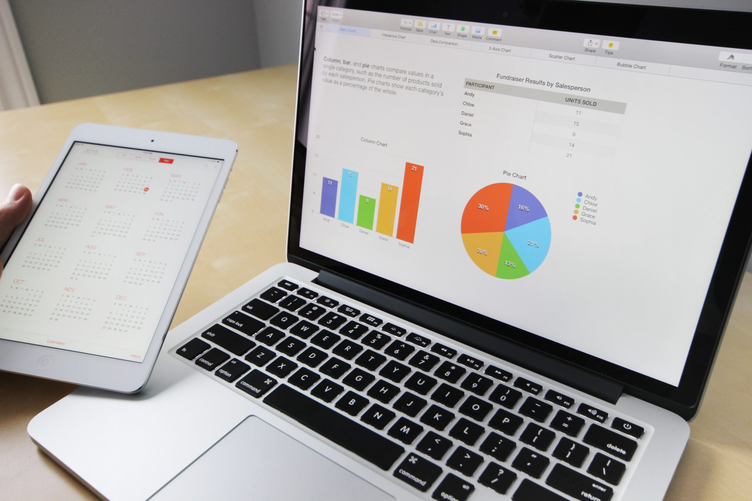
Plotly Dash is an open source Python framework for building interactive web applications for analytics. It simplifies the process of creating web-based interfaces for data analysis and presentation without requiring extensive web development knowledge.
Plotly Dash Enterprise extends and augments the open source framework to enable the creation of sophisticated production-grade applications for operational decision-making. Plotly Dash Enterprise provides development features and platform and security capabilities that enterprises require, such as AI, App Gallery, DevOps, security integration, caching, and much more.
The latest release of Dash Enterprise automates repetitive tasks, generates Python code for data visualizations and apps, and accelerates development inside Plotly App Studio. These enhancements free you to focus on refining models, improving insights, and delivering apps that meet business needs.
Inside Dash Enterprise: AI Chat, Data Explorer, and More
Plotly’s newest release of Dash Enterprise puts AI front and center. Its “Plotly AI” feature includes a chat interface that turns your plain-English prompts, like “build a sales forecast dashboard using our monthly SQL data,” into functional Python code. As an advanced user, you can refine that code with custom logic, and if you’re less technical, you can now build prototypes that once required specialized help.
“By integrating advanced AI directly into Dash, we’re streamlining the entire development process. You can start with an idea or a dataset and see a functional web app appear faster than ever.”
Dash Enterprise also introduces a Data Explorer Mode that you can use to generate charts, apply filters, and change parameters without writing code. For data scientists who prefer a direct code workflow, it provides flexibility to refine automatically generated components. The update goes further with integrated SQL authoring cells and simpler app embedding, cutting the distance from concept to production.
User experience takes a big step forward in the latest version of Dash Enterprise through App Studio, a GUI-based environment for creating and refining Dash apps. As the large language model (LLM) converts your prompts into Python code, that code is fully visible and editable within the interface. You’re never blocked from directly modifying or extending the generated code, giving you the flexibility to fine-tune every aspect of your app.
This mix of AI-assisted development and accessible design means data apps no longer require separate teams or complex frameworks. As Parmer puts it, “It’s not enough for data scientists to produce brilliant models if no one else can explore or understand them. Our goal is to remove the hurdles so people can share insights with minimal fuss.”
What Dash Enterprise Means for Your Data Projects
If you already have an established workflow, you might wonder why this Dash Enterprise release matters. Even the most accurate models can flop if decision-makers can’t interact with the results. With the new release, you can reduce the overhead of building data apps and deliver insights faster by:
- Building richer visualizations to present deeper insights with interactive charts and dashboards that adapt to your data story. You can see how CIBC’s Quantitative Solutions group used Dash Enterprise to help analysts and trading desks develop production-grade apps tailored to their needs.
- Using the new GUI-based App Studio to build, modify, and extend data apps without writing code, while still accessing Python for complete control. Intuit’s experimentation team took this approach to create tools now used by more than 500 employees, reducing experiment runtimes by over 70 percent.
- Managing complex datasets confidently by integrating Dash Enterprise with tools like Databricks to maintain performance as data scales. S&P Global adopted this approach to reduce the time it takes to launch client-facing data products from nine months to just two.
- Adding security and control with built-in security features, version control, and role-based access to protect your data apps as they grow. CIBC relied on these capabilities to deploy applications across teams in different regions without compromising security.
If you’re on an MLOps team, you may find it simpler to tie together data transformations and user permissions. This is non-negotiable in finance, healthcare, and supply chain analytics, where timely decisions rely on live data. By reducing the manual effort required to manage pipelines, you can spend more time refining models and delivering insights faster.
With Plotly’s open and extensible approach, you’re not locked into vendor-specific algorithms. Instead, you can embed any Python-based ML model or analytics workflow directly within Dash. This design has proven valuable at Databricks, where the team built an observability application to monitor infrastructure usage and costs using Plotly Dash.
Teams at Shell and Bloomberg also adopted Plotly Dash Enterprise for use cases spanning data governance, high-density visualizations, thematic investing, and more—all highlighting how these capabilities connect data, AI and BI in a single-user experience.
So, What’s Next?
AI is changing how data applications are built, data products are delivered, and insights are shared. Plotly sits at the crossroads of app development, data storytelling, and enterprise needs. To see how Plotly addresses this shift, watch the launch webinar and stay tuned for an upcoming eBook that breaks down proven strategies for building smarter data apps with AI.
Embedding AI into Dash automates parts of the development process, making data apps easier for non-technical teams. Yet technical skills and thoughtful planning remain key to building reliable, practical solutions.The world of data has moved beyond scattered notebooks and short-lived prototypes. The focus is now on production-ready solutions that guide meaningful decisions. With AI expanding rapidly, the gap between “experimental analysis” and “operational decision-making” may finally narrow — something many of you have been waiting for.
About Our Sponsor
Plotly is a leading provider of open-source graphing libraries and enterprise-grade analytics solutions. Its flagship product, Dash Enterprise, enables organizations to build scalable and interactive data apps that drive impactful decision-making. Learn more at http://www.plotly.com.
The post Plotly’s AI Tools Are Redefining Data Science Workflows appeared first on Towards Data Science.