


![Apple Reorganizes Executive Team to Rescue Siri [Report]](https://www.iclarified.com/images/news/96777/96777/96777-640.jpg)


![The latest vinyl Android figure is a faux wood ‘Pine Pal’ where no two are alike [Gallery]](https://i0.wp.com/9to5google.com/wp-content/uploads/sites/4/2025/03/android-figure-pine-pal-1.jpg?resize=1200%2C628&quality=82&strip=all&ssl=1)


![[The AI Show Episode 139]: The Government Knows AGI Is Coming, Superintelligence Strategy, OpenAI’s $20,000 Per Month Agents & Top 100 Gen AI Apps](https://www.marketingaiinstitute.com/hubfs/ep%20139%20cover-2.png)


![[The AI Show Episode 138]: Introducing GPT-4.5, Claude 3.7 Sonnet, Alexa+, Deep Research Now in ChatGPT Plus & How AI Is Disrupting Writing](https://www.marketingaiinstitute.com/hubfs/ep%20138%20cover.png)


![What are good examples of 'preflight check patterns' on existing applications? [closed]](https://i.sstatic.net/yl2Tr80w.png)


-Assassin's-Creed-Shadows-Review-00-12-31.png?width=1920&height=1920&fit=bounds&quality=80&format=jpg&auto=webp#)


![Release: Rendering Ranger: R² [Rewind]](https://images-3.gog-statics.com/48a9164e1467b7da3bb4ce148b93c2f92cac99bdaa9f96b00268427e797fc455.jpg)


Anticipating User Errors in Web
Introduction This article came to me as a logical continuation of my first article. After finishing it, I kept exploring the topic of UX in general and realized that it's not only hitting targets that our users can struggle with. This time I'll be talking about how we usually make our interfaces react to various types of incorrect user input (or lack of any) and how it can create even more confusion for our users. And again, this article covers mostly how we, developers, can contribute to improving this. Disabled Buttons The first thing that comes to mind when thinking about where users can make mistakes is a form element. It's very common for web apps to disable the main submit button until the user fills everything and fills it correctly. This happens on login screens, personal information pages, contact forms, some long onboarding flows, and so on. It may seem like a no-brainer to just set that disabled attribute until the user passes all the validation, but there can be a lot of confusion for users. It can be that they don’t even know exactly whether it was disabled initially or if it has changed its state to disabled in response to any of their actions. Most importantly, it makes the button practically non-existent for screen readers and keyboard navigation, because it can't receive focus. Usually we disable buttons instead of hiding them when we want to show that they can be enabled at some point, but many times we don't properly explain to our users what should enable it. In most cases they don't even need to be disabled. Exceptions where we could use the attribute could be buttons in loading states, disabled because something is unavailable on our side, or other special cases. As Matthew Standage notes, “when we disable a button on a form we are often disabling the call-to-action — that thing on the page we trying to encourage users to click to proceed with their journey.“ That's why by default react-hook-form library is configured in a way that it doesn't validate anything inline until the first submit, suggesting that way to leave the button initially enabled. So, the first and simplest solution is to keep them enabled from the beginning. Let users submit their forms, validate their input, and then explicitly explain and point to any errors they have. Сomplementary to this, inline validation on the field's blur event still fits rather well. It's a good practice to inform users orderly and not overload them with information at once only when the submit is made. Another less ideal fallback solution - aria-disabled attribute. disabled applies a lot of modifications to an element, while aria-disabled just conveys the semantics of it, meaning that you would need to add some CSS and JS to make it complete. If you absolutely need to have a disabled button, here's a great article by Sandrina Pereira on how to do it more inclusively with steps on applying aria-disabled. Generally, disabled attribute can be used for many other cases and elements, but for form buttons aria-disabled is better. From MDN: The header button element associated with non-collapsible accordion panel, A button which is important to keep in the page's focus order, but its action is presently unavailable - such as submitting a form, Temporarily inactive items in a menu widget that would otherwise be skipped over via standard keyboard navigation. Bonus point: Displaying error messages Since we are talking about forms and input errors, it should be the right place to figure out how to properly display them. Probably the most popular position to place validation errors is directly below the corresponding field. It might be a good idea to reconsider this. Google has an error message covered by autocomplete. Inaccurately unfolding element has both input and errors obstructed In these cases it might be very well obvious what kind of error gets hidden, but in a less common scenario this behavior can become pretty inconvenient. Let's cover now how to properly present them from an accessibility standpoint. First of all, to mark an input itself as invalid, we use aria-invalid="true", which will make the screen reader recognize and announce that the field is invalid when it’s focused. Error messages related to input also need to be connected to it, and not only visually, but for screen readers as well. For that, we can use aria-describedby with an id of the element containing the error message. You can also pass multiple ids with aria-describedby="addressError addressHint". One gotcha: Important to note that although aria-describedby supports multiple ids, if you change them (or the elements’ content) dynamically while the input is focused, the SR won’t re-announce its new content automatically. It will only read the new content after you leave the input and focus it again. Source Finally, since errors appear dynamically in the form, we need to properly announce their appearance to t
Introduction
This article came to me as a logical continuation of my first article. After finishing it, I kept exploring the topic of UX in general and realized that it's not only hitting targets that our users can struggle with.
This time I'll be talking about how we usually make our interfaces react to various types of incorrect user input (or lack of any) and how it can create even more confusion for our users.
And again, this article covers mostly how we, developers, can contribute to improving this.
Disabled Buttons
The first thing that comes to mind when thinking about where users can make mistakes is a form element. It's very common for web apps to disable the main submit button until the user fills everything and fills it correctly. This happens on login screens, personal information pages, contact forms, some long onboarding flows, and so on. It may seem like a no-brainer to just set that disabled attribute until the user passes all the validation, but there can be a lot of confusion for users. It can be that they don’t even know exactly whether it was disabled initially or if it has changed its state to disabled in response to any of their actions. Most importantly, it makes the button practically non-existent for screen readers and keyboard navigation, because it can't receive focus.
Usually we disable buttons instead of hiding them when we want to show that they can be enabled at some point, but many times we don't properly explain to our users what should enable it. In most cases they don't even need to be disabled. Exceptions where we could use the attribute could be buttons in loading states, disabled because something is unavailable on our side, or other special cases.
As Matthew Standage notes, “when we disable a button on a form we are often disabling the call-to-action — that thing on the page we trying to encourage users to click to proceed with their journey.“
That's why by default react-hook-form library is configured in a way that it doesn't validate anything inline until the first submit, suggesting that way to leave the button initially enabled.
So, the first and simplest solution is to keep them enabled from the beginning. Let users submit their forms, validate their input, and then explicitly explain and point to any errors they have. Сomplementary to this, inline validation on the field's blur event still fits rather well. It's a good practice to inform users orderly and not overload them with information at once only when the submit is made.
Another less ideal fallback solution - aria-disabled attribute. disabled applies a lot of modifications to an element, while aria-disabled just conveys the semantics of it, meaning that you would need to add some CSS and JS to make it complete. If you absolutely need to have a disabled button, here's a great article by Sandrina Pereira on how to do it more inclusively with steps on applying aria-disabled.
Generally, disabled attribute can be used for many other cases and elements, but for form buttons aria-disabled is better. From MDN:
- The header button element associated with non-collapsible accordion panel,
- A button which is important to keep in the page's focus order, but its action is presently unavailable - such as submitting a form,
- Temporarily inactive items in a menu widget that would otherwise be skipped over via standard keyboard navigation.
Bonus point: Displaying error messages
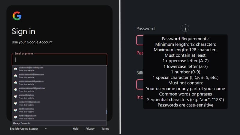
Since we are talking about forms and input errors, it should be the right place to figure out how to properly display them. Probably the most popular position to place validation errors is directly below the corresponding field. It might be a good idea to reconsider this.
Google has an error message covered by autocomplete. Inaccurately unfolding element has both input and errors obstructed
In these cases it might be very well obvious what kind of error gets hidden, but in a less common scenario this behavior can become pretty inconvenient.
Let's cover now how to properly present them from an accessibility standpoint.
First of all, to mark an input itself as invalid, we use aria-invalid="true", which will make the screen reader recognize and announce that the field is invalid when it’s focused.
Error messages related to input also need to be connected to it, and not only visually, but for screen readers as well. For that, we can use aria-describedby with an id of the element containing the error message. You can also pass multiple ids with aria-describedby="addressError addressHint".
One gotcha:
Important to note that although
aria-describedbysupports multiple ids, if you change them (or the elements’ content) dynamically while the input is focused, the SR won’t re-announce its new content automatically. It will only read the new content after you leave the input and focus it again.
Source
Finally, since errors appear dynamically in the form, we need to properly announce their appearance to the screen readers by using aria-live="assertive". Otherwise, the SR won’t announce it unless the user manually navigates to it.
Note that the aria-live attribute must be present in the DOM right from the beginning, even if the element doesn’t hold any message yet, otherwise, Assistive Technologies may not work properly.
Borrowing example from the code snippet above, the end result should look like this:
 class="field">
     for="ticketCount">Number of Tickets
     id="ticketCount" type="text" aria-invalid="true" aria-describedby="ticketError">
     aria-live="assertive" id="ticketError">Add between 1 and 9 tickets.
So called Live Regions should be used for other dynamic messages as well, but that's a different broad topic.
From the article mentioned above:
There’s much more to tell you about this little aria-live attribute and the big things it does. There are gotchas as well. For example, if it is applied incorrectly, the attribute can do more harm than good. It’s worth reading “Using aria-live” by Ire Aderinokun and Adrian Roselli’s “Loading Skeletons” to better understand how it works and how to use it.
Navigation errors
I already mentioned my first article in the introduction, which basically covers a similar topic of how to make hitting elements less error-prone and a little more pleasant.
But there's one more related case I omitted.
Hover menus that unfold with a list of items, a UI pattern that's been tackled many years ago, still fail to deliver an effortless navigation sometimes. It doesn't have to be a menu, sometimes it can be some tooltip with buttons or other selectors that appear only on hover. Essentially, it's a set of controls hidden behind a smaller element to save space that appears on hover, trying to save the user a click.
Try to open the menus and move your pointer directly to the last item:
Instinctively, we are going with the shortest route when we see our target right in our reach, but apparently the path to it lies beyond the hover area of the whole menu, and we see our target disappear. This is a complication of pointer devices; on a touch device, there won't be any problem at all.
Of course, for some shapes of menus, you can rely on libraries, but there may be a need to handle more peculiar cases.
There are at least 4 ways to deal with this, and you can use a combination of the last 3 to better suit your needs.
- Click — changing menu to open on click is by far the simplest method, whether it's worth all the extra effort that comes with the other methods or you are stopping here is up to you.
- Timer — setting some delay on pointer events to not close the menu instantly. Implementation is up to you; I left mine simplified for the demo.
- Static Safe Triangles — a middle ground between relative simplicity and implementing fully dynamic safe triangles. Basically, you add curved invisible (made visible for demo purposes) triangles to the sides of your button. The triangles will make a path to your last submenu items while not obstructing much navigation to other menu items. Inspired by this.
Let me break down a little the last one.
First, we are placing the safe area inside the submenu and making it the same height. With position: absolute; we push it outside to cover the width of the button (in my case, the button and submenu have equal width). Unlike with other solutions, you don't need to set any pointer-events: none;, the triangles themselves will be an active part of your submenu in a shape you already see.
The triangles are drawn with one relatively simple path() string using clip-path: path();. In my example the coordinates are hardcoded, but you can use your framework of choice to calculate the values dynamically.
You can use this tool to have an explanation of each step of the path drawing.
Setting this dynamically with a template string will look like this:
`path("M ${width} 0 S ${width} ${topDistance + 1} , 0 ${topDistance + 1} L ${width} ${topDistance + 1} L ${width} 0 M ${width} ${height} S ${width} ${bottomDistance - 1} , 0 ${bottomDistance - 1} L ${width} ${bottomDistance - 1} L ${width} ${height}")`
-
width,height- width and height of the area (also width of the opening button and height of the unfolding submenu); -
topDistance- distance between the top edge of the submenu and the button by Y coordinate; -
bottomDistance- distance between the bottom edge of the submenu and the button by Y coordinate.
I do a 1 pixel adjustment into the button's area to prevent any small gaps that could appear between them during rounding or other weird behavior of Firefox, which happened to me. Same goes for the right: 99%; line of .safeAreaElement, this will leave 1% of the area inside the submenu.
- Dynamic Safe Triangle — the most complicated solution with its own nuances. One Safe Triangle is now dynamically drawn starting from your pointer position. This is the best implementation I could find, with interactive examples and code explanations, and I have nothing to add to it.
Navigation Blocking
A behavioral pattern I feel like used to be more common before, but now I barely see it anywhere. Navigation blocking is supposed to occur when you are filling a form, making a transaction, i.e., in the process of doing a multi-step task, and you have some unsaved progress. It won't be possible, of course, to fully block your navigation. This will just open a modal dialog to double-check that you won't be losing anything important. Traditional implementation would prevent you from accidentally clicking on a link, hitting the browser's navigation buttons, or even closing the tab or the whole browser.
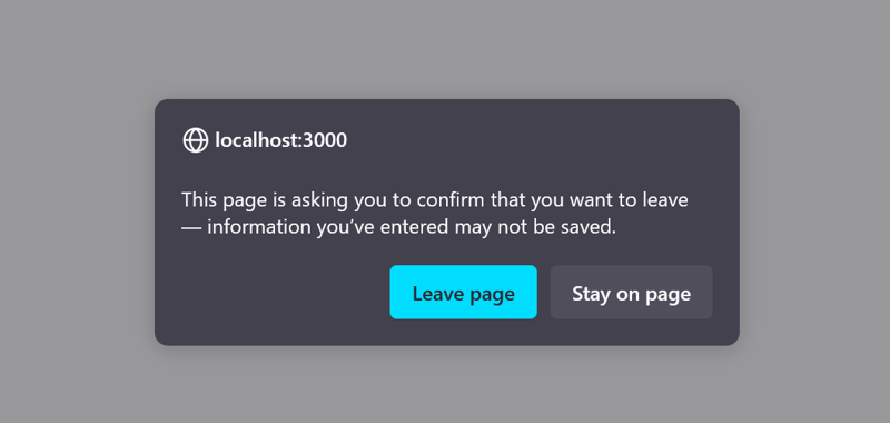 Firefox message displayed before leaving the page
The code for this would look like this:
window.addEventListener('beforeunload', function (e) {
  if (isTaskInProgress) {
    e.preventDefault();
    e.returnValue = true;
  }
});
Now, this is something you would do for MPA. For SPA you would ideally need both listening to the beforeunload event (to have browser navigation/closure covered) and router-specific logic, since for SPA that's where the majority of routing really happens. Depending on your router of choice, one or both of these cases may already be covered by the library.
I'll list some implementations in my stack:
- Tanstack Router
- React Router's and useBeforeUnload
- Solid Router
- Next.js removed it from app router, leaving place only for custom solutions
As in many cases, this is one of the techniques that should be used sparingly, and in the next section we’ll be talking about the relevance of such confirm modals.
Modals on destructive actions
Modal dialogs is another important topic, as they are usually what guarding users from critical actions. Modals in general are a common thing in UI, they can be used for different scoped tasks to take users out of their current context. But a confirmation modal is something that can also be easily overused, leading to creating a habit of automatically confirming them and losing it's meaning in the first place.
In general, users don’t show much annoyance with self-initiated modals, but they get very frustrated with any kind of auto-triggered modals. But if a modal helps users avoid critical mistakes, they find them acceptable.
Use modal dialogs to avoid an irreversible error/action that will have serious consequences, like deleting or transferring something. This kind of modal should be something they normally don't do, something to grab their attention and slow them down, letting them consciously process the action taking place.
When it comes to implementation, we need to consider accessibility with how the focus will be handled when the modal is opened and closed, prevent the underlying page from scrolling, as well as provide obvious ways to close it, like a big enough X button, ESC keyboard button, and clicking outside of it.
Thankfully, modern element makes implementing all of it easy, with very little JS needed. It's well supported with global adoption of 96%, customizable, has some more complicated cases like hitting ESC with multiple dialogs open handled, and can be well animated. As far as I know, all past issues with native dialogs were fixed, and now there's no real reason not to use it. I really like the implementation of modals in DaisyUI.
The better approach to safeguard a critical action is the undo option. By allowing users to rollback their unintended operation, we encourage some to use the app without the fear of breaking something and entrust others with an uninterrupted flow of decisions. It's a good safety net that doesn't get in the way, unlike modals.
Unfortunately, the undo is much harder to implement and requires designing on all levels, while it may not be possible at all in some cases.
Wrap up
I wanted to put together all the ways to handle user errors, the ways we can trap them inadvertently sometimes, and the ways to make some improvements here.
The solutions are not always simple. Sometimes it takes more than one safety net, and sometimes it's very easy to overdo it with our efforts.
If you feel like something could be presented better, feel free to reach out!
Resources
https://www.smashingmagazine.com/2023/08/better-context-menus-safe-triangles
https://www.smashingmagazine.com/2024/09/how-manage-dangerous-actions-user-interfaces/#when-to-use-it-2