


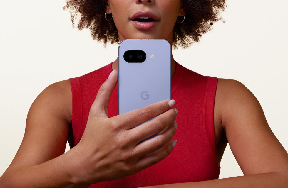
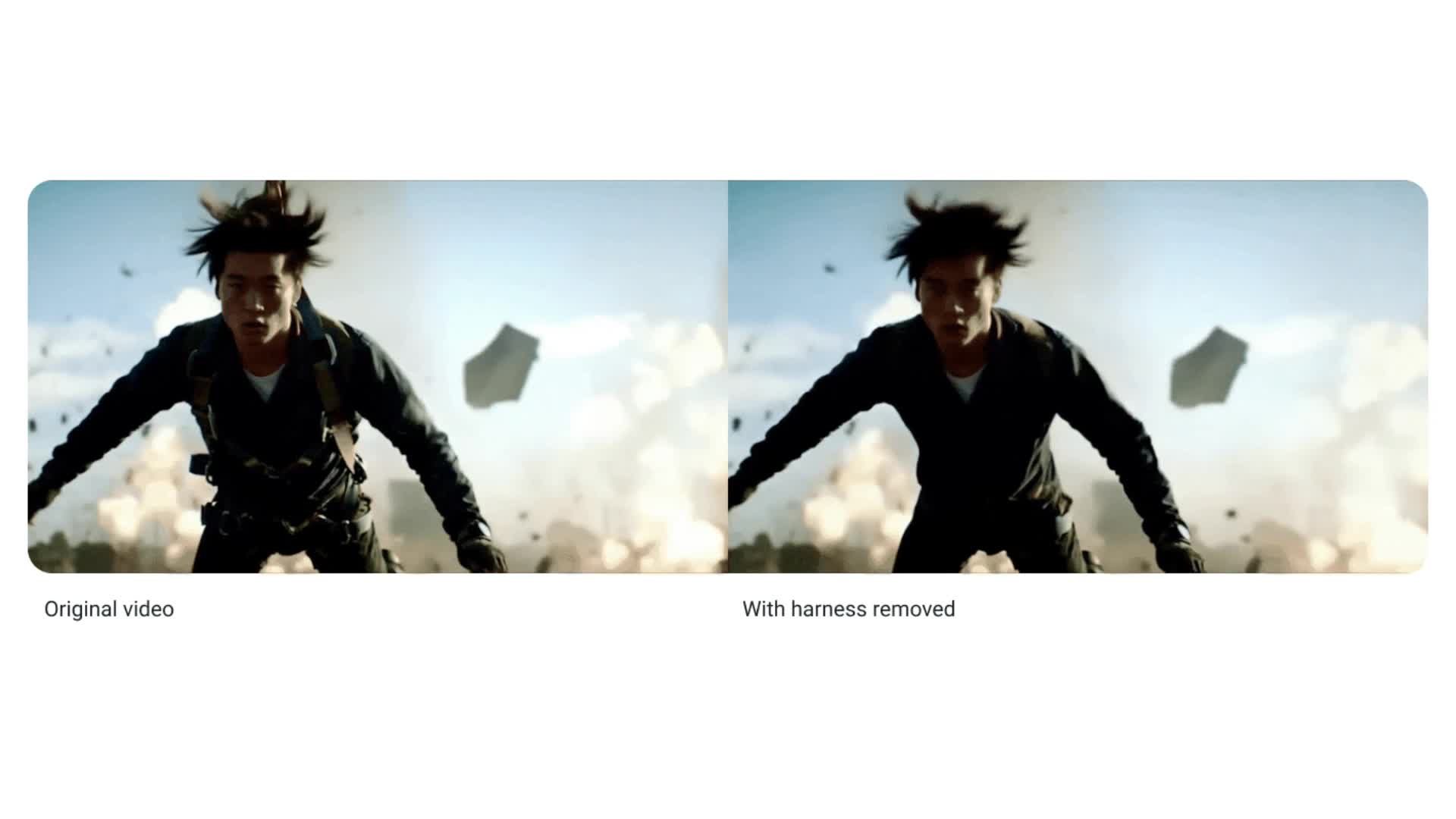
![Apple Debuts Official Trailer for 'Murderbot' [Video]](https://www.iclarified.com/images/news/96972/96972/96972-640.jpg)
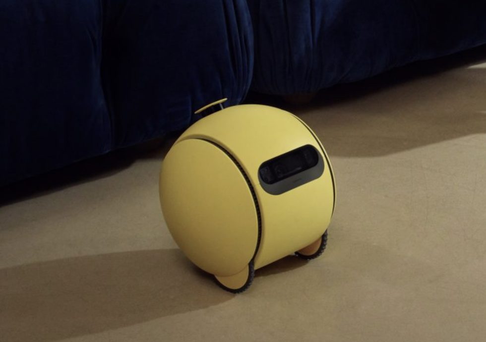
![Alleged Case for Rumored iPhone 17 Pro Surfaces Online [Image]](https://www.iclarified.com/images/news/96969/96969/96969-640.jpg)

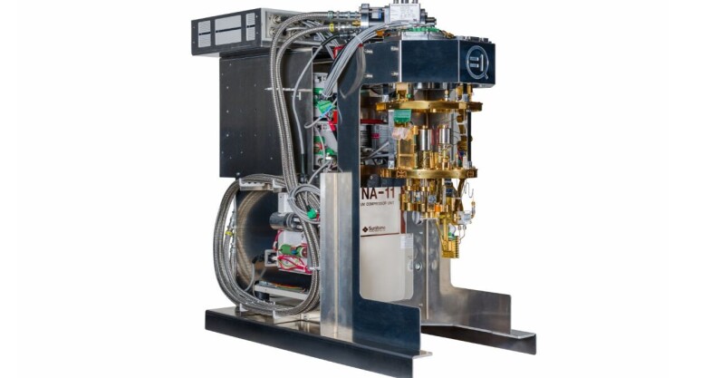
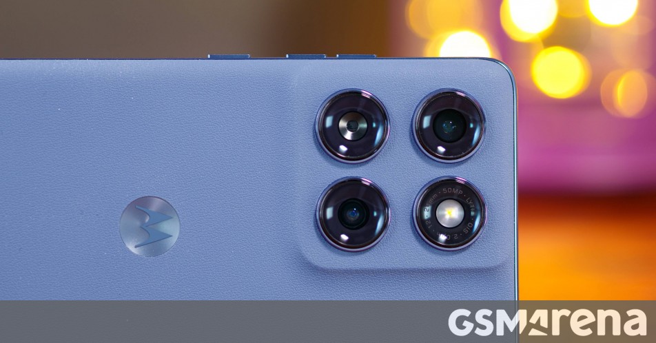
![Apple Rushes Five Planes of iPhones to US Ahead of New Tariffs [Report]](https://www.iclarified.com/images/news/96967/96967/96967-640.jpg)


_jvphoto_Alamy.jpg?#)


![[The AI Show Episode 143]: ChatGPT Revenue Surge, New AGI Timelines, Amazon’s AI Agent, Claude for Education, Model Context Protocol & LLMs Pass the Turing Test](https://www.marketingaiinstitute.com/hubfs/ep%20143%20cover.png)


![QA - Best methods for getting large amount of test data into event consuming applications generated from an API application [closed]](https://cdn.sstatic.net/Sites/softwareengineering/Img/apple-touch-icon@2.png?v=1ef7363febba)


![From drop-out to software architect with Jason Lengstorf [Podcast #167]](https://cdn.hashnode.com/res/hashnode/image/upload/v1743796461357/f3d19cd7-e6f5-4d7c-8bfc-eb974bc8da68.png?#)


.jpeg?#)


Flutter Animations: From Beginner Basics to Heroic Transitions
Animations can transform a good Flutter app into a great one, making your UI feel alive and intuitive. Whether you’re new to Flutter or ready to level up, this tutorial will guide you from simple animations to advanced transitions. We’ll start with beginner-friendly implicit animations, move to explicit animations for more control, and finish with the stunning Hero animation that ties screens together like magic. By the end, you’ll have the skills to animate anything in Flutter. We are going to group this into Part (From basic animations and advanced and Hero animations) For a more visual tutorial, check out my youtube channel : Ready to get moving? Let’s jump in! Part 1: Basic Implicit Animations Implicit animations are perfect for beginners because Flutter handles the animation logic for you. You define the start and end states, and Flutter smoothly transitions between them. Let’s begin with AnimatedContainer. Example 1: Coloring and Growing a Box with AnimatedContainer The AnimatedContainer widget animates changes to properties like size, color, or padding. Let’s make a box that grows and changes color when tapped. import 'package:flutter/material.dart'; void main() { runApp(MyApp()); } class MyApp extends StatelessWidget { @override Widget build(BuildContext context) { return MaterialApp(home: AnimatedContainerDemo()); } } class AnimatedContainerDemo extends StatefulWidget { @override _AnimatedContainerDemoState createState() => _AnimatedContainerDemoState(); } class _AnimatedContainerDemoState extends State { bool _isExpanded = false; @override Widget build(BuildContext context) { return Scaffold( appBar: AppBar(title: Text('AnimatedContainer Demo')), body: Center( child: GestureDetector( onTap: () { setState(() { _isExpanded = !_isExpanded; }); }, child: AnimatedContainer( duration: Duration(seconds: 1), width: _isExpanded ? 200 : 100, height: _isExpanded ? 200 : 100, color: _isExpanded ? Colors.blue : Colors.red, curve: Curves.easeInOut, ), ), ), ); } } How It Works: AnimatedContainer transitions its properties over a duration (1 second here). Tapping toggles _isExpanded, changing the width, height, and color. curve: Curves.easeInOut ensures a smooth start and stop. If you run this and tap the box. It grows from 100x100 (red) to 200x200 (blue) with a silky-smooth animation. Part 2: Intermediate Implicit Animations Now that you’ve got the basics, let’s explore more implicit animations: AnimatedOpacity for fading effects and AnimatedCrossFade for switching widgets. Example 2: Fading Text with AnimatedOpacity Let’s fade a text widget in and out with a button press. class AnimatedOpacityDemo extends StatefulWidget { @override _AnimatedOpacityDemoState createState() => _AnimatedOpacityDemoState(); } class _AnimatedOpacityDemoState extends State { bool _isVisible = true; @override Widget build(BuildContext context) { return Scaffold( appBar: AppBar(title: Text('AnimatedOpacity Demo')), body: Center( child: Column( mainAxisAlignment: MainAxisAlignment.center, children: [ AnimatedOpacity( opacity: _isVisible ? 1.0 : 0.0, duration: Duration(seconds: 1), child: Text( 'Hello, Flutter!', style: TextStyle(fontSize: 30), ), ), SizedBox(height: 20), ElevatedButton( onPressed: () { setState(() { _isVisible = !_isVisible; }); }, child: Text('Toggle Fade'), ), ], ), ), ); } } How It Works: AnimatedOpacity changes the opacity from 0.0 (invisible) to 1.0 (visible). The button toggles _isVisible, triggering the fade over 1 second. Example 3: Switching Widgets with AnimatedCrossFade AnimatedCrossFade lets you transition between two widgets with a crossfade effect. Let’s switch between two colored boxes in this example. class AnimatedCrossFadeDemo extends StatefulWidget { @override _AnimatedCrossFadeDemoState createState() => _AnimatedCrossFadeDemoState(); } class _AnimatedCrossFadeDemoState extends State { bool _showFirst = true; @override Widget build(BuildContext context) { return Scaffold( appBar: AppBar(title: Text('AnimatedCrossFade Demo')), body: Center( child: Column( mainAxisAlignment: MainAxisAlignment.center, children: [ AnimatedCrossFade( firstChild: Container( width: 100, height: 100, color: Colors.green, ), secondChild: Container( width: 10
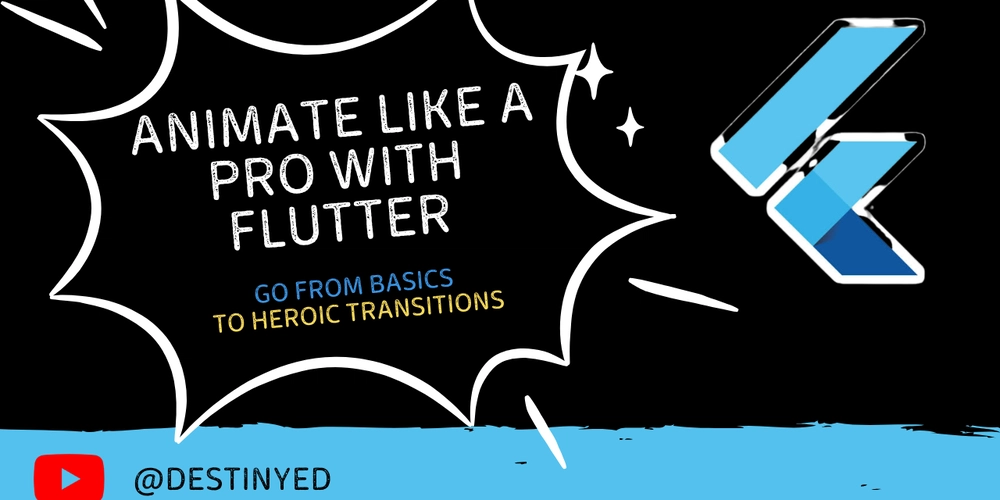
Animations can transform a good Flutter app into a great one, making your UI feel alive and intuitive. Whether you’re new to Flutter or ready to level up, this tutorial will guide you from simple animations to advanced transitions. We’ll start with beginner-friendly implicit animations, move to explicit animations for more control, and finish with the stunning Hero animation that ties screens together like magic. By the end, you’ll have the skills to animate anything in Flutter.
We are going to group this into Part (From basic animations and advanced and Hero animations)
For a more visual tutorial, check out my youtube channel :
Ready to get moving? Let’s jump in!
Part 1: Basic Implicit Animations
Implicit animations are perfect for beginners because Flutter handles the animation logic for you. You define the start and end states, and Flutter smoothly transitions between them. Let’s begin with AnimatedContainer.
Example 1: Coloring and Growing a Box with AnimatedContainer
The AnimatedContainer widget animates changes to properties like size, color, or padding. Let’s make a box that grows and changes color when tapped.
import 'package:flutter/material.dart';

void main() {
  runApp(MyApp());
}

class MyApp extends StatelessWidget {
  @override
  Widget build(BuildContext context) {
    return MaterialApp(home: AnimatedContainerDemo());
  }
}

class AnimatedContainerDemo extends StatefulWidget {
  @override
  _AnimatedContainerDemoState createState() => _AnimatedContainerDemoState();
}

class _AnimatedContainerDemoState extends State {
  bool _isExpanded = false;

  @override
  Widget build(BuildContext context) {
    return Scaffold(
      appBar: AppBar(title: Text('AnimatedContainer Demo')),
      body: Center(
        child: GestureDetector(
          onTap: () {
            setState(() {
              _isExpanded = !_isExpanded;
            });
          },
          child: AnimatedContainer(
            duration: Duration(seconds: 1),
            width: _isExpanded ? 200 : 100,
            height: _isExpanded ? 200 : 100,
            color: _isExpanded ? Colors.blue : Colors.red,
            curve: Curves.easeInOut,
          ),
        ),
      ),
    );
  }
}
How It Works:
AnimatedContainer transitions its properties over a duration (1 second here).
Tapping toggles _isExpanded, changing the width, height, and color.
curve: Curves.easeInOut ensures a smooth start and stop.
If you run this and tap the box. It grows from 100x100 (red) to 200x200 (blue) with a silky-smooth animation.
Part 2: Intermediate Implicit Animations
Now that you’ve got the basics, let’s explore more implicit animations: AnimatedOpacity for fading effects and AnimatedCrossFade for switching widgets.
Example 2: Fading Text with AnimatedOpacity
Let’s fade a text widget in and out with a button press.
class AnimatedOpacityDemo extends StatefulWidget {
  @override
  _AnimatedOpacityDemoState createState() => _AnimatedOpacityDemoState();
}

class _AnimatedOpacityDemoState extends State {
  bool _isVisible = true;

  @override
  Widget build(BuildContext context) {
    return Scaffold(
      appBar: AppBar(title: Text('AnimatedOpacity Demo')),
      body: Center(
        child: Column(
          mainAxisAlignment: MainAxisAlignment.center,
          children: [
            AnimatedOpacity(
              opacity: _isVisible ? 1.0 : 0.0,
              duration: Duration(seconds: 1),
              child: Text(
                'Hello, Flutter!',
                style: TextStyle(fontSize: 30),
              ),
            ),
            SizedBox(height: 20),
            ElevatedButton(
              onPressed: () {
                setState(() {
                  _isVisible = !_isVisible;
                });
              },
              child: Text('Toggle Fade'),
            ),
          ],
        ),
      ),
    );
  }
}
How It Works:
AnimatedOpacity changes the opacity from 0.0 (invisible) to 1.0 (visible).
The button toggles _isVisible, triggering the fade over 1 second.
Example 3: Switching Widgets with AnimatedCrossFade
AnimatedCrossFade lets you transition between two widgets with a crossfade effect. Let’s switch between two colored boxes in this example.
class AnimatedCrossFadeDemo extends StatefulWidget {
  @override
  _AnimatedCrossFadeDemoState createState() => _AnimatedCrossFadeDemoState();
}

class _AnimatedCrossFadeDemoState extends State {
  bool _showFirst = true;

  @override
  Widget build(BuildContext context) {
    return Scaffold(
      appBar: AppBar(title: Text('AnimatedCrossFade Demo')),
      body: Center(
        child: Column(
          mainAxisAlignment: MainAxisAlignment.center,
          children: [
            AnimatedCrossFade(
              firstChild: Container(
                width: 100,
                height: 100,
                color: Colors.green,
              ),
              secondChild: Container(
                width: 100,
                height: 100,
                color: Colors.purple,
              ),
              crossFadeState: _showFirst
                  ? CrossFadeState.showFirst
                  : CrossFadeState.showSecond,
              duration: Duration(seconds: 1),
            ),
            SizedBox(height: 20),
            ElevatedButton(
              onPressed: () {
                setState(() {
                  _showFirst = !_showFirst;
                });
              },
              child: Text('Switch'),
            ),
          ],
        ),
      ),
    );
  }
}
How It Works:
AnimatedCrossFade fades between firstChild (green box) and secondChild (purple box).
crossFadeState determines which child is visible, with a 1-second transition.
Part 3: Explicit Animations
Implicit animations are easy, but explicit animations give you full control using AnimationController and Tween. Let’s create a rotating icon.
Example 4: Spinning Icon
We’ll make a star icon spin 360 degrees repeatedly.
class RotationDemo extends StatefulWidget {
  @override
  _RotationDemoState createState() => _RotationDemoState();
}

class _RotationDemoState extends State
    with SingleTickerProviderStateMixin {
  late AnimationController _controller;
  late Animation _animation;

  @override
  void initState() {
    super.initState();
    _controller = AnimationController(
      duration: Duration(seconds: 2),
      vsync: this,
    );
    _animation = Tween(begin: 0, end: 2 * 3.14159).animate(_controller)
      ..addListener(() {
        setState(() {});
      });
  }

  @override
  void dispose() {
    _controller.dispose();
    super.dispose();
  }

  @override
  Widget build(BuildContext context) {
    return Scaffold(
      appBar: AppBar(title: Text('Rotation Demo')),
      body: Center(
        child: Transform.rotate(
          angle: _animation.value,
          child: Icon(Icons.star, size: 100),
        ),
      ),
      floatingActionButton: FloatingActionButton(
        onPressed: () {
          if (_controller.isAnimating) {
            _controller.stop();
          } else {
            _controller.repeat();
          }
        },
        child: Icon(Icons.play_arrow),
      ),
    );
  }
}
How It Works:
AnimationController manages the animation’s timing (2 seconds per cycle).
Tween maps values from 0 to 2π (a full rotation).
vsync: this syncs the animation to the screen refresh rate, requiring SingleTickerProviderStateMixin.
The floating action button toggles the spinning.
Part 4: Advanced Custom Animation
In this part, we are going to combine multiple animations for a more complex effect: a ball that bounces up and down while changing size.
Example 5: Bouncing Ball
This example uses AnimatedBuilder for efficiency and combines position and size animations.
class BounceDemo extends StatefulWidget {
  @override
  _BounceDemoState createState() => _BounceDemoState();
}

class _BounceDemoState extends State
    with SingleTickerProviderStateMixin {
  late AnimationController _controller;
  late Animation _height;
  late Animation _size;

  @override
  void initState() {
    super.initState();
    _controller = AnimationController(
      duration: Duration(seconds: 1),
      vsync: this,
    )..repeat(reverse: true);

    _height = Tween(begin: 0, end: 200).animate(
      CurvedAnimation(parent: _controller, curve: Curves.bounceOut),
    );
    _size = Tween(begin: 50, end: 30).animate(
      CurvedAnimation(parent: _controller, curve: Curves.easeInOut),
    );
  }

  @override
  void dispose() {
    _controller.dispose();
    super.dispose();
  }

  @override
  Widget build(BuildContext context) {
    return Scaffold(
      appBar: AppBar(title: Text('Bouncing Ball Demo')),
      body: AnimatedBuilder(
        animation: _controller,
        builder: (context, child) {
          return Stack(
            children: [
              Positioned(
                bottom: _height.value,
                left: MediaQuery.of(context).size.width / 2 - _size.value / 2,
                child: Container(
                  width: _size.value,
                  height: _size.value,
                  decoration: BoxDecoration(
                    color: Colors.orange,
                    shape: BoxShape.circle,
                  ),
                ),
              ),
            ],
          );
        },
      ),
    );
  }
}
How It Works:
AnimatedBuilder rebuilds only the animated part, improving performance.
_height uses Curves.bounceOut for a realistic bounce effect.
_size shrinks the ball as it rises, adding depth.
repeat(reverse: true) loops the animation back and forth.
Part 5: Hero Animation
For the final part, let’s create a Hero animation—a seamless transition between two screens, often used for images or icons in galleries or detail views.
Example 6: Image Transition with Hero
We’ll build a list screen with an image that, when tapped, transitions smoothly to a larger version on a detail screen.
import 'package:flutter/material.dart';

void main() {
  runApp(MyApp());
}

class MyApp extends StatelessWidget {
  @override
  Widget build(BuildContext context) {
    return MaterialApp(home: HeroListScreen());
  }
}

class HeroListScreen extends StatelessWidget {
  final image = "https://picsum.photos/200/300";
  @override
  Widget build(BuildContext context) {
    return Scaffold(
      appBar: AppBar(title: Text('Hero Animation - List')),
      body: ListView(
        children: [
          GestureDetector(
            onTap: () {
              Navigator.push(
                context,
                MaterialPageRoute(builder: (context) => HeroDetailScreen(
imageUrl : image,
heroTag : "hero_id"
)),
              );
            },
            child: Padding(
              padding: const EdgeInsets.all(8.0),
              child: Hero(
                tag: 'hero_id',
                child: Image.network(
                  image,
                  width: 150,
                  height: 150,
                  fit: BoxFit.cover,
                ),
              ),
            ),
          ),
        ],
      ),
    );
  }
}

class HeroDetailScreen extends StatelessWidget {
  final String heroTag;
  final String imageUrl;
  HeroDetailsScreen({required this.heroTag, required this.imageUrl});
  @override
  Widget build(BuildContext context) {
    return Scaffold(
      appBar: AppBar(title: Text('Hero Animation - Detail')),
      body: Center(
        child: Hero(
          tag: heroTag,
          child: Image.network(
            imageUrl,
            width: 300,
            height: 300,
            fit: BoxFit.cover,
          ),
        ),
      ),
    );
  }
}
How It Works:
The Hero widget wraps the image on both screens, linked by a unique tag (hero_id).
Tapping the image navigates to HeroDetailScreen, and Flutter animates the image from 150x150 to 300x300, adjusting position and scale.
The back button reverses the animation seamlessly.
Congratulations if you go to this part!
You’ve just unlocked the power of Flutter animations! Here’s how to keep going:
Experiment and try other implicit widgets like AnimatedPadding or AnimatedPositioned.
Customize the Hero animation by adding a flightShuttleBuilder property to the Hero widget for effects like rotation or fade during transitions.
Explore advanced topics by looking into PageRouteBuilder for custom page transitions or Rive for pre-designed animations.
There you have it!
You've successfully completed your crash course in Flutter animations! You’ve gone from basic boxes that grow and fade, to spinning icons, bouncing balls, and even the show-stopping Hero transition.
These skills are your toolkit to make apps that don’t just work, but wow.
Thank you for reading. Keep animating with Flutter!


