


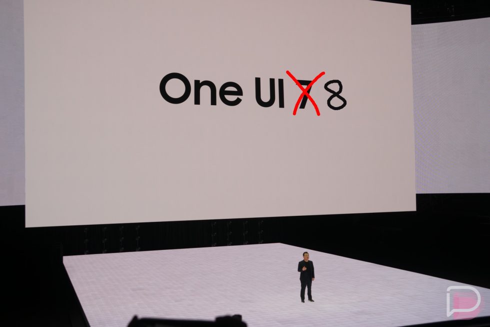
![[Update: Trump Backtracks]The U.S. Just Defunded a Key Security Database, And Your Android Phone Could Pay the Price](https://www.androidheadlines.com/wp-content/uploads/2025/03/Android-logo-AM-AH.jpg)


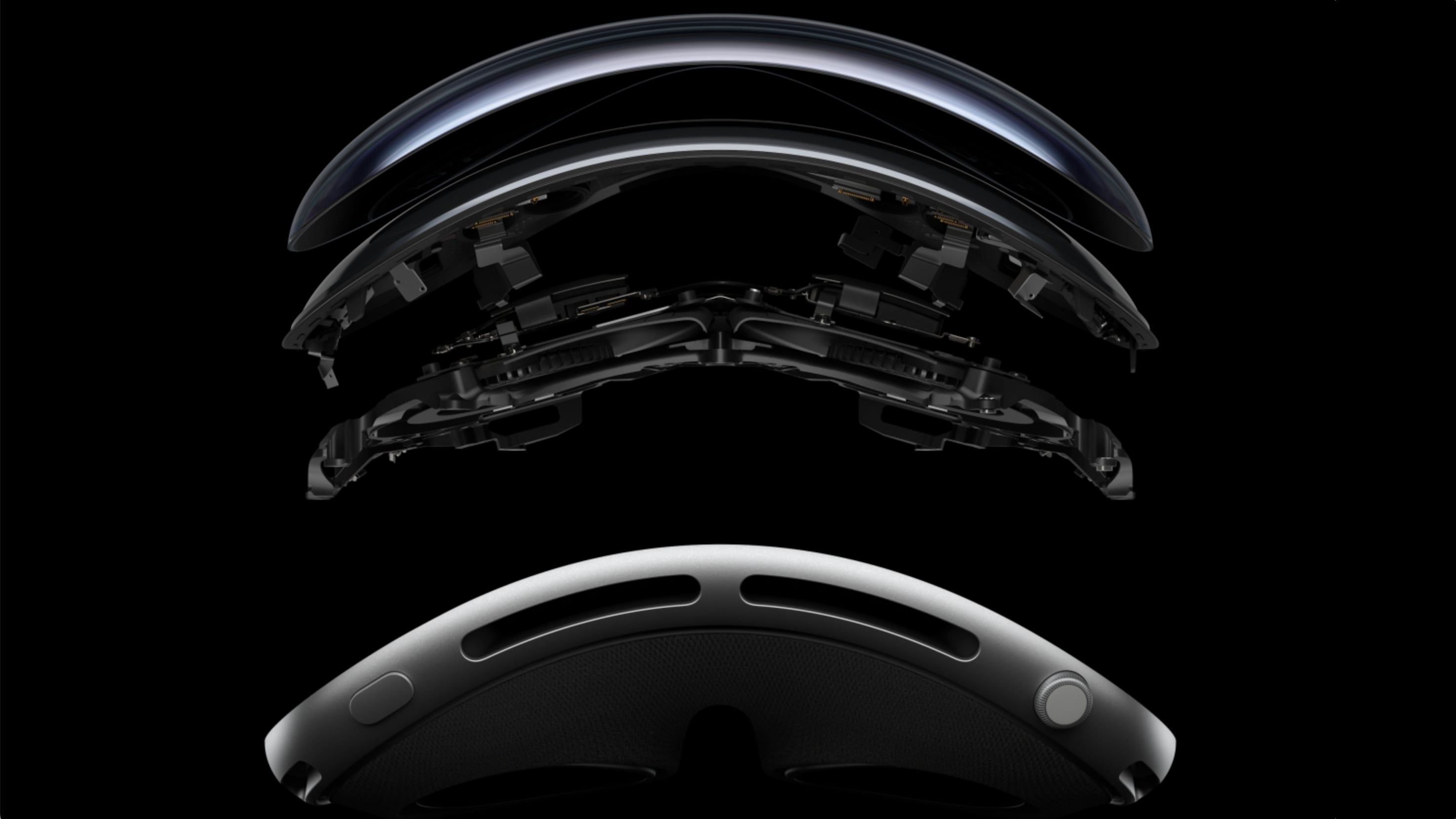
![Apple Vision 'Air' Headset May Feature Titanium and iPhone 5-Era Black Finish [Rumor]](https://www.iclarified.com/images/news/97040/97040/97040-640.jpg)

![Apple to Split Enterprise and Western Europe Roles as VP Exits [Report]](https://www.iclarified.com/images/news/97032/97032/97032-640.jpg)


![[Update: Optional] Google rolling out auto-restart security feature to Android](https://i0.wp.com/9to5google.com/wp-content/uploads/sites/4/2025/01/google-play-services-2.jpg?resize=1200%2C628&quality=82&strip=all&ssl=1)

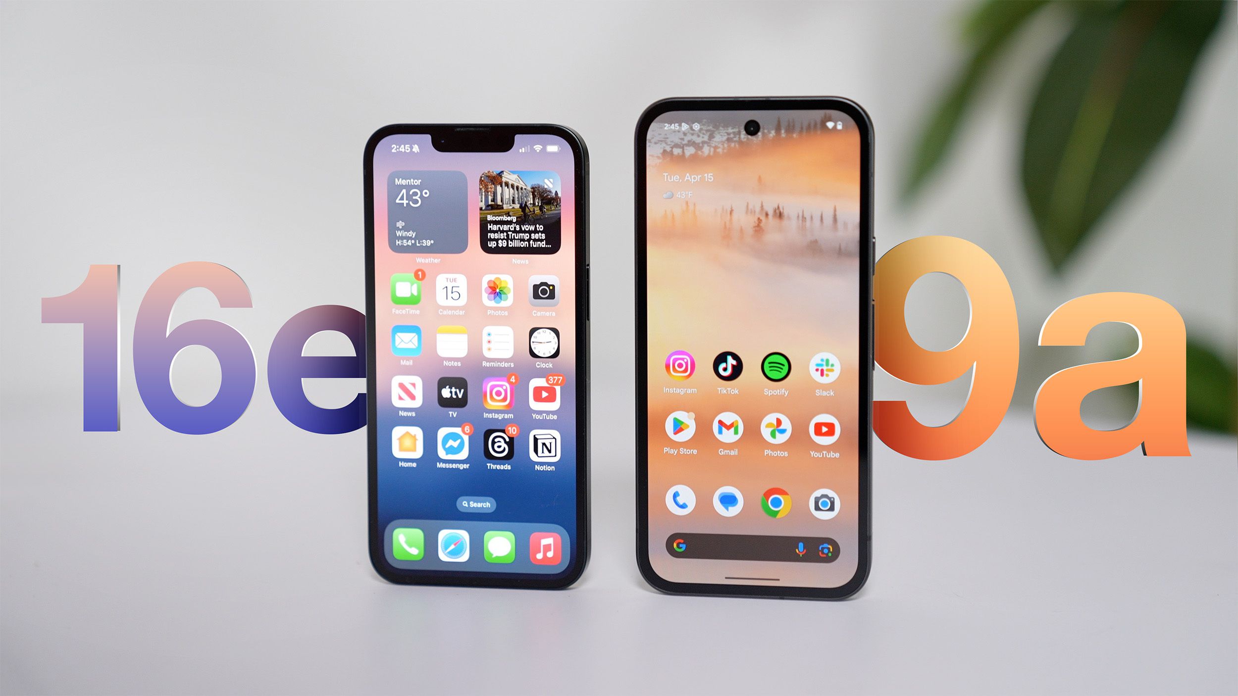
![Pixel 9a vs. Pixel 7a: Is now the time to upgrade? [Video]](https://i0.wp.com/9to5google.com/wp-content/uploads/sites/4/2025/04/Pixel-7a-8a-and-9a-design.jpg?resize=1200%2C628&quality=82&strip=all&ssl=1)


-xl-xl.jpg)


.webp?#)


![[The AI Show Episode 144]: ChatGPT’s New Memory, Shopify CEO’s Leaked “AI First” Memo, Google Cloud Next Releases, o3 and o4-mini Coming Soon & Llama 4’s Rocky Launch](https://www.marketingaiinstitute.com/hubfs/ep%20144%20cover.png)


.png?width=1920&height=1920&fit=bounds&quality=70&format=jpg&auto=webp#)


Top 10 Icon Libraries for Next.js - 2025
Icons are more than just visual candy—they help communicate ideas faster, improve UX, and make your UI look polished. When you're building with Next.js, choosing the best icon library can save time and help you ship with style. Moreover, it keeps your designs consistent and lets you focus on building awesome features. This list is for Next.js developers, designers, and indie hackers looking for powerful, flexible, and modern icon libraries to elevate their web projects in 2025. Lineicons – All-in-One A feature-rich line icons library packed with everything you need—from basic UI elements to detailed categories and pro-level customization. Whether you're building SaaS apps, dashboards, or landing pages, Lineicons has got you covered. 30,000+ total icons (including 4,000+ free icons) 10 unique styles: solid, outlined, duo-tone, rounded, etc. Works seamlessly with React, Next.js, Vue, Svelte, Figma, and more Available in SVG, JSX, TSX, WebP, Base64, HTML, and NPM formats Includes a Figma plugin, Pro CDN, and constantly updated sets Explore Now Heroicons If you're a Tailwind CSS fan, Heroicons feels like a natural fit. Designed by the Tailwind team, these icons are clean, modern, and perfect for minimal UIs. 316+ handcrafted icons in outline and solid styles Official React package with easy imports Fully customizable with Tailwind utilities Lightweight and optimized for performance No learning curve—just drop them in and go Explore Now Feather Icons Feather Icons is a minimalist’s dream. The icons are clean, sharp, and ideal for projects that need clarity without visual clutter. 280+ open-source, SVG-based icons Light file size and consistent stroke width Easily customizable for color, size, and stroke Great for simple UIs, toolbars, and navigation React packages available with optimized imports Explore Now Lucide – Open-Source and Clean Lucide is a community-driven fork of Feather Icons, but with more icons and faster updates. It’s perfect for devs who want feather-light performance and clean, consistent visuals. 1,500+ icons with a consistent stroke and minimal design Built-in support for React, Vue, and other major frameworks Open-source and constantly growing with community input Tree-shakable and lightweight for fast-loading apps Easy to customize strokes and colors in SVG Explore Now Material Icons by Google Google's Material Icons (now called Material Symbols) are a universal choice for building clean, accessible UIs. With multiple visual weights and adaptive features, they offer incredible flexibility. 15+ categories and 3 styles for icons. CSS variable support for easy styling and animation Perfect for web apps, mobile interfaces, and native apps Available as SVG, icon font, and React components Backed by Google’s accessibility standards Explore Now Ant Design Icons If you’re using the Ant Design system, this is the icon library you need. It offers a wide set of elegant icons that match the Ant UI components perfectly. 780+ icons, covering UI, business, and general use cases Built for and bundled with Ant Design (antd) library React-first, with optimized NPM package Consistent design language for enterprise apps Easy integration with tree-shaking for bundle optimization Explore Now MUI – Material UI Icons MUI Icons is Google's Material Icon set re-packaged and optimized for the MUI ecosystem. It's one of the most widely used React-based icon libraries. 2,000+ Material Design icons pre-wrapped in React components Tight integration with MUI (formerly Material UI) Easy props for customization: size, color, style, etc. Built-in accessibility and responsiveness Great for dashboards, mobile-first, and scalable UIs Explore Now Just Icons Just Icons is a bold and striking icon pack built for React projects. It emphasizes clarity and usability, making it ideal for dashboards and admin panels. 5,000+ open-source icons with bold stroke styles Designed specifically for modern web and mobile UIs Supports SVG and React JSX formats Lightweight and customizable for performance Great balance between simplicity and personality Explore Now Phosphor Icons With a beautiful visual identity and multiple weights, Phosphor Icons is a go-to for design-centric teams. You can even animate them or switch weights on the fly. 9,000+ icons with support for thin, bold, fill, and duotone Smooth integration with React, Vue, React Native, and more Easy weight-switching through props in JSX Great for dashboards, mobile apps, and marketing UIs Offers animated icons for extra flair Explore Now Font Awesome Font Awesome has been around forever—and for good reason. It covers everything from UI elements to social media, with a strong ecosystem and loads of tooling. Official React and Next.js component support Icon kits, font-based icons, and SVG modes CDN
Icons are more than just visual candy—they help communicate ideas faster, improve UX, and make your UI look polished. When you're building with Next.js, choosing the best icon library can save time and help you ship with style.
Moreover, it keeps your designs consistent and lets you focus on building awesome features.
This list is for Next.js developers, designers, and indie hackers looking for powerful, flexible, and modern icon libraries to elevate their web projects in 2025.
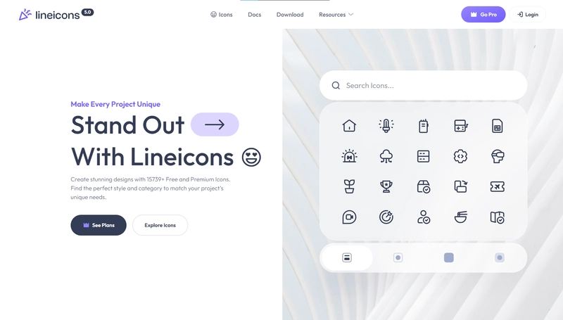
Lineicons – All-in-One
A feature-rich line icons library packed with everything you need—from basic UI elements to detailed categories and pro-level customization. Whether you're building SaaS apps, dashboards, or landing pages, Lineicons has got you covered.
- 30,000+ total icons (including 4,000+ free icons)
- 10 unique styles: solid, outlined, duo-tone, rounded, etc.
- Works seamlessly with React, Next.js, Vue, Svelte, Figma, and more
- Available in SVG, JSX, TSX, WebP, Base64, HTML, and NPM formats
- Includes a Figma plugin, Pro CDN, and constantly updated sets
Heroicons
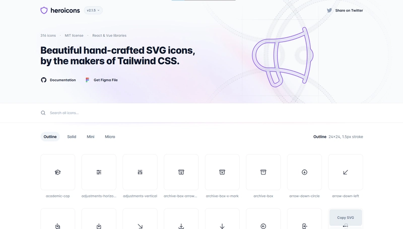
If you're a Tailwind CSS fan, Heroicons feels like a natural fit. Designed by the Tailwind team, these icons are clean, modern, and perfect for minimal UIs.
- 316+ handcrafted icons in outline and solid styles
- Official React package with easy imports
- Fully customizable with Tailwind utilities
- Lightweight and optimized for performance
- No learning curve—just drop them in and go
Feather Icons
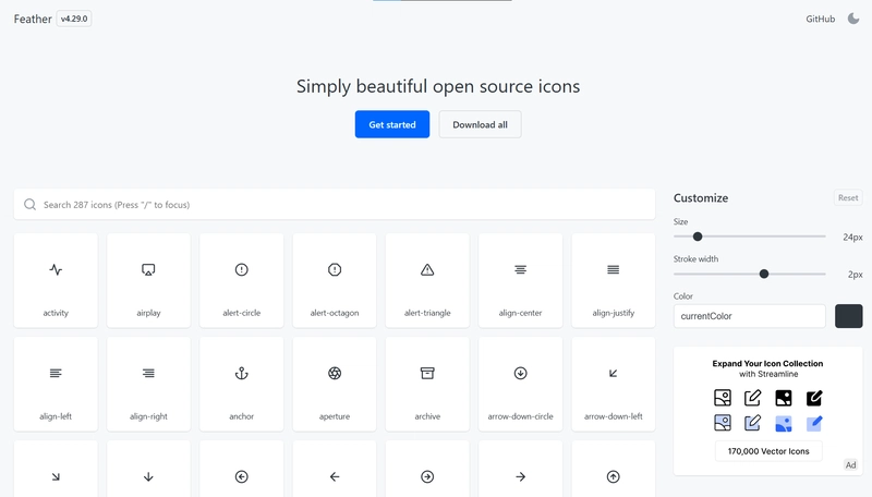
Feather Icons is a minimalist’s dream. The icons are clean, sharp, and ideal for projects that need clarity without visual clutter.
- 280+ open-source, SVG-based icons
- Light file size and consistent stroke width
- Easily customizable for color, size, and stroke
- Great for simple UIs, toolbars, and navigation
- React packages available with optimized imports
Lucide – Open-Source and Clean
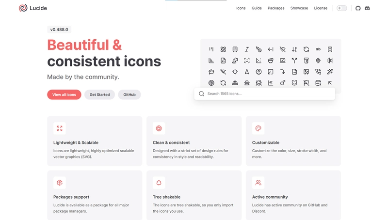
Lucide is a community-driven fork of Feather Icons, but with more icons and faster updates. It’s perfect for devs who want feather-light performance and clean, consistent visuals.
- 1,500+ icons with a consistent stroke and minimal design
- Built-in support for React, Vue, and other major frameworks
- Open-source and constantly growing with community input
- Tree-shakable and lightweight for fast-loading apps
- Easy to customize strokes and colors in SVG
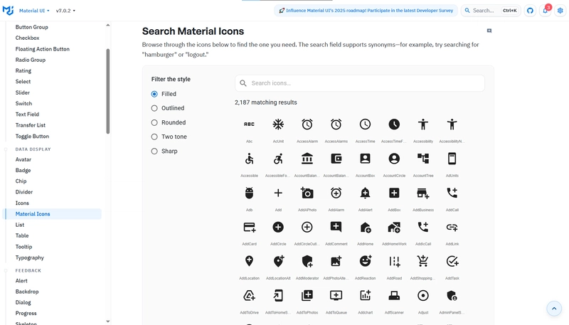
Material Icons by Google
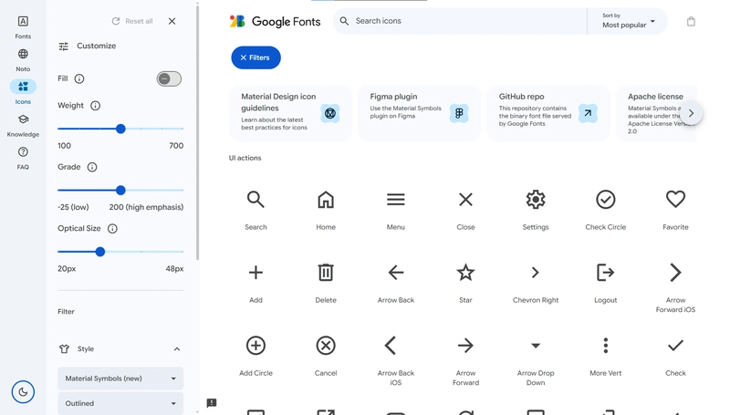
Google's Material Icons (now called Material Symbols) are a universal choice for building clean, accessible UIs. With multiple visual weights and adaptive features, they offer incredible flexibility.
- 15+ categories and 3 styles for icons.
- CSS variable support for easy styling and animation
- Perfect for web apps, mobile interfaces, and native apps
- Available as SVG, icon font, and React components
- Backed by Google’s accessibility standards
Ant Design Icons
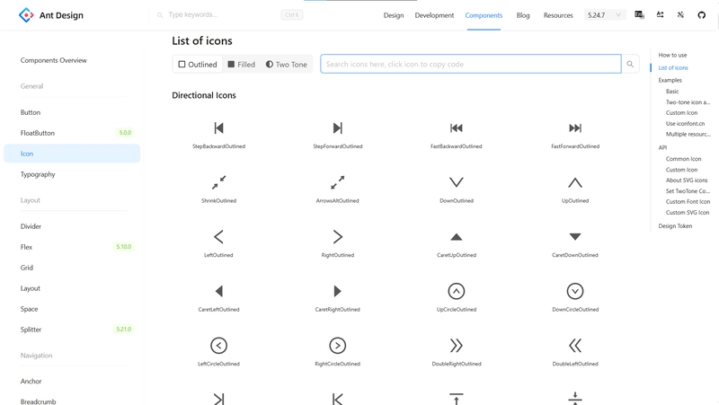
If you’re using the Ant Design system, this is the icon library you need. It offers a wide set of elegant icons that match the Ant UI components perfectly.
- 780+ icons, covering UI, business, and general use cases
- Built for and bundled with Ant Design (antd) library
- React-first, with optimized NPM package
- Consistent design language for enterprise apps
- Easy integration with tree-shaking for bundle optimization
MUI – Material UI Icons
MUI Icons is Google's Material Icon set re-packaged and optimized for the MUI ecosystem. It's one of the most widely used React-based icon libraries.
- 2,000+ Material Design icons pre-wrapped in React components
- Tight integration with MUI (formerly Material UI)
- Easy props for customization: size, color, style, etc.
- Built-in accessibility and responsiveness
- Great for dashboards, mobile-first, and scalable UIs
Just Icons
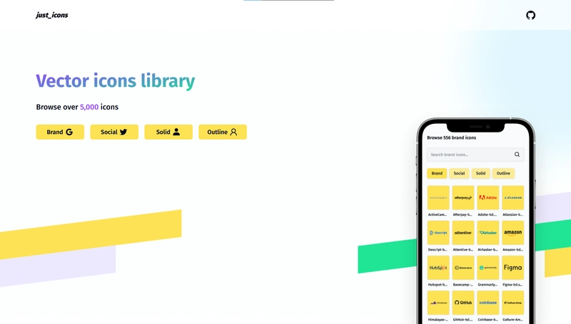
Just Icons is a bold and striking icon pack built for React projects. It emphasizes clarity and usability, making it ideal for dashboards and admin panels.
- 5,000+ open-source icons with bold stroke styles
- Designed specifically for modern web and mobile UIs
- Supports SVG and React JSX formats
- Lightweight and customizable for performance
- Great balance between simplicity and personality
Phosphor Icons
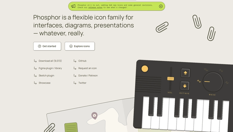
With a beautiful visual identity and multiple weights, Phosphor Icons is a go-to for design-centric teams. You can even animate them or switch weights on the fly.
- 9,000+ icons with support for thin, bold, fill, and duotone
- Smooth integration with React, Vue, React Native, and more
- Easy weight-switching through props in JSX
- Great for dashboards, mobile apps, and marketing UIs
- Offers animated icons for extra flair
Font Awesome
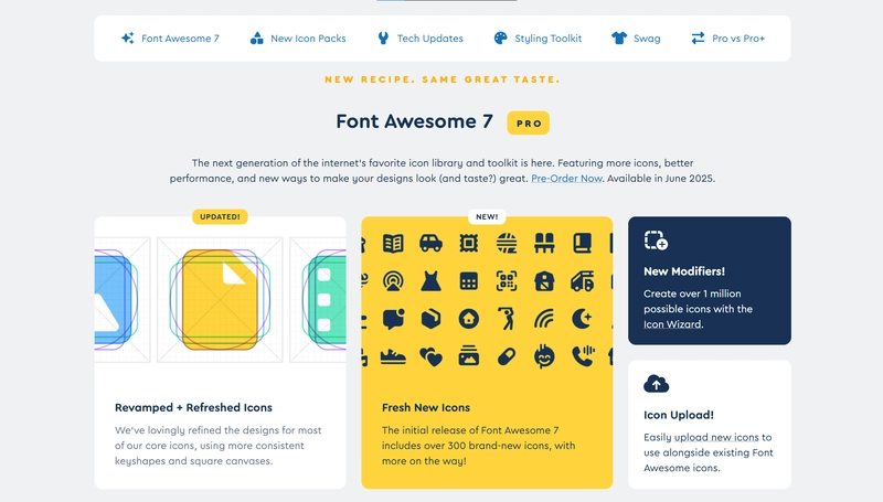
Font Awesome has been around forever—and for good reason. It covers everything from UI elements to social media, with a strong ecosystem and loads of tooling.
- Official React and Next.js component support
- Icon kits, font-based icons, and SVG modes
- CDN and NPM support for fast integration
- Includes brand, utility, and accessibility icons
Iconify
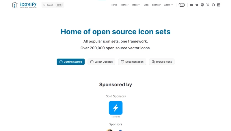
Iconify isn’t just one icon set—it’s an entire platform. It gives you access to nearly every major icon library out there, all from a single source.
- Over 200,000+ open-source vector icons.
- Tree-shaking and lazy-loading support
- React, Vue, Svelte, and plain HTML integrations
- Easy to search and use multiple styles in one project
- Great for teams needing brand icons + utility icons
Bootstrap Icons
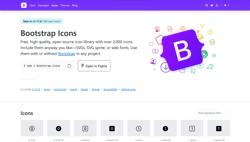
While built by the Bootstrap team, these icons are general-purpose and can be used with any framework—including Next.js.
- 2,000+ icons available under the MIT license
- Designed for sharp legibility and accessibility
- Available via NPM, CDN, or direct download
- Great fit for traditional UIs and form-heavy apps
- Easy to pair with Bootstrap or any utility framework
Streamline Icons
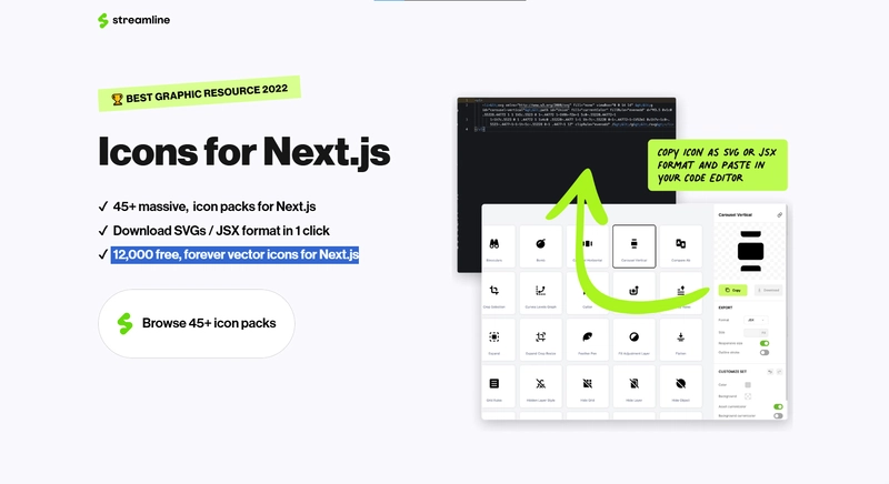
Streamline is a premium icon system offering massive packs tailored for different styles, industries, and branding needs. Perfect for teams that want total control over their design language.
- 12,000 free, forever vector icons for Next.js
- Organized in industry-focused categories (e.g., finance, health, tech)
- Available in SVG, PNG, Figma, and React packages
- High attention to detail and pixel perfection
- Premium license ideal for commercial projects
CoreUI Icons
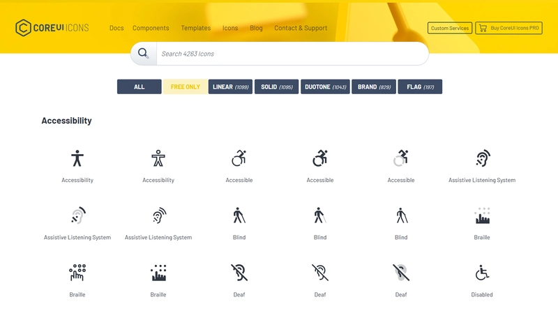
CoreUI Icons is a free and open-source set built specifically for admin panels, dashboards, and control panels. It’s simple, practical, and React-ready.
- 4,200+ icons in multiple variants: linear, duotone, and brand
- Perfect for business and backend UI needs
- Easy to use via SVG or CoreUI’s React components
- Small file sizes, built-in accessibility
- Ideal pairing with CoreUI Admin templates
Final Thoughts
Whether you're building a SaaS dashboard, e-commerce store, or portfolio with Next.js, a good icon library helps speed up dev time and polish your UI.
Try a few of these and see what fits your style!
Have a favorite we didn’t cover in the list? Drop it in the comments—we’d love to hear from you!