


![Apple to Split Enterprise and Western Europe Roles as VP Exits [Report]](https://www.iclarified.com/images/news/97032/97032/97032-640.jpg)
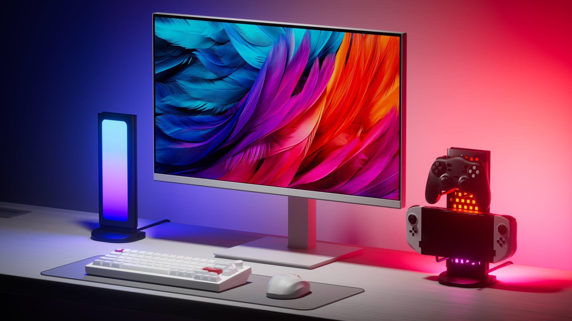
![Nanoleaf Announces New Pegboard Desk Dock With Dual-Sided Lighting [Video]](https://www.iclarified.com/images/news/97030/97030/97030-640.jpg)
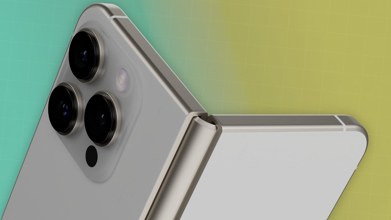
![Apple's Foldable iPhone May Cost Between $2100 and $2300 [Rumor]](https://www.iclarified.com/images/news/97028/97028/97028-640.jpg)


![Alleged Pixel 10 series wallpapers leak with vibrant colors and a strange new theme [Gallery]](https://i0.wp.com/9to5google.com/wp-content/uploads/sites/4/2025/04/pixel-10-wallpaper-leak-1.jpg?resize=1200%2C628&quality=82&strip=all&ssl=1)


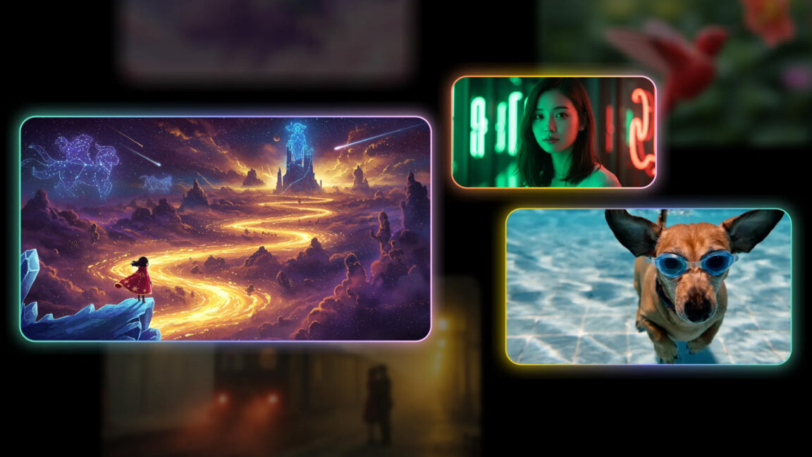
![[The AI Show Episode 144]: ChatGPT’s New Memory, Shopify CEO’s Leaked “AI First” Memo, Google Cloud Next Releases, o3 and o4-mini Coming Soon & Llama 4’s Rocky Launch](https://www.marketingaiinstitute.com/hubfs/ep%20144%20cover.png)


Build a Responsive Image Gallery Using Flexbox and Grid
Build a Responsive Image Gallery Using Flexbox and Grid Looking for a clean, responsive image gallery for your portfolio or project? In this tutorial, we’ll walk through how to build one using just HTML and CSS — no JavaScript, no libraries, just layout magic. We'll combine the power of Flexbox for structure and CSS Grid for responsive image placement. Step 1: Set Up the Basic HTML We’ll start with a simple container and image elements. You can replace the image URLs with your own or use placeholders like the ones shown here. Step 2: Style the Gallery With CSS Grid Now let’s apply grid layout styles to the container so the images arrange themselves cleanly across different screen sizes. .gallery { display: grid; grid-template-columns: repeat(auto-fit, minmax(150px, 1fr)); gap: 12px; padding: 20px; max-width: 1000px; margin: auto; } .gallery img { width: 100%; display: block; border-radius: 8px; object-fit: cover; } This setup ensures: Images stretch to fit their container The grid adapts to the screen size Spacing and alignment look clean at any width Step 3: Make It Look Even Better You can easily add hover effects, light/dark mode tweaks, or even a lightbox script later if you want interactivity. Here’s a quick hover effect: .gallery img:hover { transform: scale(1.03); transition: transform 0.2s ease-in-out; box-shadow: 0 2px 12px rgba(0, 0, 0, 0.2); } Conclusion You now have a flexible, elegant image gallery built entirely with CSS Grid and Flexbox principles. This type of layout is ideal for showcasing portfolio pieces, product photos, or blog content blocks. Want more tutorials like this? Check out the rest of my dev.to posts here. If this guide helped you, you can support my work with a coffee: https://buymeacoffee.com/hexshift

Build a Responsive Image Gallery Using Flexbox and Grid
Looking for a clean, responsive image gallery for your portfolio or project? In this tutorial, we’ll walk through how to build one using just HTML and CSS — no JavaScript, no libraries, just layout magic. We'll combine the power of Flexbox for structure and CSS Grid for responsive image placement.
Step 1: Set Up the Basic HTML
We’ll start with a simple container and image elements. You can replace the image URLs with your own or use placeholders like the ones shown here.


Step 2: Style the Gallery With CSS Grid
Now let’s apply grid layout styles to the container so the images arrange themselves cleanly across different screen sizes.
.gallery {
  display: grid;
  grid-template-columns: repeat(auto-fit, minmax(150px, 1fr));
  gap: 12px;
  padding: 20px;
  max-width: 1000px;
  margin: auto;
}

.gallery img {
  width: 100%;
  display: block;
  border-radius: 8px;
  object-fit: cover;
}
This setup ensures:
- Images stretch to fit their container
- The grid adapts to the screen size
- Spacing and alignment look clean at any width
Step 3: Make It Look Even Better
You can easily add hover effects, light/dark mode tweaks, or even a lightbox script later if you want interactivity. Here’s a quick hover effect:
.gallery img:hover {
  transform: scale(1.03);
  transition: transform 0.2s ease-in-out;
  box-shadow: 0 2px 12px rgba(0, 0, 0, 0.2);
}
Conclusion
You now have a flexible, elegant image gallery built entirely with CSS Grid and Flexbox principles. This type of layout is ideal for showcasing portfolio pieces, product photos, or blog content blocks.
Want more tutorials like this? Check out the rest of my dev.to posts here.
If this guide helped you, you can support my work with a coffee:
https://buymeacoffee.com/hexshift