


![Jony Ive and OpenAI Working on AI Device With No Screen [Kuo]](https://www.iclarified.com/images/news/97401/97401/97401-640.jpg)

![Anthropic Unveils Claude 4 Models That Could Power Apple Xcode AI Assistant [Video]](https://www.iclarified.com/images/news/97407/97407/97407-640.jpg)
![Apple Accelerates Smart Glasses for 2026, Cancels Watch With Camera [Report]](https://www.iclarified.com/images/news/97408/97408/97408-640.jpg)


-xl.jpg)


.webp?#)


_David_Hall_-Alamy.jpg?width=1280&auto=webp&quality=80&disable=upscale#)
_Andriy_Popov_Alamy_Stock_Photo.jpg?width=1280&auto=webp&quality=80&disable=upscale#)


![[The AI Show Episode 148]: Microsoft’s Quiet AI Layoffs, US Copyright Office’s Bombshell AI Guidance, 2025 State of Marketing AI Report, and OpenAI Codex](https://www.marketingaiinstitute.com/hubfs/ep%20148%20cover%20%281%29.png)


![Laid off but not afraid with X-senior Microsoft Dev MacKevin Fey [Podcast #173]](https://cdn.hashnode.com/res/hashnode/image/upload/v1747965474270/ae29dc33-4231-47b2-afd1-689b3785fb79.png?#)


-1-52-screenshot.png?width=1920&height=1920&fit=bounds&quality=70&format=jpg&auto=webp#)

.png?width=1920&height=1920&fit=bounds&quality=70&format=jpg&auto=webp#)


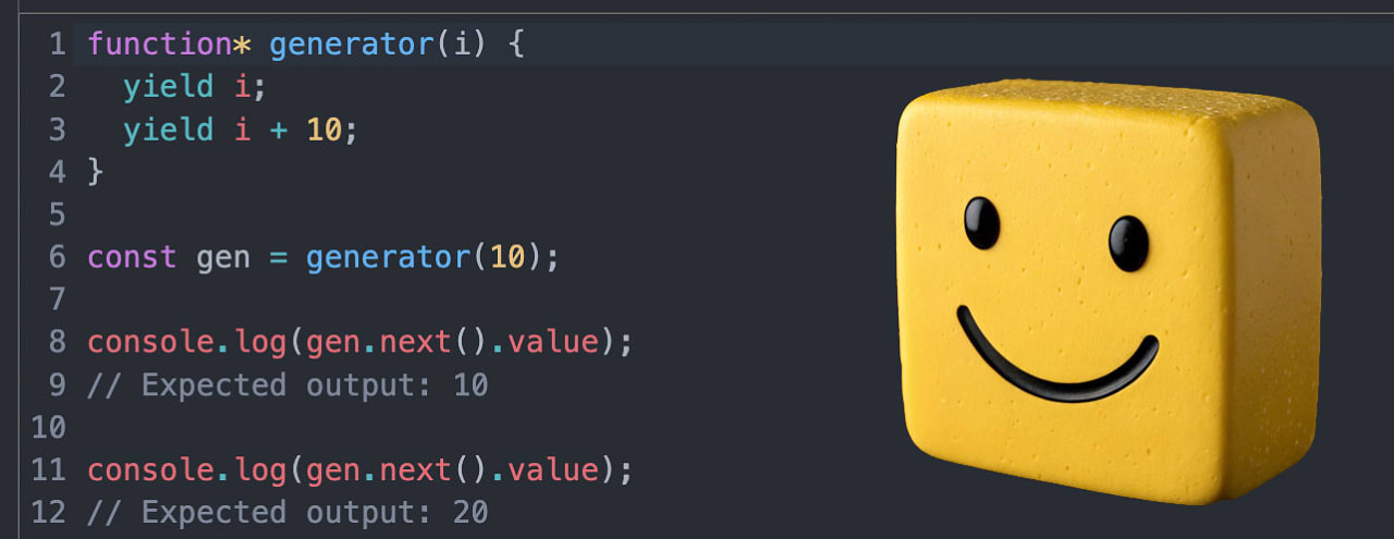
How to Use React 19 in Power Apps PCF Components
The Power Apps Component Framework – PCF for short – lets you create complex custom components using traditional web development tools like HTML, CSS, and JavaScript. When creating a new PCF project, you can choose from two types of controls: standar...

The Power Apps Component Framework – PCF for short – lets you create complex custom components using traditional web development tools like HTML, CSS, and JavaScript.
When creating a new PCF project, you can choose from two types of controls: standard controls and React virtual controls. For non-trivial components, React is often a good choice because it abstracts away much of the heavy DOM manipulation. But, when you’re using React with PCF, you’re currently limited to React 16 in Canvas apps and React 17 in Model-Driven apps.
That doesn’t mean you can’t use a newer version – but doing so means opting out of virtualization support. For many PCF components, that trade-off is usually acceptable.
In this article, I’ll show you how to integrate the latest version of React (v19) with your PCF component. We’ll install the necessary dependencies and configure the component to take full advantage of the latest version of React.
This article assumes that you:
Understand how to use the PAC CLI to create PCF projects.
Are comfortable using the command line and a code editor (for example, VS Code)
Know the basics of React
Have some experience with PCF development
Note: You don’t need access to a Power Platform environment unless you want to deploy the component. The built-in test harness will be sufficient to follow along with this article.
In this tutorial, you will:
Create a PCF Project
To create a PCF project, you’ll use the PAC CLI. If you haven’t installed it yet, follow the instructions here.
From the directory of your choice, create a new folder for this project, and then open your terminal and run:
pac pcf init -ns SampleNameSpace -n SampleComponent --template field
Once it finishes, run:
npm install
This installs the default project dependencies.
So why didn’t we use the --framework flag to specify React during project creation? Because that flag sets up a React virtual control, which only supports React 16/17. Instead, we’re creating a standard control and installing React ourselves.
Install the React Dependencies
To use React 19, you’ll need four dependencies:
reactreact-dom@types/react@types/react-dom
These last two provide TypeScript typings for React. Install the above dependencies with:
npm install -D react react-dom @types/react @types/react-dom
You can verify the installation by looking at the package.json file in the project.

While not necessary for what we will be doing, in order to use some newer React features, you may need to tweak the compilerOptions in the tsconfig.json file to include the line below:
"jsx": "react-jsx"
Here is what the tsconfig.json file should look like with the added jsx line:

Create a Non-React Button
Let’s verify that everything works before we introduce React.
From the command line, run:
npm run start:watch
This may take a moment. It will open a browser showing your PCF test harness. You’ll likely see an empty screen. That’s expected – we haven’t rendered anything yet.
Open index.ts in the SampleComponent folder. This file contains a class that implements the PCF standard control interface. Let’s create a basic non-React button.
Update the init method in the index.ts file like this:
public init(
    context: ComponentFramework.Context,
    notifyOutputChanged: () => void,
    state: ComponentFramework.Dictionary,
    container: HTMLDivElement
): void {
    // A basic button with vanilla JS and the DOM
    const btn = document.createElement('button');
    btn.textContent = 'Click me!';
    container.appendChild(btn);

    // A simple event lister for button clicks
    btn.addEventListener('click', () => {
        alert('Button clicked!');
    });
}
Now, head back to your test harness. You should see a button. Clicking it should display an alert.


Create a React Button
Next, let’s replace our plain DOM code with React.
Delete the button code from init(), leaving the init method empty.
Then, create a new file: Button.tsx. Inside Button.tsx, add the code below. This component will accept a label prop and emit an onClick event. Make sure to export the function.
export default function Button(props: { label: string; onClick: () => void }) {
return ;
}
Add the React Button to the PCF Component
In index.ts, update the file to:
Import
createRootfromreact-dom/clientImport the
ButtoncomponentRender the
Buttoncomponent
Here is the minimal example:
import { createRoot } from 'react-dom/client'; // import the createRoot method
import Button from './Button'; //import the button.tsx component we just created

export class SampleComponent
    implements ComponentFramework.StandardControl
{
    constructor() {
        // Empty
    }
    public init(
        context: ComponentFramework.Context,
        notifyOutputChanged: () => void,
        state: ComponentFramework.Dictionary,
        container: HTMLDivElement
    ): void {
        // Add the code below to create a React root that allows us to render our button component.
        const root = createRoot(container);
        root.render(
            Button({ label: 'React Button', onClick: () => alert('React Button Clicked!') })
        );
    }
    // Other methods here...
}
You should now see “React Button” in the browser. Clicking it will trigger the alert.


Render the React Button When the PCF Component Updates
Many PCF components receive dynamic input values. If the inputs change, we want the React component to re-render. This is where updateView() comes in. updateView() is triggered when the PCF property bag changes.
Let’s move the rendering logic from init() to updateView().
First, import Root from react-dom/client, and initialize root as a property of the class.
import { createRoot, Root } from 'react-dom/client'; //add Root as an import

export class SampleComponent implements ComponentFramework.StandardControl {
    root: Root; // initialize the root property on the SampleComponent class
    constructor() {
        // Empty
    }
    // other methods here...
}
Then, modify init() to set this.root to the root created by React’s createRoot method. Move the rendering logic from the init method to updateView(), replacing root with this.root.
public init(
    context: ComponentFramework.Context,
    notifyOutputChanged: () => void,
    state: ComponentFramework.Dictionary,
    container: HTMLDivElement
    ): void {
        this.root = createRoot(container); // assign the root React creates to this.root
    }

public updateView(context: ComponentFramework.Context): void {
    // render the React button component, by referencing this.root
    this.root.render(
        Button({ label: 'React Button', onClick: () => alert('Button Clicked!') })
    );
}
With the above setup, React will now re-render your button when the property bag of a PCF component changes.
Wrapping Up
You’ve now created a PCF component that uses the latest version of React! By installing and configuring React manually, you avoid the version limitations of Microsoft’s built-in React controls – unlocking the power of modern React features.
While this setup doesn’t support virtualization, for many components that’s a fair trade-off for modern tooling and maintainability.
If you’re building PCF components beyond simple DOM manipulation, React can be a powerful way to improve your development workflow and UI flexibility.
Enjoyed this article? I write regularly about low-code, development patterns, and practical tech topics at scriptedbytes.com


