The Power of calc() – Your CSS Playbook to Victory
1. The Pregame Pep Talk: What is calc()? "Alright, team, huddle up! We’re about to unleash the MVP of CSS—the one, the only, calc()! This isn’t just some function; it’s the powerhouse you’ve been waiting for, ready to tackle any layout challenge you throw its way. Picture this: a tool that lets you crunch numbers—pixels, percentages, ems, you name it—right in your styles. It’s been hiding in plain sight, waiting for you to grab it and dominate the game. We’re talking flexibility, precision, and pure CSS muscle. You ready to make some plays? Because calc() is about to change everything!" "Think of it like having a calculator in your playbook—width: calc(100% - 20px)—BOOM, precision! No more guessing, no more sloppy spacing. You’ve got the power to mix units, solve problems, and leave the competition in the dust. Let’s break it down with some real moves—check these out!" Example 1: The Sidebar Slam "Imagine you’ve got a sidebar that needs to sit pretty next to your main content. You want it 200px wide, and the rest of the space? All yours. Here’s how calc() steps up:" .sidebar { width: 200px; } .main-content { width: calc(100% - 200px); } "See that? calc(100% - 200px) nails it—your main content stretches perfectly, no overlap, no fuss. That’s a clean win, team!" Example 2: The Responsive Rumble "Now let’s get scrappy with a responsive hero section. You want padding that scales—say, 20px plus 2% of the viewport width. calc() makes it happen:" .hero { padding: calc(20px + 2vw); } "Look at that beauty! As the screen size shifts, that padding flexes like a champ—20px as your base, plus a little extra juice from 2vw. It’s dynamic, it’s slick, it’s YOU taking control!" "This is just the warm-up, team—calc() is your secret sauce, ready to solve problems you didn’t even know you had. It’s not about rigid rules; it’s about freedom to create. So lace up, get fired up, and let’s take this CSS game to the next level—together!" There you go—high-energy, inspiring, and packed with two killer examples to rally the troops. How’s this feel, coach? Ready to expand it or tweak the vibe? Let’s keep the momentum rolling! 2. Why It’s a Game-Changer: The Stakes Are High "Listen up, team—this isn’t just practice, this is the championship! calc() isn’t some sideline trick; it’s the heart-pounding, game-changing playmaker that’s about to redefine how you dominate CSS. Why does it matter? Because the stakes are sky-high out there—layouts that don’t just sit there, they adapt. Spacing that doesn’t just work, it sings. And those hard-coded hacks you’ve been wrestling with? Kiss ‘em goodbye. With calc(), you’re not just coding—you’re crafting a masterpiece that flexes on every screen. Let’s win this!" "This is about real-world victories, team. Responsive grids that snap into place like a perfectly executed play. Dynamic padding that moves with the crowd, not against it. You’re not here to settle for ‘good enough’—you’re here to own the field. Let’s break it down with some clutch moments where calc() steals the show!" Example 1: The Responsive Grid Glory "Picture a three-column grid—each column needs to share the space, but you’ve got 20px gutters between them. Hard-coding widths? That’s a fumble waiting to happen. calc() steps in and scores:" .column { width: calc((100% - 40px) / 3); margin-right: 20px; } .column:last-child { margin-right: 0; } "Check that out! calc((100% - 40px) / 3) splits the width minus two 20px gaps, giving you three equal columns that adapt like champs. Resize the screen—boom, it holds strong. That’s a grid that fights to win!" Example 2: The Dynamic Padding Power Move "Now imagine a card component—padding that scales with the viewport so it’s never too cramped or too loose. calc() delivers the knockout punch:" .card { padding: calc(10px + 1.5vw); } "Feel that intensity! calc(10px + 1.5vw) keeps a solid 10px base but adds a viewport boost—small screens stay tight, big screens breathe easy. That’s not just padding, that’s a statement—your design’s alive, team!" "This is why calc() matters—it’s your ticket to layouts that don’t break, spacing that doesn’t buckle, and a workflow that doesn’t waste time. Every pixel’s a battle, every line’s a chance to shine. You’ve got the tool, you’ve got the talent—now go out there and build something unstoppable. The crowd’s waiting!" 3. Play-by-Play: How to Use It Like a Pro "Alright, squad, gather ‘round—we’re breaking this down like it’s game day! calc() is your star player, and I’m your coach walking you through the playbook. The syntax? Simple, clean, and powerful: property: calc(expression). That’s it—plug in your numbers, mix your units, and let it rip. We’re talking pixels, percentages, ems, whatever you’ve got—calc() handles it like a seasoned vet. You want margins that adjust? Sizes that dance? This is your move. Line up your

1. The Pregame Pep Talk: What is calc()?
"Alright, team, huddle up! We’re about to unleash the MVP of CSS—the one, the only, calc()! This isn’t just some function; it’s the powerhouse you’ve been waiting for, ready to tackle any layout challenge you throw its way. Picture this: a tool that lets you crunch numbers—pixels, percentages, ems, you name it—right in your styles. It’s been hiding in plain sight, waiting for you to grab it and dominate the game. We’re talking flexibility, precision, and pure CSS muscle. You ready to make some plays? Because calc() is about to change everything!"
"Think of it like having a calculator in your playbook—width: calc(100% - 20px)—BOOM, precision! No more guessing, no more sloppy spacing. You’ve got the power to mix units, solve problems, and leave the competition in the dust. Let’s break it down with some real moves—check these out!"
Example 1: The Sidebar Slam
"Imagine you’ve got a sidebar that needs to sit pretty next to your main content. You want it 200px wide, and the rest of the space? All yours.
Here’s how calc() steps up:"
.sidebar {
  width: 200px;
}

.main-content {
  width: calc(100% - 200px);
}
"See that? calc(100% - 200px) nails it—your main content stretches perfectly, no overlap, no fuss. That’s a clean win, team!"
Example 2: The Responsive Rumble
"Now let’s get scrappy with a responsive hero section. You want padding that scales—say, 20px plus 2% of the viewport width. calc() makes it happen:"
.hero {
  padding: calc(20px + 2vw);
}
"Look at that beauty! As the screen size shifts, that padding flexes like a champ—20px as your base, plus a little extra juice from 2vw. It’s dynamic, it’s slick, it’s YOU taking control!"
"This is just the warm-up, team—calc() is your secret sauce, ready to solve problems you didn’t even know you had. It’s not about rigid rules; it’s about freedom to create. So lace up, get fired up, and let’s take this CSS game to the next level—together!"
There you go—high-energy, inspiring, and packed with two killer examples to rally the troops. How’s this feel, coach? Ready to expand it or tweak the vibe? Let’s keep the momentum rolling!
2. Why It’s a Game-Changer: The Stakes Are High
"Listen up, team—this isn’t just practice, this is the championship! calc() isn’t some sideline trick; it’s the heart-pounding, game-changing playmaker that’s about to redefine how you dominate CSS. Why does it matter? Because the stakes are sky-high out there—layouts that don’t just sit there, they adapt. Spacing that doesn’t just work, it sings. And those hard-coded hacks you’ve been wrestling with? Kiss ‘em goodbye. With calc(), you’re not just coding—you’re crafting a masterpiece that flexes on every screen. Let’s win this!"
"This is about real-world victories, team. Responsive grids that snap into place like a perfectly executed play. Dynamic padding that moves with the crowd, not against it. You’re not here to settle for ‘good enough’—you’re here to own the field. Let’s break it down with some clutch moments where calc() steals the show!"
Example 1: The Responsive Grid Glory
"Picture a three-column grid—each column needs to share the space, but you’ve got 20px gutters between them. Hard-coding widths? That’s a fumble waiting to happen. calc() steps in and scores:"
.column {
  width: calc((100% - 40px) / 3);
  margin-right: 20px;
}
.column:last-child {
  margin-right: 0;
}
"Check that out! calc((100% - 40px) / 3) splits the width minus two 20px gaps, giving you three equal columns that adapt like champs. Resize the screen—boom, it holds strong. That’s a grid that fights to win!"
Example 2: The Dynamic Padding Power Move
"Now imagine a card component—padding that scales with the viewport so it’s never too cramped or too loose. calc() delivers the knockout punch:"
.card {
  padding: calc(10px + 1.5vw);
}
"Feel that intensity! calc(10px + 1.5vw) keeps a solid 10px base but adds a viewport boost—small screens stay tight, big screens breathe easy. That’s not just padding, that’s a statement—your design’s alive, team!"
"This is why calc() matters—it’s your ticket to layouts that don’t break, spacing that doesn’t buckle, and a workflow that doesn’t waste time. Every pixel’s a battle, every line’s a chance to shine. You’ve got the tool, you’ve got the talent—now go out there and build something unstoppable. The crowd’s waiting!"
3. Play-by-Play: How to Use It Like a Pro
"Alright, squad, gather ‘round—we’re breaking this down like it’s game day! calc() is your star player, and I’m your coach walking you through the playbook. The syntax? Simple, clean, and powerful: property: calc(expression). That’s it—plug in your numbers, mix your units, and let it rip. We’re talking pixels, percentages, ems, whatever you’ve got—calc() handles it like a seasoned vet. You want margins that adjust? Sizes that dance? This is your move. Line up your units, execute the play—watch it stick the landing every time!"
"Let’s run some drills—simple stuff first, then we’ll get creative. You’re not just learning here; you’re mastering the game. Check these plays out!"
Example 1: The Margin Maneuver
"Need a sidebar with a margin that shrinks as the screen grows? Let’s set it up—20px base, plus 5% of the viewport width. Here’s the call:"
.sidebar {
  margin-left: calc(20px + 5%);
}
"See that? calc(20px + 5%) mixes a fixed pixel base with a percentage kick—small screens stay tight, big screens open up. It’s smooth, it’s smart, it’s you running the field like a pro!"
Example 2: The Dynamic Height Hustle
"Now let’s get wild—say you’ve got a hero section that needs to feel epic. You want 50% of the viewport height, plus 2rem for flair, minus 10px to dodge a header. Boom, here’s the play:"
.hero {
  height: calc(50vh + 2rem - 10px);
}
"Look at that beauty! calc(50vh + 2rem - 10px) juggles three units like it’s nothing—viewport height for scale, rems for polish, pixels for precision. That’s not just a height, that’s a statement. You’re calling the shots now!"
"This is your moment, team—calc() lets you mix it up however you need. Margins, widths, heights—it’s all in your hands. Keep it tight, keep it sharp, and don’t be afraid to push the limits. I’ve shown you the moves; now you take the ball and run it. You’ve got the strategy—go make it happen!"
There’s your section—confident, clear, and packed with two examples (one simple, one wild) to guide the team to victory. How’s this play looking, coach? Ready to refine it or move to the next down? Let’s keep the momentum!
4. Trick Shots: Creative Uses to Steal the Show
"Okay, team, this is where we have some fun—time to pull off the trick shots that leave the crowd roaring! calc() isn’t just a workhorse; it’s your ticket to the highlight reel, the wild card that turns heads and wins games. We’re talking unexpected moves—centering like a magician, typography that flows like a dream, even animation tweaks that hit the buzzer. Don’t play it safe; let’s get creative and show the world what you’ve got. Picture this: a headline that scales perfectly with font-size: calc(1rem + 1vw). That’s your highlight reel!"
"Ready to wow ‘em? Let’s toss up some jaw-dropping plays and inspire you to experiment—because this is where you shine!"
Example 1: The Centering Slam Dunk
"Centering an element dead-on, no sweat? Forget the old Flexbox shuffle—calc() pulls a fast one. Say your box is 300px wide—here’s the move:"
.centered-box {
  width: 300px;
  position: absolute;
  left: calc(50% - 150px); /* Half the width! */
}
"Boom! calc(50% - 150px) lands it smack in the middle—50% of the screen minus half the box’s width. It’s clean, it’s slick, and it works every time. Try it with a variable width—go on, dare to dazzle!"
Example 2: The Fluid Typography Triple
"Now let’s flex those creative muscles—fluid text that grows with the viewport but stays grounded. Watch this:"
h1 {
  font-size: calc(1.5rem + 2vw);
}
"Look at that! calc(1.5rem + 2vw) gives you a solid 1.5rem base—readable anywhere—then adds 2% of the viewport width for that big-screen swagger. Small screens? Crisp. Huge monitors? Epic. That’s your typography doing a victory dance!"
"This is your playground, team—calc() lets you bend the rules and break the mold. Try it for animation delays, like animation-delay: calc(0.5s + 1vw), or stack it with transforms. Don’t just use it—own it! Experiment, tweak, and strut your stuff. You’ve got the skills; now go steal the show!"
There it is—playful, inspiring, and loaded with two dazzling examples to push the team to new heights. How’s this trick shot landing, coach? Want to tweak the flair or keep the ball rolling? Let’s make it legendary!
5. Overcoming the Defense: Browser Support and Pitfalls
"Alright, team, heads up—we’re in the clutch now! calc() is your all-star, and the field’s wide open, but every great play needs a solid defense. I’m here to break it down: the practical stuff, the nitty-gritty that keeps us winning. First, the good news—browser support? Rock-solid, even back to IE9+. That’s right, this champ’s been battle-tested across the board—Chrome, Firefox, Safari, you name it. You’re not fighting compatibility wars here; you’re free to swing big. We’ve got this!"
"But hold tight—there’s a catch to watch for. The syntax is your playbook, and it’s gotta be tight. Spacing matters—calc(100% - 20px) is your golden ticket, but calc(100%-20px)? That’s a fumble, a rookie mistake that’ll get flagged. Keep those spaces around the operators, and you’re error-free. The field’s wide open, but stay sharp—sloppy spacing loses points. Let’s run some clean examples and lock it in!"
Example 1: The Safe Width Win
"Need a content area that adjusts perfectly? Here’s how you play it safe and smart:"
.content {
  width: calc(100% - 50px); /* Spaces around the minus—crisp and clean! */
}
"See that? calc(100% - 50px) subtracts 50px from the full width—plenty of room for a sidebar or margin. Browsers eat it up, from ancient IE9 to bleeding-edge Chrome. Keep those spaces, and it’s a guaranteed score!"
Example 2: The Padding Precision Pass
"Now let’s push it—padding that scales but stays bulletproof. Watch this:"
.section {
  padding: calc(10px + 2%); /* Spaces around the plus—flawless execution! */
}
"Look at that beauty! calc(10px + 2%) mixes pixels and percentages like a pro—10px base plus a 2% boost. Every browser from 2012 to today runs it smooth. But skip the spaces—calc(10px+2%)—and you’re risking a timeout. Stay disciplined, and you’re untouchable!"
"This is your game plan, team—calc() has your back with killer support, but you’ve gotta execute with precision. Spaces are your secret weapon; keep ‘em in, keep errors out. You’re not just playing here—you’re dominating. Stay focused, run it clean, and we’ll clear every hurdle. Let’s finish strong!"
There you go—reassuring, strategic, and packed with two examples to keep the team on point. How’s this defense looking, coach? Ready to tighten it up or move to the next play? Let’s keep the focus and take it home!
6. The Victory Lap: Putting It All Together
"Team, this is it—the victory lap! You’ve trained, you’ve strategized, and now it’s time to put it all on the field with calc(). We’re not just talking theory anymore—this is where you flex everything you’ve got and show the world what a champion looks like. Picture a responsive card layout: margins that breathe, widths that adapt, all powered by calc(). This isn’t just a win; it’s a blowout. Look at that layout—clean, crisp, unstoppable. That’s your signature move now, team!"
"Let’s seal this with a full-on play—something you can take, tweak, and make your own. You’re not walking off this field; you’re sprinting to the next project, ready to dominate. Check these out and feel the rush!"
Example 1: The Responsive Card Layout Grand Slam
"Here’s the crown jewel—a card grid that bends but never breaks. Three cards, dynamic widths, perfect spacing. Watch this:"
.card-container {
  display: flex;
  gap: 20px;
}
.card {
  width: calc((100% - 40px) / 3); /* Two 20px gaps split across three cards */
  padding: calc(10px + 1vw);
  background: #f5f5f5;
}
"BOOM! calc((100% - 40px) / 3) splits the width minus the gaps—each card adjusts like a dream. Then calc(10px + 1vw) on the padding? That’s flair and function, scaling with the screen. Resize it, test it, own it—clean as a whistle and unstoppable!"
Example 2: The Hero Banner Clutch Finish
"Now let’s cap it with a hero banner—height that pops, no matter the device. Here’s the closer:"
.hero-banner {
  height: calc(60vh - 50px);
  margin: calc(20px + 1%);
  background: linear-gradient(45deg, #ff6b6b, #4ecdc4);
}
"Feel that roar! calc(60vh - 50px) nails a viewport-driven height, dodging a pesky header, while calc(20px + 1%) keeps the margins fluid. It’s bold, it’s beautiful, and it’s yours to claim!"
"This is your moment, team—calc() ties it all together, from gritty layouts to dazzling details. Take this card setup, run it in your next project, and watch jaws drop. You’ve got the tools, the swagger, the skills to own the CSS game. This isn’t the end—it’s your launchpad. Go out there, build something epic, and let’s keep the winning streak alive!"
7. Final Huddle: Go Out and Crush It
"Alright, team, bring it in—this is our moment! You’ve seen the power of calc(), you’ve run the plays, and now it’s time to take it to the streets. This isn’t just a wrap-up; it’s your call to action. Get out there and experiment—tweak it, twist it, make calc() your own. Share your wins with the crew—post those slick layouts, those genius hacks, and let’s cheer each other on. Don’t stop here; keep pushing the boundaries of what CSS can do. You’re not just players—you’re trailblazers, and the web’s waiting for your next big move!"
"Need a spark? Here’s some fuel for the fire—two more tricks to kick things off. You’ve got the tools, the talent—now go make the web bow to your brilliance!"
Example 1: The Sticky Footer Fire
"Want a footer that sticks like glue, no matter the content height? calc() makes it sing:"
.main-content {
  min-height: calc(100vh - 60px); /* Full height minus footer */
}
.footer {
  height: 60px;
}
"Look at that! calc(100vh - 60px) ensures your content fills the viewport, leaving just enough room for that 60px footer. It’s simple, it’s smooth, and it’s begging for you to try it—go make it yours!"
Example 2: The Scaling Border Blitz
"How about a border that grows with the screen? Here’s a little razzle-dazzle:"
.box {
  border: calc(2px + 0.5vw) solid #ff6b6b;
  padding: 20px;
}
"Feel that heat! calc(2px + 0.5vw) starts at 2px but scales up as the viewport widens—subtle on mobile, bold on desktop. It’s a small tweak with big impact. Take it, run with it, and show off what you’ve got!"
"This is your send-off, team—calc() is in your hands, and the playbook’s wide open. Experiment like mad, share your victories, and don’t settle for ordinary. You’ve got the spark, the skill, the guts to redefine what’s possible. Now hit the field, crush it, and let’s make some noise. You’ve got the tools, the talent—now go make the web bow to your brilliance!"












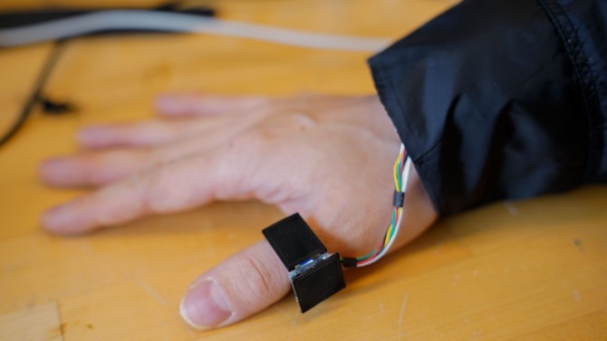
![Apple Watch Series 10 Prototype with Mystery Sensor Surfaces [Images]](https://www.iclarified.com/images/news/96892/96892/96892-640.jpg)

![Get Up to 69% Off Anker and Eufy Products on Final Day of Amazon's Big Spring Sale [Deal]](https://www.iclarified.com/images/news/96888/96888/96888-640.jpg)
![Apple Officially Releases macOS Sequoia 15.4 [Download]](https://www.iclarified.com/images/news/96887/96887/96887-640.jpg)





![What’s new in Android’s March 2025 Google System Updates [U: 3/31]](https://i0.wp.com/9to5google.com/wp-content/uploads/sites/4/2025/01/google-play-services-1.jpg?resize=1200%2C628&quality=82&strip=all&ssl=1)





-xl-xl.jpg)

















![[The AI Show Episode 141]: Road to AGI (and Beyond) #1 — The AI Timeline is Accelerating](https://www.marketingaiinstitute.com/hubfs/ep%20141.1.png)
![[The AI Show Episode 140]: New AGI Warnings, OpenAI Suggests Government Policy, Sam Altman Teases Creative Writing Model, Claude Web Search & Apple’s AI Woes](https://www.marketingaiinstitute.com/hubfs/ep%20140%20cover.png)
![[The AI Show Episode 139]: The Government Knows AGI Is Coming, Superintelligence Strategy, OpenAI’s $20,000 Per Month Agents & Top 100 Gen AI Apps](https://www.marketingaiinstitute.com/hubfs/ep%20139%20cover-2.png)


















![Is this a suitable approach to architect a flutter app? [closed]](https://i.sstatic.net/4hMHGb1L.png)





![From broke musician to working dev. How college drop-out Ryan Furrer taught himself to code [Podcast #166]](https://cdn.hashnode.com/res/hashnode/image/upload/v1743189826063/2080cde4-6fc0-46fb-b98d-b3d59841e8c4.png?#)









-1280x720.jpg?width=1920&height=1920&fit=bounds&quality=80&format=jpg&auto=webp#)









![✨ [11] - Build a Messages Screen in React Native Expo](https://media2.dev.to/dynamic/image/width%3D1000,height%3D500,fit%3Dcover,gravity%3Dauto,format%3Dauto/https:%2F%2Fdev-to-uploads.s3.amazonaws.com%2Fuploads%2Farticles%2Favictotnfv40brvxrsmc.png)


