


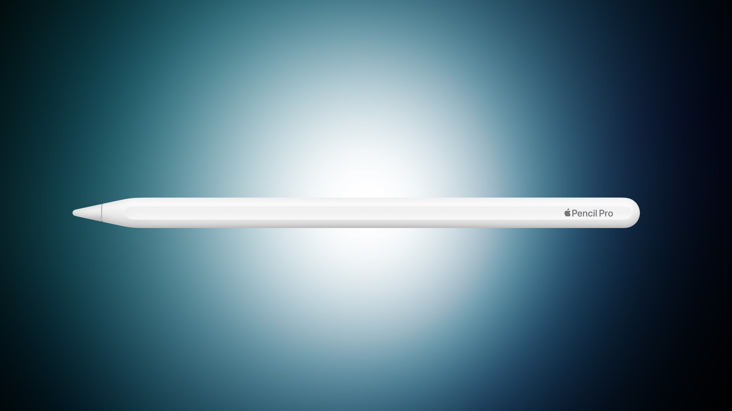
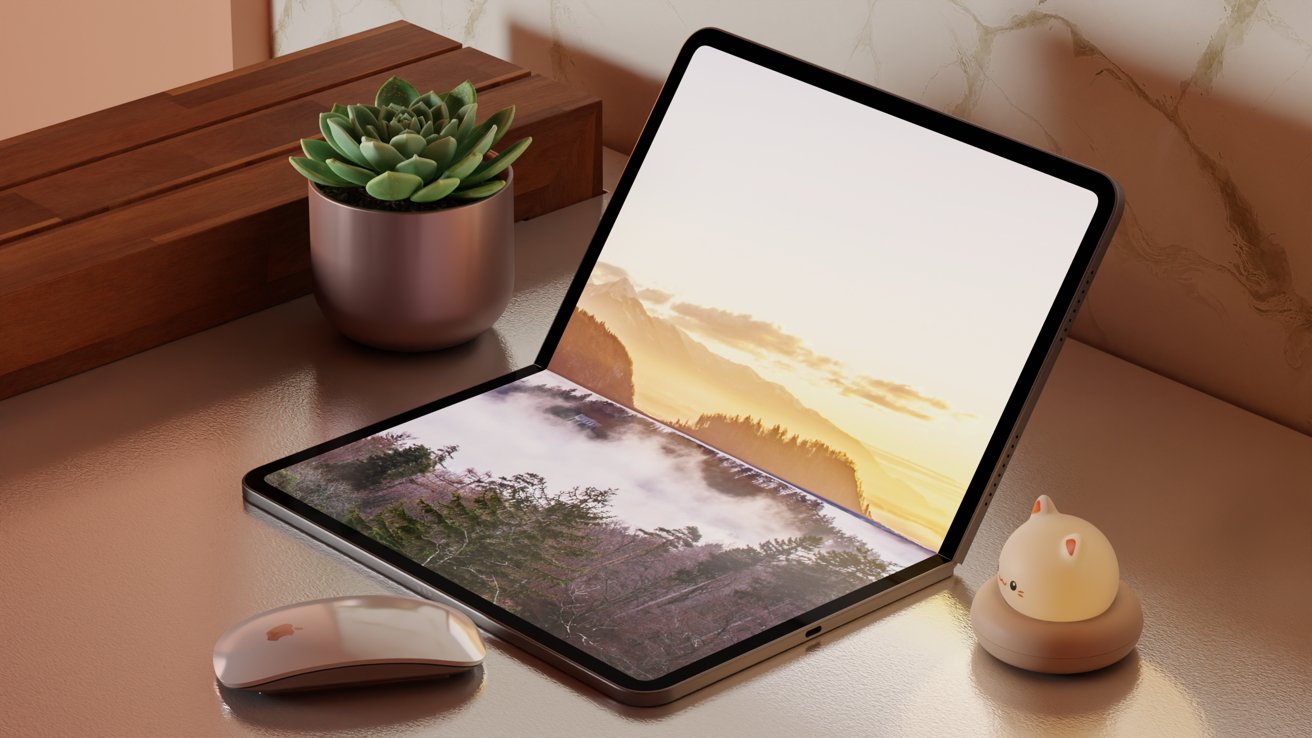
![Lowest Prices Ever: Apple Pencil Pro Just $79.99, USB-C Pencil Only $49.99 [Deal]](https://www.iclarified.com/images/news/96863/96863/96863-640.jpg)
![Apple Releases iOS 18.4 RC 2 and iPadOS 18.4 RC 2 to Developers [Download]](https://www.iclarified.com/images/news/96860/96860/96860-640.jpg)


![What Google Messages features are rolling out [March 2025]](https://i0.wp.com/9to5google.com/wp-content/uploads/sites/4/2023/12/google-messages-name-cover.png?resize=1200%2C628&quality=82&strip=all&ssl=1)


![Chip Glitching 101 with [Hash]](https://hackaday.com/wp-content/uploads/2025/03/glitching.jpeg?#)


![[The AI Show Episode 141]: Road to AGI (and Beyond) #1 — The AI Timeline is Accelerating](https://www.marketingaiinstitute.com/hubfs/ep%20141.1.png)
![[The AI Show Episode 140]: New AGI Warnings, OpenAI Suggests Government Policy, Sam Altman Teases Creative Writing Model, Claude Web Search & Apple’s AI Woes](https://www.marketingaiinstitute.com/hubfs/ep%20140%20cover.png)
![[The AI Show Episode 139]: The Government Knows AGI Is Coming, Superintelligence Strategy, OpenAI’s $20,000 Per Month Agents & Top 100 Gen AI Apps](https://www.marketingaiinstitute.com/hubfs/ep%20139%20cover-2.png)


![From broke musician to working dev. How college drop-out Ryan Furrer taught himself to code [Podcast #166]](https://cdn.hashnode.com/res/hashnode/image/upload/v1743189826063/2080cde4-6fc0-46fb-b98d-b3d59841e8c4.png?#)


![[FREE EBOOKS] The Ultimate Linux Shell Scripting Guide, Artificial Intelligence for Cybersecurity & Four More Best Selling Titles](https://www.javacodegeeks.com/wp-content/uploads/2012/12/jcg-logo.jpg)


.png?#)


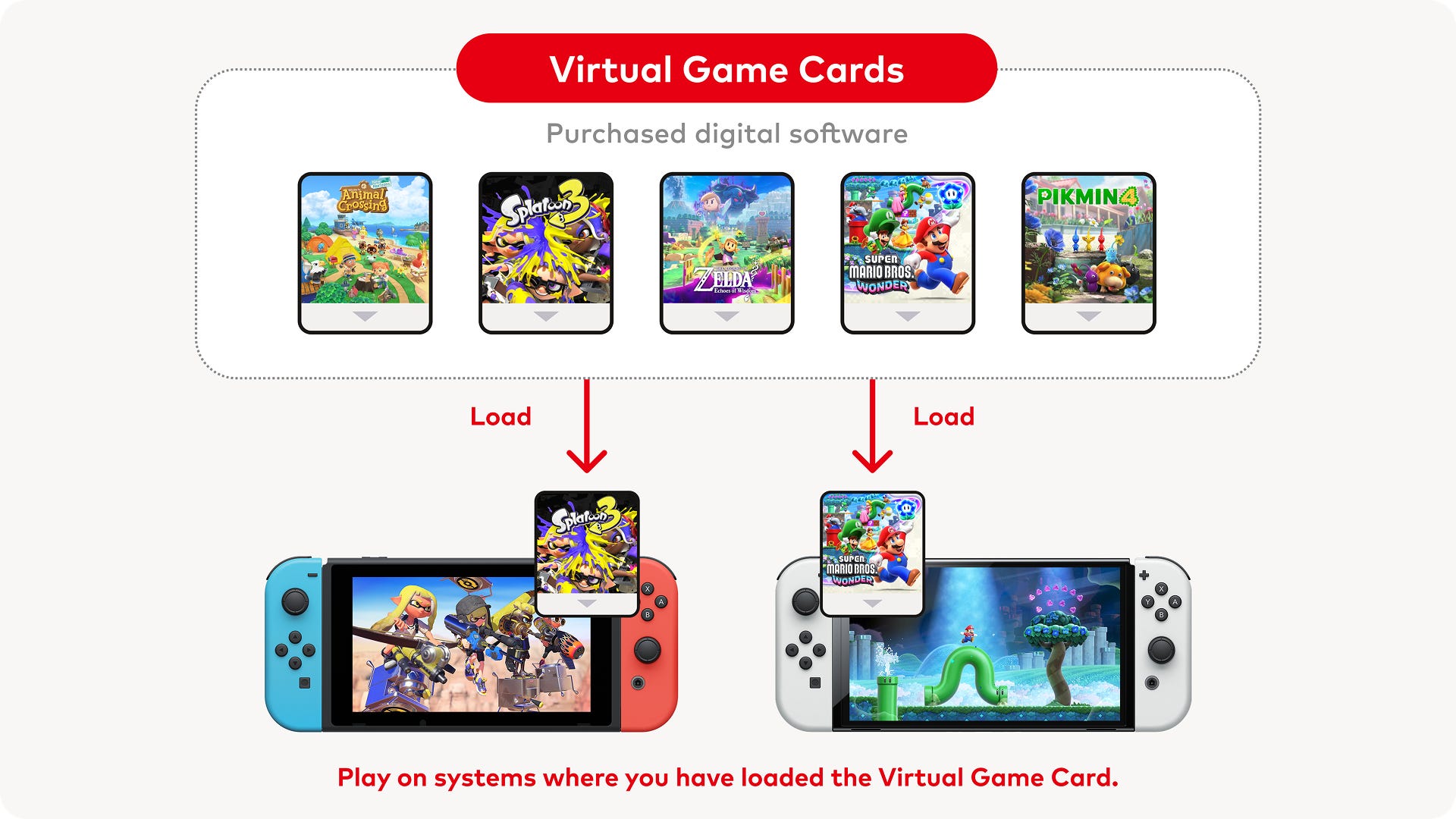
![Mini Review: Rendering Ranger: R2 [Rewind] (Switch) - A Novel Run 'N' Gun/Shooter Hybrid That's Finally Affordable](https://images.nintendolife.com/0e9d68643dde0/large.jpg?#)


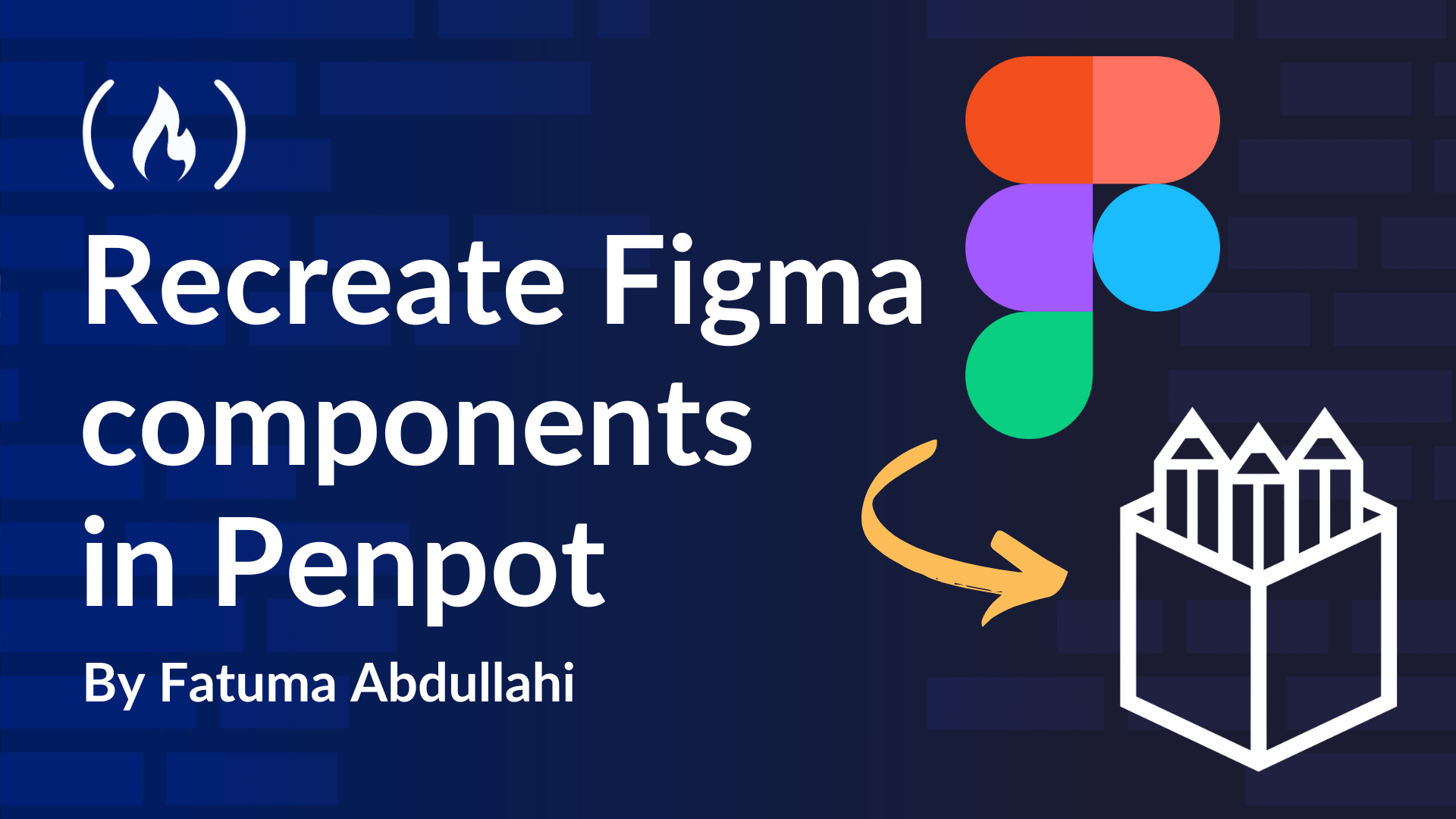
How to Move Figma Components to Penpot
Penpot is an open-source design tool for creating complete design systems. It is free, self-hostable, and allows multiple projects. Penpot supports reusable components and assets and allows files and libraries to be shared across projects. Penpot fil...
Penpot is an open-source design tool for creating complete design systems. It is free, self-hostable, and allows multiple projects. Penpot supports reusable components and assets and allows files and libraries to be shared across projects. Penpot files can be exported in various formats to enhance collaboration.
Penpot designs directly translate to code that meets web standards, facilitating collaboration and hand-off between designers and developers.
This tutorial will walk you through recreating or moving existing Figma components to Penpot. It will include a rundown of the Penpot tool and how to use it, a brief comparison of the two tools, and important resources.
Table of Contents
How to Recreate Existing Figma Files in Penpot
There are two ways to move or recreate existing Codex components from Figma to Penpot: By using the community-supported migration tool or by manually recreating the components and files.
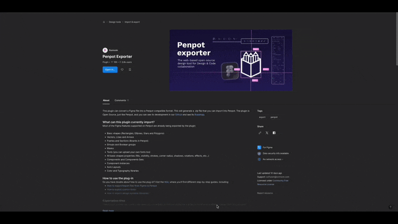
Using the Community-Supported Migration Plugin
You can use this plugin to move your Figma designs to Penpot. It is a straightforward way to migrate from Figma, especially if you have many components.
To do so, add it as a Figma plugin and find the option in the context menu. Then, click on the "Penpot Exporter" option to activate the plugin. The plugin will then create a zip file for your component and download it.
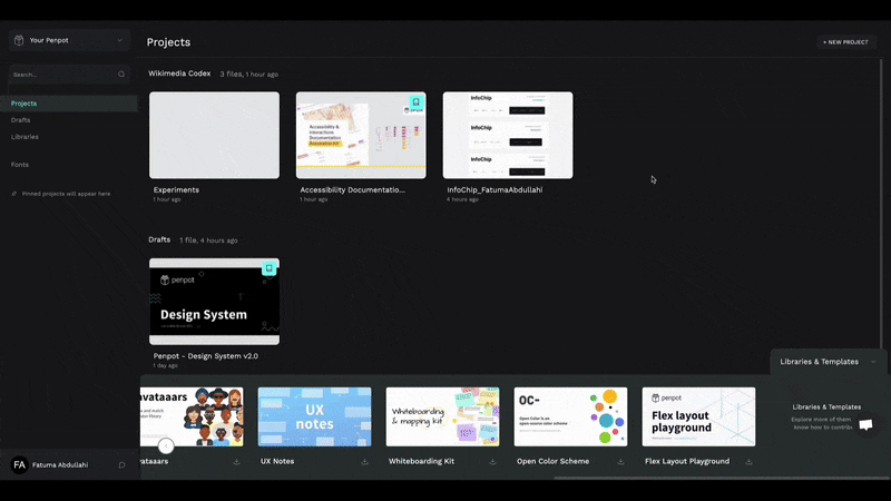
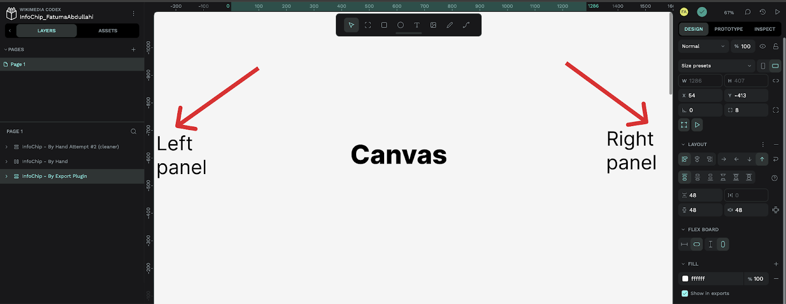
Over in Penpot, in your Projects dashboard, click on the three dots context menu and select "Import Penpot files" to open a file picker window. Click on the zip file downloaded from Figma, and Penpot will create a new project with the same name as the zip file. This new project will contain your Figma component translated to the Penpot environment.
Looking at the new component, you'll notice that the migration plugin correctly picks up any child components and typography variables while keeping things fairly organized. But it does not pick up color variables.
Manually Recreating Figma components
Another way to move Figma components to Penpot is to recreate them manually. While this option is more tedious than the previous one, it gives you fine-tuned control over how the component looks, how the files are organized, and how the assets are carried over.
It is an excellent excuse to spruce up the existing components, especially if there are few. It is also a good exercise for first-time users to grasp Penpot.
To effectively move components using this method, you will need to understand how Penpot works. The following concepts will help make this process more efficient.
Understanding the Penpot User Interface
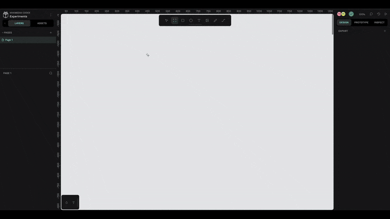
Penpot's UI is pretty similar to Figma's, except that Penpot defaults to Dark Mode. You have your controls on the right and your files, assets, and layers on the left, with a canvas in the middle.
Both have a toolbar that enables you to interact with the canvas. The toolbars have slightly different icons and names but have the same functionality. Notably, in Penpot, the Frame tool is called Board.
Penpot supports most of Figma's features, except for Design Tokens, which will be added soon.
Understanding Penpot Layouts
Penpot supports Flex and Grid layouts. These layouts allow you to position items precisely and simplify creating fluid designs. For those familiar with CSS Grid and Flex, they work in the same way.
Flex layout allows you to organize the elements within a parent container, like a board or an encompassing shape, across one dimension, width, or height. It enables you to determine the spacing and positioning of the child elements via visual controls with labels on the right side panel.
Grid layouts allow the same controls as Flex layouts but with the added flexibility of simultaneously spanning a child element across both dimensions. This makes Grid layouts quite helpful in creating complex and nuanced designs.
How to Create and Use Penpot Components
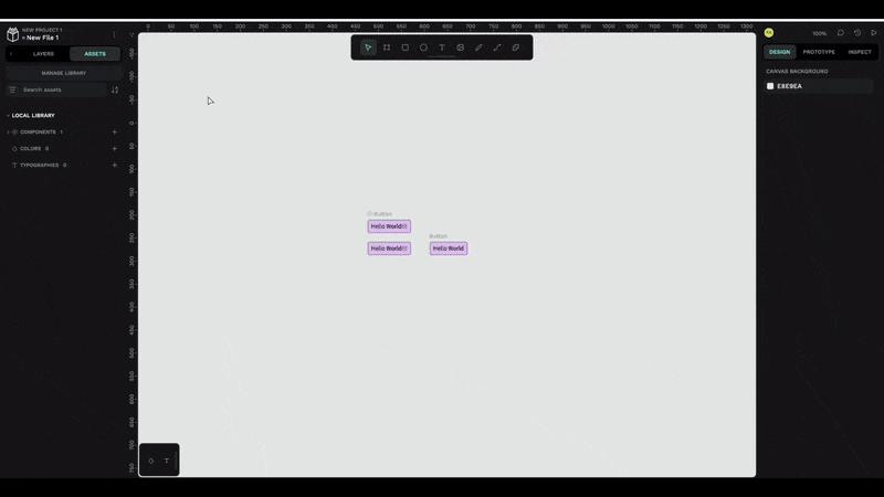
Creating a component in Penpot is relatively straightforward. You select the elements that will make up the component, then right-click and click "Create component," turning your selection into a component.
Your new component will be available under the "Assets" tab on the left side panel. To use, drag it onto the canvas.
You can also create copies of the component. By default, the copies are tied to the main component, and any changes to the main will be reflected in all copies. You can override this by detaching the copies from the context menu.
How to Create Reusable Assets in Penpot
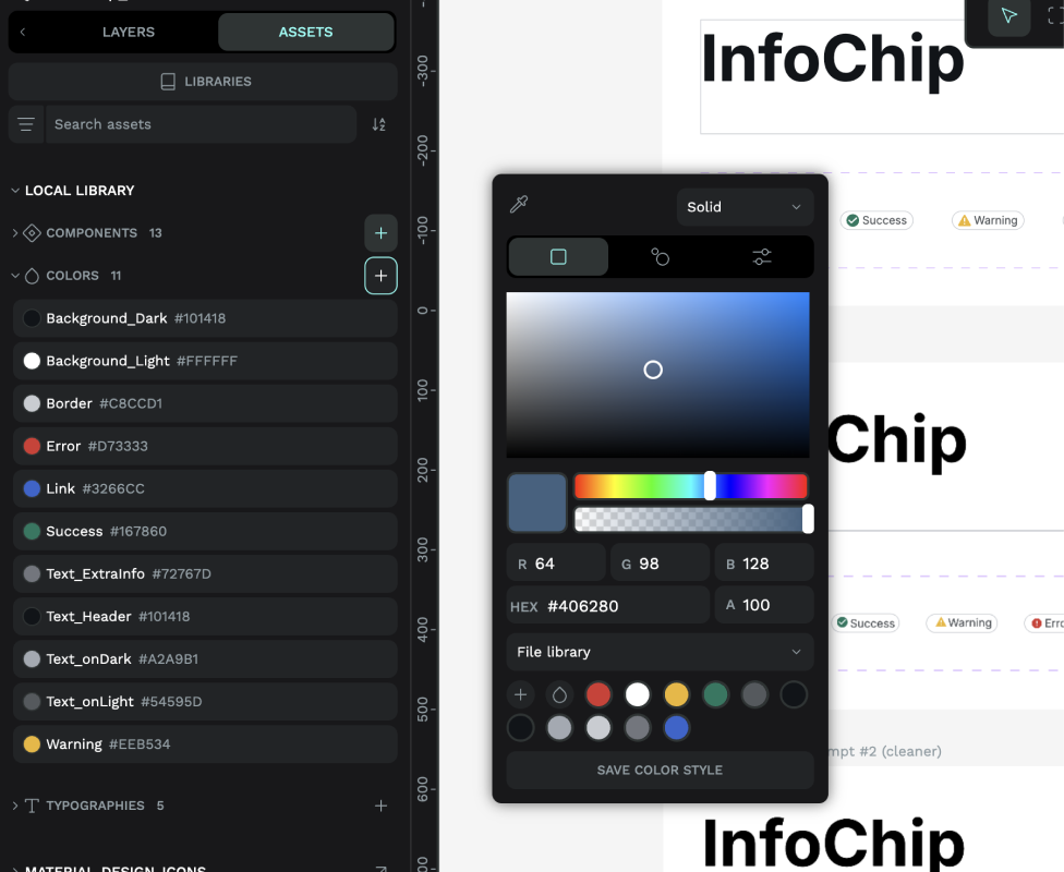
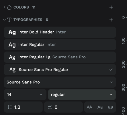
Penpot has three asset types: Typography, Colors, and Components, with Penpot design tokens coming very soon. Typography refers to information on font types and weights that make up text styles. Colors enable you to create and sort your repeated colors. Components refer to reusable design pieces and, in this context, include graphical items like icons and images.
To create a color or typography asset, click the "Assets" tab and the plus icon on the relevant accordion item. For color, it will open a color picker. Paste the hex value in the appropriate place, then save it. The color will show up in the accordion drop-down. You can click on it to give it a semantic name if desired.
For typography, click on the plus icon at the relevant accordion. This will open a panel where you can specify the font, font weight, letter spacing, and line height. You can also change the asset's name after it's saved.
How to Add and Use Icons in Penpot
You can add icon packs and libraries in Penpot from the Project dashboard. At the bottom of the page, a banner containing a list of commonly used libraries is displayed. These libraries usually include a few icon packs. You can scroll through to choose one or click on the explore more option at the end of the slider to open up the dedicated Penpot templates page.
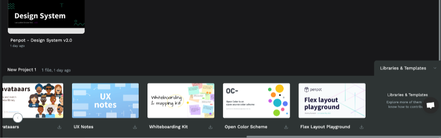
If you find a relevant library from the bottom banner, click the download icon. Penpot will prompt you to add the selected library. Once you accept it, it will be added to the "Libraries" menu item on the left side panel.
If you click through to the dedicated templates page, clicking the download icon will download a Penpot file. You can then drag it to the projects page, and it will also be available in the "Libraries" section of the projects page.
To use the libraries within your project file, click the "Assets" tab on the left side panel, then click the "Libraries" button below it. This will open a modal with all your libraries listed under "Shared Libraries."
Click on the plus icon on the ones you want to use in your project. This will link that library to your project and be available in the left side panel. You can then search for any particular icon from the search bar and drag it onto the canvas.
To remove a library from your project, click on the libraries button. In the modal, under "libraries in this file," all used libraries are listed. Click on the link icon next to the library you want to remove. This will delink it and remove it from the side panel.
Figma Vs. Penpot – My experience
As a first-time user of Penpot and a long-term casual user of Figma, I noticed some differences and encountered some teething problems.
Swapping Out Icons
You can swap out components in Penpot! It's too bad that I discovered this after I had finished my first component migration.
Renaming Files and Folders
I struggled to find how to rename files and folders in Penpot. I kept looking for the shortcut or a menu item in the context menu. It turns out you have to double-click on the title to change it. You can rename files in the same way in Figma, but I just never did it like that.
Adherence to Web Standards
I was pleasantly surprised at the code quality that Penpot provides, along with your designs. It meets the w3c standards, but the HTML could be more semantic.
Penpot Design System
Penpot avails its design system along with lots of little libraries that help you understand how the tool works. This is very nice as it allows you to get a good understanding of design language and how to organize design systems.
Limited Shape Options in the Toolbar
The Penpot toolbar lacks essential shapes such as pen, arrow, and triangle. While you can recreate this with the path tool or use a library to import them, it is definitely something I missed that was readily available in Figma.
It took me a few tries to get comfortable with Penpot and in the end, I really liked it. Plus, its open-source nature makes it even more endearing.
Resources and Notes
Using Penpot has a learning curve, even if you are familiar with other design tools like Figma. These resources can help you get up to speed faster and make you more efficient with Penpot.