


![Apple to Shift Robotics Unit From AI Division to Hardware Engineering [Report]](https://www.iclarified.com/images/news/97128/97128/97128-640.jpg)
![Apple Shares New Ad for iPhone 16: 'Trust Issues' [Video]](https://www.iclarified.com/images/news/97125/97125/97125-640.jpg)


![[The AI Show Episode 144]: ChatGPT’s New Memory, Shopify CEO’s Leaked “AI First” Memo, Google Cloud Next Releases, o3 and o4-mini Coming Soon & Llama 4’s Rocky Launch](https://www.marketingaiinstitute.com/hubfs/ep%20144%20cover.png)


.jpg?width=1920&height=1920&fit=bounds&quality=70&format=jpg&auto=webp#)


.jpg?#)


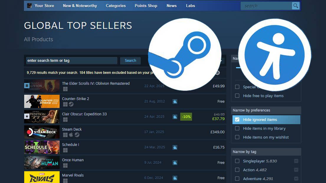
Read this and your Web Design and Development Skills will take off
The Three Pillars of Web Design & Development: Layout, Color, and Typography I have published this original story here I’m about to give you over 5 years of web-design knowledge in just this guide. No fluff — just the good stuff. Ready? Let’s go. Visual Hierarchy and User Guidance You’ve probably heard that people read websites in an “F” pattern: across the top, back to the left, down a bit, across, and so on. Truth is, that’s outdated — forcing users into an F can actually make them miss important information. Instead, embrace visual hierarchy. Think of a headline that’s huge and bold (they’ll read it first), a sub-headline that’s medium-sized (they’ll read it next), and a tiny caption tucked off to the side (they’ll read it last). By making your most critical elements the biggest and boldest, you guide attention organically. And when it comes to calls to action — buttons, links, anything you want people to click — turn up the contrast. High-contrast, solid-background buttons get clicked. Ghost buttons (just an outline) get ignored. Effective Use of Color: Accessibility and Contrast Every site needs a color palette that reflects its brand — and that people can actually see. Accessibility first. If your text and UI elements don’t have enough contrast, users with visual impairments will struggle. A tool like Coolors.co can analyze your brand palette and instantly tell you which combinations pass WCAG-level contrast checks. 60–30–10 rule. Aim for 60% neutral (black, white, grays), 30% brand hues, and 10% accent. That accent is your secret sauce for drawing attention to CTAs, links, or any element you want to pop. These aren’t iron-clad laws, but they’re excellent guiding principles — especially when you’re starting out. Typography: Readability and User Experience Typography is often underrated, yet it’s critical to readability and UX. There are thousands of fonts — serif, sans-serif, script, display, monospace — but three text levels matter most on the web: H1 (Main header): Biggest and boldest. Defines the page’s purpose. H2 (Subheadings): Breaks content into scannable sections. Paragraph (P) text: Should be clean and highly readable — no decorative scripts here. Set clear size and weight differences so users instantly know what to read and when. Conversion Practices: Designing for Results Pretty design alone doesn’t pay the bills — conversions do. I once launched a “chef’s-kiss” redesign that looked amazing, but sales tanked. Why? I prioritized aesthetics over conversion. To design for results, focus on: Clarity: Who is this site for? What should users do next? Why should they care? Scannability: Users scan, they don’t read. Use headings, bullets, and spacing to facilitate quick decision-making. Motivation: Speak to users’ emotions and needs. Don’t just look good — make them want to act. Design isn’t for you or your client; it’s for the audience. Designing for the Right Audience Never design for personal taste. Instead, research your target users: What visuals resonate with them? Which colors, fonts, and layouts build trust in that demographic? Use your findings to inform every design choice, from typography to calls to action. Continuous Learning: Staying Ahead in Web Design Web design doesn’t age like fine wine — it ages like bread on the counter. What worked five years ago may be obsolete today. AI won’t replace skilled web designers, but it will replace lazy ones. Keep learning. Follow trends, experiment with new tools, and refine your process. If you don’t quit, you win. Next Steps If you’re just getting started, check out my follow-up stories related to web design, development & tools. If this article helped, like, share, follow, and subscribe to the newsletter — because continuous growth never stops. Remember: focus on layout, color, typography, and conversion — and you’ll build websites that look great and perform. And don’t forget: if you don’t quit, you win. Don’t forget to give this guide millions of likes. And share your designing experience in the comments. Keep supporting me so I can provide value to the community. Thank you! Stay connected with me on my other platforms:
The Three Pillars of Web Design & Development: Layout, Color, and Typography
I have published this original story here
I’m about to give you over 5 years of web-design knowledge in just this guide. No fluff — just the good stuff. Ready? Let’s go.
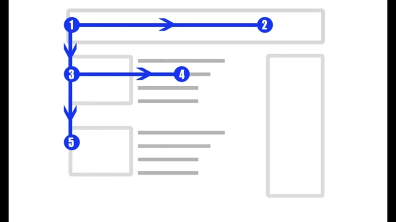
Visual Hierarchy and User Guidance
You’ve probably heard that people read websites in an “F” pattern: across the top, back to the left, down a bit, across, and so on. Truth is, that’s outdated — forcing users into an F can actually make them miss important information.
Instead, embrace visual hierarchy. Think of a headline that’s huge and bold (they’ll read it first), a sub-headline that’s medium-sized (they’ll read it next), and a tiny caption tucked off to the side (they’ll read it last). By making your most critical elements the biggest and boldest, you guide attention organically.
And when it comes to calls to action — buttons, links, anything you want people to click — turn up the contrast. High-contrast, solid-background buttons get clicked. Ghost buttons (just an outline) get ignored.
Effective Use of Color: Accessibility and Contrast
Every site needs a color palette that reflects its brand — and that people can actually see.
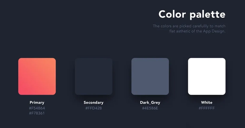
- Accessibility first. If your text and UI elements don’t have enough contrast, users with visual impairments will struggle. A tool like Coolors.co can analyze your brand palette and instantly tell you which combinations pass WCAG-level contrast checks.
- 60–30–10 rule. Aim for 60% neutral (black, white, grays), 30% brand hues, and 10% accent. That accent is your secret sauce for drawing attention to CTAs, links, or any element you want to pop.
These aren’t iron-clad laws, but they’re excellent guiding principles — especially when you’re starting out.
Typography: Readability and User Experience
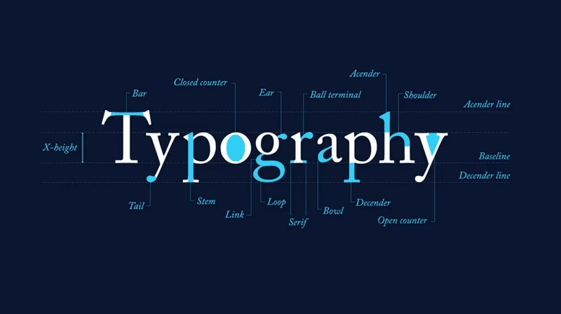
Typography is often underrated, yet it’s critical to readability and UX. There are thousands of fonts — serif, sans-serif, script, display, monospace — but three text levels matter most on the web:
- H1 (Main header): Biggest and boldest. Defines the page’s purpose.
- H2 (Subheadings): Breaks content into scannable sections.
- Paragraph (P) text: Should be clean and highly readable — no decorative scripts here.
Set clear size and weight differences so users instantly know what to read and when.
Conversion Practices: Designing for Results
Pretty design alone doesn’t pay the bills — conversions do. I once launched a “chef’s-kiss” redesign that looked amazing, but sales tanked. Why? I prioritized aesthetics over conversion.
To design for results, focus on:
- Clarity: Who is this site for? What should users do next? Why should they care?
- Scannability: Users scan, they don’t read. Use headings, bullets, and spacing to facilitate quick decision-making.
- Motivation: Speak to users’ emotions and needs. Don’t just look good — make them want to act.
Design isn’t for you or your client; it’s for the audience.
Designing for the Right Audience
Never design for personal taste. Instead, research your target users:
- What visuals resonate with them?
- Which colors, fonts, and layouts build trust in that demographic?
Use your findings to inform every design choice, from typography to calls to action.
Continuous Learning: Staying Ahead in Web Design
Web design doesn’t age like fine wine — it ages like bread on the counter. What worked five years ago may be obsolete today. AI won’t replace skilled web designers, but it will replace lazy ones.
Keep learning. Follow trends, experiment with new tools, and refine your process. If you don’t quit, you win.
Next Steps
If you’re just getting started, check out my follow-up stories related to web design, development & tools. If this article helped, like, share, follow, and subscribe to the newsletter — because continuous growth never stops.
Remember: focus on layout, color, typography, and conversion — and you’ll build websites that look great and perform.
And don’t forget: if you don’t quit, you win.
Don’t forget to give this guide millions of likes. And share your designing experience in the comments. Keep supporting me so I can provide value to the community. Thank you!
Stay connected with me on my other platforms: