


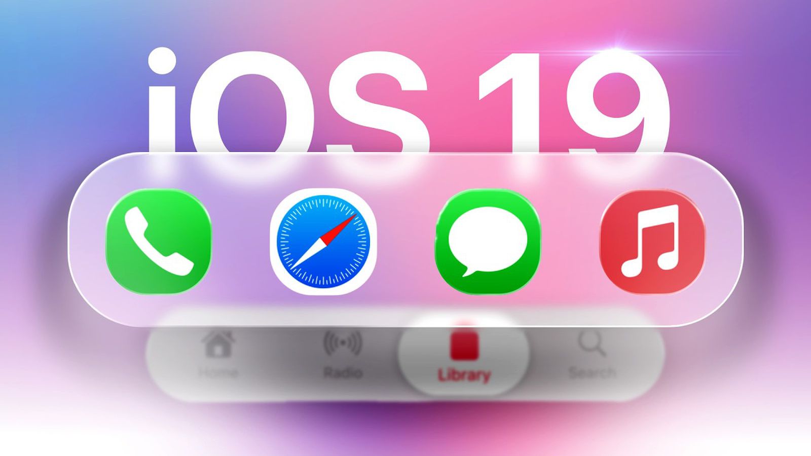
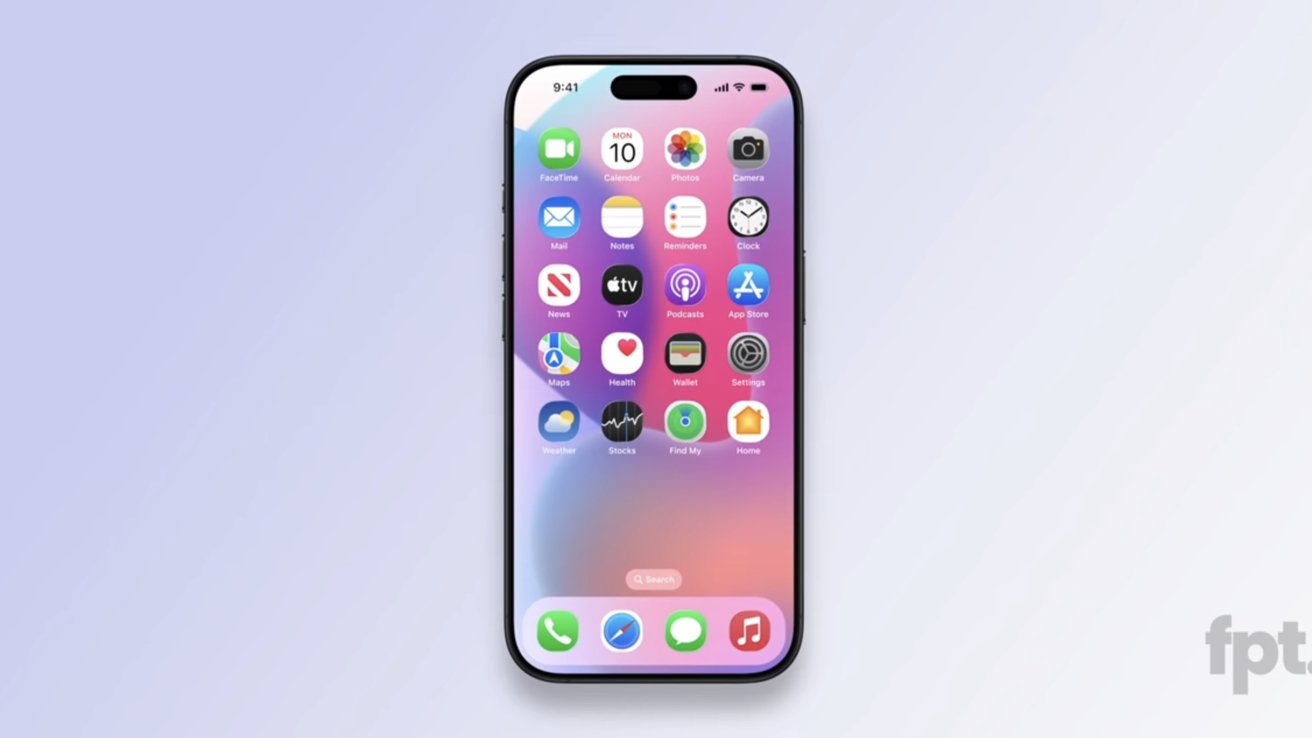
![New iOS 19 Leak Allegedly Reveals Updated Icons, Floating Tab Bar, More [Video]](https://www.iclarified.com/images/news/96958/96958/96958-640.jpg)
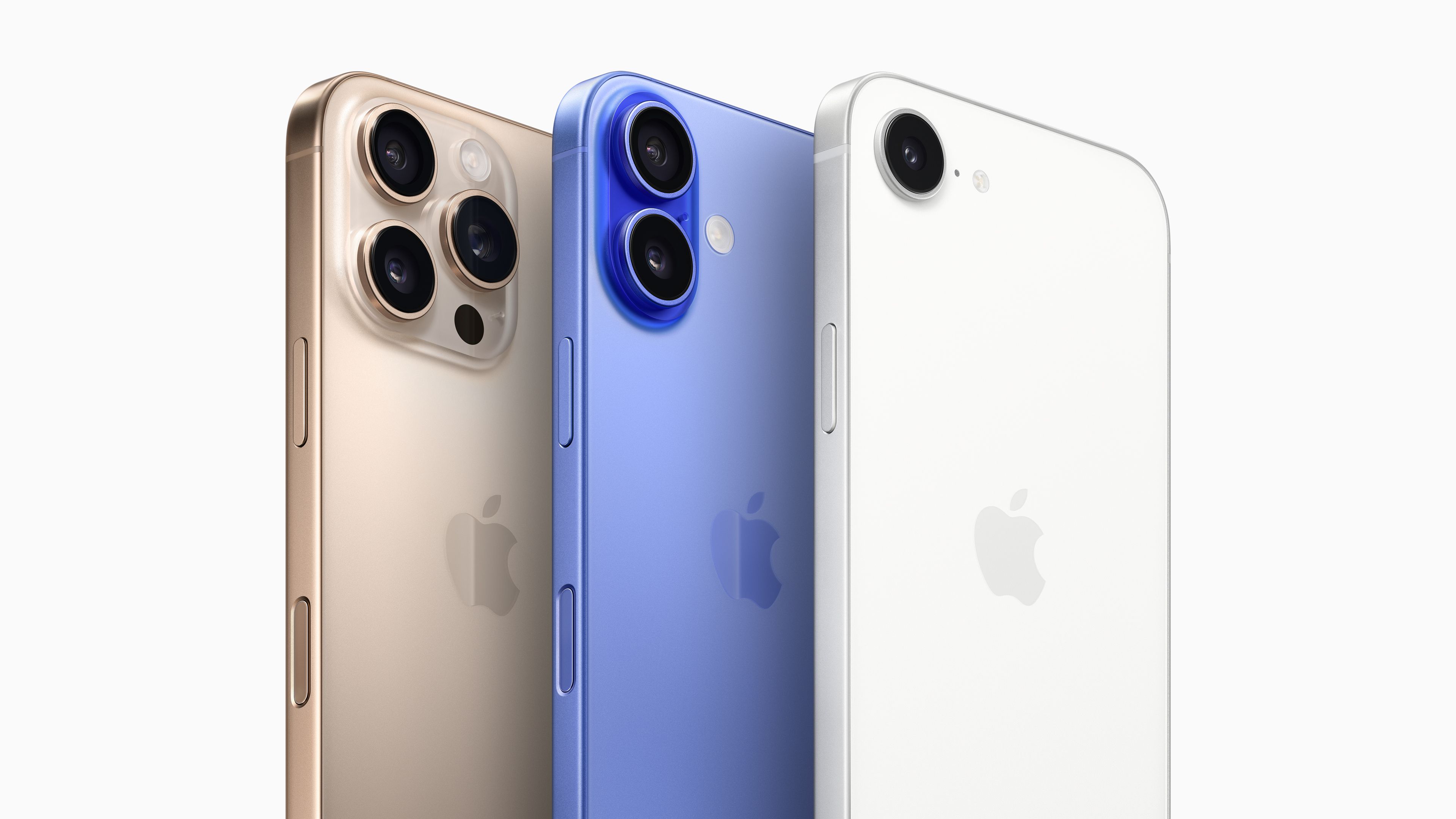
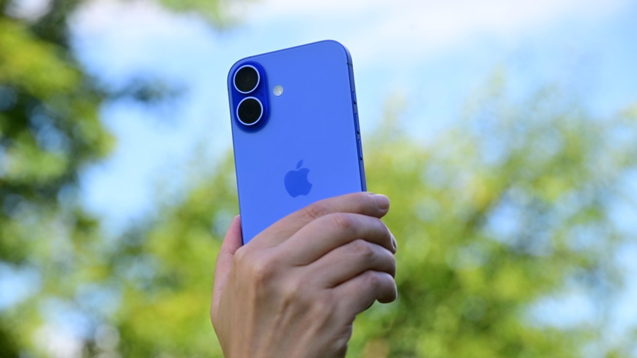
![Apple to Source More iPhones From India to Offset China Tariff Costs [Report]](https://www.iclarified.com/images/news/96954/96954/96954-640.jpg)
![Blackmagic Design Unveils DaVinci Resolve 20 With Over 100 New Features and AI Tools [Video]](https://www.iclarified.com/images/news/96951/96951/96951-640.jpg)


.webp?#)
.webp?#)
.webp?#)


_NicoElNino_Alamy.png?#)


![[The AI Show Episode 142]: ChatGPT’s New Image Generator, Studio Ghibli Craze and Backlash, Gemini 2.5, OpenAI Academy, 4o Updates, Vibe Marketing & xAI Acquires X](https://www.marketingaiinstitute.com/hubfs/ep%20142%20cover.png)


![From drop-out to software architect with Jason Lengstorf [Podcast #167]](https://cdn.hashnode.com/res/hashnode/image/upload/v1743796461357/f3d19cd7-e6f5-4d7c-8bfc-eb974bc8da68.png?#)


(1).jpg?width=1920&height=1920&fit=bounds&quality=80&format=jpg&auto=webp#)


As frontend developers, we don’t just build interfaces – we build experiences for everyone. Yet, accessibility (a11y) is often treated as an afterthought. Let’s change that. Why it matters: 1 in 6 people globally live with disabilities (WHO). Legal risks: Lawsuits like Domino’s vs. Guillermo set precedents. Ethically, it’s the right thing to do. Practically, accessible sites rank better, reach more users, and future-proof your work. Here’s how I prioritize accessibility in React projects: 1. Semantic HTML + ARIA Roles Avoid soup! Use native elements like , , and . When necessary, enhance with ARIA: // ❌ Bad: Generic div as a button Submit // ✅ Good: Semantic + ARIA Submit 2. Keyboard Navigation & Focus Management Ensure all interactive elements are keyboard-friendly. Use tabIndex and :focus-visible: // Custom component with keyboard support const CustomButton = ({ onClick, children }) => { const handleKeyPress = (e) => { if (e.key === 'Enter' || e.key === ' ') onClick(); }; return ( {children} ); }; 3. Accessible Forms with Labels Never skip or use placeholder text as a label: // ❌ Bad: Placeholder as label // ✅ Good: Proper labeling Email Address We’ll never share your email. 4. Contrast Ratios & Responsive Design Use tools like WebAIM Contrast Checker to meet WCAG standards. Avoid tiny click targets! 5. Test with Screen Readers & Tools Lighthouse Audit: Run audits in Chrome DevTools. axe DevTools: Automated accessibility testing. NVDA/JAWS: Test with actual screen readers if you can. 6. What about Mobile ? Accessibility is non-negotiable, whether you’re building for web or mobile. In React Native, small tweaks can make your app usable for everyone. Here’s how: A). Label Images and Icons Screen readers rely on accessibilityLabel to describe visual elements: Why it matters: Without labels, screen readers might say "unlabeled image" or skip the element entirely. B). Use accessibilityRole for Clarity Define the purpose of interactive elements: Submit C). Add accessibilityHint for Complex Actions Provide extra context where needed: D). Test with VoiceOver/TalkBack iOS: Enable VoiceOver in Settings > Accessibility. Android: Enable TalkBack in Accessibility settings. Pro Tip: Use accessibilityLiveRegion for dynamic content (e.g., loading states): {loading ? 'Loading...' : 'Success!'}
As frontend developers, we don’t just build interfaces – we build experiences for everyone. Yet, accessibility (a11y) is often treated as an afterthought. Let’s change that.
Why it matters:
- 1 in 6 people globally live with disabilities (WHO).
- Legal risks: Lawsuits like Domino’s vs. Guillermo set precedents.
- Ethically, it’s the right thing to do.
- Practically, accessible sites rank better, reach more users, and future-proof your work.
Here’s how I prioritize accessibility in React projects:
1. Semantic HTML + ARIA Roles
Avoid Ensure all interactive elements are keyboard-friendly. Use Never skip Use tools like WebAIM Contrast Checker to meet WCAG standards. Avoid tiny click targets!
Accessibility is non-negotiable, whether you’re building for web or mobile. In React Native, small tweaks can make your app usable for everyone. Here’s how:
Screen readers rely on Why it matters: Without labels, screen readers might say "unlabeled image" or skip the element entirely.
Define the purpose of interactive elements: Provide extra context where needed: , , and . When necessary, enhance with ARIA:
// ❌ Bad: Generic div as a button
<div onClick={handleClick}>Submitdiv>
// ✅ Good: Semantic + ARIA
<button
onClick={handleClick}
aria-label="Submit form"
role="button" // Redundant here, but useful for custom components
>
Submit
button>
2. Keyboard Navigation & Focus Management
tabIndex and :focus-visible:
// Custom component with keyboard support
const CustomButton = ({ onClick, children }) => {
const handleKeyPress = (e) => {
if (e.key === 'Enter' || e.key === ' ') onClick();
};
return (
<div
role="button"
tabIndex={0}
onClick={onClick}
onKeyPress={handleKeyPress}
className="custom-btn"
>
{children}
div>
);
};
3. Accessible Forms with Labels
or use placeholder text as a label:
// ❌ Bad: Placeholder as label
<input type="text" placeholder="Enter email" />
// ✅ Good: Proper labeling
<label htmlFor="email">Email Addresslabel>
<input
type="email"
id="email"
name="email"
aria-describedby="email-help"
/>
<p id="email-help">We’ll never share your email.p>
4. Contrast Ratios & Responsive Design
5. Test with Screen Readers & Tools
6. What about Mobile ?
A). Label Images and Icons
accessibilityLabel to describe visual elements:
<Image
accessibilityLabel="Men wearing hat, glasses, and a headset"
accessibilityRole="image"
source={{ uri: 'https://images.unsplash.com/photo-1509098681029-b45e9c845022?q=80&w=240&auto=format' }}
style={styles.avatar}
width={200}
height={200}
/>
B). Use
accessibilityRole for Clarity
<TouchableOpacity
accessibilityLabel="Submit form"
accessibilityRole="button" // Tells screen readers this is clickable
onPress={handleSubmit}
>
<Text>SubmitText>
TouchableOpacity>
C). Add
accessibilityHint for Complex Actions
<Button
accessibilityLabel="Delete account"
accessibilityHint="Double-tap to permanently delete your account"
onPress={confirmDelete}
/>
D). Test with VoiceOver/TalkBack
accessibilityLiveRegion for dynamic content (e.g., loading states):
<Text accessibilityLiveRegion="polite">{loading ? 'Loading...' : 'Success!'}Text>