


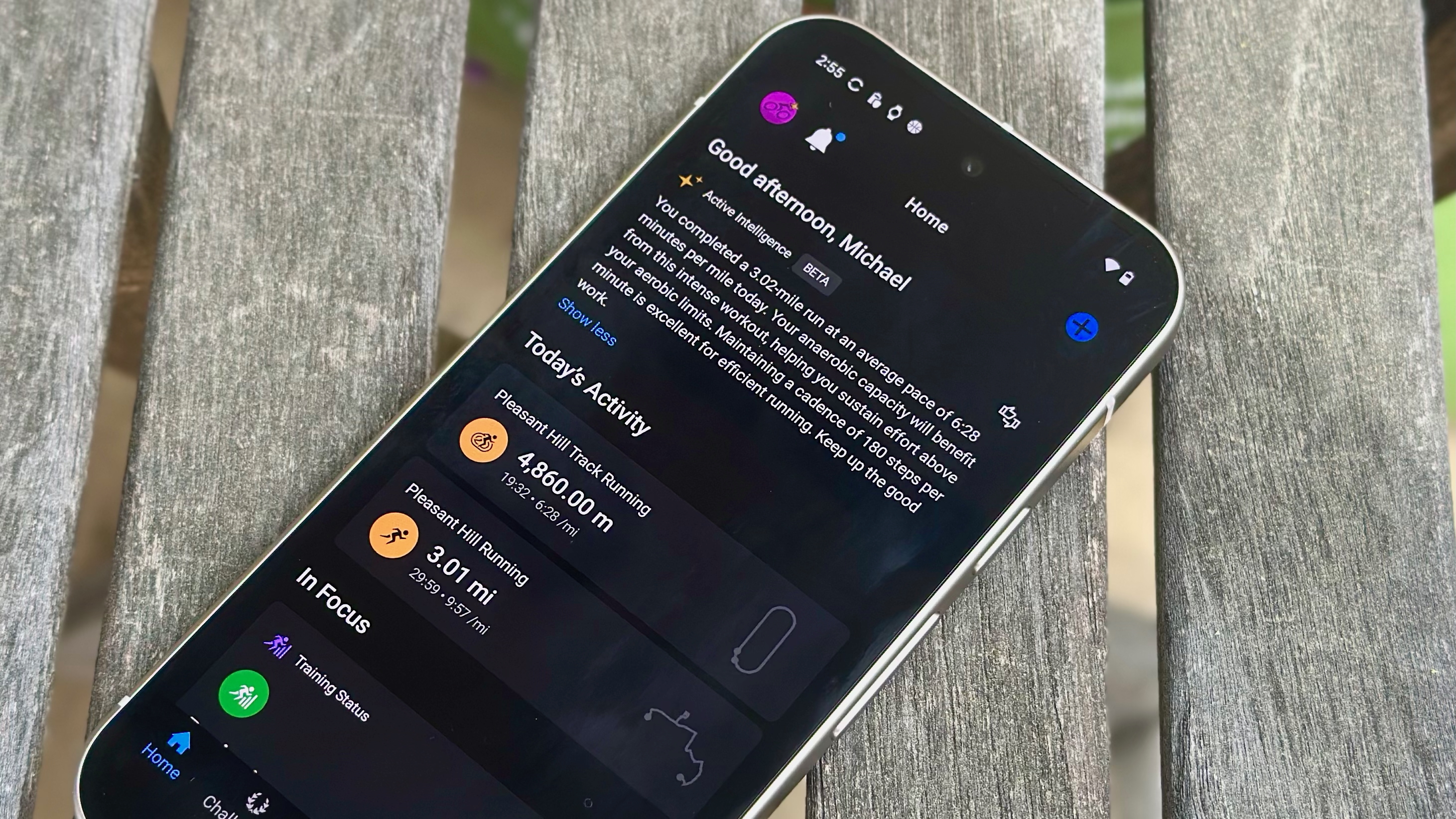


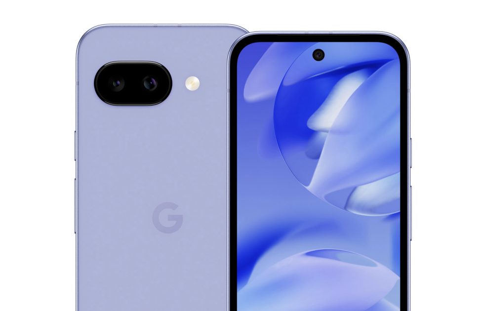
![Apple's M5 iPad Pro Enters Advanced Testing for 2025 Launch [Gurman]](https://www.iclarified.com/images/news/96865/96865/96865-640.jpg)
![M5 MacBook Pro Set for Late 2025, Major Redesign Waits Until 2026 [Gurman]](https://www.iclarified.com/images/news/96868/96868/96868-640.jpg)
![Apple to Revamp Health App with AI-Powered Doctor [Gurman]](https://www.iclarified.com/images/news/96870/96870/96870-640.jpg)
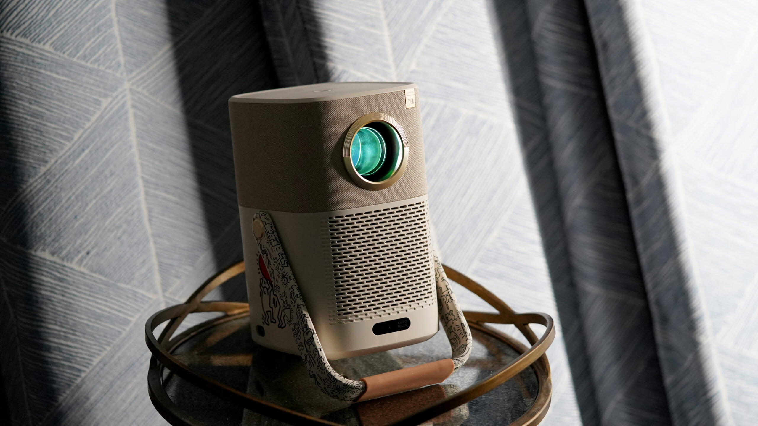
![Lowest Prices Ever: Apple Pencil Pro Just $79.99, USB-C Pencil Only $49.99 [Deal]](https://www.iclarified.com/images/news/96863/96863/96863-640.jpg)


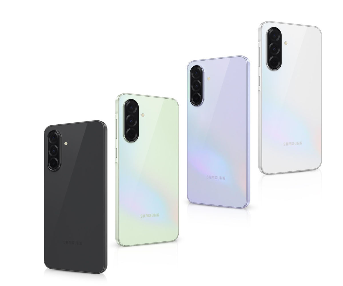
![What Google Messages features are rolling out [March 2025]](https://i0.wp.com/9to5google.com/wp-content/uploads/sites/4/2023/12/google-messages-name-cover.png?resize=1200%2C628&quality=82&strip=all&ssl=1)


![[The AI Show Episode 141]: Road to AGI (and Beyond) #1 — The AI Timeline is Accelerating](https://www.marketingaiinstitute.com/hubfs/ep%20141.1.png)
![[The AI Show Episode 140]: New AGI Warnings, OpenAI Suggests Government Policy, Sam Altman Teases Creative Writing Model, Claude Web Search & Apple’s AI Woes](https://www.marketingaiinstitute.com/hubfs/ep%20140%20cover.png)
![[The AI Show Episode 139]: The Government Knows AGI Is Coming, Superintelligence Strategy, OpenAI’s $20,000 Per Month Agents & Top 100 Gen AI Apps](https://www.marketingaiinstitute.com/hubfs/ep%20139%20cover-2.png)


![What is a basic way to recreate a tik tok like algorithm? [duplicate]](https://cdn.sstatic.net/Sites/softwareengineering/Img/apple-touch-icon@2.png?v=1ef7363febba)


![From broke musician to working dev. How college drop-out Ryan Furrer taught himself to code [Podcast #166]](https://cdn.hashnode.com/res/hashnode/image/upload/v1743189826063/2080cde4-6fc0-46fb-b98d-b3d59841e8c4.png?#)


![[FREE EBOOKS] The Ultimate Linux Shell Scripting Guide, Artificial Intelligence for Cybersecurity & Four More Best Selling Titles](https://www.javacodegeeks.com/wp-content/uploads/2012/12/jcg-logo.jpg)


.png?#)


Demystifying CSS Grid: A Comprehensive Guide for Modern Layouts
Demystifying CSS Grid: A Comprehensive Guide for Modern Layouts CSS Grid is a powerful layout system that transforms the way web developers structure their UIs. While it can feel overwhelming at first, understanding its core concepts will empower you to create flexible and responsive designs with ease. What is CSS Grid? CSS Grid Layout is a two-dimensional layout system for the web, designed for building complex web applications and web interfaces. It allows us to arrange elements within a grid and define their size, position, and responsiveness. Key Concepts Before diving into practical examples, let’s clarify some essential concepts: Grid Container: The parent element that holds the grid items. You define the grid layout on this element using display: grid;. Grid Items: The child elements of the grid container that can be positioned and sized in the grid. Grid Lines: The lines that define the boundaries of rows and columns. Grid Cells: The individual spaces where grid items are placed. Grid Areas: A rectangular area formed by cells, where one or more grid items can be placed. Setting Up a Simple Grid Let’s create a basic grid layout. Here’s how you can set up a grid with three columns: HTML Structure Item 1 Item 2 Item 3 Item 4 Item 5 CSS Styles .grid-container { display: grid; grid-template-columns: repeat(3, 1fr); grid-gap: 10px; } .grid-container > div { background-color: #4CAF50; color: white; padding: 20px; text-align: center; } In this example: We set the container to use display: grid;. The grid-template-columns property specifies that there will be three columns of equal width (1fr means one fraction of the available space). The grid-gap property creates a 10px gap between the grid items. Advanced Features CSS Grid comes with advanced features that allow for greater flexibility: Named Grid Areas You can assign names to grid areas for better readability: HTML Structure Header Sidebar Content Footer CSS Styles .grid-container { display: grid; grid-template-areas: 'header header' 'sidebar content' 'footer footer'; grid-gap: 10px; } .header { grid-area: header; } .sidebar { grid-area: sidebar; } .content { grid-area: content; } .footer { grid-area: footer; } Media Queries for Responsiveness To make the layout responsive, you can use media queries to adjust the grid layout based on the viewport size: @media (max-width: 600px) { .grid-container { grid-template-columns: 1fr; } } This makes the layout stack on smaller screens, providing a better user experience. Conclusion CSS Grid is an invaluable tool for frontend developers, enabling sophisticated layouts without relying heavily on positioning or floats. By mastering CSS Grid, you can create adaptive, responsive designs that enhance user engagement on any device. Resources CSS-Tricks Grid Guide Mozilla Developer Network Explore CSS Grid further, and don’t hesitate to experiment with different configurations to expand your design capabilities!
Demystifying CSS Grid: A Comprehensive Guide for Modern Layouts
CSS Grid is a powerful layout system that transforms the way web developers structure their UIs. While it can feel overwhelming at first, understanding its core concepts will empower you to create flexible and responsive designs with ease.
What is CSS Grid?
CSS Grid Layout is a two-dimensional layout system for the web, designed for building complex web applications and web interfaces. It allows us to arrange elements within a grid and define their size, position, and responsiveness.
Key Concepts
Before diving into practical examples, let’s clarify some essential concepts:
-
Grid Container: The parent element that holds the grid items. You define the grid layout on this element using
display: grid;. - Grid Items: The child elements of the grid container that can be positioned and sized in the grid.
- Grid Lines: The lines that define the boundaries of rows and columns.
- Grid Cells: The individual spaces where grid items are placed.
- Grid Areas: A rectangular area formed by cells, where one or more grid items can be placed.
Setting Up a Simple Grid
Let’s create a basic grid layout. Here’s how you can set up a grid with three columns:
HTML Structure
 class="grid-container">
   class="item1">Item 1