_robertharding_Alamy.jpg?#)


![Redesigned Plastic Apple Watch SE in 'Serious Jeopardy' [Gurman]](https://www.iclarified.com/images/news/96789/96789/96789-640.jpg)
![Apple Watch to Gain Cameras in Future Models [Gurman]](https://www.iclarified.com/images/news/96790/96790/96790-640.jpg)
![Apple M4 Mac Mini on Sale for $499 [Lowest Price Ever]](https://www.iclarified.com/images/news/96788/96788/96788-640.jpg)
![Apple Shares First Look and Premiere Date for 'The Buccaneers' Season Two [Video]](https://www.iclarified.com/images/news/96786/96786/96786-640.jpg)


![Google updates Circle to Search with transparent navigation bar [U]](https://i0.wp.com/9to5google.com/wp-content/uploads/sites/4/2025/01/galaxy-s25-circle-to-search-1.jpg?resize=1200%2C628&quality=82&strip=all&ssl=1)


![[The AI Show Episode 139]: The Government Knows AGI Is Coming, Superintelligence Strategy, OpenAI’s $20,000 Per Month Agents & Top 100 Gen AI Apps](https://www.marketingaiinstitute.com/hubfs/ep%20139%20cover-2.png)


![[The AI Show Episode 138]: Introducing GPT-4.5, Claude 3.7 Sonnet, Alexa+, Deep Research Now in ChatGPT Plus & How AI Is Disrupting Writing](https://www.marketingaiinstitute.com/hubfs/ep%20138%20cover.png)


![From hating coding to programming satellites at age 37 with Francesco Ciulla [Podcast #165]](https://cdn.hashnode.com/res/hashnode/image/upload/v1742585568977/09b25b8e-8c92-4f4b-853f-64b7f7915980.png?#)


![[DEALS] The All-in-One CompTIA Certification Prep Courses Bundle (90% off) & Other Deals Up To 98% Off – Offers End Soon!](https://www.javacodegeeks.com/wp-content/uploads/2012/12/jcg-logo.jpg)


.jpg?width=1920&height=1920&fit=bounds&quality=80&format=jpg&auto=webp#)


.png?#)


KendoReact Challenge: Epicure's Lost Recipes
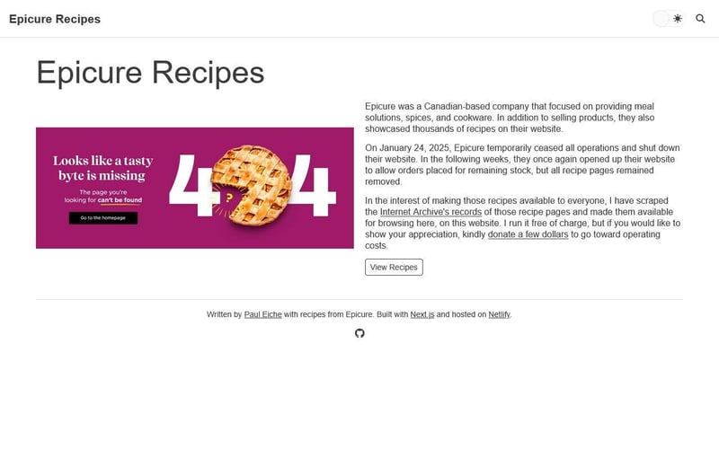
This is a submission for the KendoReact Free Components Challenge. What I Built Earlier this year, a company called Epicure closed down their business and website. They were primarily focused on cooking products, but they also had over 3,000 recipes on their site which were no longer accessible. I built a NextJS static site using data scraped from the Internet Archive to resurrect Epicure's lost recipes. When I built this website, I originally created it using MUI components. For this challenge, I have created a branch of that project using KendoReact components instead. Demo Take a look at the KendoReact Challenge branch of epicure-recipes here: https://deploy-preview-23--epicure-recipes.netlify.app/ And if you'd like, browse the source code here: https://github.com/peiche/epicure-recipes/tree/kendo-challenge/ Here are a few screenshots of the website's different browsing capabilities. It is possible to view recipes in a list; recipes tagged under a category; and recipes tagged as using a particular Epicure product. This can vary widely, since Epicure made seasoning packets and jars, as well as kitchen utensils and tools like burger presses and microwave steamers. When I was scraping data from Epicure's recipes, I found that each page contained data in JSON format that contained not only the recipe itself, but also category and product information. This made it quite easy for me to build out tag and product pages as well. I don't have any interest in upselling their products, of course. I'm not affiliated with Epicure, and they aren't manufacturing any new ones, anyway. But it is useful to know what products are used in a recipe, and if you have one of those products, the ability to find more recipes that use it. Because this is a static site built from JSON data, there is no way to reorder recipes on any given page (although the metadata for dates published and the like does exist in the original JSON). These pages are good for browsing, but if you're looking for a specific recipe, you're better off using the search page. The search is built using Algolia's InstantSearch for React. I mentioned that the site is built on static JSON data; that very same data was also used to generate the Algolia search index. The site's search is separated into two parts. The first is the search page, which uses the aforementioned index. Since I already have data for tags and products, it required no extra effort on my part to include that data as facets. The second part of the search is the suggest, which Algolia offers as a "learning" index. It uses the primary search index and updates it based on usage, adding and modifying records as people use the site. KendoReact Experience Below is a list of KendoReact components I used in the project, followed by some custom work when they couldn't offer enough functionality or customization for my liking. Typography This is a pretty obvious one, and almost shouldn't even count in the list of components. But it is one, since with this single component one can render a variety of typography-related tags. Button Buttons are used throughout the site, primarily for functionality that doesn't directly result in navigation to a different page. This includes things like the Search button in the navbar and pagination on the search page. The difficulty I encountered with converting from MUI to KendoReact was that Kendo's Button component can't be a link. It can only render a element, never a . Sure, you can set the onClick event to trigger navigation, but for SEO purposes I prefer to render a link. To that end, there are instances on the site where I manually created anchor elements that merely look like buttons using the same CSS classes as the Button component. You can see an example of this in the "button" on the homepage. AppBar The site's top navigation uses this, along with subsequent components. Rather than use display: flex in custom CSS to create spacing, I was able to leverage the AppBarSection and AppBarSpacer components with zero utility class usage. GridLayout and GridLayoutItem In places where I needed to create a grid, such as the list pages and search results, I used these components. Unlike MUI's Grid counterpart, these use display: grid rather than display: flex. I am less familiar with CSS Grid than I am with Flex, but making a symmetrical layout is simple enough. What I did have issues with is making the layout responsive. I found tutorials on how to do so with KendoReact (like this one) that require extensive configuration or creating a listener to window resizing. None of that appealed to me, so I created a couple utility classes in my stylesheet, one for a two-column layout (used on the search results page) and one for a thee-column layout (used on all the list grid pages). Card Inside every GridLayoutItem component was a shared recipe card componen
This is a submission for the KendoReact Free Components Challenge.
What I Built
Earlier this year, a company called Epicure closed down their business and website. They were primarily focused on cooking products, but they also had over 3,000 recipes on their site which were no longer accessible. I built a NextJS static site using data scraped from the Internet Archive to resurrect Epicure's lost recipes. When I built this website, I originally created it using MUI components. For this challenge, I have created a branch of that project using KendoReact components instead.
Demo
Take a look at the KendoReact Challenge branch of epicure-recipes here:
https://deploy-preview-23--epicure-recipes.netlify.app/
And if you'd like, browse the source code here:
https://github.com/peiche/epicure-recipes/tree/kendo-challenge/
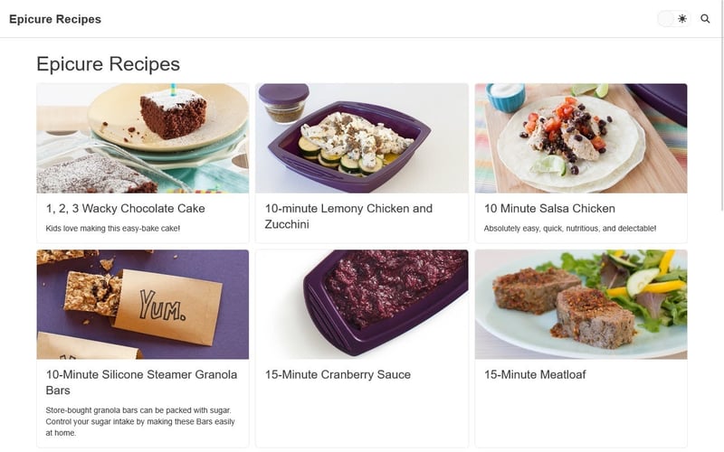
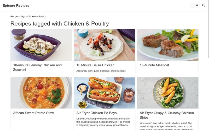
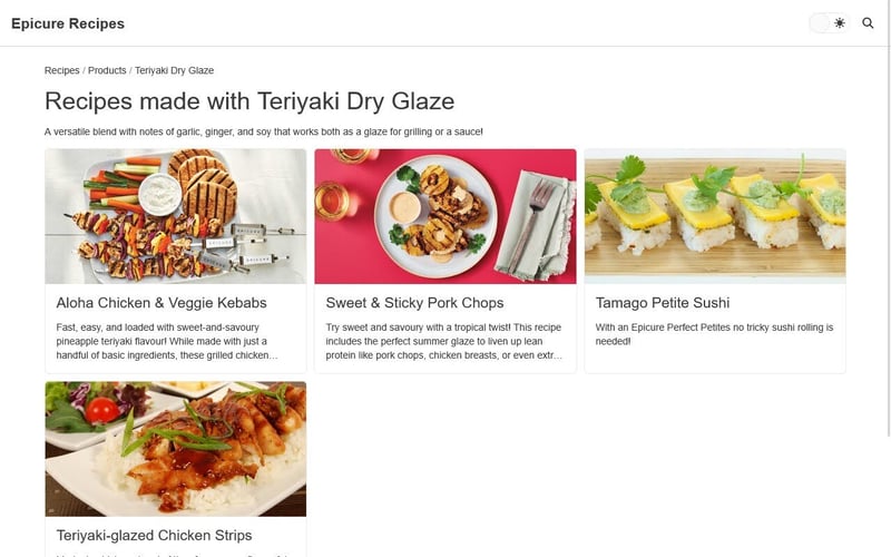
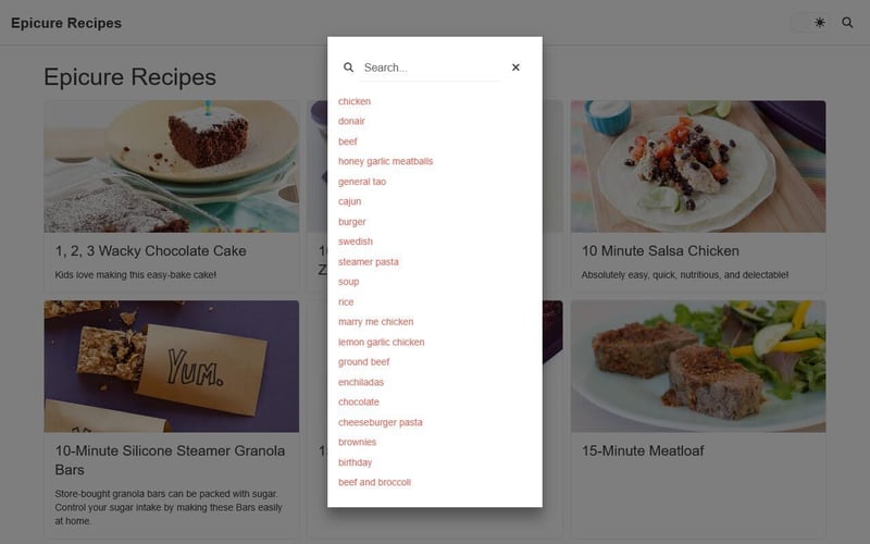
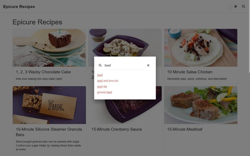
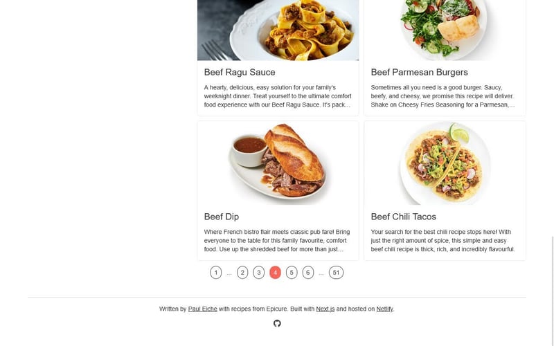
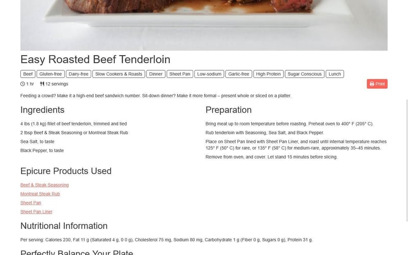
Here are a few screenshots of the website's different browsing capabilities. It is possible to view recipes in a list; recipes tagged under a category; and recipes tagged as using a particular Epicure product. This can vary widely, since Epicure made seasoning packets and jars, as well as kitchen utensils and tools like burger presses and microwave steamers.
When I was scraping data from Epicure's recipes, I found that each page contained data in JSON format that contained not only the recipe itself, but also category and product information. This made it quite easy for me to build out tag and product pages as well. I don't have any interest in upselling their products, of course. I'm not affiliated with Epicure, and they aren't manufacturing any new ones, anyway. But it is useful to know what products are used in a recipe, and if you have one of those products, the ability to find more recipes that use it.
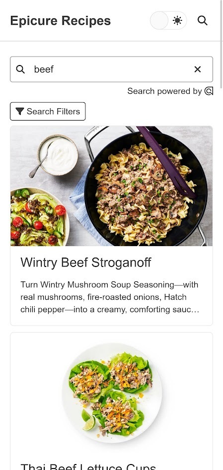
Because this is a static site built from JSON data, there is no way to reorder recipes on any given page (although the metadata for dates published and the like does exist in the original JSON). These pages are good for browsing, but if you're looking for a specific recipe, you're better off using the search page.
The search is built using Algolia's InstantSearch for React. I mentioned that the site is built on static JSON data; that very same data was also used to generate the Algolia search index.
The site's search is separated into two parts. The first is the search page, which uses the aforementioned index. Since I already have data for tags and products, it required no extra effort on my part to include that data as facets.
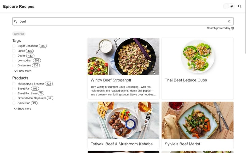
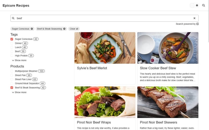
The second part of the search is the suggest, which Algolia offers as a "learning" index. It uses the primary search index and updates it based on usage, adding and modifying records as people use the site.
KendoReact Experience
Below is a list of KendoReact components I used in the project, followed by some custom work when they couldn't offer enough functionality or customization for my liking.
Typography
This is a pretty obvious one, and almost shouldn't even count in the list of components. But it is one, since with this single component one can render a variety of typography-related tags.
Button
Buttons are used throughout the site, primarily for functionality that doesn't directly result in navigation to a different page. This includes things like the Search button in the navbar and pagination on the search page.
The difficulty I encountered with converting from MUI to KendoReact was that Kendo's Button component can't be a link. It can only render a element, never a . Sure, you can set the onClick event to trigger navigation, but for SEO purposes I prefer to render a link. To that end, there are instances on the site where I manually created anchor elements that merely look like buttons using the same CSS classes as the Button component. You can see an example of this in the "button" on the homepage.
AppBar
The site's top navigation uses this, along with subsequent components. Rather than use display: flex in custom CSS to create spacing, I was able to leverage the AppBarSection and AppBarSpacer components with zero utility class usage.
GridLayout and GridLayoutItem
In places where I needed to create a grid, such as the list pages and search results, I used these components. Unlike MUI's Grid counterpart, these use display: grid rather than display: flex. I am less familiar with CSS Grid than I am with Flex, but making a symmetrical layout is simple enough.
What I did have issues with is making the layout responsive. I found tutorials on how to do so with KendoReact (like this one) that require extensive configuration or creating a listener to window resizing. None of that appealed to me, so I created a couple utility classes in my stylesheet, one for a two-column layout (used on the search results page) and one for a thee-column layout (used on all the list grid pages).
Card
Inside every GridLayoutItem component was a shared recipe card component, which used Card and subsequent components, like CardImage, CardHeader, and CardBody. Some style specificity I had to override with the utility classes provided by the themes' stylesheets (more on that later).
TextBox
I don't have much by way of forms on the site, but there are two: the search suggest and the search results page itself.
Chip
You might think that I'm using the Chip component on the recipe detail page, but you'd be wrong. Those are actually a custom component with all the classes to recreate the appearance of a Chip. The reason I didn't use the KendoReact component is simple: you can't make it a link, only a button. For SEO purposes, I prefer to use a link when navigation is required.
On the search results page, however, I am using the Chip as provided by KendoReact. There's no navigation there: clicking on one of those will rearrange the search filters. The hit count next to each facet is also a Chip, but used solely for its display design.
Checkbox
On the search results page, each facet is represented by a checkbox. Checking it will filter according to that selection; unchecking it will undo the selection.
Dialog
To pop up the search suggest modal, I'm using the Dialog component. Super simple, and no customization required.
Drawer
Like every page, the search results page is responsive. I designed the entire site to be usable on a phone as well as a computer, and the search is no exception. When your screen is too small to display the search filters alongside the results, I hide the filters in a sidebar. Inside the drawer, the selected facets are also displayed.
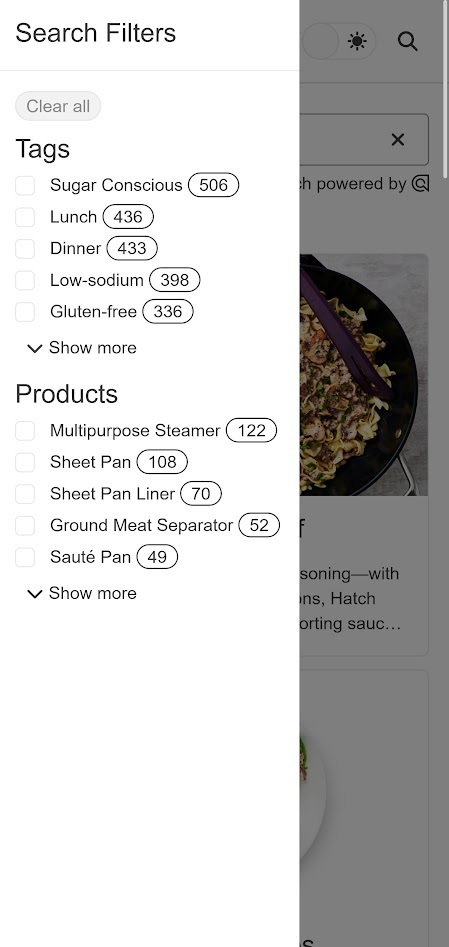
I did find the Drawer somewhat counterintuitive to use, as the default behavior expects to be given a list of items as navigation. However, there is a component called DrawerNavigation that can be used to manually insert any kind of content inside the drawer.
Switch
I put a Switch in the header to swap between light and dark modes (more on that in a minute). There isn't a whole lot of customization; it only allows for custom text in the different toggle states, and I really wanted to use sun and moon icons. I found a site that lets you search for symbols, so I copied those characters and put them in the text props.
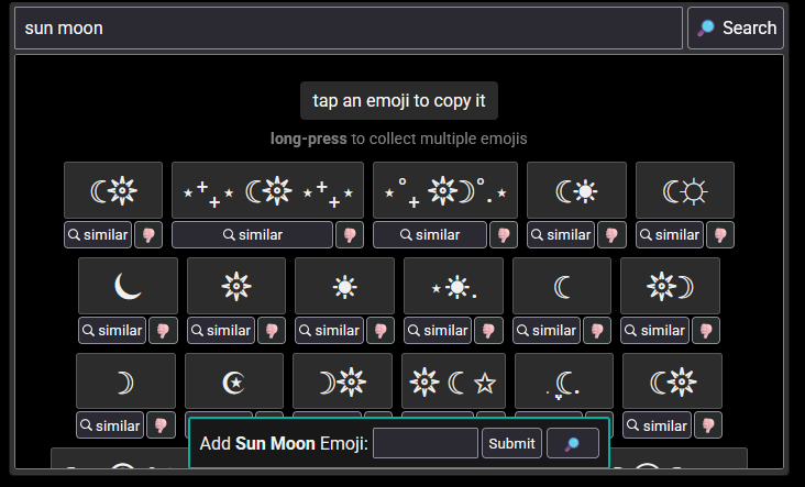
The selection defaults to light mode, but switching it saves the change to local storage, allowing a user to keep using that theme without having to click it again the next time they visit.

Custom Components
As I mentioned, some of KendoReact's components did not offer enough versatility to use out-of-the-box. I want to talk about those for a minute here.
Button
I already mentioned this one, but I think it bears repeating. Sometimes you want to style a link like a button, and KendoReact does not provide an easy way to do that. Every time I wanted a link that looked like a button, I would create the button, copy its CSS classes, and then manually create the link. (In my case, I used NextJS's Link component.)
{/* Button component */}
<Button
  themeColor='primary'
  fillMode='solid'
>PrintButton>

{/* Recreated link  */}
<Link
  className='k-button k-button-md k-button-solid k-button-solid-primary k-rounded-md'
  href={`/recipe/${slug}/print`}
  target='_blank'
>
  <span className='k-button-text'>Printspan>
Link>
Chip
The "chips" on the recipe detail page, as I've mentioned, are custom anchor elements. Much like I did with the links that look like buttons, I created a Chip, copied its CSS classes, and created an anchor element with those classes. You can see the custom shared component here:
https://github.com/peiche/epicure-recipes/blob/kendo-challenge/src/components/chipLink.tsx
Pager
As far as I could tell from the documentation, the Pager component was to be used within the context of a data table. I had two use-cases: pagination for the browse pages and the search results page. The former had to result in navigation, so they had to be links. The latter are buttons since they update the page but don't result in navigation away from a page. (The URL does get updated, though, so a specific search result can be linked to.)
I ended up writing my own pagination components, one for each use-case. I briefly considered writing a single component that could handle both, but there is such a thing as over-engineering!