


![Apple to Craft Key Foldable iPhone Components From Liquid Metal [Kuo]](https://www.iclarified.com/images/news/96784/96784/96784-640.jpg)

![Apple to Focus on Battery Life and Power Efficiency in Future Premium Devices [Rumor]](https://www.iclarified.com/images/news/96781/96781/96781-640.jpg)


_Federico_Caputo_Alamy.jpg?#)


![[The AI Show Episode 139]: The Government Knows AGI Is Coming, Superintelligence Strategy, OpenAI’s $20,000 Per Month Agents & Top 100 Gen AI Apps](https://www.marketingaiinstitute.com/hubfs/ep%20139%20cover-2.png)


![[The AI Show Episode 138]: Introducing GPT-4.5, Claude 3.7 Sonnet, Alexa+, Deep Research Now in ChatGPT Plus & How AI Is Disrupting Writing](https://www.marketingaiinstitute.com/hubfs/ep%20138%20cover.png)


![From hating coding to programming satellites at age 37 with Francesco Ciulla [Podcast #165]](https://cdn.hashnode.com/res/hashnode/image/upload/v1742585568977/09b25b8e-8c92-4f4b-853f-64b7f7915980.png?#)


.jpg?width=1920&height=1920&fit=bounds&quality=80&format=jpg&auto=webp#)


.png?#)


What Germany Currently Is Up To, Debt-Wise
Billions, visualized to scale using python and HTML The post What Germany Currently Is Up To, Debt-Wise appeared first on Towards Data Science.

€1,600 per second. That’s how much interest Germany has to pay for its debts. In total, the German state has debts ranging into the trillions — more than a thousand billion Euros. And the government is planning to make even more, up to one trillion additional debt is rumored to follow over the next 10 years.
The numbers involved in governmental finances are so huge that one probably cannot realistically assess just how much even 1 billion Euro or Dollar are.
In this article, I demonstrate that conventional lists and Charts fail to convey a sense of just how much money is at stake when it comes to governmental spending. I then show how a little bit of programming can interactively visualize this money and how it relates to other numbers. I will use Germany as an example, as it currently receives a lot of media coverage and its debt statistics are freely available.
Plain enumeration
To start, we’ll use plain enumeration of the key facts as the first method to (not) put information into relation. It excludes household debts. As we’ll later see, this simple method utterly fails compared to the visualization tools provided through simple scripts.
- €1,600: interest rate per second
- €25,503: debt per German citizen if state debt is split
And here’s already a large jump for us. We are directly jumping into the billions:
- €49,5 billion: interest rate per year
- €100 billion: Sondervermögen (euphemism for debt) for German Army
- €500 billion: planned additional debt for infrastructure
Now, we are making another jump:
- €2,11 trillion: total German governmental debt (as of March 2025)
After reading these numbers, we might know a bit more about Germany’s debt. But we hardly have an understanding of how they relate to each other. Yes, we know that €1 billion is a thousand times €1 million. But that’s just common sense.
We would probably fare better if we could see the numbers visualized side by side. That’s what we will do next.
Linearly scaled charts
Using python and the Matplotlib plotting library, it is straightforward to create a simple chart. (Complete code is linked in this article’s Resource section at the end).
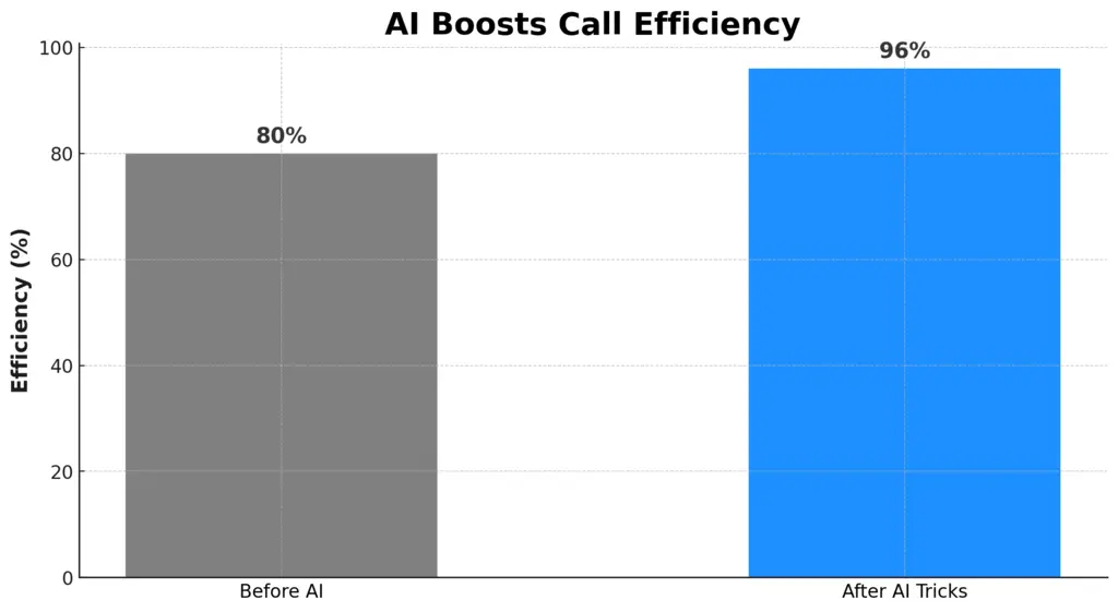
I picked four numbers to visualize together: €1,600 (because most people know just how much already that is), €25,503 (because it nicely shows the hidden debt that any German has), €1 billion (because that’s a very large sum, something that large companies don’t even make per year), and, finally €49,5 billion (because that’s how much Germany currently needs to spend just in interest per year which is more than most countries’ GDP).
import matplotlib.pyplot as plt


# Data
amounts = [1600, 25503, 1e9, 49.5e9, ]
labels = ['Per-sec. interest', 'Per-person debt','€1 billion', 'Yearly interest']


plt.figure(figsize=(10, 6))
plt.bar(labels, amounts, color=['orange', 'orange', '#03A9F4', '#ff0000'])
After running this code, we get the following plot:

What we see in an instant: we don’t see the small money. The huge amounts completely dwarf the €1,600. I’d wager to say that anybody reading this has more connection to just €1,000 than to, say, €1 million. We know what €1,000 could afford us. A couple of €1,000 is a good monthly income for most people.
But the chart does not even recognize it.
Is the mistake that I used linearly scaled axes? Let’s see next.
Logarithmically scaled charts
In visualizing the data logarithmically, we’ll stick to python and matplotlib. We merely need to add a single line of code and directly get an updated chart:

Is it better? To some extent, yes! We can now begin to see the difference between everyday amounts (like the €1,600 interest per second) and the planned spending (i.e., debt).
Thanks to the logarithmic scaling, they appear on the same chart. In this visualization, the chart does not grow linearly, but logarithmically. This means that the spacing between two markers on the y-axis does not represent a fixed, equal increment (like before in the linearly scaled plot). Instead, each step represents a multiplication by a constant factor. In our plot, the spacing is determined by multiplying with 100 (or, adding two trailing zeros).
For our purpose: is such logarithmic scaling better than linear scaling? Yes, definitely.
But, is it sufficient? Can we not do better in trying to convey what Germany’s up to when it plans for €500 billion of additional debt? And, how does this debt relate to other, already existing debts?
Yes, of course we can. Using a little bit of HTML, JavaScript, and some CSS styling, we can quickly create a simple interactive webpage. For a beginner it’s easily doable over a weekend.
A static webpage is all it needs!
Data scientists and programmers wrangle with data day-in, day-out. Tools like Excel and python scripts help them with transforming the data to gain insights.
Sometimes, however, a simple webpage can convey the relationship between numbers better. Especially when we are talking about the huge sums involved in governmental debts.
We start our visualization in HTML, by stacking a few div-elements on top of each other:
...

     €25,503 (Debt per German citizen if total governmental debt is split )


     €1 billion


       €49,5 billion (German interest per year)


...
For each section, we indicate the amount in € in an HTML attribute.
Next, we will use JavaScript to transform the amounts into an easy-to-grasp-visualization.
For this, we define that each pixel represents €1,000. By using rectangular forms, we can thus represent any amount of money:
document.addEventListener("DOMContentLoaded", function() {
     const wealthBars = document.querySelectorAll(".debt");
     wealthBars.forEach(bar => {
       if (!bar.dataset.scaled) {
         const amount = parseInt(bar.dataset.height) / 1000;
         const width = Math.min(Math.sqrt(amount), 200); // Cap the width pixels
         const height = amount / width;
         bar.style.width = width + "px";
         bar.style.height = height + "px";
         bar.dataset.scaled = "true";
Lastly, we add some CSS styling to make the rendered webpage look well:
.debt-wrapper {
 display: flex;
 flex-direction: column;
 align-items: center;
 margin: 20px 0;
}


.debt-title {
 font-size: 20px;
 margin-bottom: 10px;
}


/* Debt Bars */
.debt {
 position: relative;
 transition: height 0.3s ease-out, width 0.3s ease-out;
 background-color: #ffcc00;
 max-width: 200px; /* Maximum width for bars */
}
Putting all of this together (find the full source code in the Resources section below), we get the following (I added further key numbers that I considered relevant in putting the German debt into proportion):

Now, that is an easy to understand visualization! You can explore it yourself here: https://phrasenmaeher.github.io.
This simple webpage more accurately represents the huge amount of fresh debt that Germany wants to make. Using basic Programming skills, we show how the debt relates to everyday sums (like €1,600) and existing debt-related costs (like the €49,5 billion interest per year). Just start scrolling down, and you get a sense of how much money it is. In the above GIF, we have not even scrolled 1% of the entire way down (look at the scroll bar to the right, it barely moves).
Recall that 1 pixel equals €1,000. Even if you are earning €10,000 per month, that’s merely 10 pixels, which is barely noticeable in the debt bars. If you scroll just 1 pixel down, you have uncovered €200,000 of new debt (with the default bar width of 200). Even if you make €1 million (per year), that’s just a mere scrolling of 5 pixels. However much money you make, the visualization demonstrates: it’s literally a drop in the debt ocean.
If you are German, I don’t feel envy, especially not for the upcoming generations: somebody has to pay this back. In addition to existing debts.
Resources
- Interactive webpage: https://phrasenmaeher.github.io/
- All code (Python, HTML, JavaScript, CSS): https://github.com/phrasenmaeher/german-debt
- Sources for the numbers: https://github.com/phrasenmaeher/german-debt?tab=readme-ov-file#select-sources
The post What Germany Currently Is Up To, Debt-Wise appeared first on Towards Data Science.