


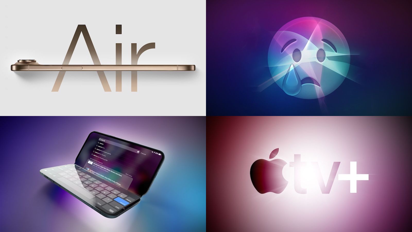
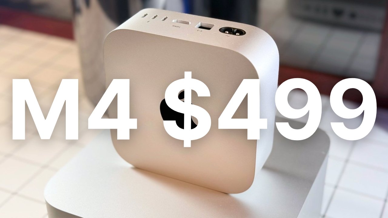
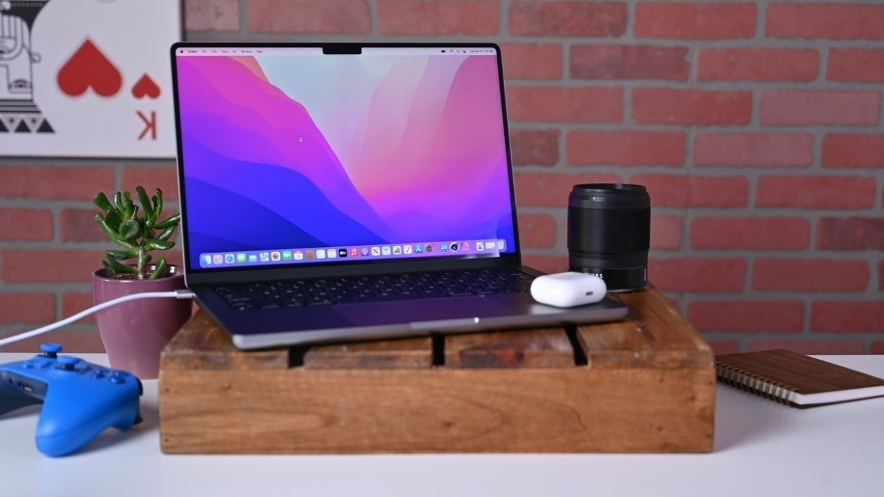
![Apple M4 Mac Mini on Sale for $499 [Lowest Price Ever]](https://www.iclarified.com/images/news/96788/96788/96788-640.jpg)
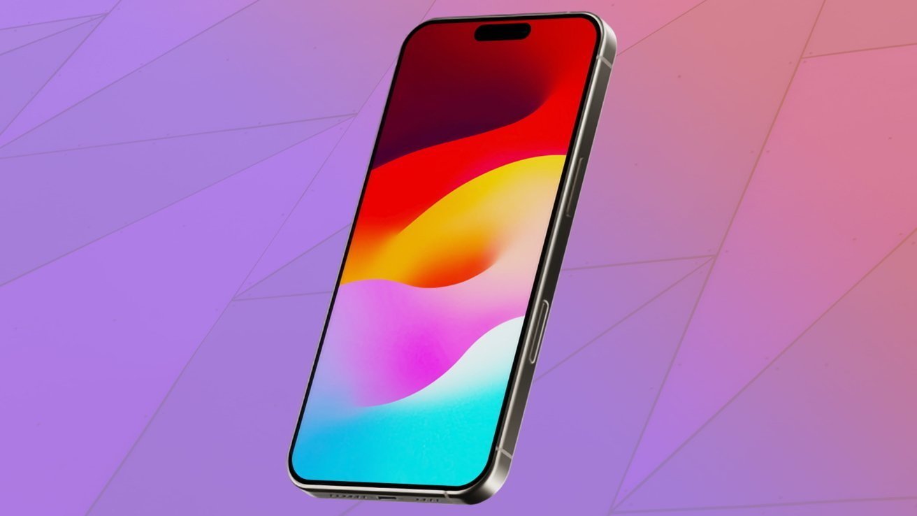
![Apple Shares First Look and Premiere Date for 'The Buccaneers' Season Two [Video]](https://www.iclarified.com/images/news/96786/96786/96786-640.jpg)
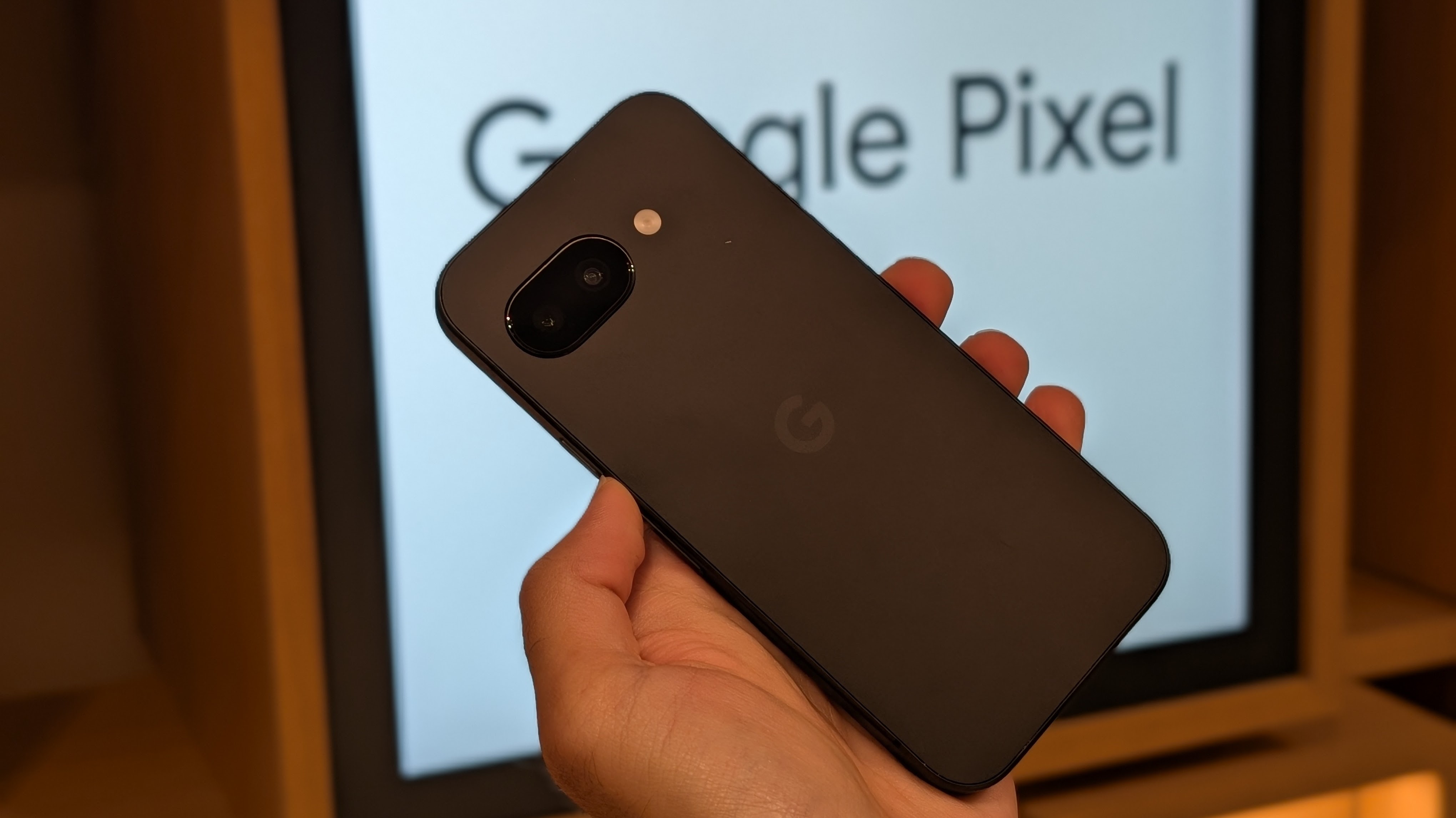
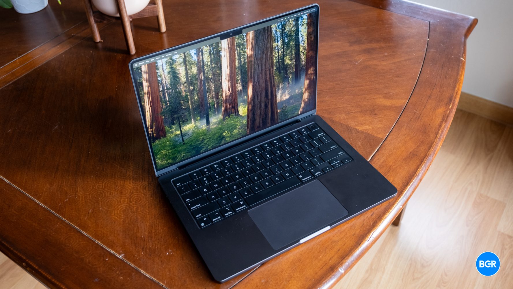
![Apple to Craft Key Foldable iPhone Components From Liquid Metal [Kuo]](https://www.iclarified.com/images/news/96784/96784/96784-640.jpg)


_Federico_Caputo_Alamy.jpg?#)


![[The AI Show Episode 139]: The Government Knows AGI Is Coming, Superintelligence Strategy, OpenAI’s $20,000 Per Month Agents & Top 100 Gen AI Apps](https://www.marketingaiinstitute.com/hubfs/ep%20139%20cover-2.png)


![[The AI Show Episode 138]: Introducing GPT-4.5, Claude 3.7 Sonnet, Alexa+, Deep Research Now in ChatGPT Plus & How AI Is Disrupting Writing](https://www.marketingaiinstitute.com/hubfs/ep%20138%20cover.png)


![Is Sybase SQL Anywhere 9.0 Web Services a viable backend option for a fiscal Android app in 2025? [closed]](https://cdn.sstatic.net/Sites/softwareengineering/Img/apple-touch-icon@2.png?v=1ef7363febba)


![From hating coding to programming satellites at age 37 with Francesco Ciulla [Podcast #165]](https://cdn.hashnode.com/res/hashnode/image/upload/v1742585568977/09b25b8e-8c92-4f4b-853f-64b7f7915980.png?#)


![[FREE EBOOKS] Artificial Intelligence for Cybersecurity & Five More Best Selling Titles](https://www.javacodegeeks.com/wp-content/uploads/2012/12/jcg-logo.jpg)


.jpg?width=1920&height=1920&fit=bounds&quality=80&format=jpg&auto=webp#)


.png?#)


KendoReact Kit
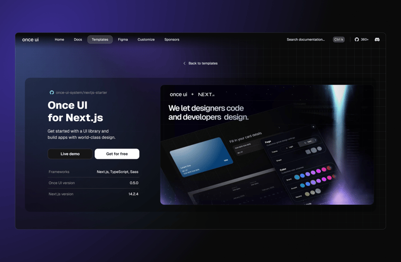
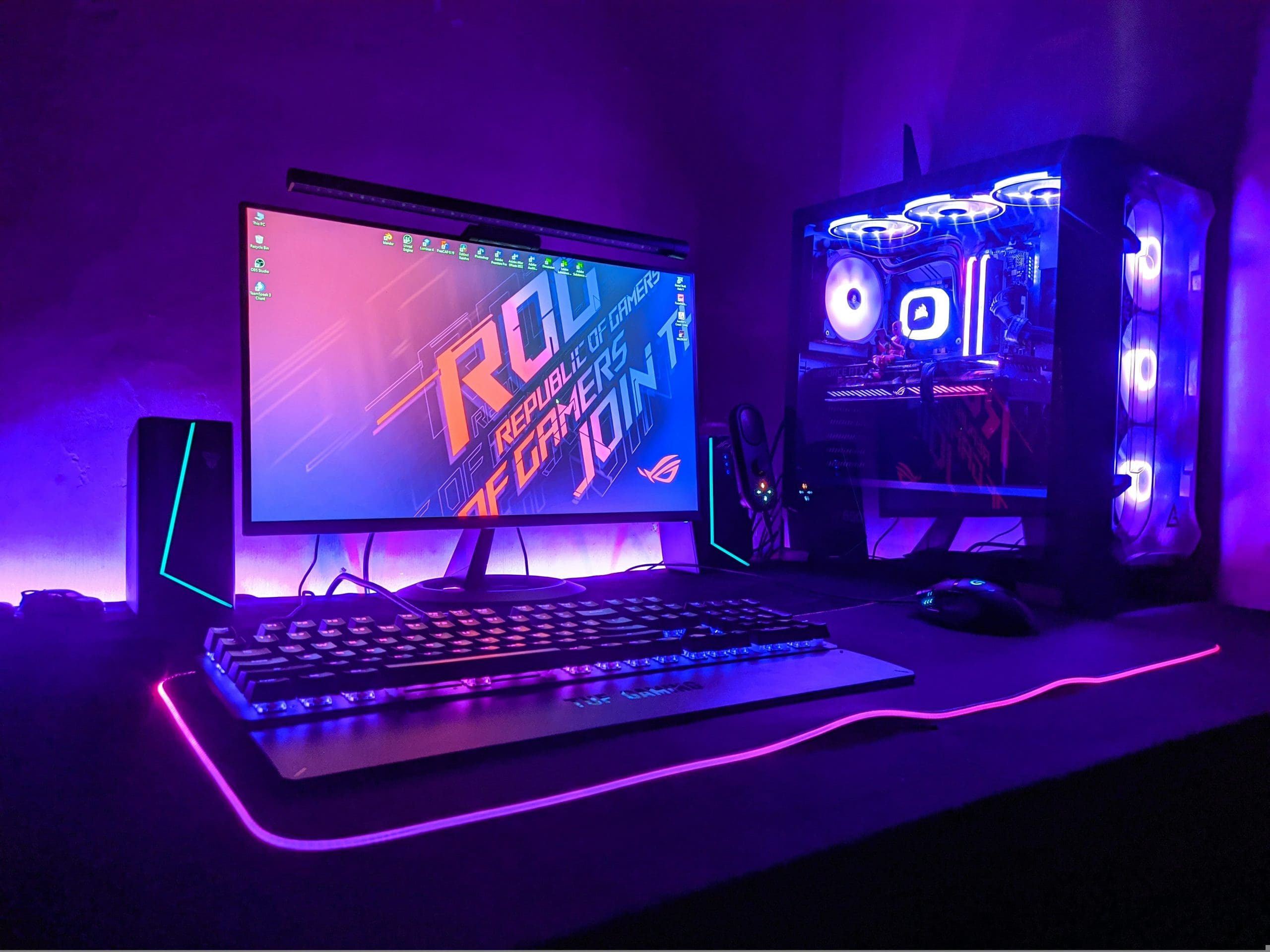
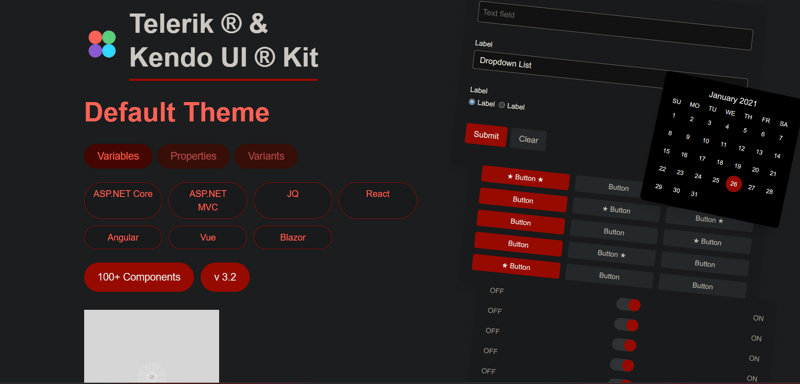
This is a submission for the KendoReact Free Components Challenge. What I Built I created a React application that recreates the Telerik Kendo UI Kit interface. The app features a variety of UI elements, including forms, buttons, toggles, and a calendar widget, all designed to reflect the Kendo UI aesthetic. My goal was to showcase how KendoReact Free components can be used to build a visually appealing and functional interface. Demo Check out the live demo here: Vercel Screenshot KendoReact Experience: To build this application, I used several Kendo React Free components to create an interactive and polished UI. Here’s how I used them: 1️⃣ Button: For actions like "Submit" and "Clear" in the form. 2️⃣ Input: For text fields in the form section. 3️⃣ DropDownList: To provide selectable options. 4️⃣ RadioButton: For choice selections in the form. 5️⃣ Switch: To create the toggle switches. 6️⃣ Calendar: For the date selection widget. 7️⃣ PanelBar: To organize content into expandable panels. 8️⃣ Grid: For displaying tabular data (used in an extended section). 9️⃣ Chart: To visualize data (used in an extended section). 1️⃣0️⃣ DatePicker: For date selection (used alongside the calendar). These components helped me build a seamless and user-friendly experience that aligns with the Kendo UI design language. Delightfully Designed I used the KendoUI Figma Kits to guide the design of my application. The kits provided detailed design assets that I referenced to ensure consistency in styling and layout. By aligning my implementation with the Figma designs, I created a cohesive UI that matches the Kendo UI aesthetic. Using the Figma Kits made it easier to translate the design into code, ensuring a professional and polished result.
This is a submission for the KendoReact Free Components Challenge.
What I Built
I created a React application that recreates the Telerik Kendo UI Kit interface. The app features a variety of UI elements, including forms, buttons, toggles, and a calendar widget, all designed to reflect the Kendo UI aesthetic. My goal was to showcase how KendoReact Free components can be used to build a visually appealing and functional interface.
Demo
Check out the live demo here: Vercel
Screenshot
KendoReact Experience:
To build this application, I used several Kendo React Free components to create an interactive and polished UI. Here’s how I used them:
1️⃣ Button: For actions like "Submit" and "Clear" in the form.
2️⃣ Input: For text fields in the form section.
3️⃣ DropDownList: To provide selectable options.
4️⃣ RadioButton: For choice selections in the form.
5️⃣ Switch: To create the toggle switches.
6️⃣ Calendar: For the date selection widget.
7️⃣ PanelBar: To organize content into expandable panels.
8️⃣ Grid: For displaying tabular data (used in an extended section).
9️⃣ Chart: To visualize data (used in an extended section).
1️⃣0️⃣ DatePicker: For date selection (used alongside the calendar).
These components helped me build a seamless and user-friendly experience that aligns with the Kendo UI design language.
Delightfully Designed
I used the KendoUI Figma Kits to guide the design of my application. The kits provided detailed design assets that I referenced to ensure consistency in styling and layout. By aligning my implementation with the Figma designs, I created a cohesive UI that matches the Kendo UI aesthetic.
Using the Figma Kits made it easier to translate the design into code, ensuring a professional and polished result.