


![iOS 19 Leak: First Look at Alleged VisionOS Inspired Redesign [Video]](https://www.iclarified.com/images/news/96824/96824/96824-640.jpg)

![OpenAI Announces 4o Image Generation [Video]](https://www.iclarified.com/images/news/96821/96821/96821-640.jpg)


![Do you care about Find My Device privacy settings? [Poll]](https://i0.wp.com/9to5google.com/wp-content/uploads/sites/4/2024/06/Chipolo-One-Point-with-Find-My-Device-app.jpg?resize=1200%2C628&quality=82&strip=all&ssl=1)


![[The AI Show Episode 140]: New AGI Warnings, OpenAI Suggests Government Policy, Sam Altman Teases Creative Writing Model, Claude Web Search & Apple’s AI Woes](https://www.marketingaiinstitute.com/hubfs/ep%20140%20cover.png)
![[The AI Show Episode 139]: The Government Knows AGI Is Coming, Superintelligence Strategy, OpenAI’s $20,000 Per Month Agents & Top 100 Gen AI Apps](https://www.marketingaiinstitute.com/hubfs/ep%20139%20cover-2.png)


.png?width=1920&height=1920&fit=bounds&quality=80&format=jpg&auto=webp#)


Testing the Power of Multimodal AI Systems in Reading and Interpreting Photographs, Maps, Charts and More
Can multimodal AI systems consisting in LLMs with vision capabilities understand figures and extract information from them? The post Testing the Power of Multimodal AI Systems in Reading and Interpreting Photographs, Maps, Charts and More appeared first on Towards Data Science.

Introduction
It’s no news that artificial intelligence has made huge strides in recent years, particularly with the advent of multimodal models that can process and create both text and images, and some very new ones that also process and produce audio and video. I think that these Ai Systems have the potential to revolutionize data analysis, robotics, and even everyday tasks like navigation and information extraction from visuals. Along these lines, I recently posed myself the following question:
Can multimodal AI systems consisting in large language models with vision capabilities understand figures that contain information, then process it and produce summaries, explanations, object identification, etc.?
Although this is in itself a question that would require a whole research project to be properly addressed, I was extremely curious about it, so I needed to get at least a rough approximation to my question. Therefore, I carried out some tests on how much OpenAI’s vision-enhanced models understand about photographs, screenshots and other images containing plots, charts, shots from a driver’s position or mimicking a robot’s onboard camera, and even molecular structures.
More specifically, I tried the GPT-4o and GPT-4o-mini models developed by OpenAI, through ChatGPT or through their API. To my amazement, I found that these models can indeed understand quite a bit of what they see!
Let me present here the most interesting results I obtained, either directly through ChatGPT or programmatically, including code for a web app where you can paste a picture and have GPT-4o-mini analyze it.
First of All: How to Analyze Images With OpenAI’s GPT-4o Models, Via ChatGPT or Programmatically
I carried out my first tests right away on ChatGPT’s free version using GPT-4o, which allows up to 4 chances per day to use the “vision” capabilities for free. To use this you must upload or paste from clipboard a picture that will be sent together with the prompt. On a paid ChatGPT account you can do this more times, and with the OpenAI API you can do this as long as token credits are available, and directly programmatically as I will cover here.
Processing prompts containing pictures programmatically
But how to do image processing with GPT-4o models programmatically? Well, it isn’t that complex, as explained at OpenAI’s API reference.
In JavaScript, which I love because it allows me to easily write programs that run out of the box online as you already know if you follow me, you just need a function call that looks like this:
async function sendToOpenAI(imageData) {
    const apiKey = "...API KEY HERE";
    const base64Image = imageData.split(",")[1];

    const response = await fetch("https://api.openai.com/v1/chat/completions", {
        method: "POST",
        headers: {
            "Content-Type": "application/json",
            "Authorization": `Bearer ${apiKey}`
        },
        body: JSON.stringify({
            model: "gpt-4o-mini",
            messages: [{
                role: "user",
                content: [
                    { type: "text", text: "what's in this image?" },
                    { type: "image_url", image_url: { url: `data:image/jpeg;base64,${base64Image}` } }
                ]
            }]
        })
    });

    const result = await response.json();
    document.getElementById("response").innerText = result.choices[0].message.content;
}
A web app to quickly run image-text prompts
In this example web app you can provide an API key and a text prompt, and then paste an image from the clipboard that will be immediately sent to OpenAI for analysis together with the prompt.
https://lucianoabriata.altervista.org/tests/gpt-vision/gpt-4o-mini-vision.html
The web app ends up displaying the answer, as in this example:

(Keep reading to find towards the end of the post how Google’s Gemini 2.0 interpreted this screenshot, which was just mind-blowingly correct as it captured the artist’s actual intention!)
Challenging GPT-4o Models With Varied Examples of Image-Text Prompts
Using the above app to run GPT-4o-mini and ChatGPT’s free version to run GPT-4o, I evaluated how these models can understand maps, photographs that mimic what a driver sees on the road, camera views about the position of a robot’s arm relative to some target objects, various different kinds of plots and charts presenting data, and software screenshots including some that display molecules.
I am stunned at how much the models understand! Read on to discover it all, also take a look at my first tests with the impressive Gemini 2.0 Flash from Google, and perhaps then go try your favorite AI models with your own ideas, sharing in the comments what you find!
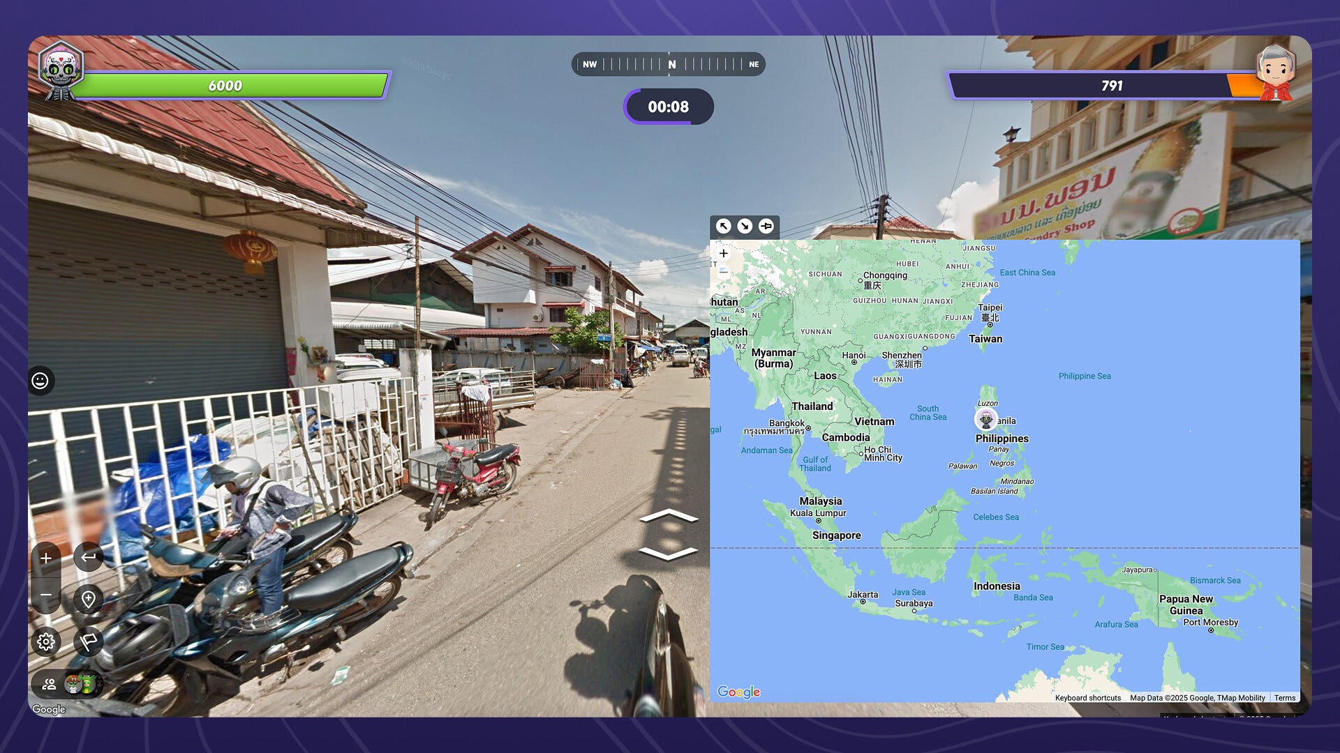
1. Vision-Based Analysis of a Google Maps Screenshot
Sometimes, maps contain so much information that you kinda get lost around. Could a multimodal system be of help in such situation? Let’s find out!
Here on the left is a screenshot from a Google Maps view that I fed into GPT-4o-mini via the API together with the question “What’s in this image?” . You can see the answer on the right:

2. Interpreting Driving Signs in a Road
Could perhaps multimodal systems help you to drive? Of course this deserves a full investigation in order to draw a solid conclusion, but let’s see what happens in some quick tests. In each test, I provided a photograph of what a driver sees in the road on the go, together with this text prompt :
Interpret any road signs or things I should pay attention to as a driver
Here are the results on some example shots, all run with the web app provided above i.e. using GPT-4o-mini:
First, for this photograph:

GPT-4o-mini said the following:
As you drive, pay attention to the following signs and features in the image:
1. **”Keep Right” Sign**: This indicates that you should stay to the right side of the road, likely because of an island or obstruction ahead.
2. **Curved Road Ahead**: The layout of the road suggests you may encounter a curve, which means you should reduce your speed and stay alert for any oncoming vehicles.
3. **Speed Limit**: The sign showing a speed limit of 40 suggests that you should not exceed this speed.
4. **Road Layout**: Be mindful of the marking lines and how they direct traffic. The two solid yellow lines indicate that crossing them (to pass another vehicle) is prohibited.
5. **Surroundings**: Note the vegetation and landscape along the road, which may obscure visibility in some areas. Maintain awareness of pedestrians or cyclists.
Make sure to remain vigilant and adhere to these guidelines for safe driving.
This answer was quite nice, complete, and useful!
Let’s try this next one, in a densely snowed place:

Here it clearly picked up the snow, and correctly inferred it is a region with mountains, offering some quite general advice that suits the situation but doesn’t seem very specific to it:
When driving in snowy mountain conditions, there are several important things to pay attention to:
1. **Yield Sign**: If there’s a yield sign, be prepared to slow down and give way to any traffic on the intersecting road.
2. **Road Conditions**: Snow can make roads slick and reduce visibility. Drive cautiously and maintain a safe distance from other vehicles.
3. **Speed Limit**: Always adhere to the posted speed limit but consider reducing your speed further due to the weather conditions.
4. **Slippery Surfaces**: Be aware that certain areas may be icier or more treacherous. Watch for signs indicating slippery roads or do not enter areas.
5. **Falling Rocks**: In mountainous areas, watch for any signs indicating potential rockfall or land slides, which may be exacerbated by snow.
6. **Wildlife**: In rural or mountainous regions, be alert for wildlife crossing the road, especially in winter months.
7. **Visibility**: If visibility is low due to snow, be sure to use your headlights and reduce your speed.
Always ensure that your vehicle is equipped for winter conditions, including snow tires or chains if necessary.
Let’s try a last one, which features a tunnel, a car right ahead of the driver, some warnings on the left, and two sign posts on the right:

Here’s the answer, which seems to be warning about all general and situation-specific issues:
Here are some important points to note based on the image:
1. **Tunnel Ahead**: You are approaching a tunnel. Prepare for possible changes in visibility and ensure your vehicle’s headlights are on.
2. **Speed and Space**: Always maintain a safe distance from the vehicle in front of you, especially in confined spaces like tunnels.
3. **No Pedestrians or Bicycles**: The sign indicates that pedestrians and bicycles are not allowed in the area. Stay alert to ensure you don’t encounter anyone on the road.
4. **Road Barriers and Traffic Flow**: Pay attention to the road markings and barriers as they guide lane usage and safe navigation near the tunnel entrance.
5. **Weather and Terrain**: The surrounding scenery suggests that weather conditions may change quickly, especially driving in mountain areas. Be prepared for changes in road conditions.
Always drive cautiously and obey any traffic signs or signals present.
Note however that it didn’t note the specific change in speed limit. I tried again this photograph with some more focused text prompts, but it could never say anything about the change in speed limit specific to this situation, rather providing general recommendations such as this:
The maximum speed limit inside a tunnel can vary based on the country’s traffic regulations, the specific road, and the tunnel’s design. Generally, in many places, typical speed limits range from 50 to 80 km/h (about 30 to 50 mph). To determine the exact speed limit for a specific tunnel, you would need to look for posted signs or consult local traffic regulations.
Which is correct but shows that it wasn’t capable of extracting the information specifically available here, which would be something along the lines of “Maximum speed is not indicated, but it is definitely above 50 according to the visible sign post.”
3. Could Vision-Ready Models Drive Robots?
If an AI model understands pictures well enough, one could then think about feeding a robot’s camera feed to the model so that it can produce outputs that make sense. Of course this is a huge thing to study in itself, having to produce commands that end up in mechanical outputs; but let’s see here how the core part — i.e. converting views to broad actions — would work.
Given this photograph of a robotic arm on a table where a red and blue ball await to be grabbed:

I ask GPT-4o the following:
How should the robotic arm move in order to grab the blue sphere?
To which the LLM replies quite correctly, even asking me if I want it to follow up with code generation:
To grab the blue sphere, the robotic arm should follow these steps:
Position the Base: Rotate the base so that the arm aligns with the blue sphere.
Lower the Arm: Adjust the arm’s height by moving its joints to bring the gripper closer to the sphere.
Extend Forward: If necessary, extend the arm forward to reach the blue sphere.
Open the Gripper: Ensure the gripper is open wide enough to grasp the sphere.
Close the Gripper: Gently close the gripper around the sphere to secure it.
Lift the Sphere: Raise the arm slightly while keeping the sphere firmly held.
Retract or Move to Destination: Move the arm to a desired location for placing the sphere.
These movements should be smooth to avoid dropping or misaligning with the sphere. Would you like assistance with programming the robotic arm for this task?
I feel the answers are quite good, but lack precision. So, rather than going down the road of asking for code, I will interrogate the LLM a bit deeper to see what it is really understanding in this picture:
When you say “Position the Base: Rotate the base so that the arm aligns with the blue sphere.” should the arm move to its left or to its right, based on the image?
The answer turns out very good:
Based on the image, the robotic arm should rotate to its left to align with the blue sphere. The sphere is positioned to the left of the arm’s current orientation, so rotating counterclockwise will bring the gripper closer to the sphere.
Yet I dig a bit deeper:
How much do you estimate it should rotate?
This new answer is essentially the same that I could estimate as a human from the photograph:
Estimating from the image, the robotic arm should rotate its base approximately 30 to 45 degrees counterclockwise to align with the blue sphere.
This estimate assumes that:
The arm’s current position is facing slightly to the right.
The blue sphere is placed in front and to the left of the arm.
Once the base is rotated, minor adjustments to the arm joints may be needed to fine-tune the position before grasping the sphere.
Finally, I ask about the red ball, to test if the model understands that it is on the other side and a smaller rotation is required:
And how about grabbing the red ball?
And it does get it right!
To grab the red sphere, the robotic arm should follow these steps:
Rotate the Base: The base should rotate slightly to the left, but much less than for the blue sphere. An estimated 15 to 20 degrees counterclockwise should align the arm with the red sphere.
Lower the Arm: Bring the gripper down closer to the red sphere.
Extend Forward (if needed): Adjust the arm’s reach if the gripper is not directly above the sphere.
Open the Gripper: Ensure the gripper is wide enough to grab the sphere.
Close the Gripper: Securely grasp the red sphere.
Lift the Arm: Raise the sphere carefully.
Move to Destination: Transport the sphere to a desired location if needed.
Since the red sphere is closer to the robotic arm than the blue sphere, less movement is required. Would you like a precise angle calculation based on measurements?
If you’re also excited about the possibility of driving robots with vision models, check out this thread on X.com.
4. Vision Models Acting on Data Plots
Being in Towards Data Science, we can’t escape the obvious question: can vision-assisted models understand the content of plots, perhaps even draw conclusions from them?
I did quite some tests here, dealing with different kinds of information and plot types.
Detecting high tides in a tide chart
I began with the following chart of tide highs and lows for one of the Azores islands, written in Portuguese but on which I asked a question in English:
When are the peak highs in the tides according to the chart?

This was the answer:
The peak high tides in the chart are marked by blue dots with corresponding times. The highest tides occur at the following times:
11 Aug: 11:18
12 Aug: 12:15
13 Aug: 12:58
14 Aug: 13:33
15 Aug: 14:05
16 Aug: 14:35
17 Aug: 15:05These times represent when the tide reaches its highest point each day.
You can immediately see that the displayed data is correct, but only represents high tides during the day and totally overlooks the high tides that happen during the day! Hence, I asked for that specifically, and got a much more complete answer:
I said:
But the times you say are all during the days… doesn’t the chart show also peak high tides at night?
GPT-4o said:
You’re absolutely right! The chart also shows peak high tides occurring at night. Here are all the peak high tide times (both daytime and nighttime) according to the chart:
11 Aug: 11:18 (Day)
12 Aug: 12:15 (Day) & 23:49 (Night)
13 Aug: 12:58 (Day) & 00:41 (Night)
14 Aug: 13:33 (Day) & 01:20 (Night)
15 Aug: 14:05 (Day) & 01:54 (Night)
16 Aug: 14:35 (Day) & 02:24 (Night)
17 Aug: 15:05 (Day) & 02:53 (Night)Each day has two peak high tides, one during the day and one at night. Thanks for catching that!
That’s now perfect. Finally, I asked one more piece of information:
OK thanks. Can you say where on earth this chart is for?
And again the answer was right:
Yes! The chart is for Ponta Delgada, São Miguel Island, which is part of the Azores, an autonomous region of Portugal in the North Atlantic Ocean. This location is known for its stunning volcanic landscapes, coastal views, and maritime activities. The tide chart shows the tidal schedule for this area from August 11 to August 17.
Interpreting a height profile from a photo
Next I made the question a bit harder, as the image consisted of a photograph of a screen (see the interfering horizontal bands), the x axis of the plot is not complete, and the question involves some thinking:
Looking at this, would I go up or down from Andermatt to Wassen? By how many meters and over how many km?

The answer was however perfect! Here it is:
From the elevation profile, Andermatt is at 1437m, and Wassen is at 916m. This means that traveling from Andermatt to Wassen involves a descent of 521 meters (1437m — 916m).
Looking at the horizontal axis, the distance from Andermatt to Wassen appears to be around 10 km. So, you would be going downhill by 521 meters over approximately 10 km.
Interpreting plots from RNA-seq data
I then tested GPT-4o’s capability to interpret plots produced as part of a bioinformatics pipeline. First, I made it process a volcano plot, which is one of the most common kinds of graphs used to analyze differential gene expression data. I took an example image from this free online tutorial, and asked the system the following:
You are a bioinformatics expert. What would you conclude from this volcano plot? I mean, which genes are up- or down-regulated?

This was GPT-4o’s answer:
This volcano plot represents differentially expressed genes in Arabidopsis thaliana infected with Pseudomonas syringae DC3000 compared to a mock treatment. Here’s my interpretation:
1. X-axis (Log₂ fold change):
Positive values indicate up-regulated genes (higher expression in infected samples).
Negative values indicate down-regulated genes (lower expression in infected samples).2. Y-axis (-Log₁₀ P-value):
Higher values indicate stronger statistical significance.3. Color coding:
Gray: Not significant.
Blue: Significant by p-value but not by fold change.
Red: Significant by both p-value and fold change threshold.Key findings:
Up-regulated genes (right side, red dots):
Strongly induced genes include AT5G42800, AT1G52440, AT1G73325, AT4G18440, among others.
These genes are highly expressed in infected plants.Down-regulated genes (left side, red dots):
Examples include AT4G28940, AT5G04100, AT1G04220, AT1G02440.
These genes are significantly suppressed during infection.Biological Implications:
Up-regulated genes may be involved in plant immune responses, such as defense signaling, stress response, or antimicrobial activity.
Down-regulated genes might be involved in normal cellular functions that get suppressed during infection.
You can see how the first part of the response clearly reads our the main features of the plot, explaining what the axes and label colors are, and even considering the plot’s title. Then, the model distills lists of genes that are up- or down-regulated passing the thresholds with strong statistical significance. Note that the list is correct for the up-regulated genes but has a few problems with the down-regulated ones. On inspection of the plot it becomes clear that this is due to the labels not being clearly resolved, even for humans.
One gear up, somehow the model knows correct information about the identified genes, so it can draw some simple conclusions about the biological significance of the results.
Truly amazing, if it were not just for that small problem on reading the labels, which in a real scenario could probably be improved.
Then in a second test related to RNA-seq data, I asked GPT-4o what it thought about two distributions of p-values shown together in a single graph (image edited from this tutorial):
This figure shows two distributions of p-values from RNA-seq data. Do you think they are OK, or do you notice anything weird?

This was the answer, again excellent:
This histogram represents two distributions of p-values from RNA-seq data, likely comparing two different sets of statistical tests. Here’s my assessment:
* What looks normal?
Uniform distribution of non-significant p-values:
The light blue bars seem to follow a relatively uniform distribution across the range, which is expected under the null hypothesis (genes with no real differential expression should have p-values uniformly distributed between 0 and 1).
Enrichment of low p-values:
The peak near p = 0 suggests that a subset of genes show strong statistical significance, which is expected when there are truly differentially expressed genes.
* What looks weird?
Excessive spike at p = 0:
If there is an unnaturally large spike at exactly 0, this could indicate a bias or an issue in the statistical testing (e.g., overfitting, batch effects, or miscalculated p-values).
Bimodal distribution:
The yellow distribution appears to have multiple peaks, which is unusual. Normally, p-value distributions should either be uniform (under the null hypothesis) or show a single peak at low p-values (for differentially expressed genes).
Peaks at intermediate p-values might suggest issues with normalization, batch effects, or improper multiple-testing corrections.
* Potential issues to check
Overdispersion or poor model fit: Are the statistical methods used properly accounting for biological variability?
Multiple testing correction issues: If false discovery rate (FDR) correction wasn’t applied correctly, the distribution could be skewed.
Batch effects or confounding variables: If the data contains hidden covariates, it can introduce unexpected structure in the p-value distribution.
5. Analysis of Screenshots Containing Molecular Structures
If you follow me you know that I work on various molecular sciences; then, of course I had to try out these vision-enhanced models with such kind of inputs.
Help using a program to generate 3D structures from 2D drawings
First I checked GPT-4o-mini’s capability to help a user who wants to create a molecule in 3D format from a drawing, who knows that this should be possible with Hack-A-Mol but doesn’t know exactly how to use it.
By the way, I covered Hack-A-Mol here:
Now let’s see how well GPT-4o can help one to interpret what one obtains in this program. I uploaded this screenshot:

And asked this question:
I’m trying to build a small molecule using this tool, by drawing and then clicking the arrow to the right…. but I don’t get very well what’s being generated exactly… can you explain?
This was the answer:
Yes! When you draw your small molecule and click the arrow, several things are generated:
2D Structure (Left Panel)
This is your drawn molecule in 2D, using standard chemical notation.
3D Structure (Right Panel — JSmol Viewer)
This is the 3D molecular model generated from your 2D drawing.
It gives you a spatial representation of the molecule.
Molecular Identifiers (Below the 2D Editor)
InChI (IUPAC International Chemical Identifier): A text-based representation of the molecular structure.
InChIKey: A hashed, fixed-length version of the InChI, useful for searching databases.
SMILES (Simplified Molecular Input Line Entry System): A compact string representation of the molecule.
Structural Data (Bottom Text Box)
You see data in MOL/SDF format, which contains atomic coordinates, bonding information, and metadata about the molecule.
Other formats available include XYZ, PDB, and CIF, which are useful for computational chemistry and molecular modeling.
What Can You Do with This?
If you want to simulate the molecule or use it in software like AlphaFold 3, you should export the structure in SDF or PDB format.
If you want to search for the molecule online, use the InChIKey or SMILES.
Using GPT-4o with vision to help understand AlphaFold models
In the next example, I tested how well GPT-4o can understand structural models of proteins produced by AlphaFold (in this case AlphaFold 2 as utilized to build the AlphaFold-EBI database of models). By the way, if you have no idea what AlphaFold is, check out these posts:
https://lucianosphere.medium.com/guide-to-my-blog-articles-on-alphafold-39c10a7dad7f
It is well-known that the AlphaFold 2 and 3 systems revolutionized modeling; however, of course they aren’t infallible. To help users understand what’s likely correct and wrong in a structural model, AlphaFold returns not just the atomic coordinates that constitute the structural model but also quality metrics, of which the most important ones are the residue-wise pLDDTs and the inter-residue PAEs. We here tested GPT-4o with vision capabilities on this Uniprot entry precomputed at the AF-EBI database:

The text part of the prompt was:
You are an expert in bioinformatics. I’m checking an entry at the AF-EBI database of protein structure models, and I got what I’m showing in the attached screenshot. What do you think? Is the model good? I’m especially interested in the relative orientation of the two domains, but I’m not sure what to conclude from the PAE plot…
And this was the answer:
From your screenshot, we can analyze the quality of the model based on the pLDDT confidence scores and the Predicted Aligned Error (PAE) plot:
Model Confidence (pLDDT)
The Mol* 3D viewer colors the model based on confidence scores.
Most of the structure is colored in blue (high to very high confidence, pLDDT > 70–90), suggesting that the individual domains are well-predicted.
However, some loops and termini (orange/red, pLDDT < 50–70) have lower confidence, which is expected for flexible regions.
PAE Plot Analysis (Domain Orientation)
The PAE plot (right panel) indicates how well the relative positions of different residues are predicted.
A low PAE (dark green) means the relative position between two residues is well-defined.
A high PAE (lighter green/white areas) suggests uncertainty in the relative positioning.
Interpreting the PAE
The diagonal (self-alignment) is always well-defined.
The block-like structure in the PAE plot suggests two or more well-defined domains with high internal confidence.
However, lighter green areas between the blocks indicate uncertainty in the relative orientation of these domains.
If your interest is in the relative orientation of the domains, this suggests the model may not be reliable in that aspect — it might have multiple plausible conformations.
Conclusion
The individual domains are well-modeled, but their relative orientation might be uncertain.
If functionally relevant, you might consider experimental validation (e.g., cryo-EM, SAXS, or NMR) or molecular dynamics simulations to explore domain flexibility.
If you need a more rigid structure, you could look for homologous experimental structures or use AlphaFold-Multimer if interactions between chains matter.
The answer was pretty neat and correct. However, we realized that we might have confused the model by talking about two domains, when the screenshot actually shows three. We then asked a folow-up question:
Now checking carefully I see the TED Domains thing shows 3 domains… am I right that according to the PAE plot the arrangement of the first two domains is confident, but not so much their arrangement relative to the third one?
The answer, based on an inspection of the PAE plot considering now that there are indeed 3 domains, the first two being confidently modeled relative to each other and the third one only modeled confidently locally, is again perfect:
Yes, your interpretation is correct! The TED Domains annotation indicates that the model has three domains, as shown by the color-coded segments at the top of the PAE plot.
Looking at the PAE plot:
The first two domains (green and orange segments) have low PAE values between them (darker green in the top-left block of the matrix). This suggests that their relative orientation is well-defined and confident.
However, the third domain (purple segment) shows higher PAE values relative to the first two (lighter green/white regions in the lower-right part of the matrix). This means that the relative position of the third domain is uncertain — it may adopt multiple conformations.
What This Means for Your Analysis
The first two domains likely form a rigid unit with a stable interaction.
The third domain may be more flexible relative to the first two, possibly moving independently or being less constrained in solution.
If this flexibility is functionally important (e.g., for ligand binding, protein-protein interactions, or conformational switching), experimental validation like SAXS, cryo-EM, or FRET could be useful.
Visual analysis of protein-ligand complexes
Last, I geared up to challenge GPT-4o with a more difficult problem. Given a 2D snapshot from a molecular graphics program showing a ligand bound to a protein, can it infer what kinds of contacts the two molecules establish?

The question was:
Here’s a screenshot of ibuprofen docked inside a pocket in BSA. What interactions do you see between the ligand and the protein? I want you to tell me exactly what interactions you see in this structure from the screenshot provided.
And this was the answer:
From the screenshot you provided, I can visually infer potential interactions, but without residue labels or a precise atomic distance measurement, I can only make educated observations. Here’s what I specifically see in your image:
1. Hydrophobic Interactions:
Ibuprofen (highlighted in yellow) is embedded in a hydrophobic pocket of the protein.
It appears to be surrounded by gray carbon atoms from amino acid side chains, likely hydrophobic residues (e.g., leucine, valine, phenylalanine, or isoleucine).
The benzene ring of ibuprofen seems to be in close contact with other aromatic or aliphatic side chains, suggesting π-π stacking or van der Waals interactions.
2. Hydrogen Bonds:
The carboxyl (-COOH) group of ibuprofen appears to be interacting with nearby blue (nitrogen) or red (oxygen) atoms from the protein.
There is at least one close contact between the oxygen of the carboxyl group and a protein residue, likely forming a hydrogen bond with a backbone amide or side chain hydroxyl (e.g., Ser, Thr, Tyr, Asp, or Glu).
3. Possible Electrostatic Interactions:
Ibuprofen is negatively charged at physiological pH (carboxylate anion, -COO⁻).
There may be a salt bridge or ion-dipole interaction if a positively charged residue (e.g., Arg, Lys, or His) is nearby, but I cannot confirm the exact residue from the image alone.
What I Cannot Determine from the Screenshot Alone:
Precise interacting residues: No residue labels are visible.
Exact interaction distances: Hydrogen bonds and electrostatic interactions typically require precise atomic distances (~2–3 Å).
Interaction strengths: Molecular modeling software would be needed to confirm interaction energies.
The answer was quite good, especially considering that the picture is just a static 2D view and is quite crowded in atoms. In fact, it correctly pinpoints that the ibuprofen is shown in yellow, and highlights hydrophobic and aromatic contacts around its aromatic ring, both of which do happen (#1 in the figure below), and hydrogen bonds from its carboxylate group to nearby N and O atoms (#2 in the figure), adding that there might also possibly exist a salt bridge between that same carboxylate and some positively charged group of the protein that it can’t distinguish clearly (#3).
For your reference, I show these interactions in the next figure, numbered 1, 2 and 3 as they were mentioned:

Other Vision-Capable Models? Peeking Into Google’s Gemini 2.0 Flash
OpenAI is probably the most famous developer of LLM-based AI systems, but of course not the only one, and their models aren’t even the best for some goals and according to some evaluations. However, they remain, to me at least, the easiest to use both directly in a GUI (ChatGPT) and programmatically (as we have seen here and I’ve shown in many other posts).
But my point here is that we can’t overlook the other models. And just while preparing this post, I decided to give a try at Google’s AI studio’s Gemini 2.0 Flash, which like GPT-4o has picture, audio and document processing capabilities — and even video!
Again I was amazed, and in fact it seemed to perform slightly better than GPT-4o and GPT-4o-mini tried throughout this post. I was in particular stunned at this specific example, where I loaded the screenshot of my app shown above, to which Gemini replied (without any prompt):
Here’s what I can infer based on the image you provided:
Prompt: “What do you think the artist”
Analysis:
The response provided at the bottom of the image states “The artist likely intended to convey themes of nature, beauty, and vibrancy through the striking imagery of the red poppies against a lush green background.”
Essentially, the AI is recognizing the subject matter and interpreting the artist’s intent as showcasing the beauty and vibrancy of nature.
That was kind of similar to what GPT-4o replied, probably because it just read what GPT-4o itself wrote. But what if I ask it a question trying to address the same point I asked GPT-4o?
Here it goes:
do your own interpretation of the picture… what do you think did the author intend to communicate?
And this was Gemini’s reply, now perfectly reflecting what I think the author intended to convey:
Okay, based on the image, here’s my interpretation of what the author might have intended:
Beyond the surface-level beauty, the image hints at a more complex exploration of color harmony and contrast within nature.
The juxtaposition of the natural poppy field with the color wheel suggests a deliberate artistic statement. The artist may be inviting us to analyze the colors present in the natural scene (dominated by greens and reds) and to understand how these colors interact and create a specific visual experience.
The placement of the color wheel with the arrows pointing to the green and red suggest complementary colours.
Perhaps the author wants us to appreciate the inherent color palettes nature provides.
In short, while the surface reading is about beauty, the integration of the color wheel suggests a deeper interest in the science and theory of color as applied to the natural world. The author seems to be inviting a more analytical and informed way of appreciating the beauty we see.
The key part of Gemini’s reply, which GPT-4o didn’t get in any of my tests, is this:
“The placement of the color wheel with the arrows pointing to the green and red suggest complementary colours.”
That was exactly my point as an artist!
If this post has good reception, I will test Gemini 2.0’s various capabilities in more detail. So let me know in the comments what you think!
Conclusions
I guess after having read all these examples, you now also admire the potential of multimodal, vision-capable AI systems. The tests I presented with the GPT-4o models (and the glimpse into Gemini 2.0) proved the ability of the most modern AI systems to interpret quite complex images, being capable of understanding and extracting information from photographs, scientific figures of various kinds, plots and charts, even when containing information as complex as molecular structures. And from the examples we can advance applications as varied as assisting data analysis, assisting driving, and controlling robots — all of them provided some problems are overcome.
This, because some images and questions are quite challenging, of course. In some cases, for example when limited by the resolution of labels in dense plots, or when limited by the lack of 3D perspective in the flat screenshots of molecular structures, or when having to estimate rotation angles for the robotic arm, there’s probably not much to do, and the model remains as limited as even the most expert humans in the subject would.
Yes, it is overall clear that with proper prompting and continued advancements in AI, these models could become invaluable tools for accelerating data interpretation and decision-making, reducing the load of human experts who can dedicate to more complex problems while the software assists non-experts to interpret graphical outputs from software, and who knows maybe some day drive cars and control robots!
www.lucianoabriata.com I write about everything that lies in my broad sphere of interests: nature, science, technology, programming, etc. Subscribe to get my new stories by email. To consult about small jobs check my services page here. You can contact me here. You can tip me here.
The post Testing the Power of Multimodal AI Systems in Reading and Interpreting Photographs, Maps, Charts and More appeared first on Towards Data Science.