


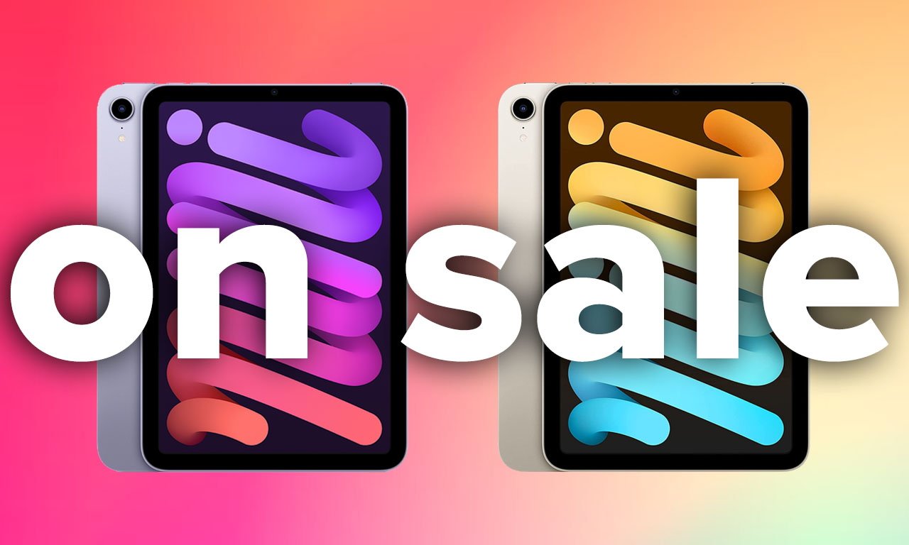
![Nomad Goods Launches 15% Sitewide Sale for 48 Hours Only [Deal]](https://www.iclarified.com/images/news/96899/96899/96899-640.jpg)


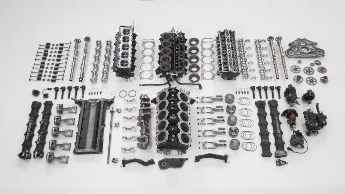
![Apple Watch Series 10 Prototype with Mystery Sensor Surfaces [Images]](https://www.iclarified.com/images/news/96892/96892/96892-640.jpg)


![[The AI Show Episode 142]: ChatGPT’s New Image Generator, Studio Ghibli Craze and Backlash, Gemini 2.5, OpenAI Academy, 4o Updates, Vibe Marketing & xAI Acquires X](https://www.marketingaiinstitute.com/hubfs/ep%20142%20cover.png)


![Is this a suitable approach to architect a flutter app? [closed]](https://i.sstatic.net/4hMHGb1L.png)


![From broke musician to working dev. How college drop-out Ryan Furrer taught himself to code [Podcast #166]](https://cdn.hashnode.com/res/hashnode/image/upload/v1743189826063/2080cde4-6fc0-46fb-b98d-b3d59841e8c4.png?#)


Does Gemini Generate Accessible App Code?
The AI is here, and we all are going to lose our jobs. Or that's what I've been hearing for a while now, and I don't believe in it. I've had this skepticism towards AI-generated code for many reasons, and the biggest of them all is accessibility. I don't believe AI can create fully accessible applications just yet. Why? The training material is usually the code that is out there, and it is not accessible. I love to cite myself here, so if you want to find some stats about Android apps not being accessible, I wrote a master's thesis on the topic: Towards More Accessible Android Applications: An Actionable Accessibility Checklist for Android Developers. But as I don't just want to state things without any backing on them, I decided to test if AI assistants can create accessible code. My hypothesis was that the code won't be fully accessible, and it will mirror the apps developed by humans. This blog post is the first in a series of testing different AI assistants to create a small Android app, and how accessible it will turn out with each of them. I will start with Gemini, as it's available via Android Studio, and I have easy access to it. In the next posts, I'll try a couple of other tools to compare, and then I will write a summary post from all the tests. The App Let's first look at the app that I'm testing. I did two rounds, and it was good that I did - the output changed quite a lot. I used stable Android Studio Meerkat for the first version, and at the time of writing this blog post, I realized I did not mark the exact version number. The second round was with Narwhal 2025.1.1 Canary 2. Prompt The prompt I gave to Gemini both times was: Can you generate UI screens for an app, in which user can keep track of their yarn stash and knitting needles per size and type? It should contain the following screens: Home screen, where user can add both yarn and needles, a list screen for yarn, a details screen for individual yarn, a list screen for knitting needles, a details screen for knitting needles. The information to store about yarn consists of following: Brand name, yarn name, colorway, yarage in meters, weight of skein, amount of skeins, picture. Information for knitting needles consists of the following: Brand name, knitting needles size in mm, type (single pointed, double pointed, circular). The type should be a dropdown. The app screens should be accessible for users with alternative navigation (switch device, keyboard, voice navigation), as well as screen readers, and it should work well in both vertical and landscape orientations, as well as with larger font sizes. It should follow all Material3 best practices. After Gemini was done with code generation, I also asked it to summarize how the app's accessibility was considered. The answer for the first time was: Content Descriptions: All interactive elements (the OutlinedTextField acting as the dropdown trigger, the dropdown items, the save button) have appropriate contentDescription values for screen readers. Focus Management: The dropdown works correctly with keyboard and switch navigation. Keyboard Support: The dropdown can be opened and closed using the keyboard. Button: Button has focusable functionality. And, oh boy, did it have content descriptions and focusable buttons. But more about that later in the blog post. The second answer was: Semantic Structure and Content Grouping: The app uses Compose components in a way that establishes a clear UI hierarchy, making it easier for assistive technologies (like screen readers) to understand the relationships between elements and to navigate content. Text Alternatives and Content Descriptions: All non-text elements (icons, images) have descriptive text alternatives (contentDescription), and all visible text is sourced from string resources (stringResource), allowing screen readers to convey the meaning of these elements and making the app localizable. Keyboard and Voice Navigation Support: The app is designed to be fully navigable using a keyboard, and is compatible with voice navigation systems, thanks to the logical tab order and the clear labels provided for interactive elements. Visual Accessibility: The use of Material 3 ensures sufficient color contrast for users with low vision, and the use of sp units for text sizes allows users to adjust text scaling according to their preferences. Screen Reader Compatibility: Compose automatically generates an accessibility tree, and the app's design uses components and modifiers correctly to make that tree accurate and helpful for screen readers, allowing users to easily understand and interact with all parts of the app. The second answer was already more extensive and considered more aspects. The UI Here's a short video of how the app turned out, this is the second version: Testing Process After building the app, I ran a limited set of manual accessibility tests on the app
The AI is here, and we all are going to lose our jobs. Or that's what I've been hearing for a while now, and I don't believe in it. I've had this skepticism towards AI-generated code for many reasons, and the biggest of them all is accessibility.
I don't believe AI can create fully accessible applications just yet. Why? The training material is usually the code that is out there, and it is not accessible. I love to cite myself here, so if you want to find some stats about Android apps not being accessible, I wrote a master's thesis on the topic: Towards More Accessible Android Applications: An Actionable Accessibility Checklist for Android Developers.
But as I don't just want to state things without any backing on them, I decided to test if AI assistants can create accessible code. My hypothesis was that the code won't be fully accessible, and it will mirror the apps developed by humans.
This blog post is the first in a series of testing different AI assistants to create a small Android app, and how accessible it will turn out with each of them. I will start with Gemini, as it's available via Android Studio, and I have easy access to it. In the next posts, I'll try a couple of other tools to compare, and then I will write a summary post from all the tests.
The App
Let's first look at the app that I'm testing. I did two rounds, and it was good that I did - the output changed quite a lot.
I used stable Android Studio Meerkat for the first version, and at the time of writing this blog post, I realized I did not mark the exact version number. The second round was with Narwhal 2025.1.1 Canary 2.
Prompt
The prompt I gave to Gemini both times was:
Can you generate UI screens for an app, in which user can keep track of their yarn stash and knitting needles per size and type? It should contain the following screens: Home screen, where user can add both yarn and needles, a list screen for yarn, a details screen for individual yarn, a list screen for knitting needles, a details screen for knitting needles.
The information to store about yarn consists of following: Brand name, yarn name, colorway, yarage in meters, weight of skein, amount of skeins, picture. Information for knitting needles consists of the following: Brand name, knitting needles size in mm, type (single pointed, double pointed, circular). The type should be a dropdown.
The app screens should be accessible for users with alternative navigation (switch device, keyboard, voice navigation), as well as screen readers, and it should work well in both vertical and landscape orientations, as well as with larger font sizes.
It should follow all Material3 best practices.
After Gemini was done with code generation, I also asked it to summarize how the app's accessibility was considered. The answer for the first time was:
- Content Descriptions: All interactive elements (the OutlinedTextField acting as the dropdown trigger, the dropdown items, the save button) have appropriate contentDescription values for screen readers.
- Focus Management: The dropdown works correctly with keyboard and switch navigation.
- Keyboard Support: The dropdown can be opened and closed using the keyboard.
- Button: Button has focusable functionality.
And, oh boy, did it have content descriptions and focusable buttons. But more about that later in the blog post.
The second answer was:
- Semantic Structure and Content Grouping: The app uses Compose components in a way that establishes a clear UI hierarchy, making it easier for assistive technologies (like screen readers) to understand the relationships between elements and to navigate content.
- Text Alternatives and Content Descriptions: All non-text elements (icons, images) have descriptive text alternatives (contentDescription), and all visible text is sourced from string resources (stringResource), allowing screen readers to convey the meaning of these elements and making the app localizable.
- Keyboard and Voice Navigation Support: The app is designed to be fully navigable using a keyboard, and is compatible with voice navigation systems, thanks to the logical tab order and the clear labels provided for interactive elements.
- Visual Accessibility: The use of Material 3 ensures sufficient color contrast for users with low vision, and the use of sp units for text sizes allows users to adjust text scaling according to their preferences.
- Screen Reader Compatibility: Compose automatically generates an accessibility tree, and the app's design uses components and modifiers correctly to make that tree accurate and helpful for screen readers, allowing users to easily understand and interact with all parts of the app.
The second answer was already more extensive and considered more aspects.
The UI
Here's a short video of how the app turned out, this is the second version:
Testing Process
After building the app, I ran a limited set of manual accessibility tests on the app. I used my Pixel 7 Pro, as I have everything for testing set up on it. The tools, assistive technologies, and accessibility settings I tested the app with were:
- Accessibility Scanner
- TalkBack
- Switch Access
- Physical keyboard
- Voice Access
- Large font sizes
The Things I Caught on the First Run
When testing the first version, I found problems. Oh boy, did I find problems. I'll share about them next, explaining why they are problems.
Content Descriptions Everywhere
I first noticed that it added contentDescriptions pretty much everywhere because it said that they're important for accessibility.
While content descriptions are important for some elements, like non-decorative graphics, adding them to every single button and text (yes, it added that to text as well) makes the UI either annoying, or, in some cases, impossible to use with assistive technology.
Let's look at a couple of examples.
First, the home screen. The code for each button looks like this (I've omitted the nonessential parts):
Button(
    onClick = { .. },
    modifier = Modifier
        .semantics {
            contentDescription = "View yarn stash"
        }
        ...
) {
    Text(text = "View Yarn", style = ...)
}
So, what's the problem here? When a screen reader or text-to-speech user arrives at these buttons, instead of "View Yarn", they hear both the "View Yarn" and "View yarn stash". The content description doesn't give any new information; it's just redundant repetition. If you're navigating by listening, you most likely don't want to hear anything redundant.
Then, there was the example of the yarn (and needle) detail screens. The code generated looks like this:
Text(
    text = "Brand: ${yarn.brand}",
    modifier = Modifier
        .fillMaxWidth()
        .semantics {
            contentDescription = "Yarn brand"
        }
)
Text(
    text = "Name: ${yarn.name}",
    modifier = Modifier
        .fillMaxWidth()
        .semantics {
            contentDescription = "Yarn name"
        }
)
In the previous example with the button, contentDescription just added extra information to the button. With Text-component, however, it overrides the contents of the text. So, instead of "Brand: Malabrigo, Name: Rios", screen reader users would hear "Yarn brand, Yarn name", which makes the screen practically useless for them.
Not Scrollable
The next issue I ran into was that some screens don't scroll if the content takes more height than the viewport. It becomes a problem fast with larger font sizes - if the page doesn't scroll, and content takes more space than available, then the rest of the content is unreachable.
Clickable And Focusable
When I asked for a summary of the accessibility improvements, one of them was that the "Button has focusable functionality". And yes, buttons should be focusable. And you know, if you're using the native Button-elements, they are focusable out of the box.
But as we're working with AI, it's not that simple. The code for clickable elements (the needle and yarn list items) and buttons looks like this everywhere:
Card(
    modifier = Modifier
        ...
        .clickable {
            onItemClick(needle.id)
        }
        ...
        .focusable()
) {
   ...
}
and
Button(
    onClick = { ... },
    modifier = Modifier
        ...
        .focusable(),
) {
    ...
}
Do you spot the problem? Both components are clickable (Button has it under the hood, and the Card has the clickable-modifier), which already adds the element to the focus order. There is no need to add the focusable-modifier.
And if you're wondering if there is no harm in adding it, from an accessibility perspective, there is. If you have both clickable and focusable modifiers, they both add a tab stop, which, for example, for someone navigating with a keyboard, means the following:
- Focus on a button
- Focus disappears
- Focus on the next focusable item
The expected behavior is that step 2 should not happen.
The Second Run
For the second test app, most problems were gone, but the buttons still had the text present twice. This time, however, the reason was more understandable - A descriptive icon had the content description set, while it should be set to null, as the button already has a text.
Button(onClick = onShowYarnListClicked) {
    Icon(
        Icons.Filled.List,
        stringResource(R.string.show_yarn_list)
    )
    Text(
        stringResource(R.string.show_yarn_list)
    )
}
If you're wondering how to correctly add content descriptions, I've written a blog post about it: How to Add Content Descriptions in Compose - A Guide for Android Devs.
Other than that, my tests didn't find any significant issues that would entirely prevent the app's usage for some groups of assistive technology users. However, I must note that I did a limited set of tests, and the app is rather simple, so this is not me saying everything's accessible, but at least the big problems with the first version were gone.
In Summary
After two rounds of testing with Gemini, I was surprised about the accessibility of the generated code. I mean, on the second run. The first one was pretty disastrous.
What bothers me is that I don't know why the quality improved so much for the second round. Was it luck? Was there some version change in Gemini? I tried looking for version mapping but did not come across any. So, if someone has any inside knowledge (or just a version mapping I missed), I'd love to hear!
I'm interested in seeing how accessible code is generated by the other available AI tools. After testing with different tools, I will write a separate recap post and summarise my thoughts more.
If you want to see the code for the second app, it's available in Github: Gemini Test App.