


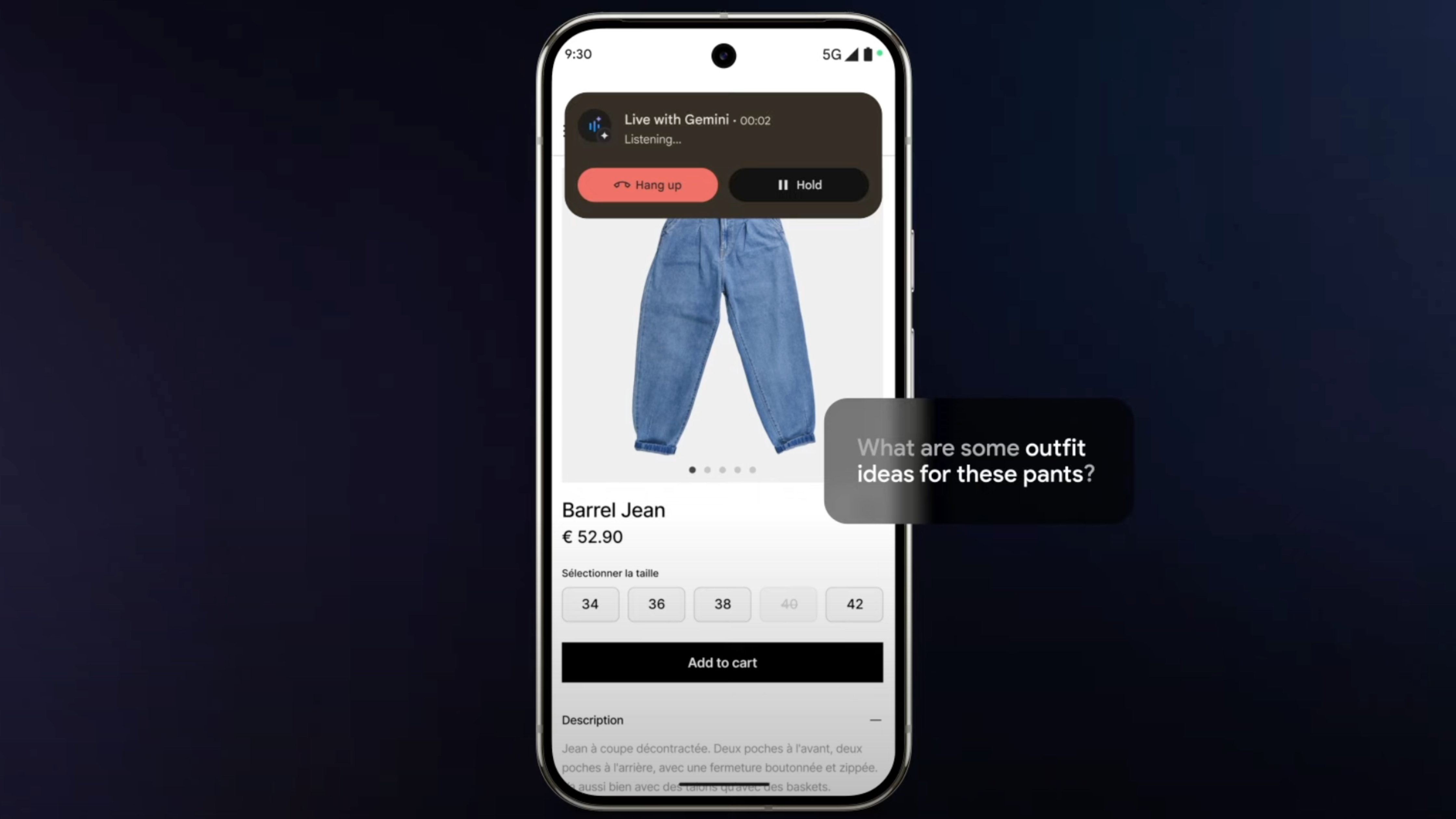
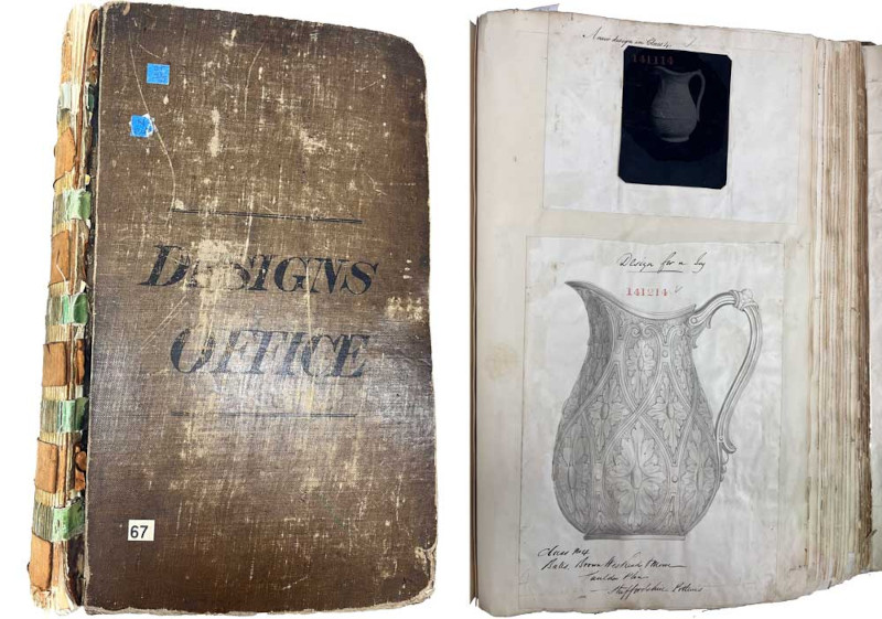
![T-Mobile says it didn't compromise its values to get FCC to approve fiber deal [UPDATED]](https://m-cdn.phonearena.com/images/article/169088-two/T-Mobile-says-it-didnt-compromise-its-values-to-get-FCC-to-approve-fiber-deal-UPDATED.jpg?#)


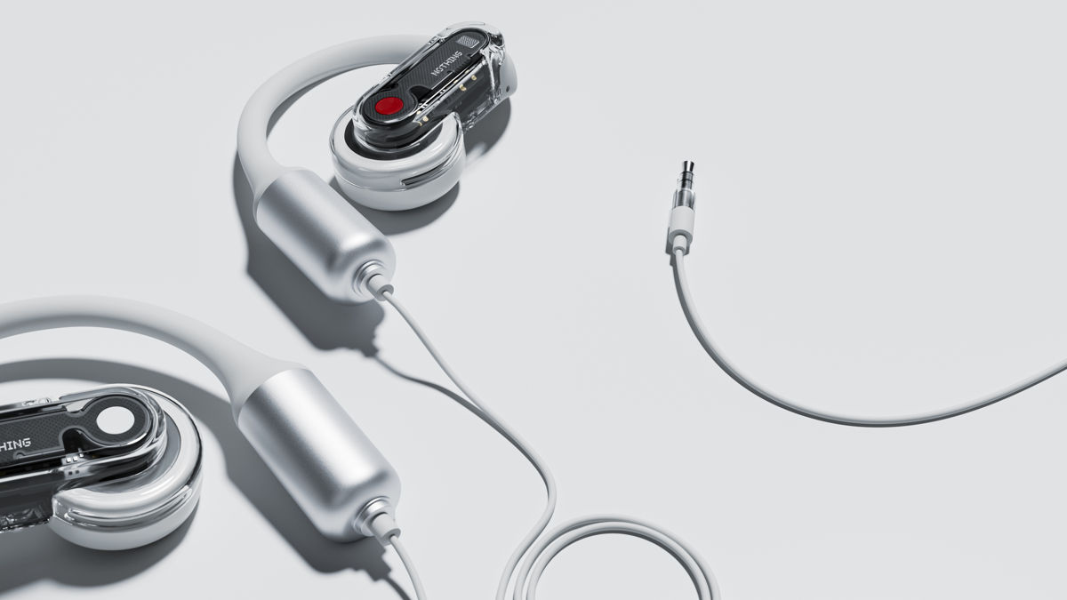


![Nomad Goods Launches 15% Sitewide Sale for 48 Hours Only [Deal]](https://www.iclarified.com/images/news/96899/96899/96899-640.jpg)


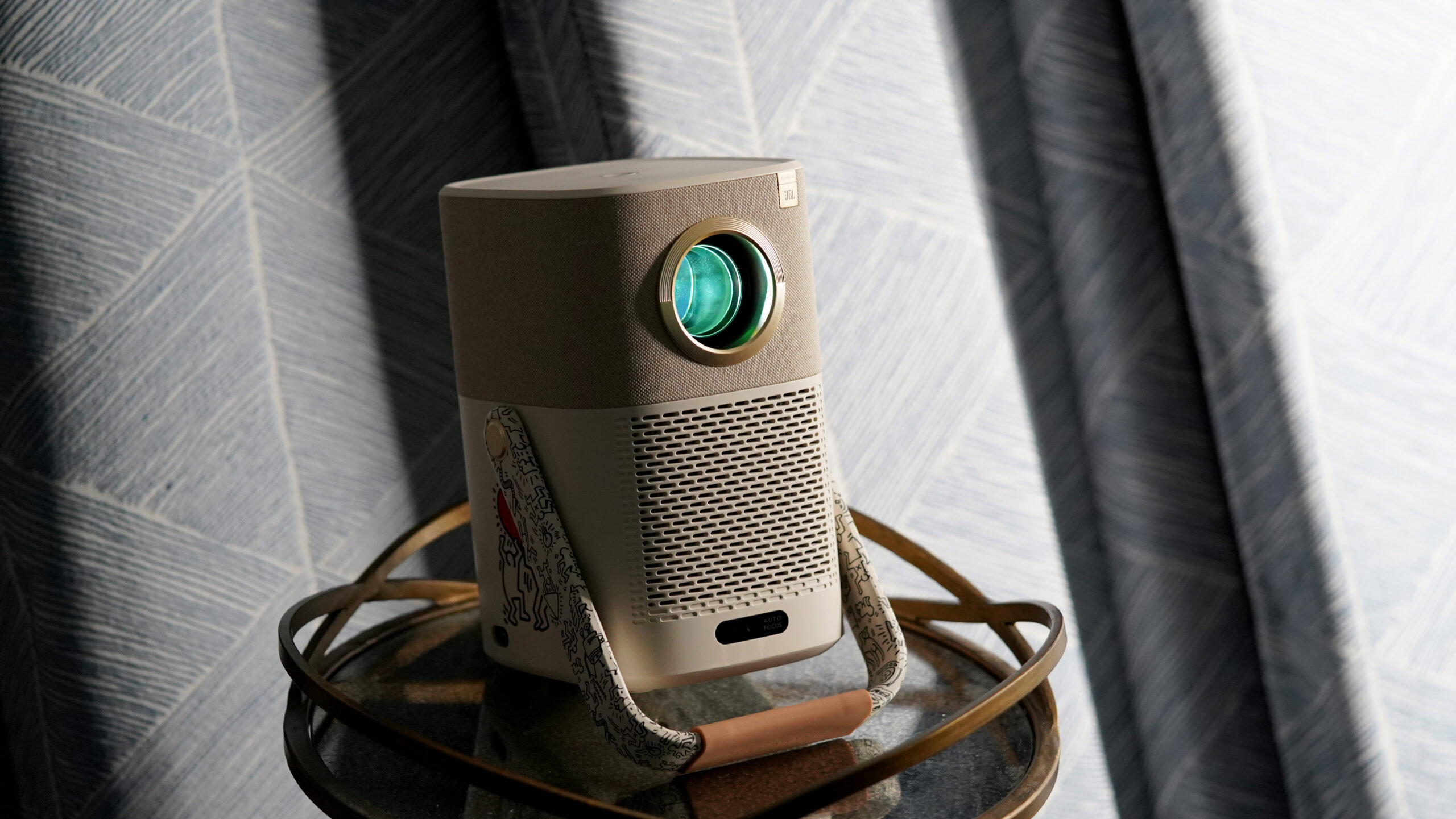
![Apple Watch Series 10 Prototype with Mystery Sensor Surfaces [Images]](https://www.iclarified.com/images/news/96892/96892/96892-640.jpg)


![[The AI Show Episode 142]: ChatGPT’s New Image Generator, Studio Ghibli Craze and Backlash, Gemini 2.5, OpenAI Academy, 4o Updates, Vibe Marketing & xAI Acquires X](https://www.marketingaiinstitute.com/hubfs/ep%20142%20cover.png)


![Is this a suitable approach to architect a flutter app? [closed]](https://i.sstatic.net/4hMHGb1L.png)


![From broke musician to working dev. How college drop-out Ryan Furrer taught himself to code [Podcast #166]](https://cdn.hashnode.com/res/hashnode/image/upload/v1743189826063/2080cde4-6fc0-46fb-b98d-b3d59841e8c4.png?#)


CSS Cheat Sheet: Everything You Need to Know in One Place
Basic Selectors: * /* Universal selector */ element /* Selects all elements of a type */ .class /* Selects elements by class */ #id /* Selects elements by ID */ element, element /* Grouping selectors */ Box Model: element { margin: 10px; /* Space outside the element */ padding: 10px; /* Space inside the element */ border: 1px solid #000; /* Border around the element */ width: 100px; /* Element width */ height: 100px; /* Element height */ box-sizing: border-box; /* Includes padding/border in width and height */ } Text Styling: element { font-family: Arial, sans-serif; /* Font family */ font-size: 16px; /* Font size */ font-weight: bold; /* Font weight (bold, normal) */ font-style: italic; /* Italic text */ text-align: center; /* Aligns text (left, right, center) */ color: #333; /* Text color */ line-height: 1.5; /* Line spacing */ text-transform: uppercase; /* Text case (uppercase, lowercase) */ text-decoration: underline; /* Underline text */ } Backgrounds: element { background-color: #f0f0f0; /* Background color */ background-image: url('image.jpg'); /* Background image */ background-size: cover; /* Adjust background image size */ background-position: center; /* Position the background image */ background-repeat: no-repeat; /* Prevent image from repeating */ } Flexbox: .container { display: flex; /* Set flex container */ justify-content: center; /* Horizontal alignment (start, center, space-between) */ align-items: center; /* Vertical alignment (stretch, center, flex-start) */ flex-direction: row; /* Direction (row, column) */ flex-wrap: wrap; /* Wrap items to next line */ } .item { flex: 1; /* Flex-grow (flex-shrink, flex-basis) */ align-self: flex-start; /* Align single item (flex-start, center) */ } Grid Layout: .container { display: grid; /* Set grid container */ grid-template-columns: repeat(3, 1fr); /* 3 equal columns */ grid-template-rows: auto; /* Set row heights */ gap: 10px; /* Space between grid items */ grid-column: 1 / 3; /* Span item across columns */ grid-row: 1 / 2; /* Span item across rows */ } .item { grid-area: header; /* Name grid areas */ } Positioning: element { position: relative; /* (relative, absolute, fixed, sticky) */ top: 10px; /* Offset from top */ left: 20px; /* Offset from left */ z-index: 10; /* Layering of elements */ } Transitions & Animations: element { transition: all 0.3s ease-in-out; /* Transition effects */ } @keyframes example { from { opacity: 0; } to { opacity: 1; } } element { animation: example 2s infinite; /* Apply animation */ } Media Queries (Responsive Design): @media (max-width: 768px) { element { font-size: 14px; } } Miscellaneous: element { opacity: 0.5; /* Set transparency */ visibility: hidden; /* Hide element but keep space */ display: none; /* Completely hide element */ overflow: hidden; /* Handle overflow content */ cursor: pointer; /* Mouse cursor styles */ border-radius: 10px; /* Rounded corners */ box-shadow: 0 4px 8px rgba(0, 0, 0, 0.2); /* Element shadow */ } Advanced Selectors: element:first-child /* Selects the first child */ element:last-child /* Selects the last child */ element:nth-child(2) /* Selects the 2nd child */ element:hover /* Selects on hover */ element::before /* Insert content before element */ element::after /* Insert content after element */ element[attribute="value"] /* Attribute selector */ element:not(selector) /* Excludes elements matching selector */ Pseudo-elements: element::before { content: ''; /* Inserts content before an element */ display: block; /* Ensures it behaves like a block */ } element::after { content: ''; /* Inserts content after an element */ display: block; /* Ensures it behaves like a block */ } Transformations: element { transform: rotate(45deg); /* Rotates the element */ transform: scale(1.5); /* Scales the element */ transform: translateX(50px); /* Moves el
Basic Selectors:
*               /* Universal selector */
element         /* Selects all elements of a type */
.class          /* Selects elements by class */
#id             /* Selects elements by ID */
element, element /* Grouping selectors */
Box Model:
element {
    margin: 10px;          /* Space outside the element */
    padding: 10px;         /* Space inside the element */
    border: 1px solid #000; /* Border around the element */
    width: 100px;          /* Element width */
    height: 100px;         /* Element height */
    box-sizing: border-box; /* Includes padding/border in width and height */
}
Text Styling:
element {
    font-family: Arial, sans-serif;   /* Font family */
    font-size: 16px;                  /* Font size */
    font-weight: bold;                /* Font weight (bold, normal) */
    font-style: italic;               /* Italic text */
    text-align: center;               /* Aligns text (left, right, center) */
    color: #333;                      /* Text color */
    line-height: 1.5;                 /* Line spacing */
    text-transform: uppercase;        /* Text case (uppercase, lowercase) */
    text-decoration: underline;       /* Underline text */
}
Backgrounds:
element {
    background-color: #f0f0f0;  /* Background color */
    background-image: url('image.jpg'); /* Background image */
    background-size: cover;     /* Adjust background image size */
    background-position: center; /* Position the background image */
    background-repeat: no-repeat; /* Prevent image from repeating */
}
Flexbox:
.container {
    display: flex;                    /* Set flex container */
    justify-content: center;          /* Horizontal alignment (start, center, space-between) */
    align-items: center;              /* Vertical alignment (stretch, center, flex-start) */
    flex-direction: row;              /* Direction (row, column) */
    flex-wrap: wrap;                  /* Wrap items to next line */
}

.item {
    flex: 1;                          /* Flex-grow (flex-shrink, flex-basis) */
    align-self: flex-start;           /* Align single item (flex-start, center) */
}
Grid Layout:
.container {
    display: grid;                    /* Set grid container */
    grid-template-columns: repeat(3, 1fr); /* 3 equal columns */
    grid-template-rows: auto;         /* Set row heights */
    gap: 10px;                        /* Space between grid items */
    grid-column: 1 / 3;               /* Span item across columns */
    grid-row: 1 / 2;                  /* Span item across rows */
}

.item {
    grid-area: header;                /* Name grid areas */
}
Positioning:
element {
    position: relative;               /* (relative, absolute, fixed, sticky) */
    top: 10px;                        /* Offset from top */
    left: 20px;                       /* Offset from left */
    z-index: 10;                      /* Layering of elements */
}
Transitions & Animations:
element {
    transition: all 0.3s ease-in-out; /* Transition effects */
}

@keyframes example {
    from { opacity: 0; }
    to { opacity: 1; }
}

element {
    animation: example 2s infinite;    /* Apply animation */
}
Media Queries (Responsive Design):
@media (max-width: 768px) {
    element {
        font-size: 14px;
    }
}
Miscellaneous:
element {
    opacity: 0.5;                     /* Set transparency */
    visibility: hidden;               /* Hide element but keep space */
    display: none;                    /* Completely hide element */
    overflow: hidden;                 /* Handle overflow content */
    cursor: pointer;                  /* Mouse cursor styles */
    border-radius: 10px;              /* Rounded corners */
    box-shadow: 0 4px 8px rgba(0, 0, 0, 0.2); /* Element shadow */
}
Advanced Selectors:
element:first-child         /* Selects the first child */
element:last-child          /* Selects the last child */
element:nth-child(2)        /* Selects the 2nd child */
element:hover               /* Selects on hover */
element::before             /* Insert content before element */
element::after              /* Insert content after element */
element[attribute="value"]  /* Attribute selector */
element:not(selector)       /* Excludes elements matching selector */
Pseudo-elements:
element::before {
    content: '';                     /* Inserts content before an element */
    display: block;                  /* Ensures it behaves like a block */
}

element::after {
    content: '';                     /* Inserts content after an element */
    display: block;                  /* Ensures it behaves like a block */
}
Transformations:
element {
    transform: rotate(45deg);        /* Rotates the element */
    transform: scale(1.5);           /* Scales the element */
    transform: translateX(50px);     /* Moves element horizontally */
    transform: skew(20deg);          /* Skews the element */
}
CSS Variables (Custom Properties):
:root {
    --primary-color: #3498db;        /* Define a custom variable */
    --font-size: 16px;
}

element {
    color: var(--primary-color);     /* Use the custom variable */
    font-size: var(--font-size);
}
Clipping & Masking:
element {
    clip-path: circle(50%);          /* Creates a circular clipping area */
    clip-path: polygon(50% 0%, 0% 100%, 100% 100%); /* Creates a polygonal clipping area */
}

element {
    mask-image: url('mask.png');     /* Masking with an image */
}
CSS Grid Advanced Layout:
.container {
    display: grid;
    grid-template-areas:
        "header header header"
        "sidebar main main"
        "footer footer footer";      /* Define named grid areas */
    grid-template-columns: 1fr 2fr;  /* Two columns, 1:2 ratio */
}

.header {
    grid-area: header;               /* Assign grid area to element */
}
.sidebar {
    grid-area: sidebar;
}
.main {
    grid-area: main;
}
.footer {
    grid-area: footer;
}
CSS Functions:
element {
    background: linear-gradient(to right, #3498db, #9b59b6); /* Gradient background */
    background: radial-gradient(circle, #ff7675, #d63031);   /* Radial gradient */
}

element {
    filter: blur(5px);               /* Apply a blur effect */
    filter: brightness(1.2);         /* Increase brightness */
    filter: grayscale(50%);          /* Apply grayscale effect */
}
CSS Flexbox Advanced Concepts:
.container {
    display: flex;
    justify-content: space-between;   /* Space between items */
    align-items: flex-start;          /* Align items to start */
    flex-direction: column-reverse;   /* Reverse column direction */
    flex-grow: 1;                     /* Element grows to fill space */
}
CSS Responsive Design (Viewport Units):
element {
    width: 100vw;                    /* Full viewport width */
    height: 100vh;                   /* Full viewport height */
    font-size: 2vw;                  /* Font size based on viewport width */
}

@media (orientation: landscape) {    /* Apply rules for landscape mode */
    element {
        background-color: #333;
    }
}
CSS Scroll Snap (for Carousels):
.container {
    scroll-snap-type: x mandatory;   /* Snaps items horizontally */
    overflow-x: scroll;              /* Enable horizontal scrolling */
}

.item {
    scroll-snap-align: start;        /* Snap items to start of container */
}
CSS Transitions (with Timing Functions):
element {
    transition: background-color 0.5s ease-in-out;  /* Smooth transitions */
}

element:hover {
    background-color: #f39c12;       /* Transition effect on hover */
}
CSS Animations (Keyframes):
@keyframes fadeIn {
    0% { opacity: 0; }
    100% { opacity: 1; }
}

element {
    animation: fadeIn 2s ease-in-out infinite; /* Repeated animation */
}
Z-index and Stacking Context:
element {
    position: relative;              /* Positioning must be set */
    z-index: 10;                     /* Higher z-index means in front */
}
Media Queries for Specific Devices:
@media (min-width: 768px) {
    element {
        display: block;              /* Layout for tablets and up */
    }
}

@media (min-width: 1024px) {
    element {
        display: flex;               /* Layout for larger screens */
    }
}
CSS Grid and Flexbox Combined:
.container {
    display: grid;                   /* Main container is a grid */
    grid-template-columns: 1fr 1fr;
}

.item {
    display: flex;                   /* Each item uses flexbox */
    justify-content: center;         /* Align contents within items */
    align-items: center;
}
CSS Grid: Implicit and Explicit Grids:
.container {
    display: grid;
    grid-template-columns: repeat(3, 1fr);  /* Explicitly define 3 columns */
    grid-auto-rows: minmax(100px, auto);    /* Implicit rows generated as needed */
}
CSS Custom Media Queries:
Custom media queries allow you to simplify your CSS when you need to use similar breakpoints across different rules.
@custom-media --small-viewport (max-width: 600px);

@media (--small-viewport) {
    element {
        font-size: 14px;
    }
}
Object Fit and Object Position (Images, Videos):
Control how media like images and videos are displayed within their containers.
img {
    object-fit: cover;           /* Crop to fit container while preserving aspect ratio */
    object-position: center;     /* Center the image within its container */
}
Scroll Behavior (Smooth Scrolling):
html {
    scroll-behavior: smooth;     /* Enables smooth scrolling for anchor links */
}
Blend Modes (Colors and Images):
element {
    background-blend-mode: multiply;   /* Blend background color/image with a multiplier effect */
    mix-blend-mode: screen;            /* Blend the element with the background */
}
CSS Shape Outlines for Text Flow:
element {
    shape-outside: circle(50%);   /* Flow text around a circular shape */
    float: left;                  /* Allows text to wrap around */
    width: 200px;
    height: 200px;
}
CSS Counters:
Useful for creating numbered lists or automatic numbering in sections.
body {
    counter-reset: section;          /* Reset counter at the start */
}

h2::before {
    counter-increment: section;      /* Increment section number */
    content: "Section " counter(section) ": "; /* Insert counter value */
}
CSS Clip (Polygon Clipping):
element {
    clip-path: polygon(50% 0%, 0% 100%, 100% 100%); /* Create custom shapes with clipping */
}
Viewport Height/Width Units (Dynamic Resizing):
element {
    height: 100vh;        /* Element is 100% of the viewport height */
    width: 100vw;         /* Element is 100% of the viewport width */
}
Isolation for Layers:
This property is useful when you want to create isolated stacking contexts to avoid z-index conflicts.
element {
    isolation: isolate;   /* Isolates the element’s z-index from its siblings */
}
CSS Filters (Visual Effects):
element {
    filter: grayscale(100%);  /* Makes the element grayscale */
    filter: blur(5px);        /* Blurs the element */
    filter: contrast(200%);   /* Adjusts contrast */
}
Aspect Ratio Control:
element {
    aspect-ratio: 16 / 9;     /* Ensure the element maintains a 16:9 aspect ratio */
}
CSS Variables with JavaScript:
You can dynamically update CSS variables using JavaScript for more interactive effects.
:root {
    --main-color: #3498db;
}

element {
    background-color: var(--main-color);
}

/* In JavaScript */
document.documentElement.style.setProperty('--main-color', '#e74c3c');
CSS Grid: Auto-fill and Auto-fit:
.container {
    display: grid;
    grid-template-columns: repeat(auto-fill, minmax(200px, 1fr)); /* Fill the space with items */
}
Responsive Typography with clamp():
element {
    font-size: clamp(1rem, 2vw + 1rem, 2.5rem);  /* Dynamically adjusts font size based on viewport width */
}
CSS Logical Properties (for Layout Direction Independence):
Logical properties like margin-inline-start are useful when dealing with internationalization (LTR vs RTL layouts).
element {
    margin-inline-start: 20px;  /* Replaces 'margin-left' but adjusts for RTL layouts */
    padding-block-end: 10px;    /* Replaces 'padding-bottom' */
}
CSS Grid Masonry Layout:
Although there’s no direct CSS masonry, grid items can create similar layouts by spanning rows and columns.
.grid-item {
    grid-row: span 2;          /* Make grid item span multiple rows */
    grid-column: span 1;
}
Backface Visibility (for 3D Rotations):
element {
    backface-visibility: hidden; /* Hide element when it's rotated away from the viewer */
    transform: rotateY(180deg);   /* Rotate the element */
}
CSS Snap Points for Scrollable Carousels:
.container {
    scroll-snap-type: x mandatory; /* Enables scroll snapping */
    scroll-padding: 10px;          /* Adds padding to snapping */
}
CSS Parent Selectors (upcoming feature in :has()):
This is a future feature but worth noting for its power.
element:has(> img) {
    border: 2px solid red;         /* Styles parent if it contains an image */
}
CSS Variables (Dynamic Theming):
CSS variables allow for easy theme switching. You can define light and dark themes and switch between them using JavaScript or media queries.
:root {
    --bg-color: #ffffff;
    --text-color: #000000;
}

[data-theme="dark"] {
    --bg-color: #333333;
    --text-color: #ffffff;
}

body {
    background-color: var(--bg-color);
    color: var(--text-color);
}
Dark Mode with Media Queries:
You can automatically apply a dark theme based on the user's system preferences.
@media (prefers-color-scheme: dark) {
    body {
        background-color: #333;
        color: #fff;
    }
}
Custom Scrollbars:
You can style scrollbars to match your website's design.
/* WebKit browsers */
::-webkit-scrollbar {
    width: 12px;                /* Width of the scrollbar */
}
::-webkit-scrollbar-track {
    background-color: #f1f1f1;  /* Track background */
}
::-webkit-scrollbar-thumb {
    background-color: #888;     /* Handle color */
    border-radius: 6px;         /* Handle rounded corners */
}
::-webkit-scrollbar-thumb:hover {
    background-color: #555;     /* Handle hover state */
}
CSS Grid Fractional Units (fr):
Fractions (fr) make grid layouts flexible and adaptive.
.container {
    display: grid;
    grid-template-columns: 1fr 2fr;   /* First column takes 1 part, second takes 2 parts */
}
Scroll-Snapping for Smooth Scrolling:
Scroll-snapping can be useful for image carousels, sliders, or specific layouts.
.container {
    scroll-snap-type: y mandatory;     /* Snap items vertically */
    overflow-y: scroll;                /* Enable scrolling */
}
.item {
    scroll-snap-align: start;          /* Snap each item to the top */
}
Object-fit and Aspect-ratio (Image/Media Control):
Control the behavior of images and videos within their containers.
img {
    object-fit: cover;     /* Ensures the image covers the container */
    object-position: center;  /* Center the image */
}
CSS Cascade Layers:
Cascade layers let you manage specificity and layer importance.
@layer base {
    h1 {
        color: blue;       /* Base layer */
    }
}

@layer theme {
    h1 {
        color: red;        /* Theme layer overrides base */
    }
}
Media Queries for Print Styles:
When creating print styles, you can optimize your website for paper output.
@media print {
    body {
        color: black;
        background: white;
    }

    .no-print {
        display: none;      /* Hide elements when printing */
    }
}
Content Visibility (for Performance):
content-visibility can boost performance by skipping rendering of off-screen elements.
element {
    content-visibility: auto;  /* Renders only when element is visible */
}
CSS @supports (Feature Queries):
Check if the browser supports a specific CSS feature and apply styles accordingly.
@supports (display: grid) {
    .container {
        display: grid;       /* Use grid layout if supported */
    }
}

@supports not (display: grid) {
    .container {
        display: block;      /* Fallback for older browsers */
    }
}
Layered Box Shadows (for Depth):
Layered shadows can add depth and realism.
element {
    box-shadow: 0 4px 6px rgba(0, 0, 0, 0.1), 0 1px 3px rgba(0, 0, 0, 0.08);
}
CSS Perspective for 3D Effects:
You can apply 3D perspective to elements for cool visual effects.
.container {
    perspective: 1000px;   /* Controls the level of 3D perspective */
}
.element {
    transform: rotateY(45deg);   /* Rotate element in 3D */
}
CSS Conic Gradients (Pie Chart-like Effects):
Conic gradients create circular gradient effects.
element {
    background: conic-gradient(red, yellow, green);
}
CSS Multicolumn Layout:
Split text into multiple columns, useful for text-heavy content like articles.
.element {
    column-count: 3;           /* Split content into 3 columns */
    column-gap: 20px;          /* Gap between columns */
}
CSS clamp() for Dynamic Sizing:
Use clamp() to define a value that adapts between a minimum and maximum, based on available space.
.element {
    font-size: clamp(1rem, 2vw + 1rem, 2.5rem); /* Flexible font-size */
}
CSS Grid Template Rows/Columns with Auto:
Grid layouts can automatically adjust row/column sizes based on content.
.container {
    display: grid;
    grid-template-columns: auto 1fr 1fr;   /* First column adjusts to content */
}
CSS Overscroll Behavior:
Control how your content behaves when scrolled to the boundaries.
.element {
    overscroll-behavior: contain;  /* Prevents scrolling past the boundaries */
}
CSS Aspect-ratio for Responsive Elements:
The aspect-ratio property allows elements like images, videos, or divs to maintain a specific ratio.
element {
    aspect-ratio: 16 / 9;    /* Maintain a 16:9 aspect ratio */
}
CSS Grid: Subgrid for Complex Layouts:
Subgrid allows child elements to inherit their parent grid's sizing.
.container {
    display: grid;
    grid-template-columns: repeat(3, 1fr);
}

.child {
    display: subgrid;
    grid-column: span 2;    /* Span two columns in the subgrid */
}
CSS Houdini (Paint API):
Houdini lets you extend CSS, creating custom styling capabilities through JavaScript. Example: creating custom properties using Houdini's API.
CSS.registerProperty({
    name: '--custom-property',
    syntax: '',
    inherits: false,
    initialValue: '0px',
});
Custom Property Animation:
Animate CSS variables for more dynamic styling.
:root {
    --translate: 0px;
}

.element {
    transform: translateX(var(--translate));
    transition: transform 0.5s ease;
}

.element:hover {
    --translate: 50px;     /* Animates variable value */
}
Pointer Events for User Interactions:
Control whether elements respond to user input.
.element {
    pointer-events: none;   /* Disables user interaction */
}
CSS Parallax Scrolling (with Transform):
You can create a simple parallax effect by moving elements at different speeds as the user scrolls.
.parallax {
    transform: translateZ(-2px) scale(1.5);  /* Moves background slower than foreground */
}
CSS Cascade Layers (Layered Styling):
Manage specificity by creating layers in your styles.
@layer base {
    h1 {
        color: blue;
    }
}

@layer utilities {
    h1 {
        color: red;    /* Red overrides blue from base */
    }
}
CSS Scrollbar Styling (for WebKit Browsers):
::-webkit-scrollbar {
    width: 12px;
}
::-webkit-scrollbar-thumb {
    background: #888;
}
::-webkit-scrollbar-track {
    background: #f1f1f1;
}
CSS Position Sticky for Sticky Headers:
header {
    position: sticky;
    top: 0;         /* Sticks to the top of the viewport */
    background: white;
    z-index: 10;    /* Ensure it stays above other content */
}
CSS Grid Auto-flow Dense:
The grid-auto-flow: dense; property can fill in gaps in a grid layout by moving elements out of order.
.container {
    display: grid;
    grid-auto-flow: dense;  /* Fills gaps in the grid */
}
Advanced Selectors:
-
Attribute Selectors: Style elements based on attributes.
input[type="text"] { border: 2px solid blue; } -
Sibling Selectors: Style elements based on their sibling relationships.
h1 + p { margin-top: -10px; /* Styles the first paragraph after an h1 */ } -
Nth-child and Nth-of-type: Target specific child elements.
li:nth-child(2) {
    color: red;  /* Styles the second list item */
}
li:nth-of-type(2n) {
    background: lightgray;  /* Styles even list items */
}
Transitions and Animations:
-
Basic Transitions:
.button { transition: background-color 0.3s ease; } .button:hover { background-color: green; } -
Keyframe Animations:
@keyframes fadeIn {
    from {
        opacity: 0;
    }
    to {
        opacity: 1;
    }
}
.fade-in {
    animation: fadeIn 1s forwards;  /* Runs the fadeIn animation */
}
Flexbox Properties:
-
Aligning Items:
.flex-container { display: flex; justify-content: space-between; /* Distributes space between items */ align-items: center; /* Centers items vertically */ } -
Wrap Items:
.flex-container {
    flex-wrap: wrap;  /* Allows items to wrap onto the next line */
}
CSS Grid Advanced Techniques:
-
Named Grid Areas:
.container { display: grid; grid-template-areas: "header header" "sidebar content" "footer footer"; } header { grid-area: header; } -
Grid Auto Rows/Columns:
.container {
    display: grid;
    grid-template-rows: auto 1fr;  /* Auto height for first row */
    grid-auto-columns: minmax(100px, 1fr);  /* Responsive columns */
}
Box Model Properties:
-
Box-Sizing:
* {
    box-sizing: border-box;  /* Includes padding and border in element's total width/height */
}
CSS Filters for Visual Effects:
img {
    filter: grayscale(100%);  /* Makes the image grayscale */
}
CSS Blend Modes:
Blend modes allow for creative visual effects when layering elements.
.overlay {
    background: rgba(255, 0, 0, 0.5);
    mix-blend-mode: multiply;  /* Blends the overlay with the background */
}
Custom Fonts with @font-face:
You can use custom fonts on your website.
@font-face {
    font-family: 'MyCustomFont';
    src: url('fonts/mycustomfont.woff2') format('woff2');
}
body {
    font-family: 'MyCustomFont', sans-serif;
}
Grid Gaps for Spacing:
Using gaps in CSS Grid layouts simplifies spacing.
.container {
    display: grid;
    gap: 20px;  /* Sets a 20px gap between grid items */
}
Styling Form Elements:
Customizing form controls for a better user experience.
input[type="text"],
input[type="email"] {
    border: 1px solid #ccc;
    border-radius: 4px;
    padding: 10px;
}
Advanced Responsive Techniques:
-
Viewport Units:
h1 { font-size: 5vw; /* Font size relative to viewport width */ } -
Media Queries for Different Devices:
@media (max-width: 768px) {
    .container {
        flex-direction: column;  /* Stack items on small screens */
    }
}
CSS Custom Properties with JS Interaction:
Dynamically change CSS properties using JavaScript.
document.documentElement.style.setProperty('--main-color', 'blue');
Using Clip Paths for Unique Shapes:
Create non-rectangular shapes using clip-path.
.shape {
    clip-path: circle(50%);
}
CSS Houdini (Advanced Customization):
Houdini APIs allow you to create custom styles beyond the current CSS capabilities.
CSS.paintWorklet.addModule('myPaintWorklet.js');
CSS Multi-Column Layouts for Text:
Create newspaper-like layouts.
.column {
    column-count: 3;        /* Number of columns */
    column-gap: 20px;       /* Gap between columns */
}
CSS Conditional Rules:
Use conditional rules with the @supports directive.
@supports (display: grid) {
    .container {
        display: grid;
    }
}
CSS Print Styles:
Style your website differently for printing.
@media print {
    body {
        background: white;
        color: black;
    }
}
Setting Up a Responsive Navigation Bar:
.navbar {
    display: flex;
    flex-direction: column;
    background-color: #333;
}

.navbar a {
    padding: 14px 20px;
    text-decoration: none;
    color: white;
}
Flexbox for Centering:
.center {
    display: flex;
    justify-content: center; /* Centers horizontally */
    align-items: center;     /* Centers vertically */
    height: 100vh;          /* Full viewport height */
}
SVG Manipulation:
Style SVG images directly with CSS for animations and effects.
svg {
    width: 100px;
    height: 100px;
    fill: red;  /* Change SVG fill color */
}
The content Property:
You can use the content property to insert text with pseudo-elements.
h1::before {
    content: "Welcome! ";
}
Text Overflow and Ellipsis:
Manage text overflow with ellipsis.
.text {
    white-space: nowrap; /* Prevents text wrapping */
    overflow: hidden;    /* Hides overflow */
    text-overflow: ellipsis; /* Shows ellipsis for overflow text */
}
Sticky Positioning:
Create sticky elements that stay visible as you scroll.
.sticky {
    position: sticky;
    top: 0;  /* Sticks to the top */
}
CSS Variables (Custom Properties)
-
Defining Variables:
:root { --primary-color: #3498db; --secondary-color: #2ecc71; } -
Using Variables:
body {
    background-color: var(--primary-color);
    color: var(--secondary-color);
}
CSS Grid Layout
-
Creating a Responsive Grid:
.grid-container {
    display: grid;
    grid-template-columns: repeat(auto-fill, minmax(150px, 1fr));
    gap: 10px;  /* Spacing between grid items */
}
Viewport Units
-
Using
vw,vh,vmin, andvmax:h1 { font-size: 5vw; /* Font size relative to the viewport width */ margin: 10vh; /* Margin relative to the viewport height */ }
CSS Scroll Snap
-
Implementing Scroll Snap:
.scroll-container {
    scroll-snap-type: x mandatory;  /* Enables scroll snap */
    overflow-x: scroll;              /* Enables horizontal scrolling */
}
.scroll-item {
    scroll-snap-align: start;        /* Aligns items to the start */
}
Text Shadow
-
Adding Text Shadow:
h1 {
    text-shadow: 2px 2px 5px rgba(0, 0, 0, 0.3);
}
CSS Shapes
-
Creating Circles or Ellipses:
.circle {
    width: 100px;
    height: 100px;
    border-radius: 50%;  /* Creates a circle */
    background-color: red;
}
Using calc() for Dynamic Sizes
-
Combining Units:
.dynamic {
    width: calc(100% - 20px);  /* Adjusts width dynamically */
}
CSS Counters
-
Using Counters for Lists:
ol {
    counter-reset: item;  /* Resets the counter */
}
li {
    counter-increment: item;  /* Increments the counter */
}
li::before {
    content: counters(item, ".") ". ";  /* Displays the counter */
}
Media Queries for Accessibility
-
Adjusting for Color Contrast:
@media (prefers-contrast: high) {
    body {
        background-color: white;  /* High contrast background */
        color: black;
    }
}
Using Pseudo-elements for Styling
-
Styling with
::beforeand::after:.box { position: relative; } .box::before { content: ''; position: absolute; top: 0; left: 0; width: 100%; height: 100%; background-color: rgba(0, 0, 0, 0.1); }
SVG Styling and Animation
-
Styling SVG with CSS:
svg { width: 100px; height: 100px; fill: currentColor; /* Fills the SVG with the current text color */ } -
Animating SVG:
@keyframes rotate {
    from {
        transform: rotate(0deg);
    }
    to {
        transform: rotate(360deg);
    }
}
.rotate {
    animation: rotate 2s linear infinite;  /* Continuous rotation */
}
CSS Logical Properties
-
Using Logical Properties for Layout:
.box {
    margin-block-start: 20px;  /* Margin at the start of the block */
    padding-inline: 15px;       /* Padding on the inline sides */
}
Grid Auto Flow
-
Changing Grid Item Placement:
.grid-container {
    grid-auto-flow: dense;  /* Fills empty spots in the grid */
}
Creating a CSS Reset or Normalize
-
Basic CSS Reset:
* {
    margin: 0;
    padding: 0;
    box-sizing: border-box;
}
Cascading Styles and Specificity
- Understanding Specificity:
- Inline styles have the highest specificity.
- IDs are more specific than classes.
- Classes are more specific than element selectors.
Using display: contents;
-
Removing Element’s Box but Keeping its Children:
.container {
    display: contents;  /* Children remain, but the container box is removed */
}
Custom Scrollbars
-
Styling Scrollbars (WebKit only):
::-webkit-scrollbar {
    width: 10px;
}
::-webkit-scrollbar-thumb {
    background: darkgray;  /* Thumb color */
    border-radius: 5px;    /* Round edges */
}
CSS Frameworks and Preprocessors
- Using CSS Frameworks (like Bootstrap or Tailwind CSS) to speed up development.
- CSS Preprocessors (like SASS or LESS) for variables and nesting.
Performance Optimization Tips
- Minify CSS: Reduce file size for faster loading.
- Use CDN for Libraries: Leverage Content Delivery Networks for external libraries.
Cross-Browser Compatibility
- Using Autoprefixer: Add vendor prefixes for CSS properties automatically.
- Testing in Multiple Browsers: Always check designs in different browsers and devices.
CSS Animations and Transitions
-
CSS Transitions:
.box { transition: background-color 0.3s ease; /* Smooth background change */ } .box:hover { background-color: #3498db; /* Change color on hover */ } -
Keyframe Animations:
@keyframes fadeIn {
    from {
        opacity: 0;
    }
    to {
        opacity: 1;
    }
}
.fade-in {
    animation: fadeIn 1s forwards;  /* Animate fade-in effect */
}
CSS Filters
-
Using Filters for Visual Effects:
.image {
    filter: grayscale(100%);  /* Grayscale effect */
}
Flexbox Alignment
-
Centering Items Vertically and Horizontally:
.flex-container {
    display: flex;
    justify-content: center;  /* Center horizontally */
    align-items: center;      /* Center vertically */
    height: 100vh;           /* Full viewport height */
}
Responsive Design
-
Media Queries for Different Devices:
@media (max-width: 768px) { .container { flex-direction: column; /* Stack items vertically on small screens */ } } -
Fluid Typography:
h1 {
    font-size: calc(1.5rem + 1vw);  /* Responsive font size */
}
Advanced Selectors
-
Using Attribute Selectors:
a[href^="https://"] { color: green; /* Style links starting with https */ } -
Pseudo-Classes:
button:disabled {
    background-color: lightgray;  /* Style for disabled buttons */
}
Creating Responsive Tables
-
Using CSS for Responsive Tables:
.table {
    display: block;  /* Make table block-level */
    overflow-x: auto;  /* Enable horizontal scrolling */
}
CSS Grid Template Areas
-
Defining Layout with Named Areas:
.grid-container {
    display: grid;
    grid-template-areas:
        "header header"
        "sidebar content"
        "footer footer";
}
Custom Form Styling
-
Styling Input Elements:
input[type="text"] {
    border: 1px solid #ccc;
    border-radius: 5px;  /* Rounded corners */
    padding: 10px;
    transition: border-color 0.3s;
}
input[type="text"]:focus {
    border-color: #3498db;  /* Change border color on focus */
}
CSS Counters
-
Creating Automatic Numbering for Lists:
ol {
    counter-reset: item;  /* Reset counter */
}
li {
    counter-increment: item;  /* Increment counter */
}
li::before {
    content: counters(item, ".") ". ";  /* Add counter before each list item */
}
Using CSS Functions
-
Using
clamp()for Responsive Sizes:h2 { font-size: clamp(1.5rem, 2vw + 1rem, 3rem); /* Responsive font size */ } -
Using
var()with Functions::root { --base-font-size: 16px; } body { font-size: calc(var(--base-font-size) * 1.25); /* Dynamic font size */ }
Content Visibility and Accessibility
- Using
visibilityvs.display:- Use
visibility: hidden;to hide elements but maintain space in the layout. - Use
display: none;to remove elements completely from the layout.
- Use
Best Practices for Maintainability
- Organizing CSS:
*   Group related styles together (e.g., layout, typography, components).
*   Use comments to separate sections.
- BEM Methodology (Block, Element, Modifier):
*   Use BEM naming conventions for better organization.

        .block__element--modifier {
          /* styles */
        }
Cross-Browser Compatibility Tips
- Use CSS Reset/Normalize:
* Start with a CSS reset or normalize stylesheet to minimize cross-browser inconsistencies.
- Test Regularly:
* Always test styles in different browsers and devices to ensure consistency.
Performance Tips
- Minimize CSS File Size:
* Use minification tools to reduce file size and improve loading times.
- Avoid Deep Nesting:
* Limit CSS specificity by avoiding deep selectors to improve performance and maintainability.
- Remove Unused CSS:
* Use tools like PurgeCSS to remove unused styles from your production build.
CSS Best Practices
- Keep Styles DRY (Don't Repeat Yourself):
* Reuse styles through classes instead of duplicating CSS rules.
- Utilize Tools:
* Consider using CSS preprocessors (like SASS or LESS) for features like variables, nesting, and mixins.

![[Tutorial] Chapter 7: Workflow](https://media2.dev.to/dynamic/image/width=800%2Cheight=%2Cfit=scale-down%2Cgravity=auto%2Cformat=auto/https%3A%2F%2Fdev-to-uploads.s3.amazonaws.com%2Fuploads%2Farticles%2Fuk4svcapth41bdi8mgmm.png)


